Abandoned Cart Email Design: Structure, Timing and What to Leave Out
The four elements a cart recovery email needs, the sequence that works, and why adding urgency, discounts and alternatives makes it convert worse.
Cart abandonment email starts from the strongest position in ecommerce: the customer chose the item themselves. Nothing needs to be sold. The design's only job is to remove whatever interrupted the purchase.
Which makes it remarkable how many cart emails are busier than the product page.
Why carts get abandoned
The design should address a real reason, and the common ones are narrow:
- Shipping cost or delivery time discovered at checkout.
- A checkout requirement — account creation, a payment method not offered.
- Comparison shopping, unfinished.
- Interruption. The most common of all: they meant to come back and forgot.
- Genuine hesitation about size, fit, suitability or returns.
Notice that only one of those is about price, and none is about the customer not wanting the item. That is why discount-first cart recovery is usually the wrong first move — it solves a problem most abandoners do not have, at the cost of discounting sales you would have made anyway.
The four elements
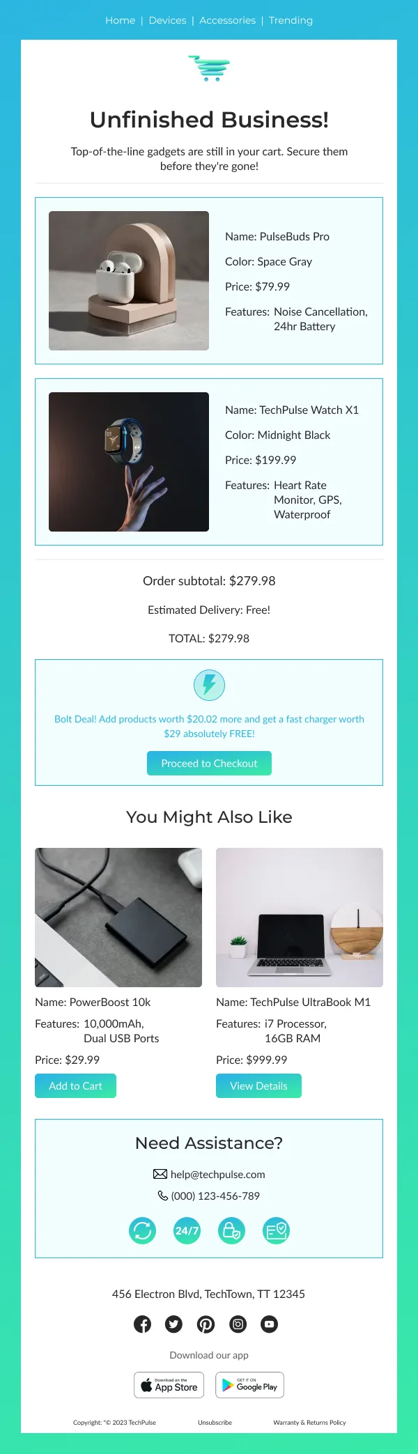
- The item. Photographed, named, recognisable at a glance. The actual item, not a category and not a related range.
- The price. Unchanged from what they saw. A different number reads as a bait-and-switch even when there is an innocent explanation.
- One button, returning to the cart with its contents intact. Not the homepage, not the category page, not the product page — the cart.
- One line of reassurance, addressing the most likely obstacle: free returns, shipping cost, delivery window, stock, or a payment option.
That fourth element is where the design earns its keep, and it is the one most often missing.
What to leave out of the first email
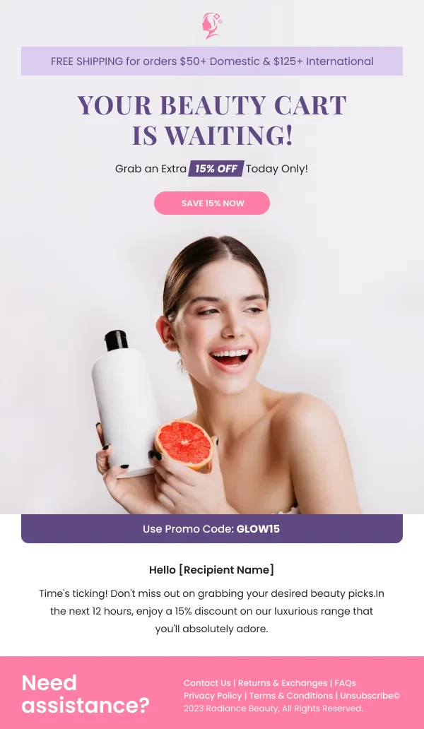
Urgency language. A discount code. A grid of alternatives. Social proof. Reviews. A newsletter signup. Your full navigation.
Each of these is defensible in isolation, and together they bury the item the reader already wanted. The cart email is the one send where restraint is not a stylistic preference but a conversion mechanism — every element competes with the one thing that was already working.
Alternatives belong in a browse abandonment email, where the reader looked but did not commit, which genuinely suggests the item was not quite right. In cart abandonment they did commit.
The sequence
One to two hours. The four elements. Nothing else. This is the highest-converting send in the sequence by a wide margin, because intent is still live.
Twenty-four hours. Same item, different obstacle addressed. Perhaps stock, perhaps a delivery option, perhaps a size guide. A different reassurance, not a louder version of the same email.
Three days. The last one. If a discount is going to appear anywhere, it is here. Frame it as a nudge rather than an apology, and keep it modest — a large discount in a recovery email teaches customers what abandoning is worth.
Stop after three. A fourth converts very little and generates unsubscribes and complaints, which cost more than the marginal recovery.
Timing details that matter
- Not immediately. An email arriving four minutes after abandonment is unnerving and often arrives while the customer is still deciding.
- Respect business hours for higher-consideration purchases. A 3am cart email is seen at 8am alongside everything else.
- Suppress on purchase. Non-negotiable, and it fails more often than you would expect. A recovery email arriving after the order completed is worse than sending nothing.
- Cap frequency across flows. A reader who browsed, abandoned, and follows a restock can receive three emails from three flows in a day, none aware of the others.
Design specifics
Show the item at a real size. A 60px thumbnail does not create recognition. Give the product image at least a third of the width on desktop and full width on mobile.
Multiple items: show up to three with the same card shape, then "and 2 more" with the total. A cart email rendering eleven line items is a receipt.
One button, repeated. If the email is long enough to scroll, the same button appears again at the bottom with the same label. Two different labels for the same destination is a hesitation the design should not have.
Keep it short enough not to need scrolling on mobile, which for the first send is achievable and worth aiming at.
Copy that does not sound like surveillance
The difference between helpful and creepy is where the emphasis sits.
"Still thinking about the Aran jumper?" — fine. It is about the product.
"We noticed you left something in your cart and didn't complete your purchase" — makes the tracking the subject of the sentence, which is the thing readers find uncomfortable.
Lead with the item, not with what you observed.
The two mechanics that decide everything
Before optimising anything visual, verify these:
The cart link restores the cart. A link that lands on an empty cart, or on a login wall, wastes every other decision in the email. Test it as a logged-out user on a different device.
Suppression works. Place an order, and confirm the remaining emails in the sequence do not send.
More cart recovery programmes are undermined by these two than by any design choice.
Measuring it
- Recovery rate — orders attributable to the sequence, as a share of abandoned carts.
- Per-email contribution. If email three carries the sequence, your timing on the first is wrong.
- Discount cost. Track what share of recovered revenue was discounted, and whether abandonment rates rise over time. A rising abandonment rate with a discounted recovery flow is customers learning the pattern.
Multi-item and high-value carts
A cart with one item and a cart with nine are different design problems, and one template rarely serves both.
One to three items. Show them all, same card shape, prices aligned. This is the default and the four-element structure handles it.
Four or more items. Show the first three and summarise the rest — "and 4 more" with the cart total. A recovery email rendering eleven line items has become a receipt, and receipts do not create urgency.
High-value carts deserve a different treatment. Above a threshold that is specific to your catalogue, the hesitation is more likely to be genuine deliberation than forgetfulness. Those emails benefit from what a low-value cart email should omit: a returns guarantee stated prominently, a payment-in-instalments option if you offer one, a link to speak to someone, and delivery certainty. Segmenting the flow by cart value is one of the higher-return changes available, and it is a content decision rather than a visual one.
Carts containing a single low-value item are sometimes not worth recovering at all. If the item costs less than the margin you would spend discounting it, the email is better sent without any offer, or not sent.
Where cart recovery sits in the wider flow
Cart abandonment is one trigger among several, and the programmes that get the most from it are the ones that treat it as part of a set rather than in isolation.
A reader who abandons a cart may also be in a browse-abandonment flow, a back-in-stock flow and a general campaign schedule. Without coordination they receive three or four emails in a day, and the cart email — the most valuable of them — competes with the others for the same click. Suppression rules between flows do more for cart recovery performance than any change to the cart email itself.
The reverse case matters too. If cart recovery is the only triggered flow you run, it is doing work that browse abandonment and replenishment should be sharing, and it will look like it is underperforming when the real gap is elsewhere in the programme.
Starting points
The abandoned cart collection has designs built to this structure, and the retargeting and triggers collection covers adjacent flows — browse abandonment, back-in-stock, price drop. For the wider ecommerce programme, see the ecommerce collection.