Festive email has the hardest attention problem in the calendar. In the weeks
around a major shopping holiday, a reader's inbox contains dozens of emails making
the same offer in the same visual language. Standing out is not a matter of being
louder — everyone is already loud.
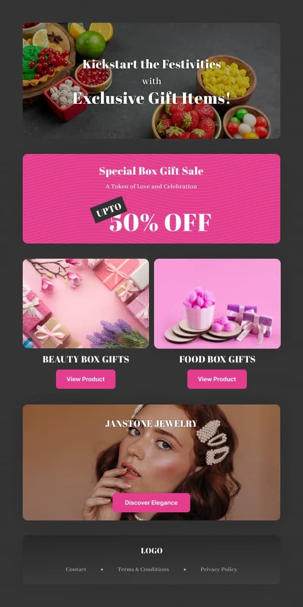
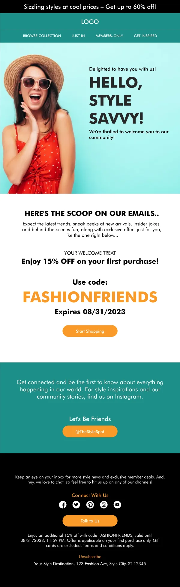
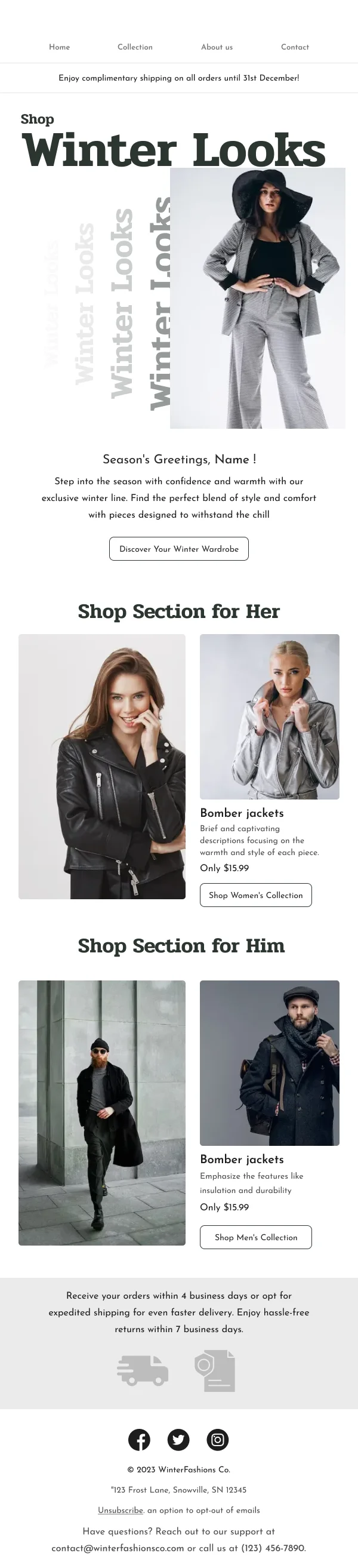
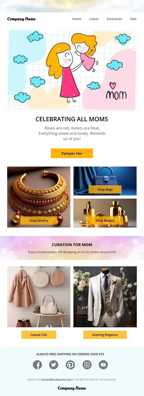
The 112 designs in this collection are built on the assumption that recognisability
and clarity beat volume.
Seasonal signal, not seasonal costume
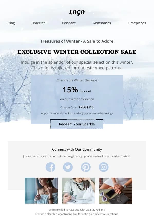
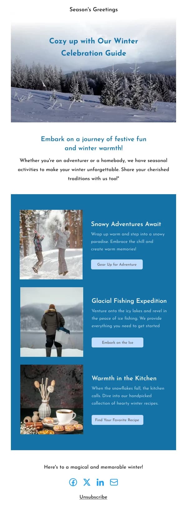
The useful distinction is between decorating your template and replacing it.
Decorating keeps the structure, the type scale, the button shape and the
footer, and changes the palette, the hero imagery and one motif. The reader
recognises the sender immediately and reads the season as context.
Replacing builds a new layout with new type, heavy ornament and a different
button treatment. It looks festive and anonymous, and it wastes whatever brand
recognition the previous eleven months earned.
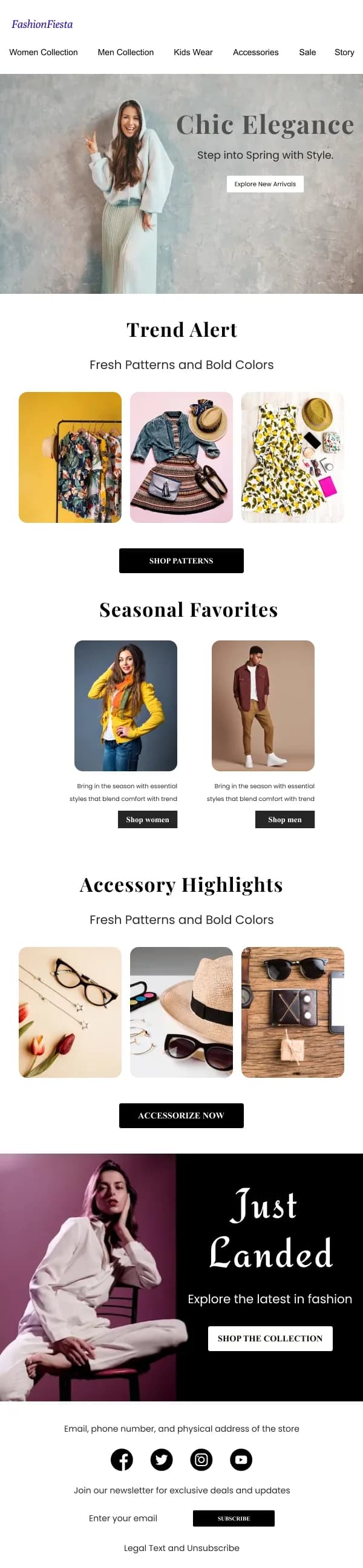
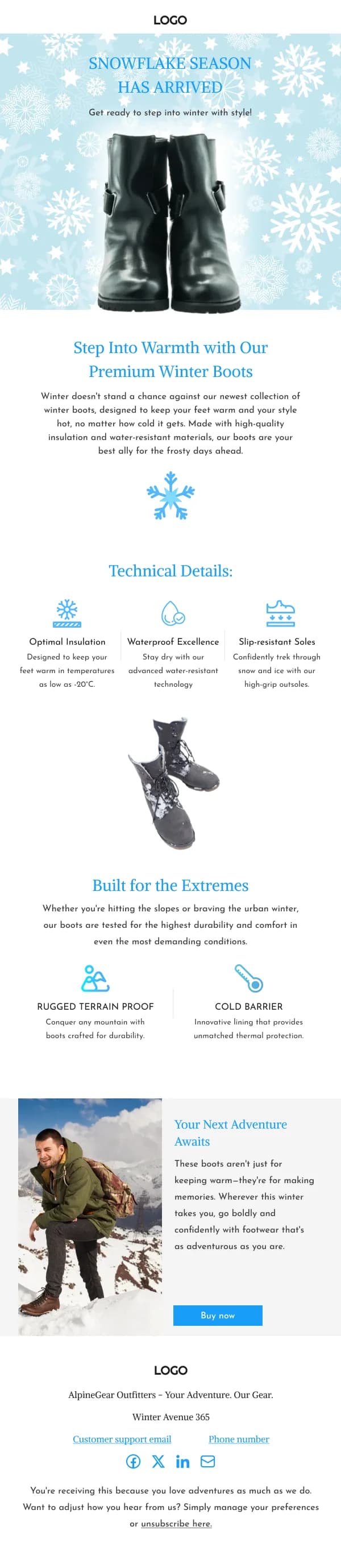
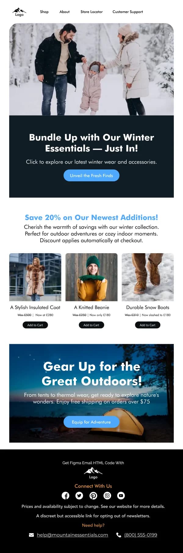
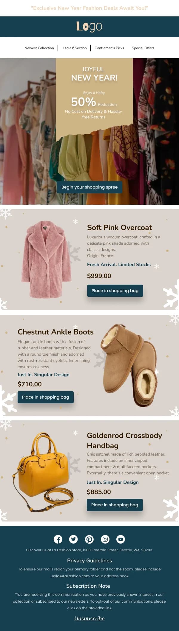
Nearly every design in this collection is built as decoration over a stable
frame, and the palette and motif are the layers intended to change.
Palette carries most of the load
Colour does the seasonal work more efficiently than illustration. A few
observations that hold across these templates:
- Two colours plus a neutral is enough. Festive palettes go wrong by adding a
third and a fourth until nothing is dominant.
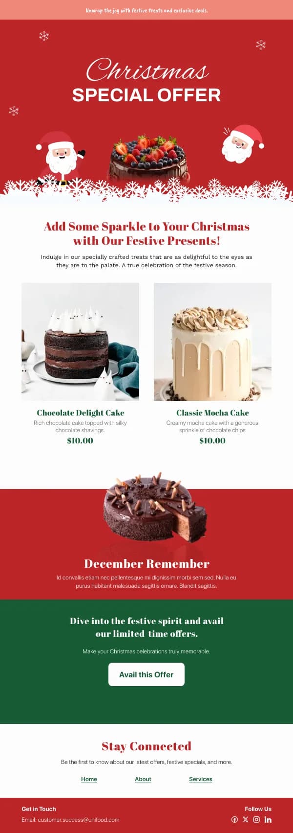
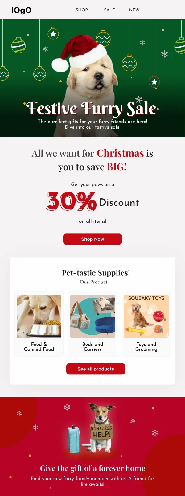
- Keep the action colour distinguishable from the seasonal accent. A red
button on a red-accented Christmas email loses the button. Where the season
claims your usual accent, move the button to a neutral dark or a contrasting
tone.
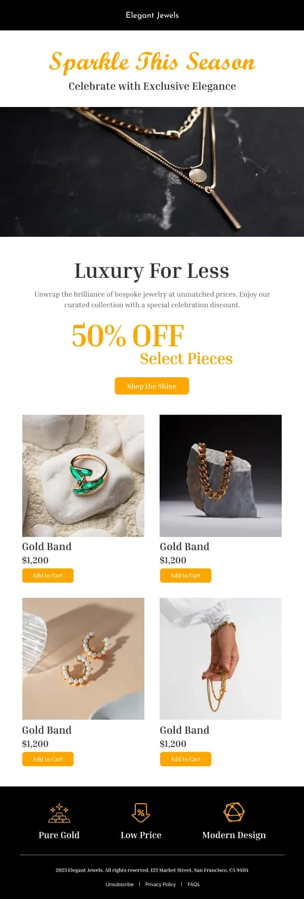
- Contrast survives less than you expect. Gold on cream, white on pale pink,
mid-grey on kraft brown — all common festive combinations, all frequently below
a readable contrast ratio. Check the body copy, not just the headline.
Different festivals, different registers
Treating every holiday as a discount event flattens real differences in what
readers expect:
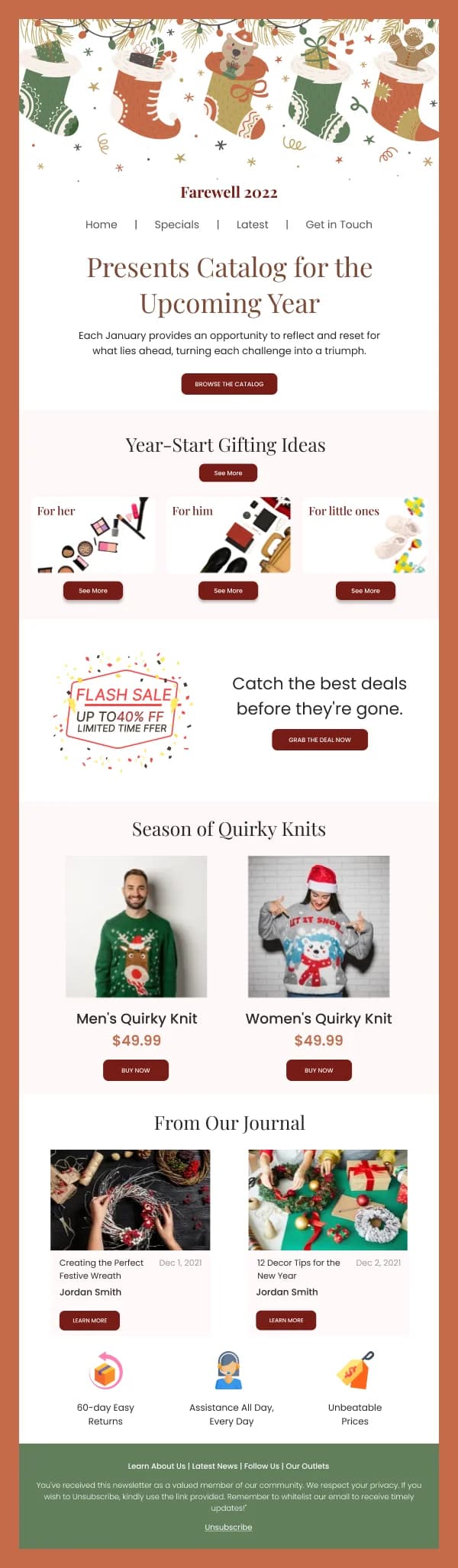
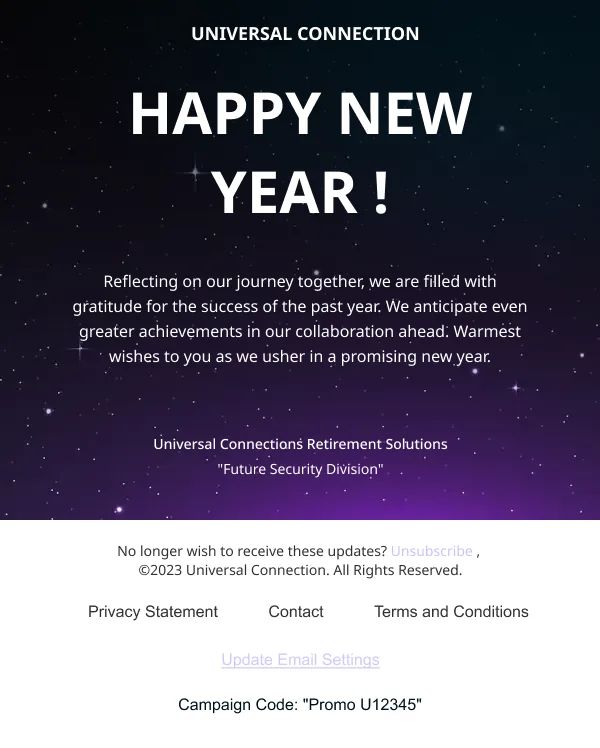
- Christmas and New Year carry both a gifting and a reflective register. Gift
guides want structure — recipient, price band, category — while a year-end note
wants space and restraint.
- Diwali is celebratory and warm, with palette and motif expectations
(deep jewel tones, lamps, rangoli-derived pattern) that are specific and worth
getting right rather than approximating.
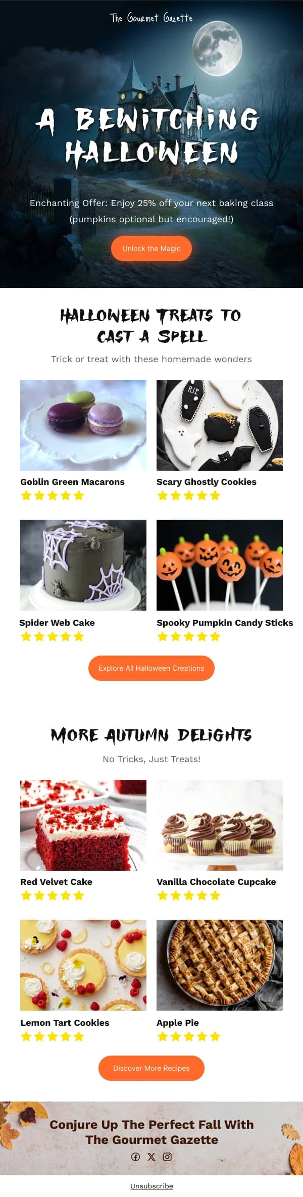
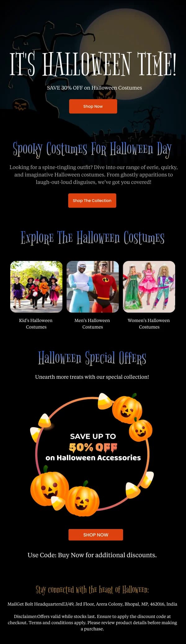
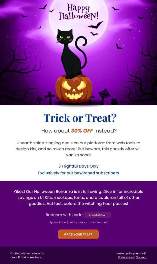
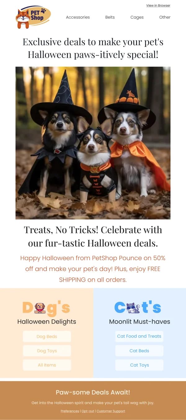
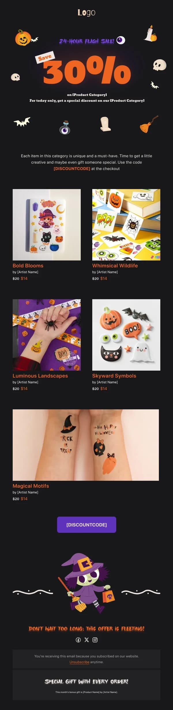
- Halloween tolerates far more playfulness than any other moment in the
calendar, and it is the one place where a genuinely different visual treatment
is expected rather than jarring.
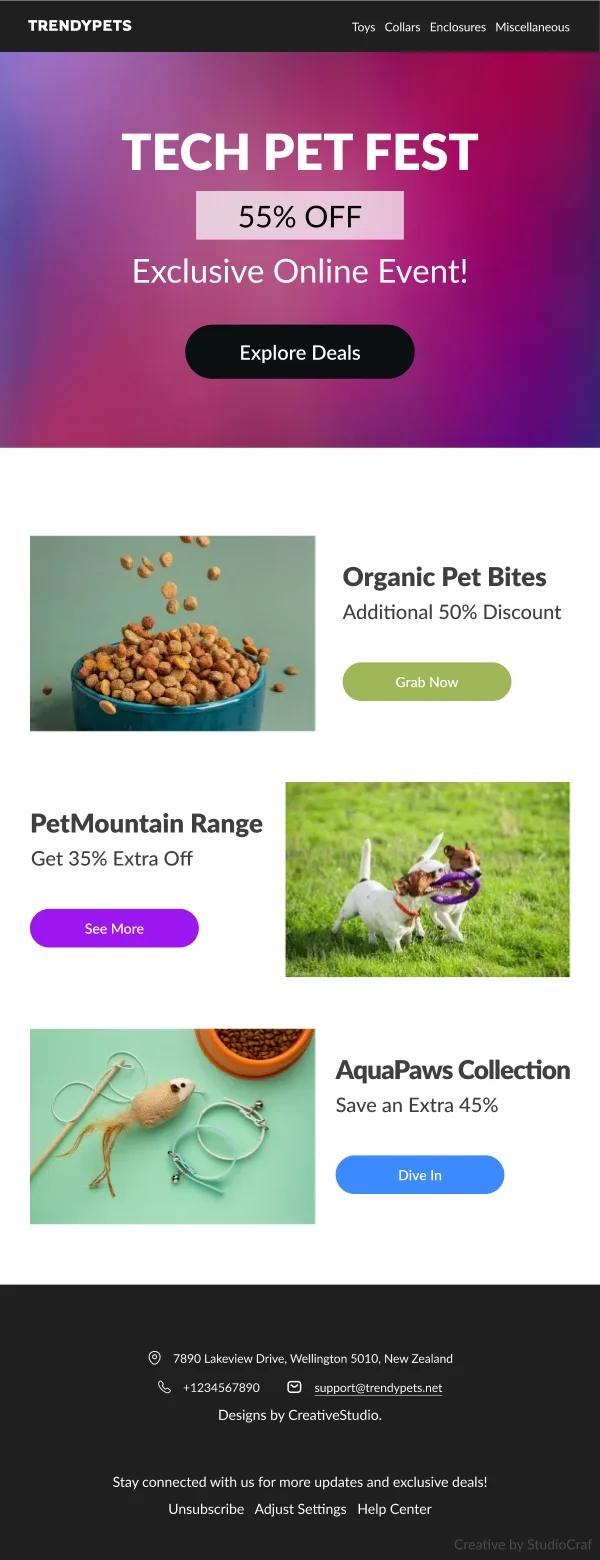
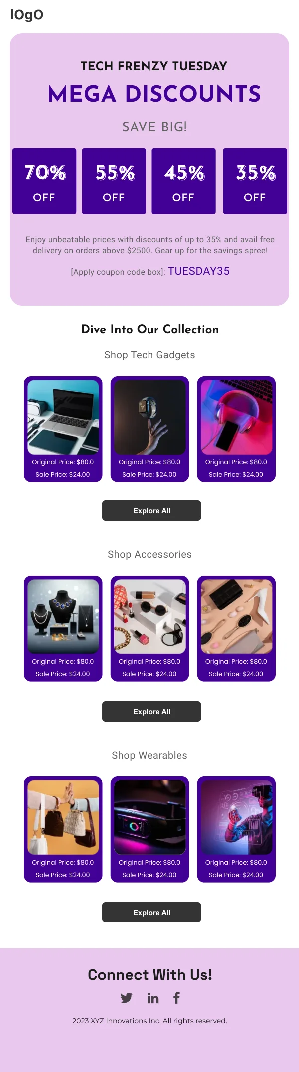
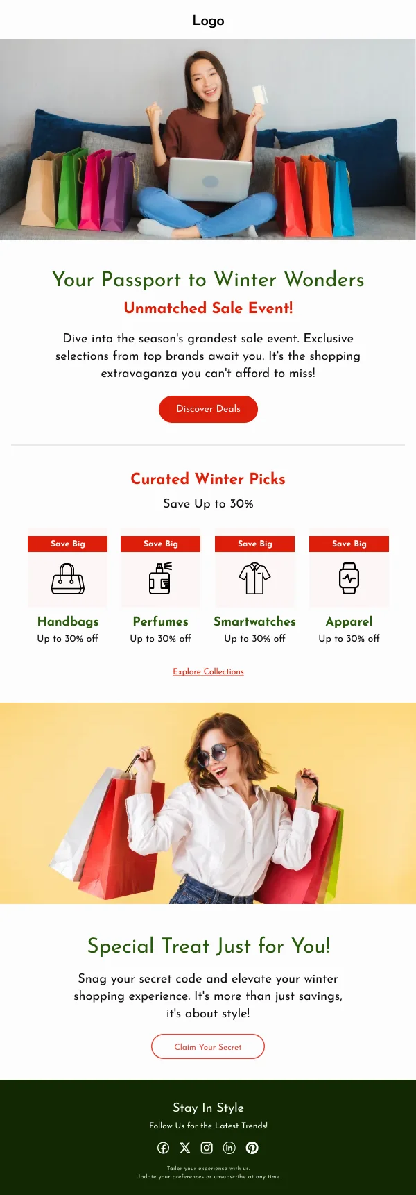
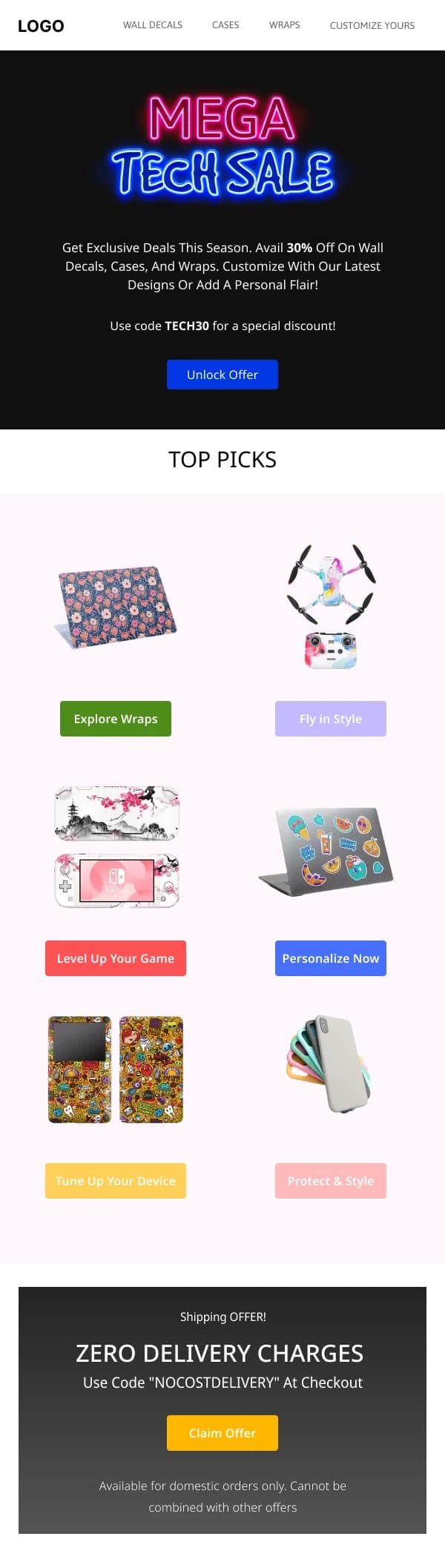
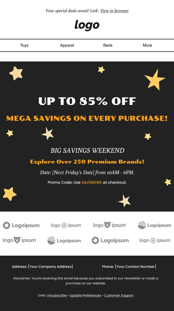
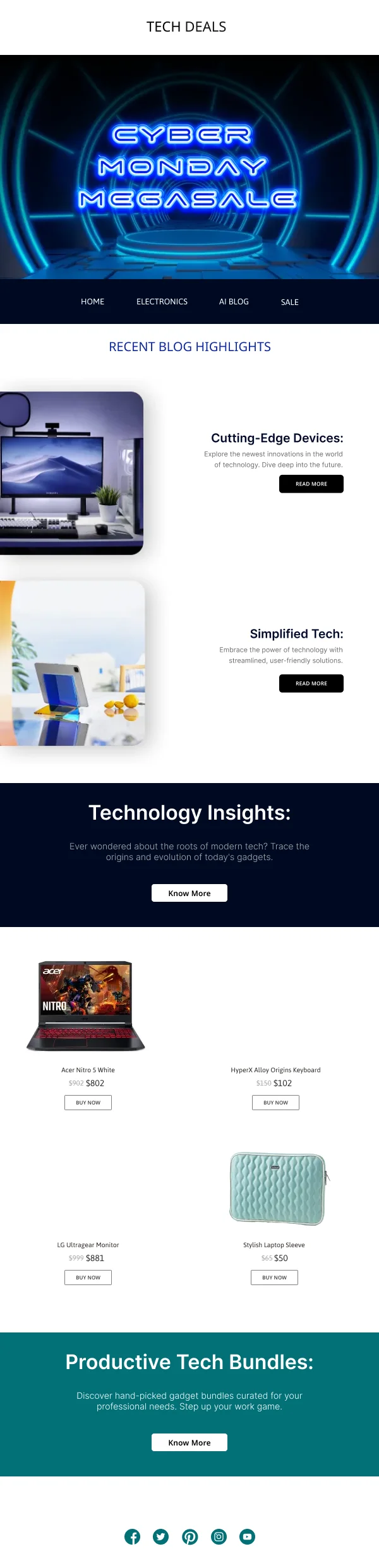
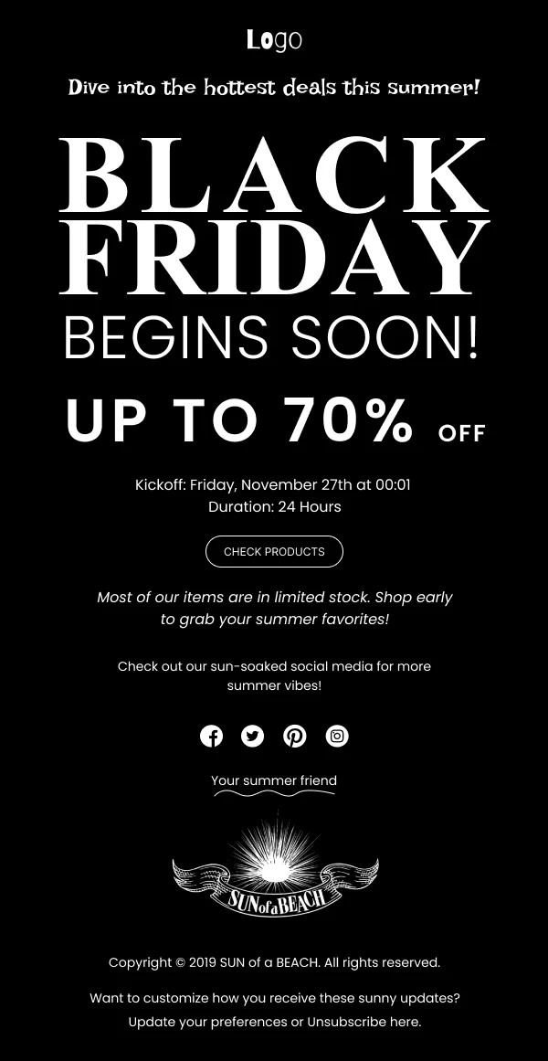
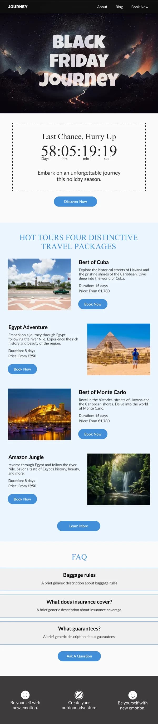
- Black Friday and Cyber Monday are pure offer clarity. Time, discount, scope,
action. Ornament actively hurts here.
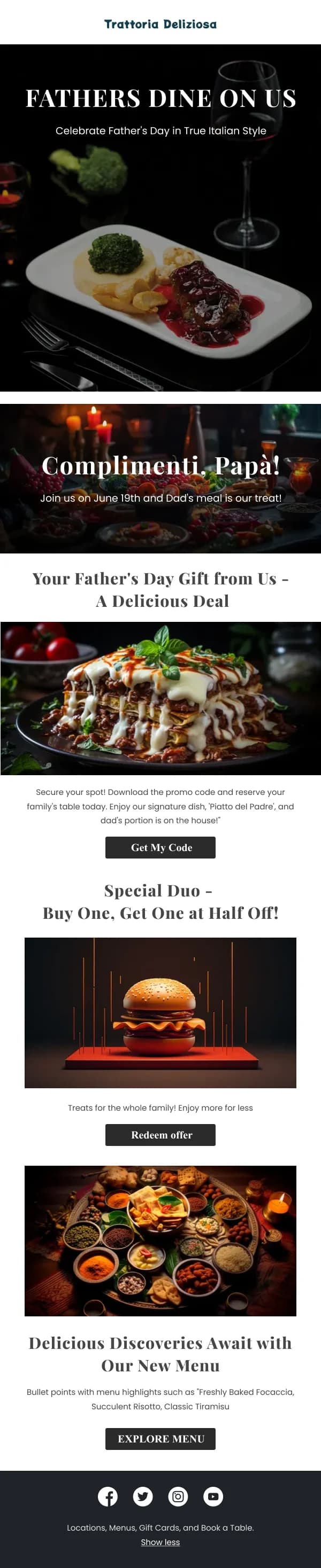
- Mother's Day and Father's Day are gifting moments with a sensitivity
dimension: these are the sends where an opt-out from the campaign is a real
kindness, and worth a line in the email itself.
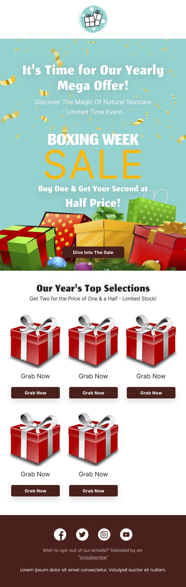
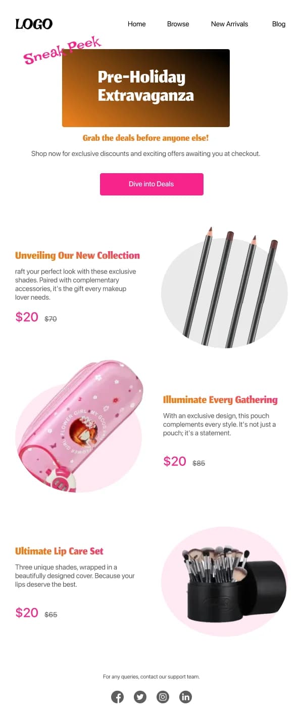
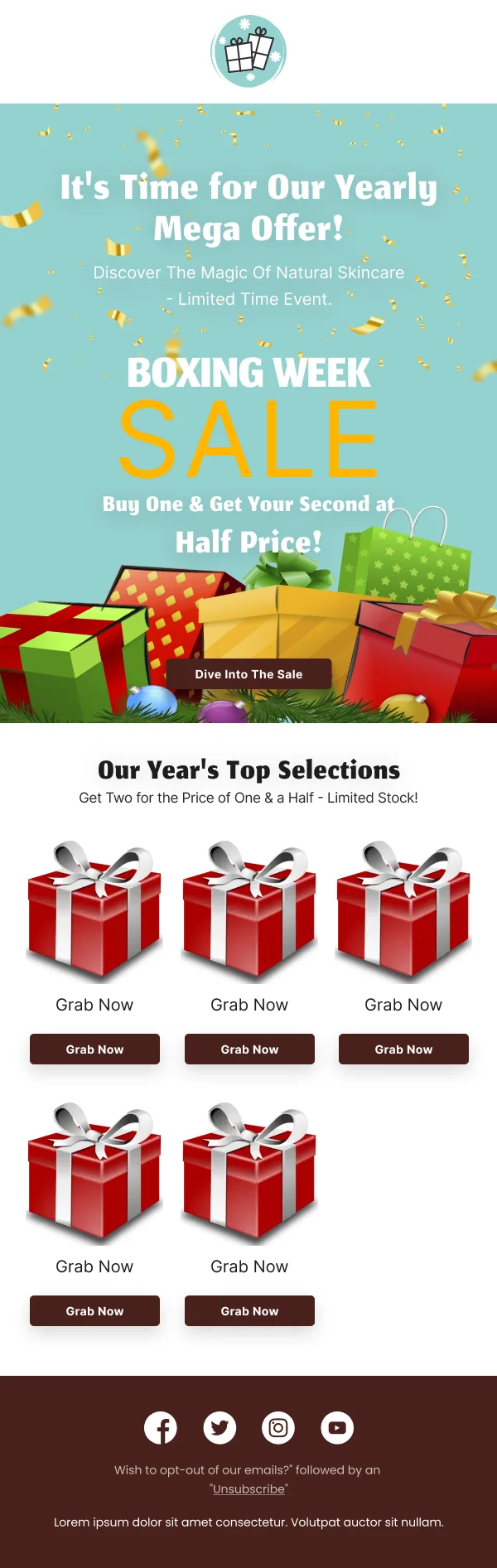
- Boxing Day is a sale send that follows a gifting send, which means the
reader was in the inbox two days ago. Reusing the Christmas hero reads as lazy.
Gift guides are a structural problem
A gift guide has to help a reader who does not know what they want, which makes
it a navigation design rather than a product showcase. The versions in this
collection that work organise by something the reader already knows:
- Recipient — for her, for him, for kids, for the host.
- Price band — under £25, under £50. Genuinely useful and consistently
under-used.
- Occasion or interest — for the cook, for the traveller.
Three to five clearly labelled routes, each with two or three products and a link
to more. A twenty-product undifferentiated grid is not a gift guide; it is a
catalogue page in an email.
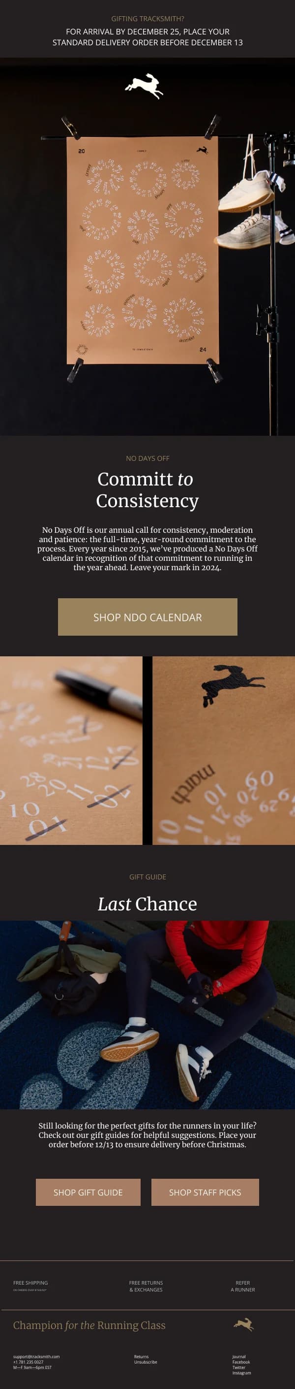
Deadlines are the most important element
For festive commerce, the shipping cut-off is often more decisive than the
discount. It deserves the same design treatment as a price: its own block, plain
date format, month in words, and repeated near the button.
The final-hours send in this collection exists because that deadline is the one
message worth sending twice.
Plan for the send window
Festive design fails most often on the calendar rather than the canvas. The
sending window for a holiday is narrow and every competitor occupies it, so the
design has to be finished before it opens.
That argues for building the seasonal variants as Figma component variants on your
existing template rather than as new files. Swap the palette, swap the hero, swap
the motif, adjust copy, send.
For the full sequence — teaser, launch, reminder, final hours, extension — see the
Black Friday and festive playbook.
Common questions
- When should festive emails start going out?
- Earlier than feels comfortable for planning, later than most brands actually send. The practical constraint is that the design work has to be finished before the sending window opens, because the window is short and crowded. Most of these templates are built to be adapted in an afternoon for exactly that reason.
- How much seasonal decoration is too much?
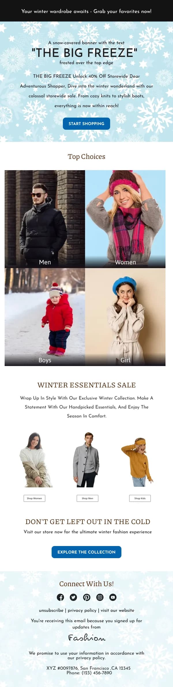
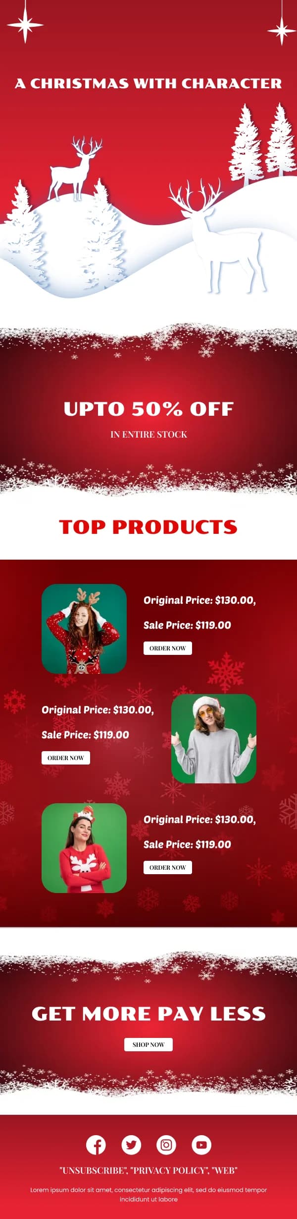
- The test is whether the reader can still tell it is you. A snowflake border and a red accent on your normal template reads as festive; a completely different layout with three ornaments and a script typeface reads as a stock template. Seasonal signal belongs in the palette and one motif, not in the structure.
- Do I need a separate design per festival?
- You need a separate palette and motif per festival, on a shared structure. Diwali and Christmas want different colour and imagery, but they want the same layout logic, the same button treatment and the same footer.
- How do I stand out in a Black Friday inbox?
- Usually by being calmer than everything around you. When every email is shouting a percentage, the one with clear typography and a single legible offer is the one that reads as a real brand rather than a discount aggregator.