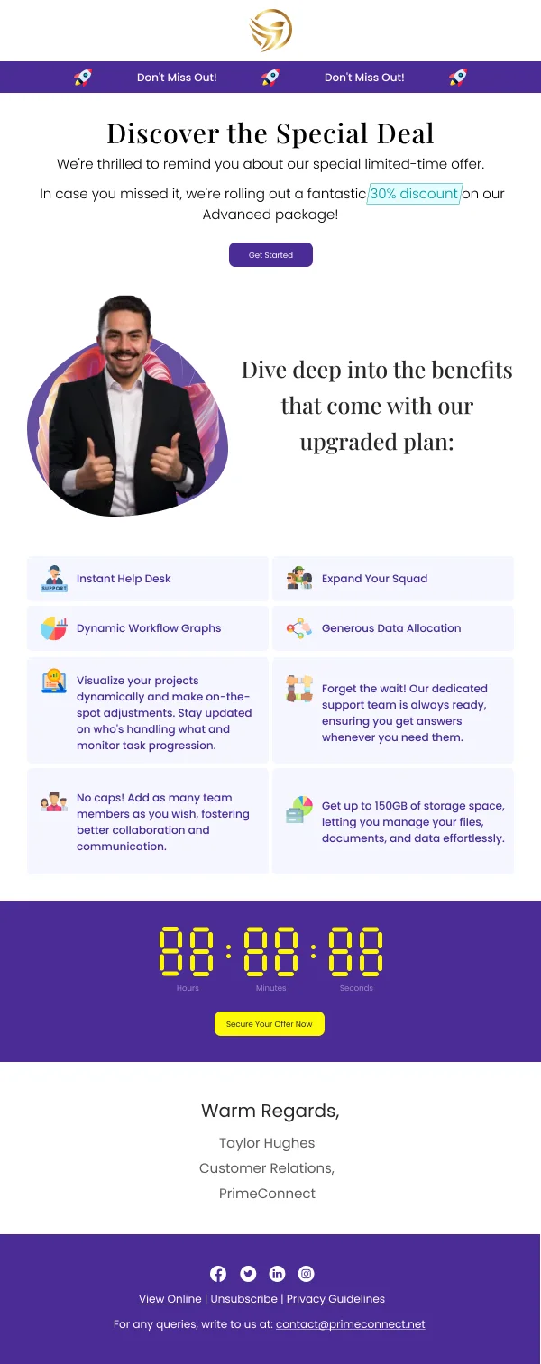
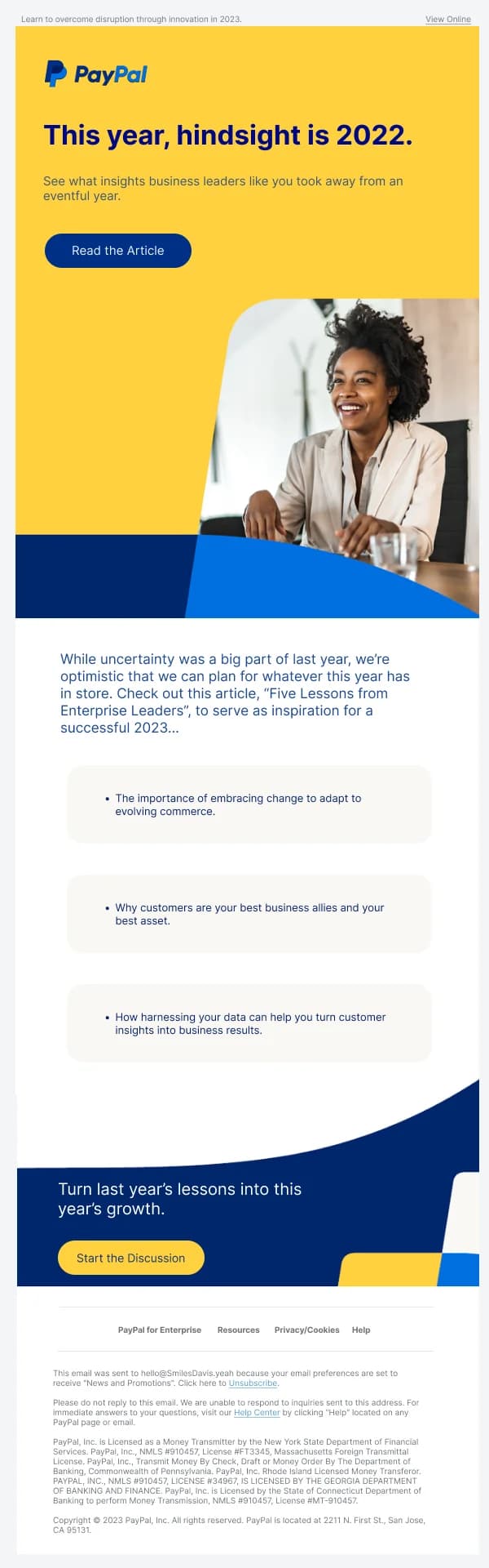
Software email operates under a constraint that marketing email does not: the
reader is already a customer, and every send either helps them or annoys them.
There is no neutral. A digital product with a badly judged email programme trains
its users to filter it, and once filtered, the genuinely important messages —
billing failures, security notices, expiry warnings — go unseen too.
The 137 designs in this collection are built around that risk.
Clarity outranks polish
The visual language of good product email is close to the visual language of good
interface design: restrained, legible, consistent, and organised so the reader can
find the one thing they need without reading everything.
Concretely, in most of these templates:
- One accent colour, used only for the action. Product email often carries
several possible next steps; reserving colour for the primary one keeps the
hierarchy legible.
- Short line lengths. 50–70 characters. Product email is frequently read
quickly, on a phone, between other tasks.
- Left alignment throughout. Centred body copy slows scanning, and product
email is scanned more than it is read.
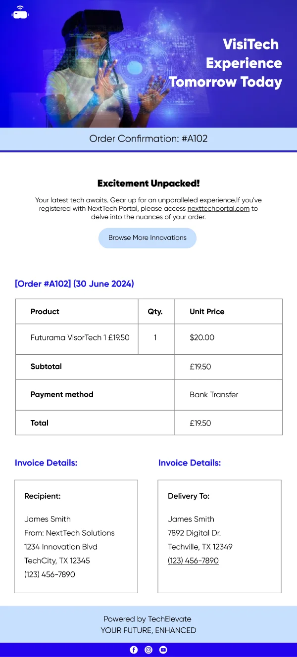
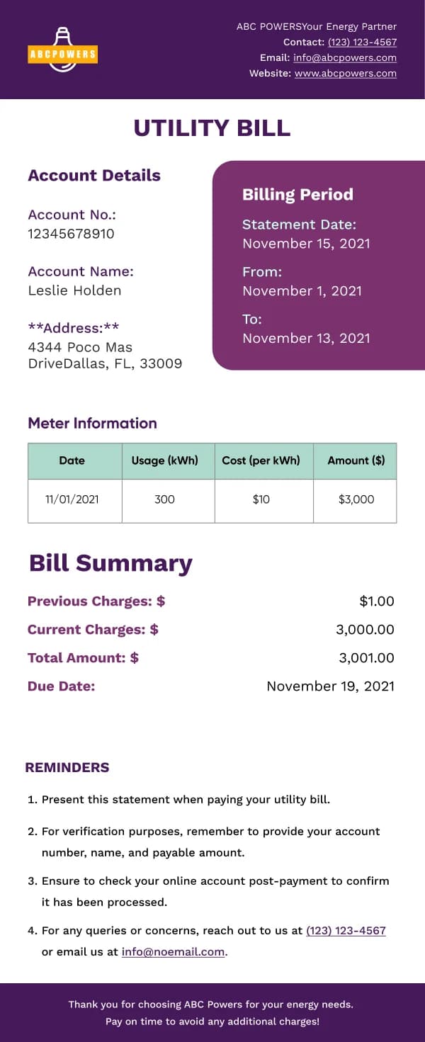
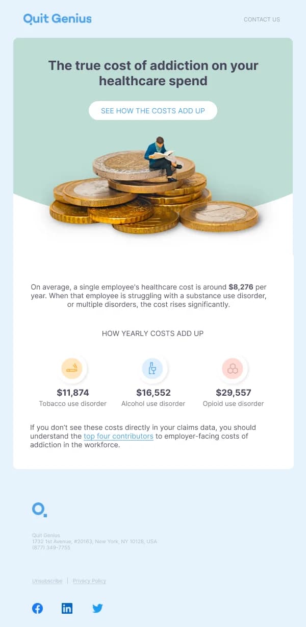
- Real structure for structured data. Usage numbers, plan details and account
changes want a small table or a labelled list, not a paragraph.
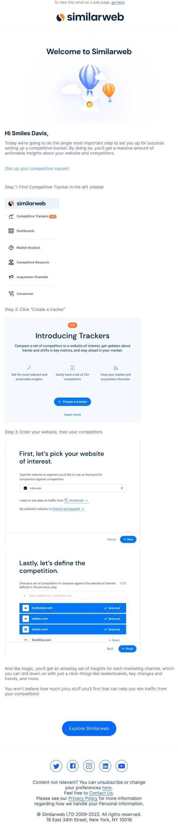
Onboarding is a sequence, not an email
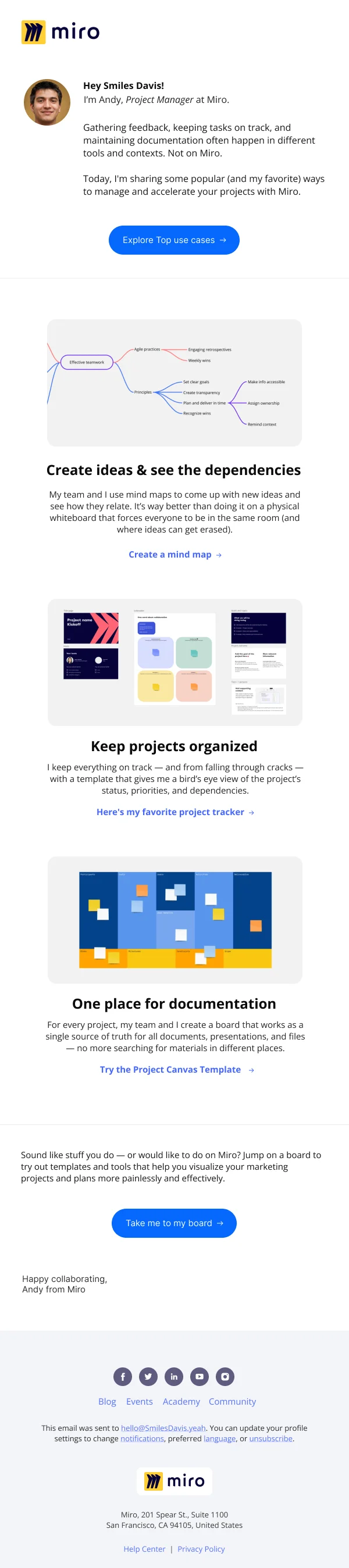
The most valuable design work in this collection is in the onboarding sets, and
the thing that makes them work is that they are built as a series with a shared
frame and a genuinely different middle.
A workable shape:
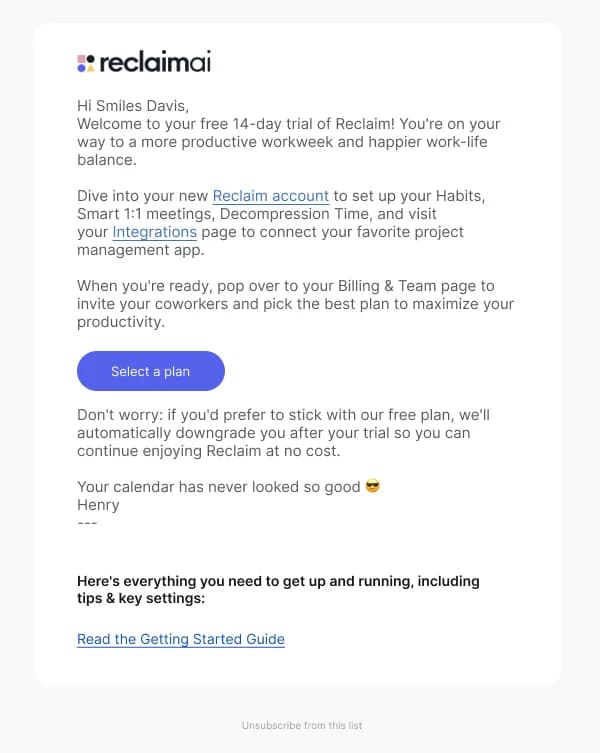
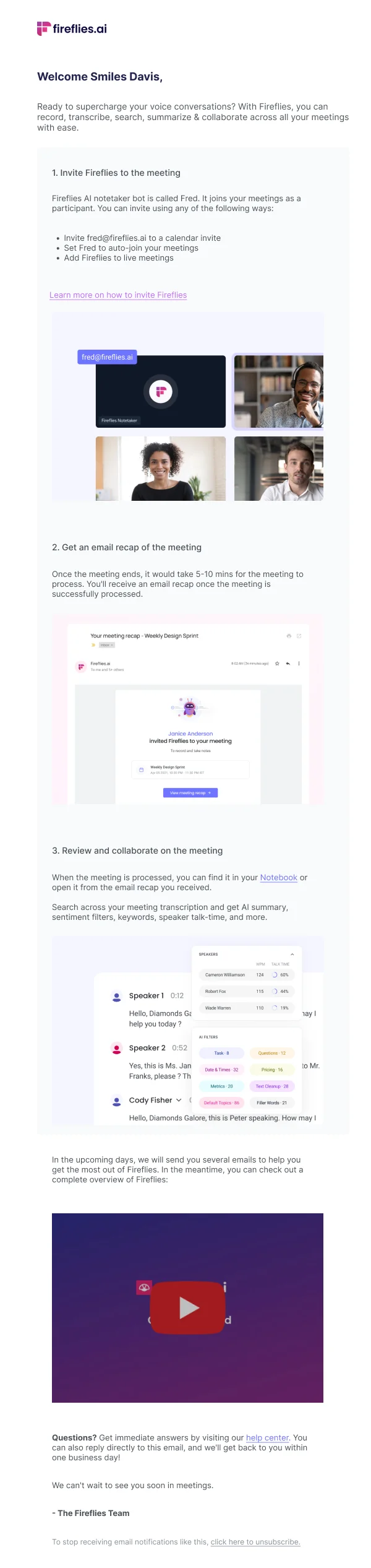
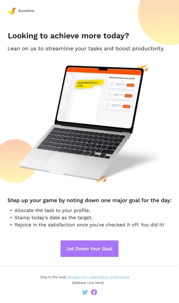
- Welcome — confirm the account exists, and name the one action that
produces the first bit of value. Not a feature tour. One action.
- First real use — help with the specific step where people stall. This is
the email that needs product knowledge rather than design flourish.
- Second capability — introduce the thing that makes people stay, once the
first thing has landed.
- Check-in — an offer of help, ideally from a person, with a low-friction
reply path.
Designing these as one template with four content variants is faster to build and
reads as more coherent than four unrelated designs.
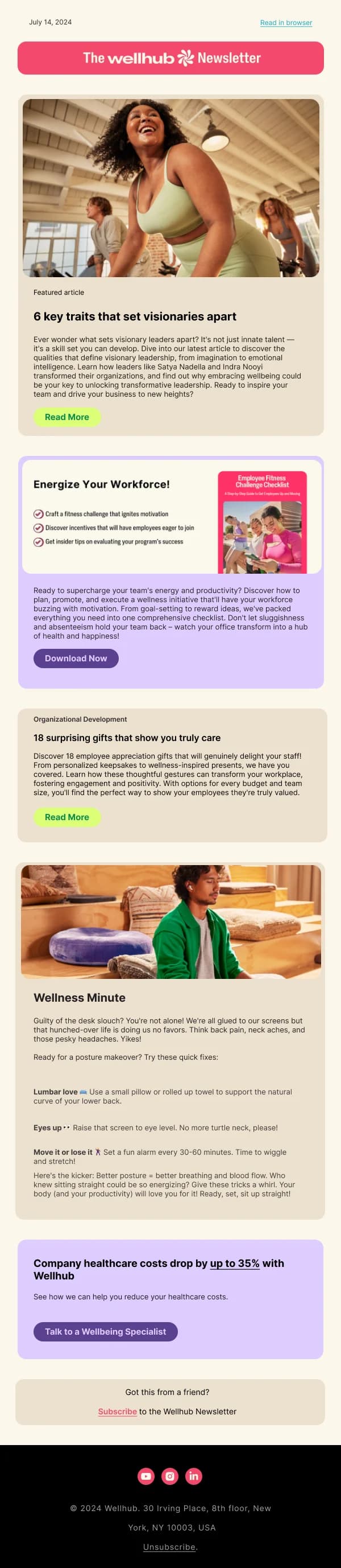
The digest problem
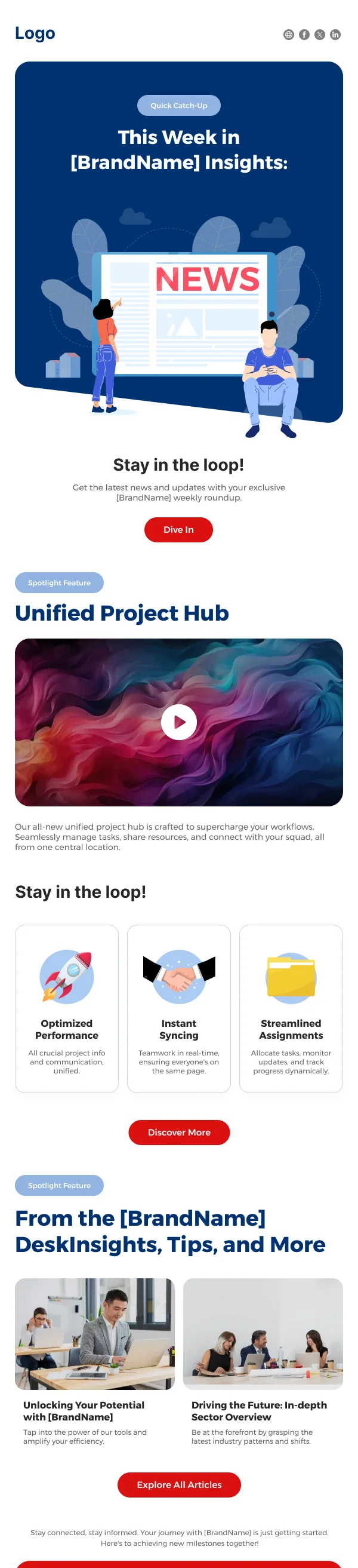
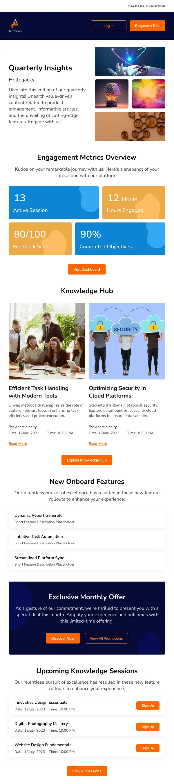
Digests are the hardest common layout in product email, because they have to hold
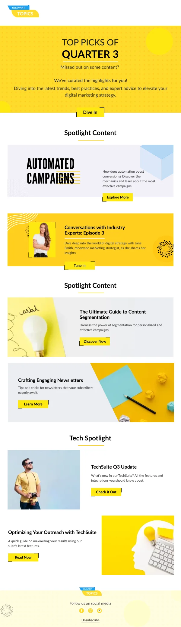
a variable number of heterogeneous items and still be scannable. Several designs
here address it, and the patterns that hold up are:
- A fixed row shape. Icon or thumbnail, title, one line of context,
timestamp. Every item gets the same shape, so the eye can skip.
- Grouping with real headings when items fall into categories. Ten
undifferentiated rows is worse than three groups of three with labels.
- A hard cap, with an overflow link. "And 14 more" plus a link beats
rendering all 24 and hoping.
- Graceful behaviour at one item. A digest layout containing a single row
looks broken unless the design anticipates it.
Account and billing email is a trust surface
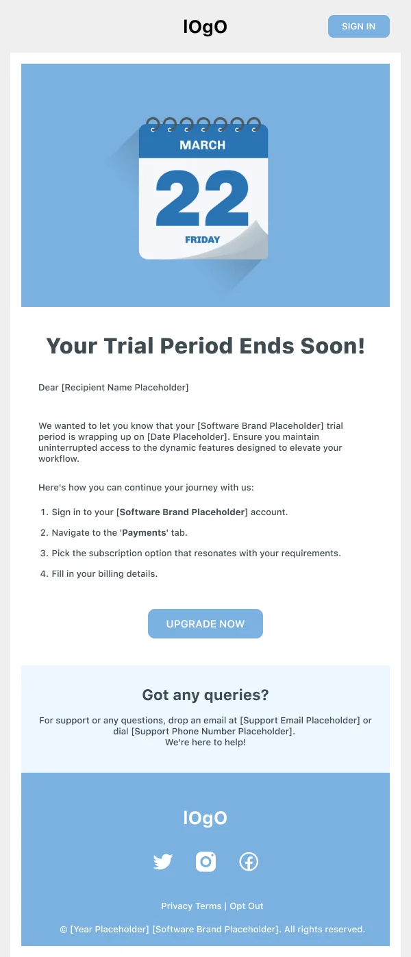
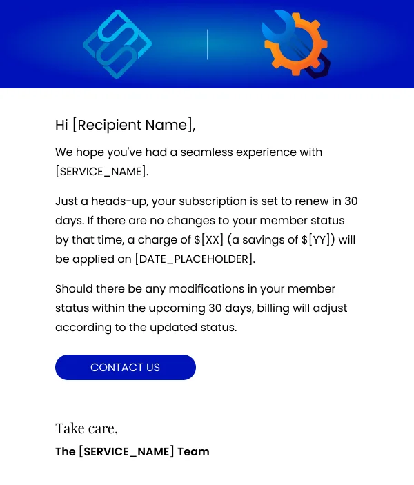
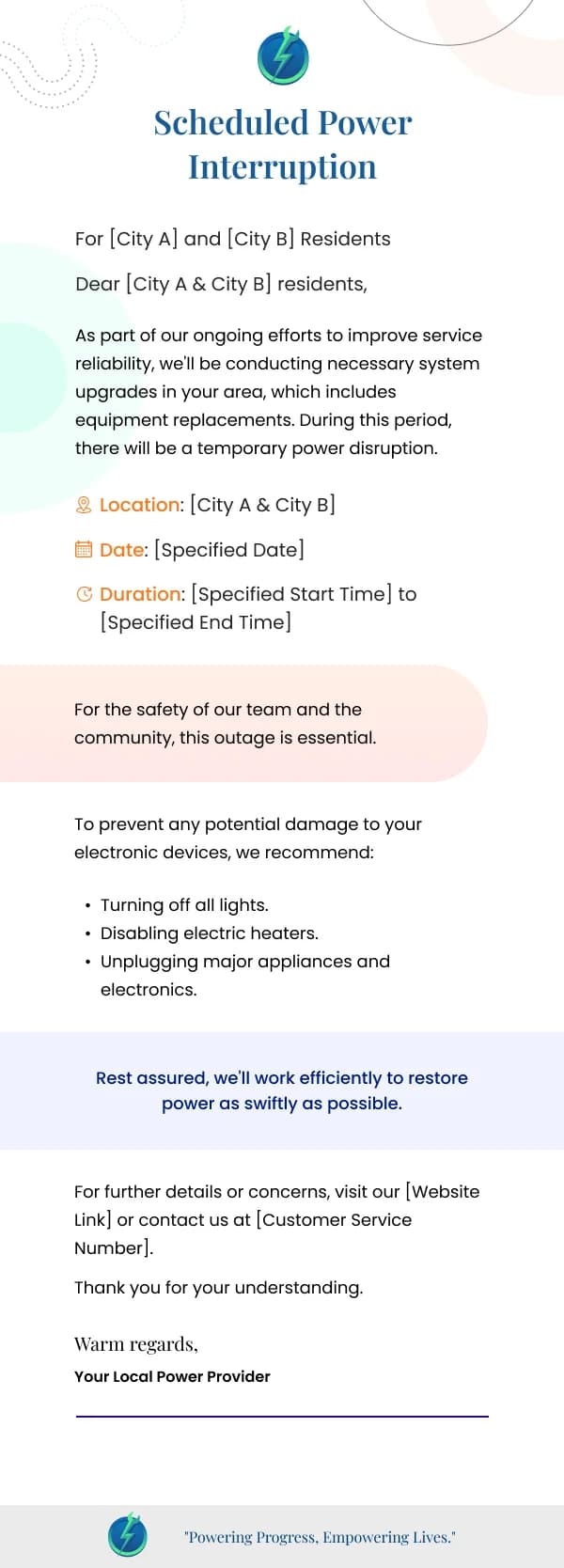
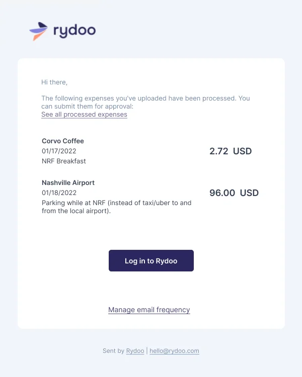
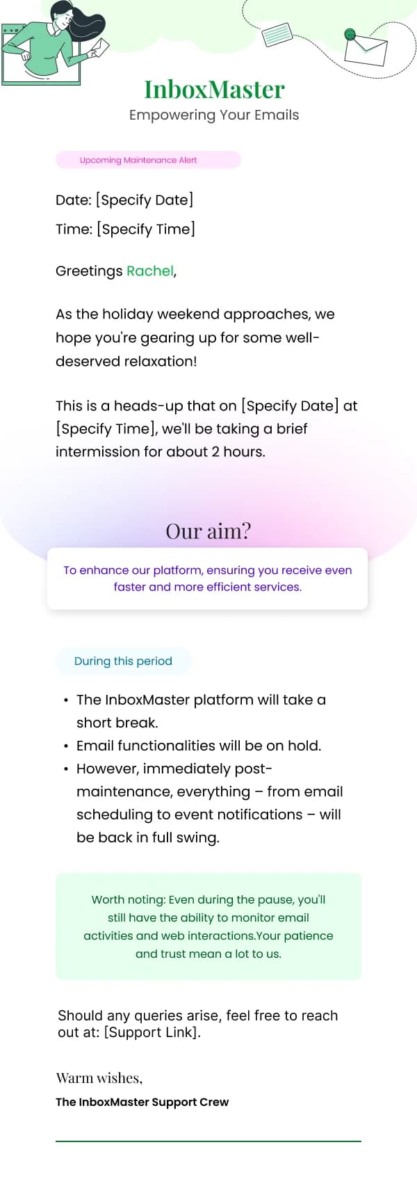
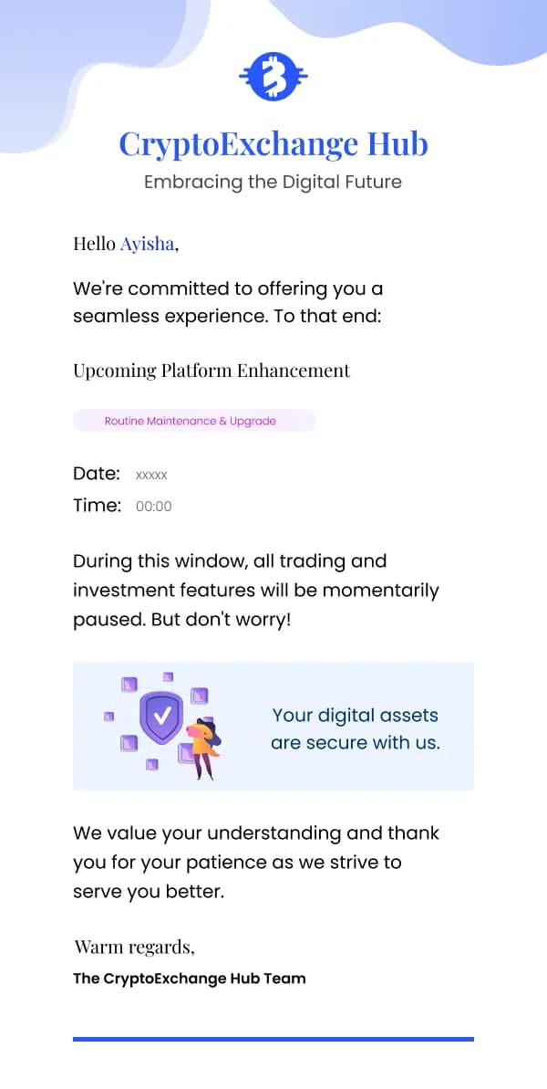
Password resets, billing failures, plan changes and security alerts are the emails
where design failures cost the most, because they are the emails most closely
imitated by phishing. A sloppy, unbranded billing notice teaches users that a
sloppy, unbranded billing notice is normal.
The templates for these sends are deliberately plain, and they follow a few rules:
- State the fact in the first line. "Your payment did not go through" before
anything else, including pleasantries.
- One action, unmistakable. For a reset, the button. For a failure, update
payment details.
- Say what happens if the reader does nothing, with a date. This is the single
most useful line in a billing email and it is usually missing.
- Keep the sender identity consistent with every other email you send.
Consistency is what lets a user spot the imitation.
Re-engagement, honestly
Dormant-user email has a bad reputation because most of it is a guilt trip with a
discount attached. The versions here that work take a different angle: they
either show the user something that changed since they left, or they ask a genuine
question with a one-click answer, or they make leaving easy.
That last one is counterintuitive and worth stating plainly: a prominent, honest
unsubscribe in a re-engagement email improves the health of the list you keep. A
user who leaves cleanly is better than one who marks you as spam.
Where these templates fit
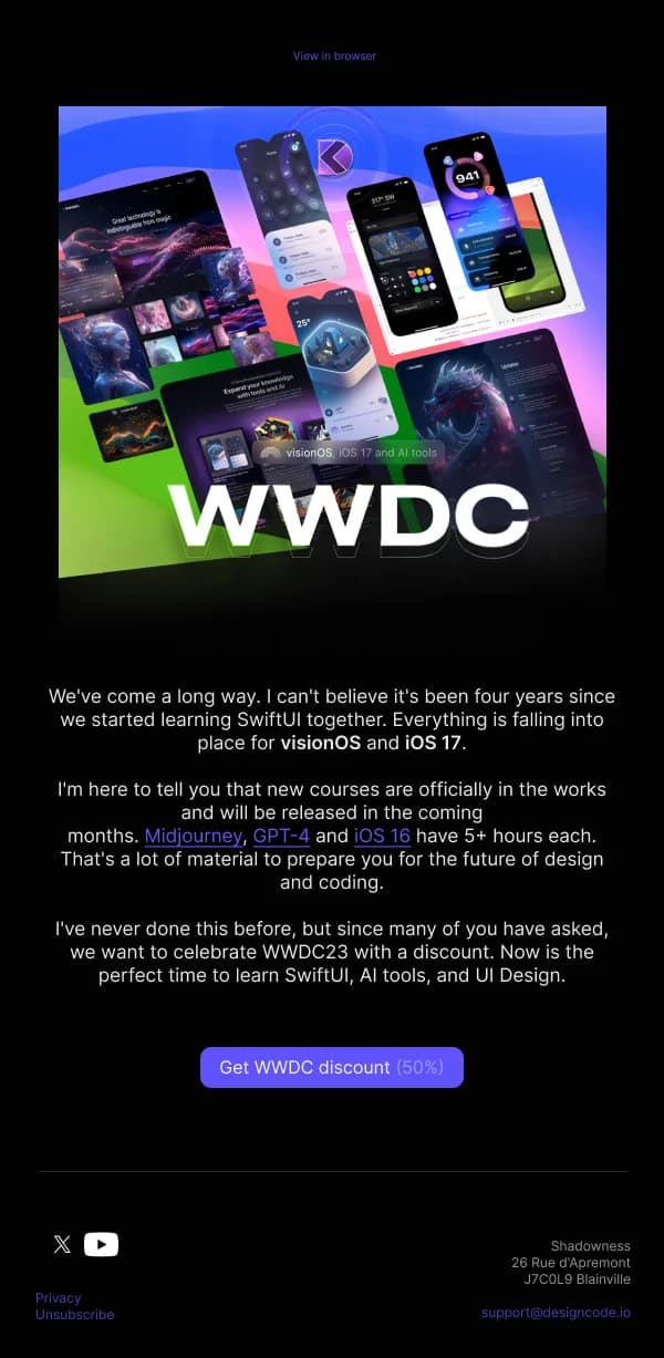
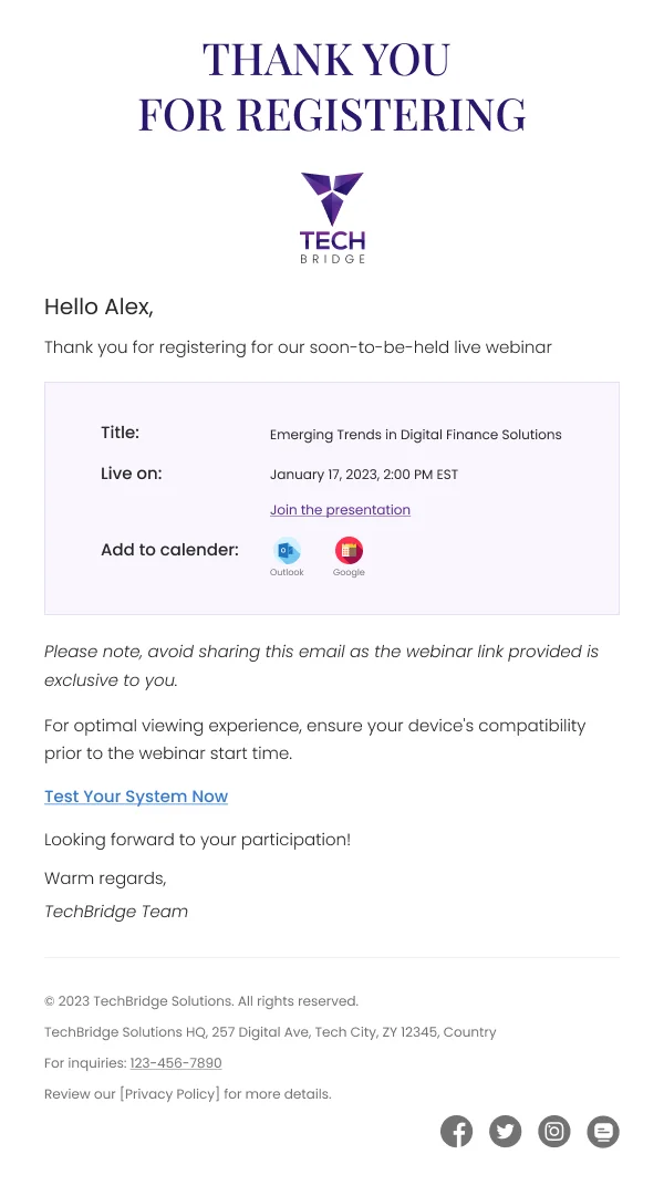
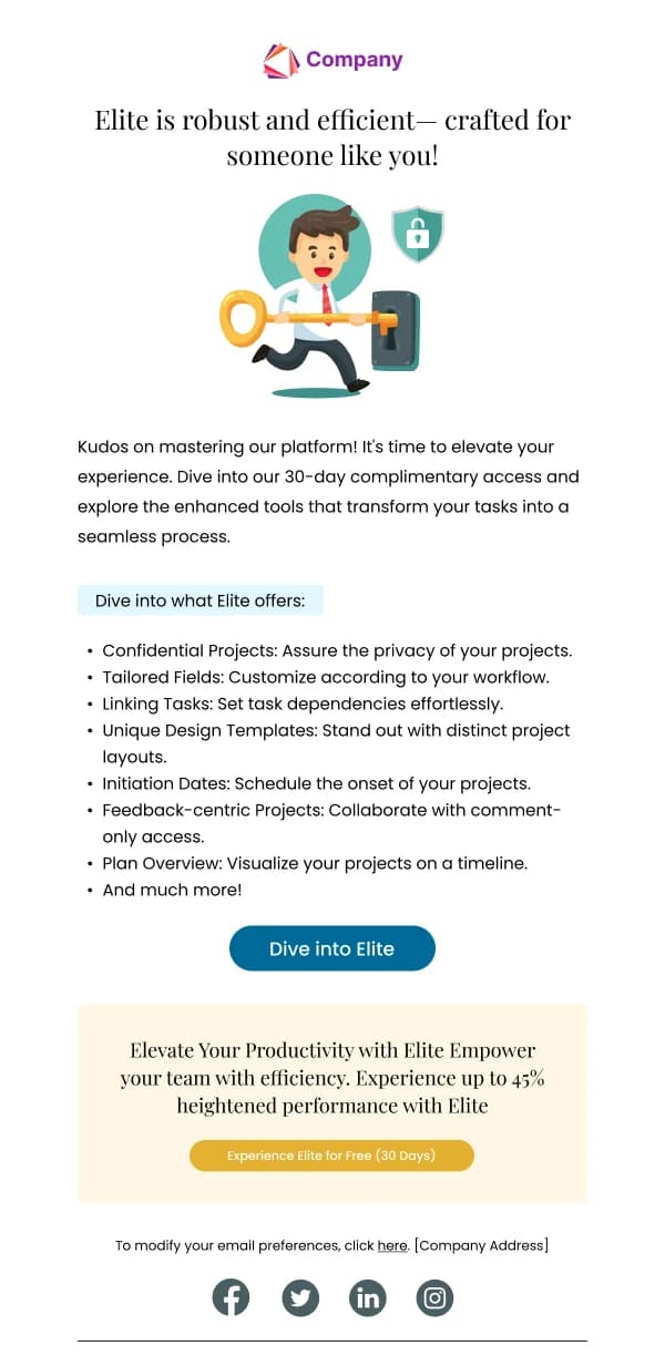
The collection covers the full arc — activation and onboarding, feature
announcements, usage and performance summaries, notifications and
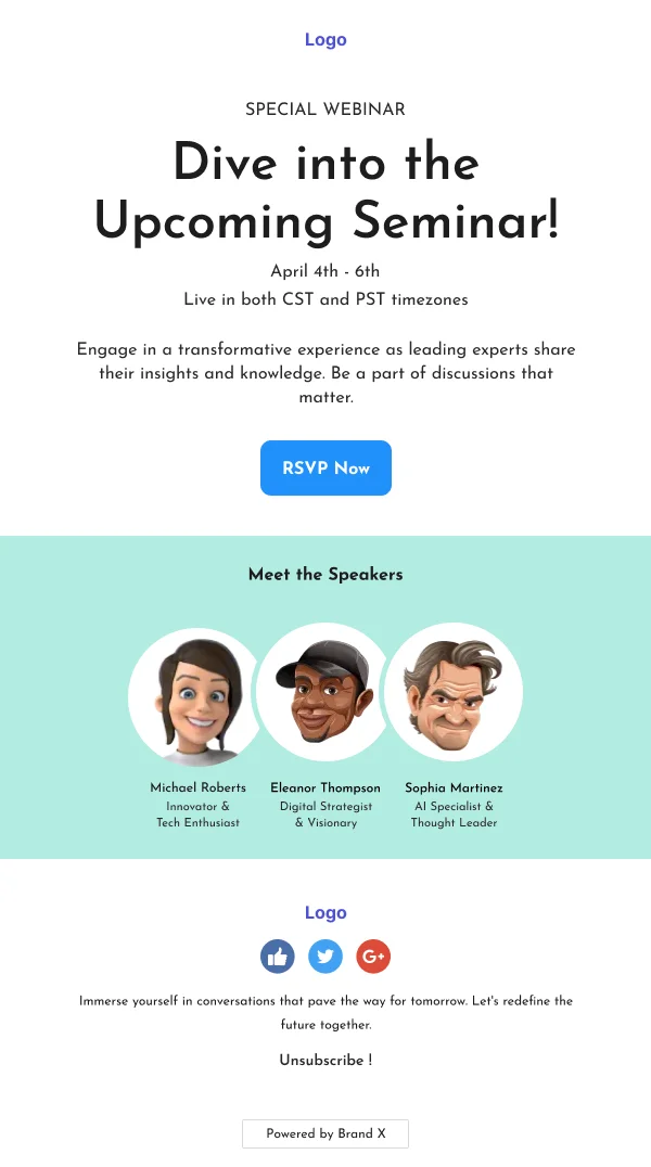
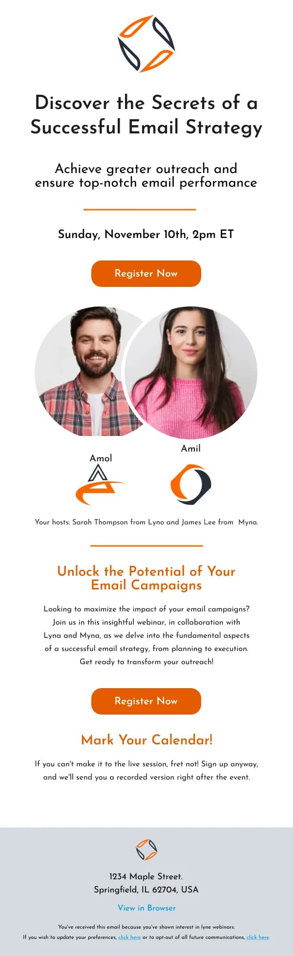
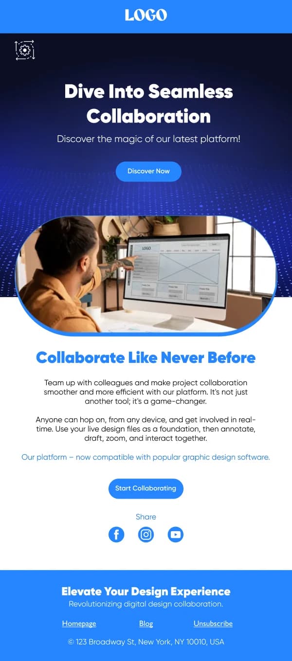
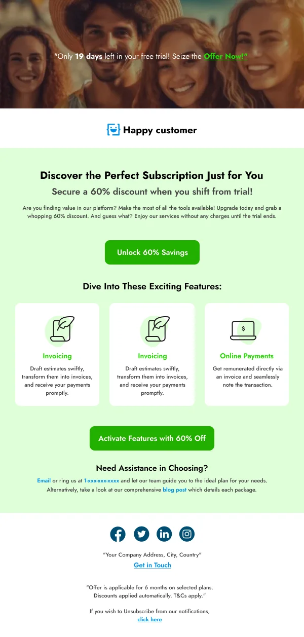
acknowledgements, account admin, webinar and event invitations, and win-back.
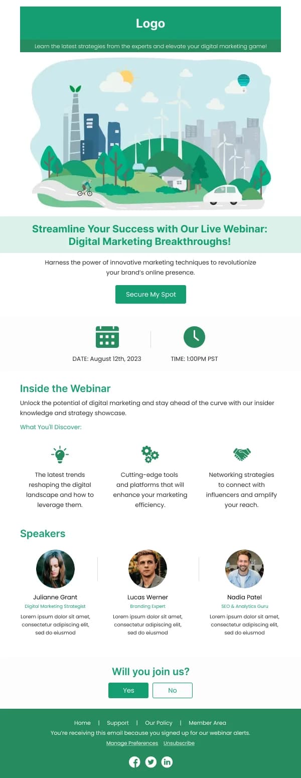
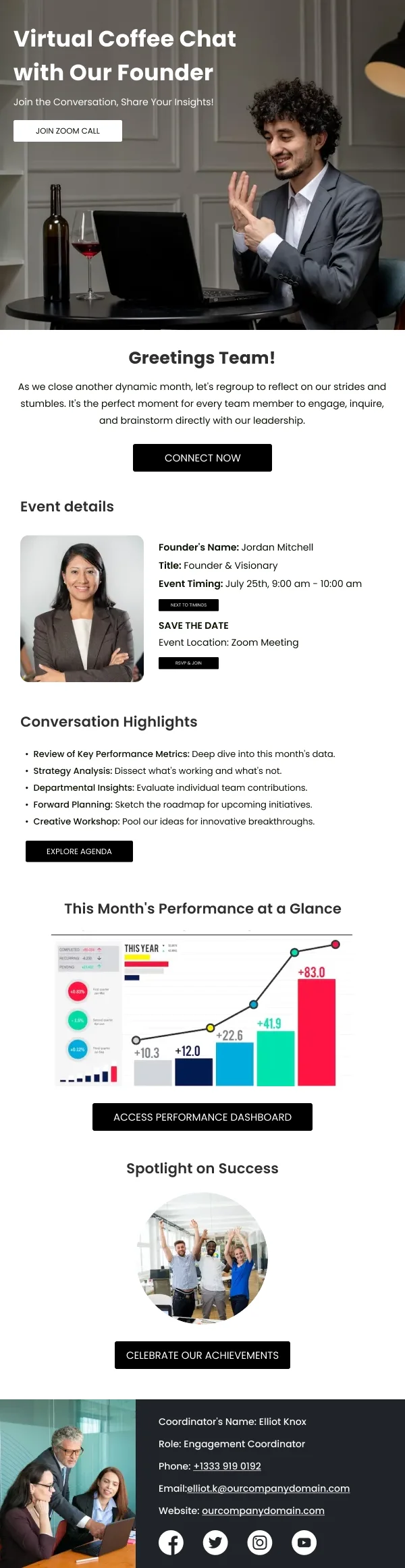
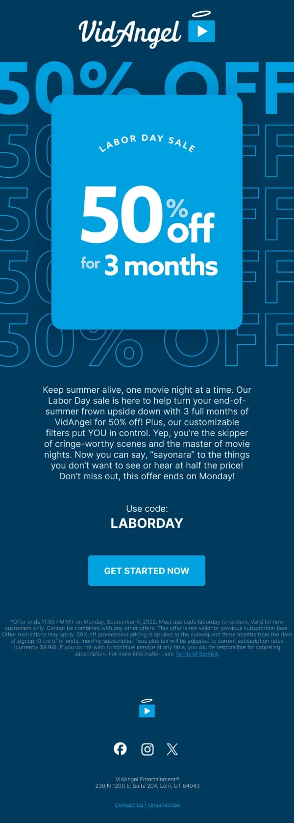
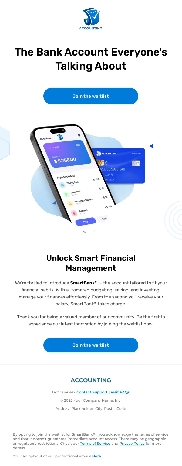
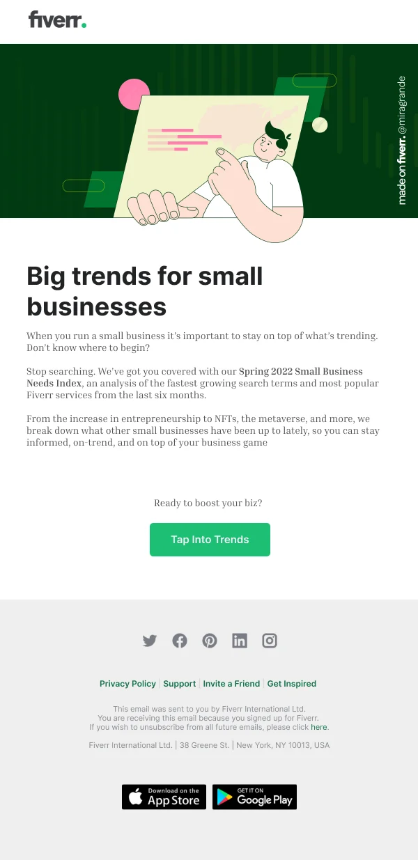
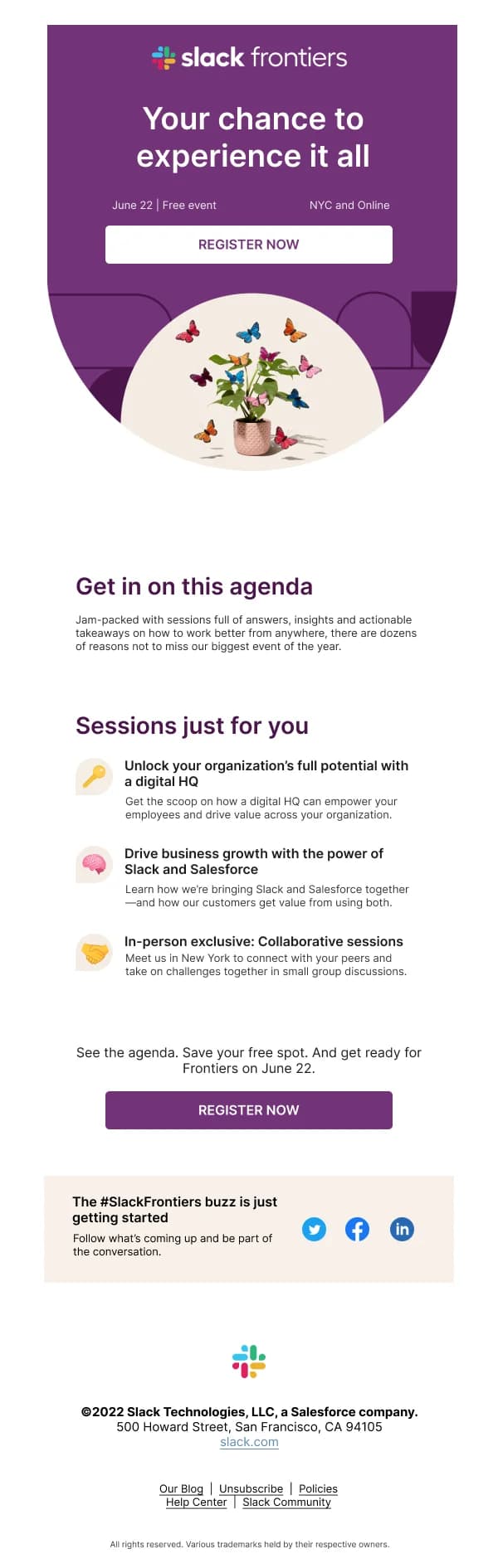
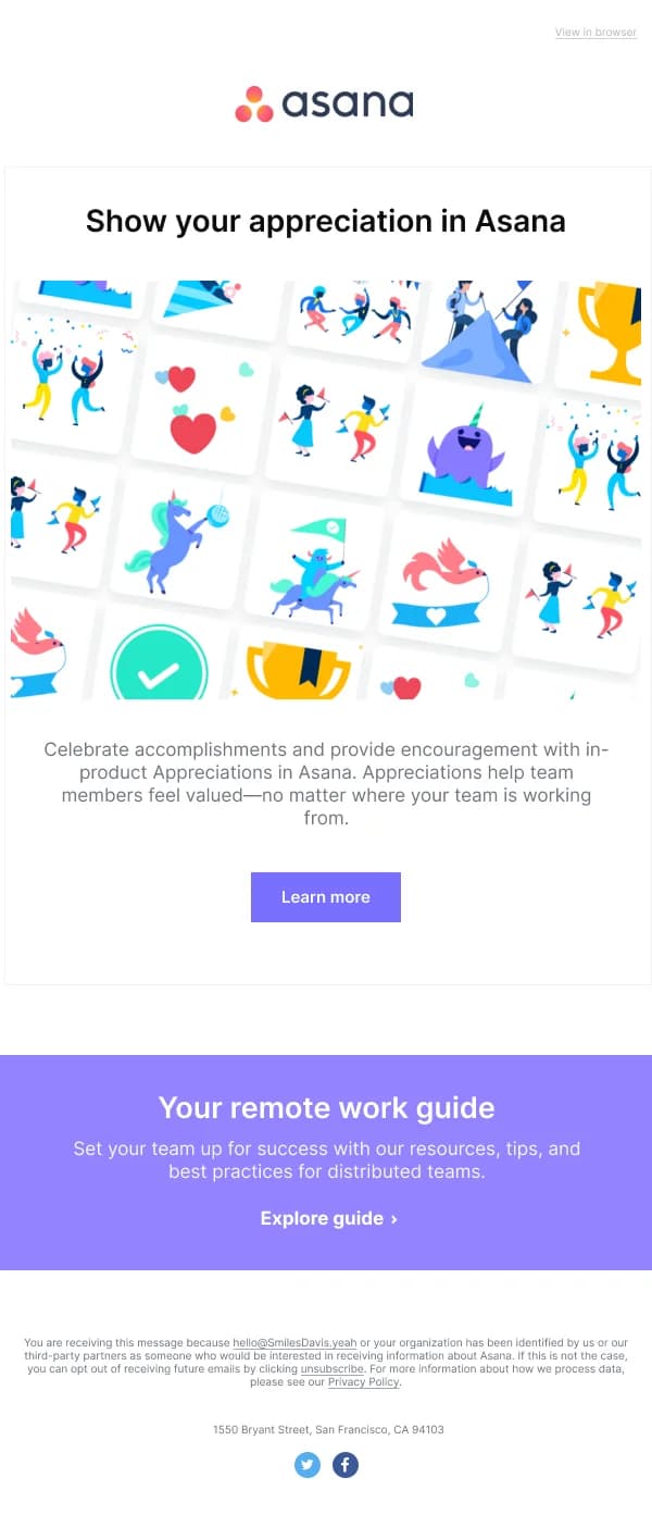
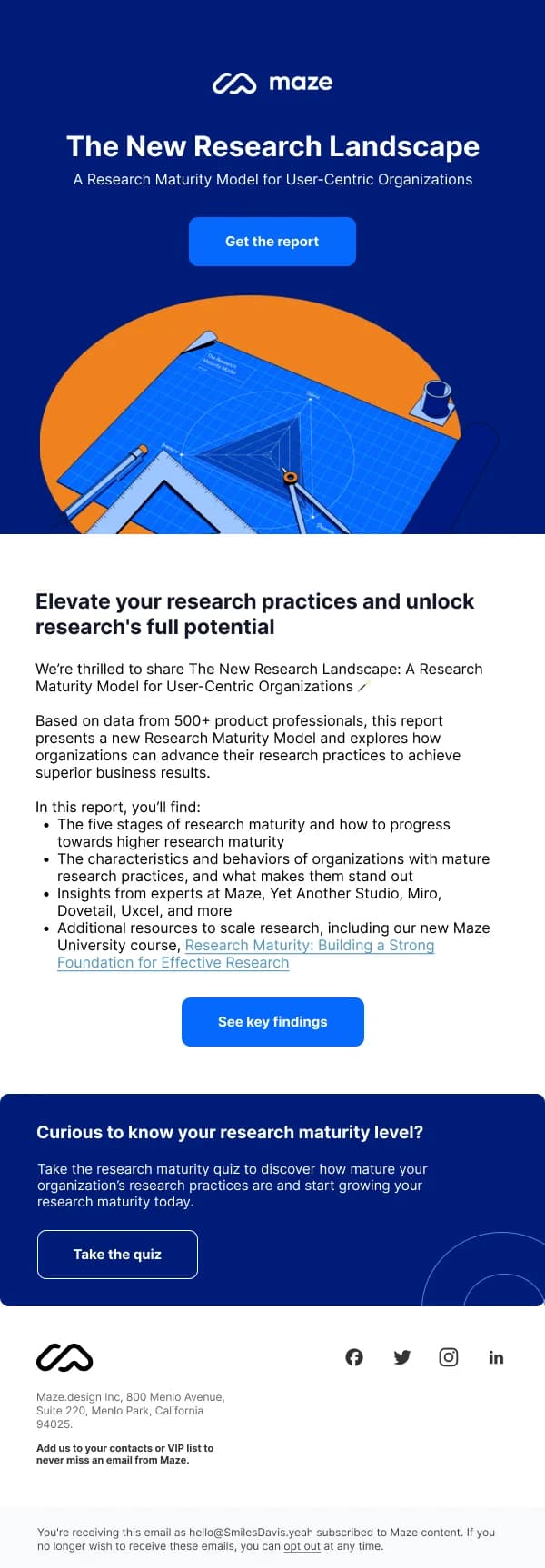
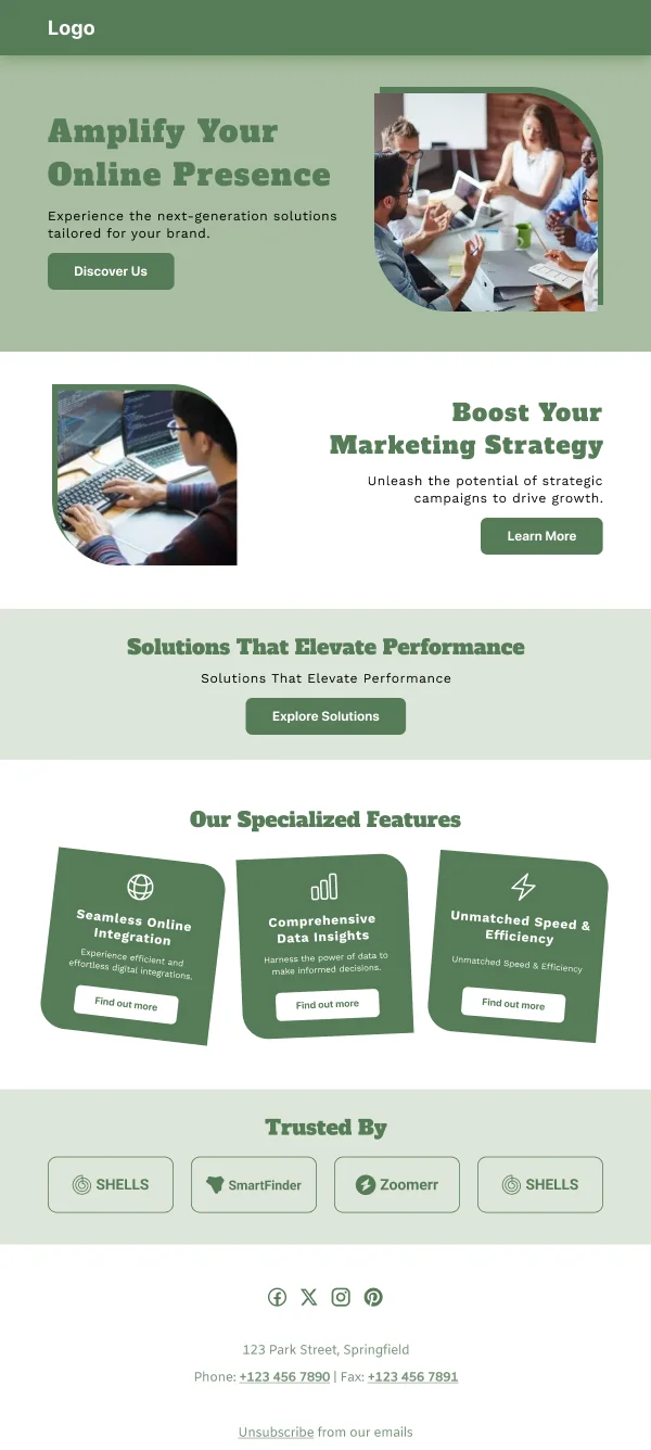
Most are drawn plainly on purpose; the ones with more visual ambition are the
announcement and event designs, where there is genuinely something to show.
For building these as a reusable set rather than one-offs, the guide on
building an email design system in Figma
covers the component and variable structure that makes a four-email onboarding
sequence maintainable.
Common questions
- What makes SaaS email different from ecommerce email?
- The reader already has the product. Nothing here is about persuading someone to buy an object; it is about getting them to use something they already signed up for, or telling them something about their account. That shifts the design from photography-led to clarity-led — plain layouts, obvious next steps, very little ornament.
- Should product emails be plain text or designed?
- Designed, but restrained. Plain text has a reputation for feeling personal, and for a founder-to-user note it genuinely does. For anything systematic — a digest, an alert, a usage summary — structure helps the reader scan, and structure needs design.
- How do I stop notification emails becoming noise?
- Bundle by default and interrupt by exception. The design consequence is that you need two templates: a digest that holds many items legibly, and a single-event alert that carries one thing urgently. Using the digest layout for an urgent alert is what teaches users to ignore you.
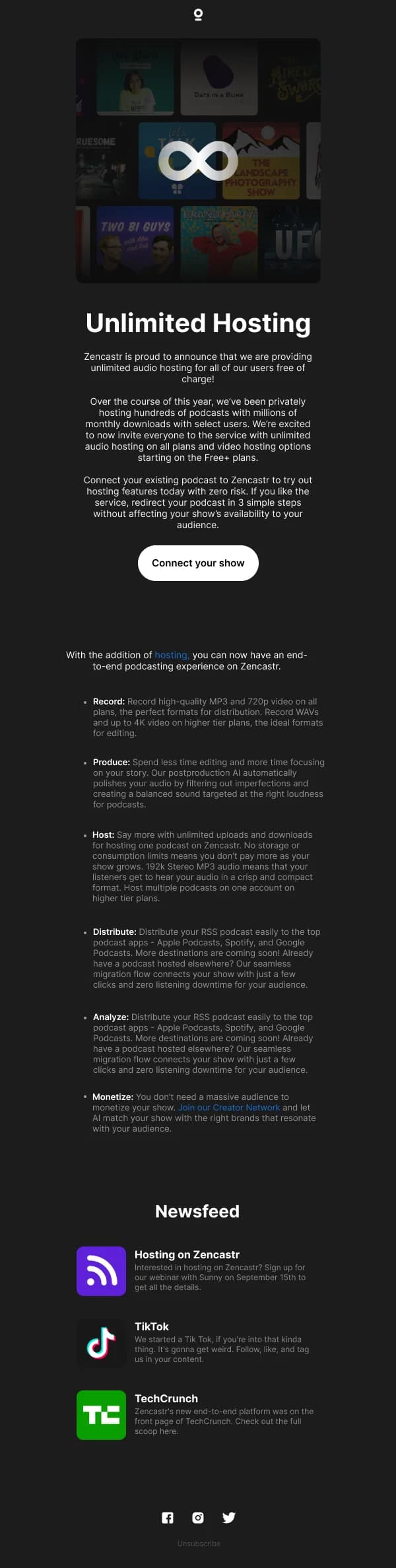
- What belongs in a product update email?
- What changed, who it affects, and what to do about it. Screenshots earn their place when the change is visual; they are filler when it is not. The most common mistake is writing a changelog when the reader needed one sentence and a link.