Cart abandonment email starts from a stronger position than almost anything else a
store sends: the reader chose the item themselves. Nothing needs to be sold. The
design's entire job is to remove whatever interrupted the purchase.
The 8 designs in this collection are deliberately spare.
Four elements
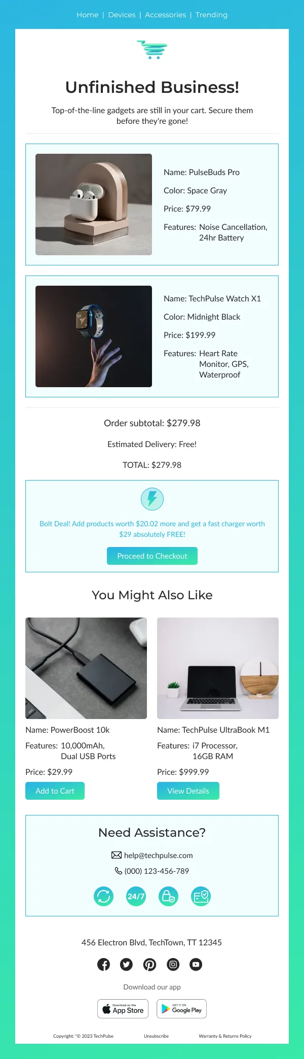
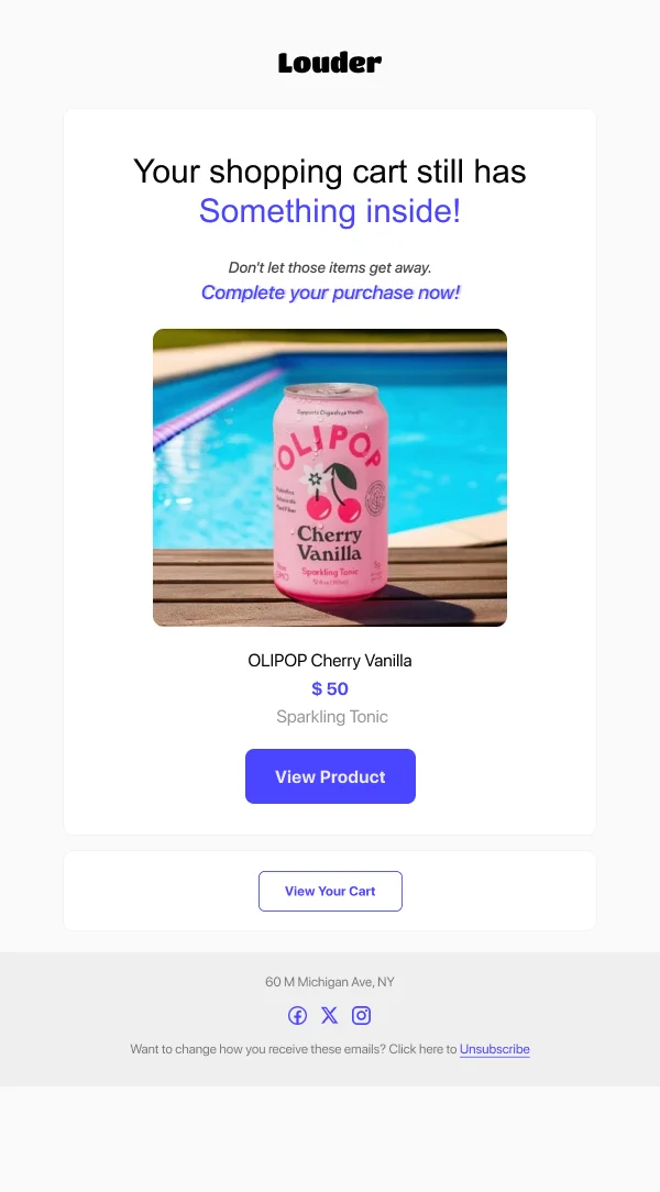
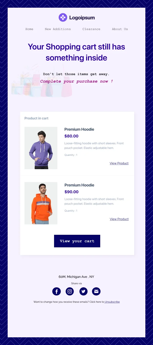
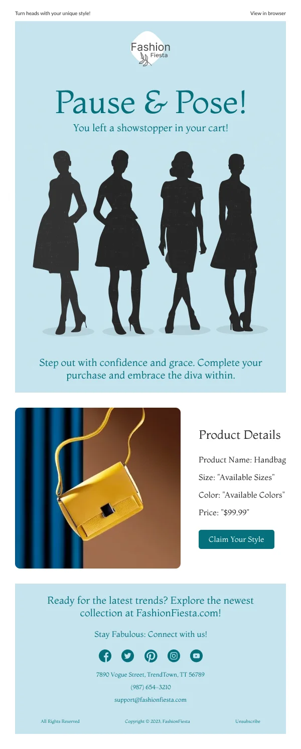
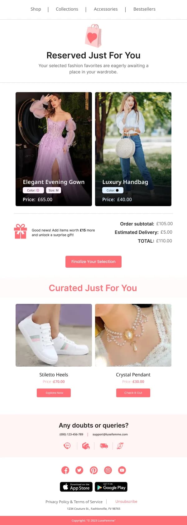
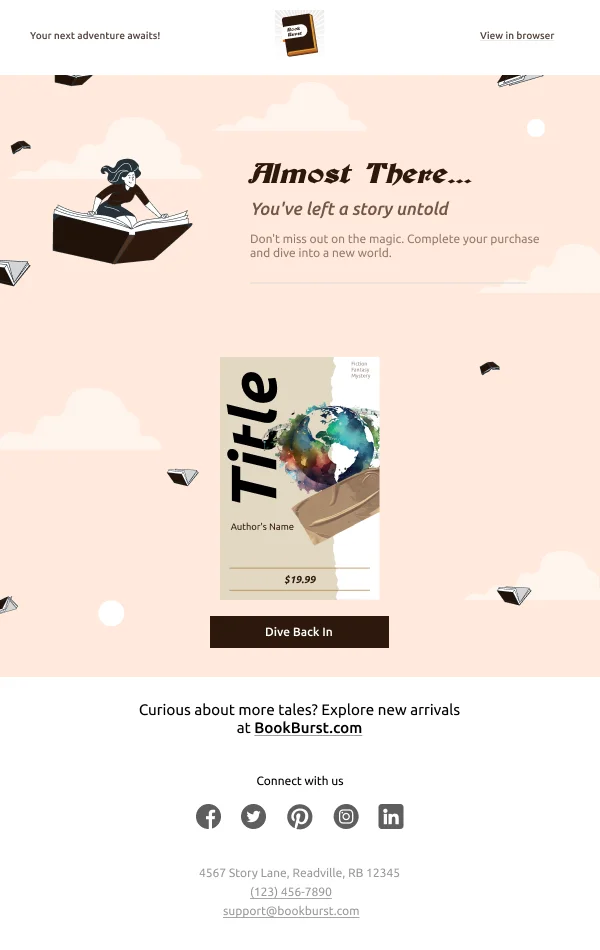
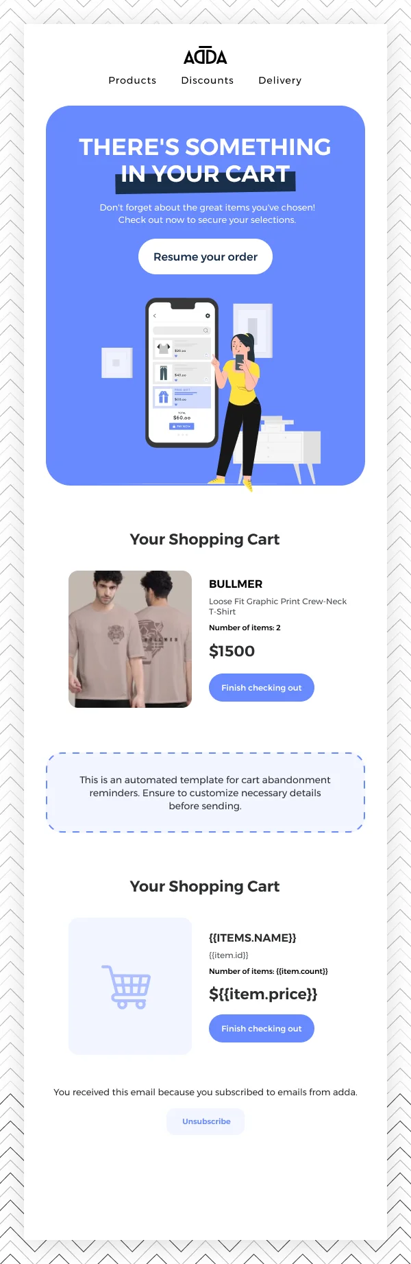
- The item, photographed, at a size that makes it recognisable.
- The price, unchanged from what they saw.
- One button, returning to the cart with its contents intact — not to the
homepage or the category page.
- One line of reassurance addressing the most likely obstacle: returns
window, shipping cost, stock, or a payment option.
That fourth element is where the design earns its keep, because abandonment
usually has a reason and it is usually one of those four.
What to leave out of the first send
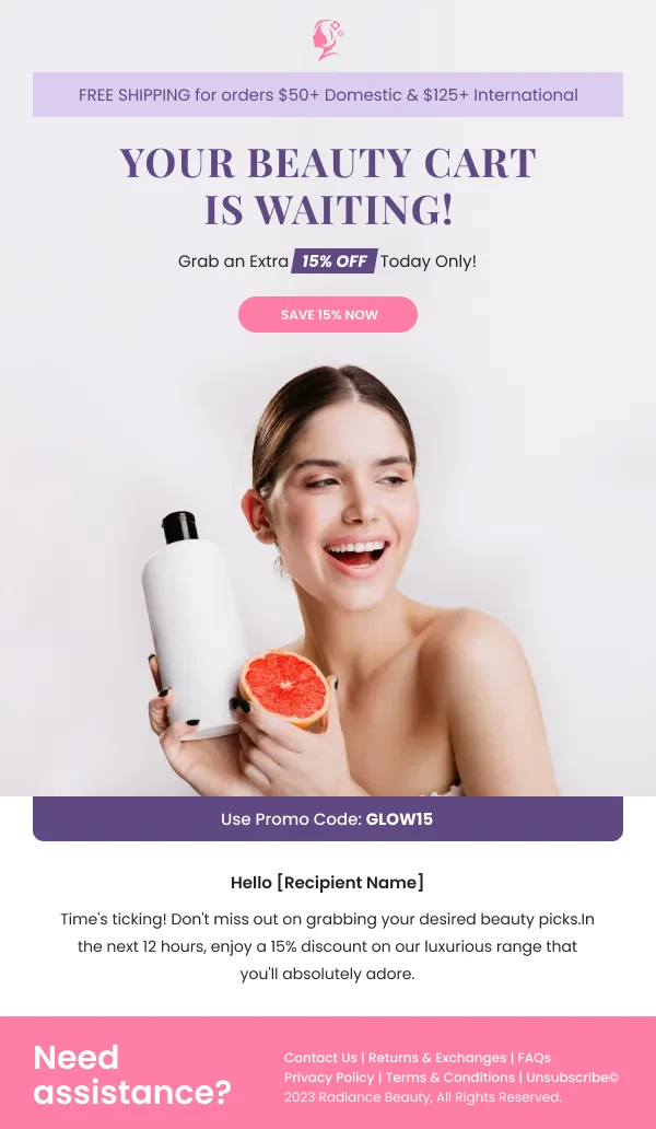
Urgency language, a discount code, a grid of alternatives, and social proof. Each
of these is defensible in isolation and collectively they bury the item.
Alternatives make more sense in a browse abandonment email, where the reader
looked but did not commit, which suggests the item was not quite right. In cart
abandonment the reader did commit.
The sequence
One to two hours: the four elements above. Nothing else.
Twenty-four hours: the same item, a different obstacle addressed. Perhaps
stock, perhaps a payment or delivery option.
Three days: the last send. If a discount is going to appear anywhere, it is
here — and it should be framed as a nudge rather than an apology.
Stopping after three is deliberate. A fourth converts very little and generates
unsubscribes.
The mechanics matter more than the visuals
Two implementation details decide whether these emails work at all: the cart link
has to restore the actual cart, and the email has to stop sending the moment the
order completes. A recovery email arriving after purchase is worse than none.
Using these templates
The cart designs come with the item block as a component, so swapping one product for three does not break the layout. Checks: is the specific item
shown, is the price unchanged, is there exactly one button, and is there a single
line addressing a real obstacle rather than three competing additions.
Common questions
- When should the first cart email send?
- Within an hour or two, while the intent is still live. A second send a day later and a third after three days is a reasonable ceiling; beyond that the intent has gone and the email is just a reminder that you are watching.
- Should it include a discount?
- Not in the first send. Leading with a code teaches customers to abandon deliberately, and it discounts sales you would have made anyway. If a discount is used at all, it belongs in the final email of the sequence.
- What is the most common design mistake?
- Adding things. The temptation is urgency, a code, alternative products and social proof in one email. Each addition competes with the item the reader already chose.