20 Ecommerce Email Design Patterns, Broken Down
Twenty layout patterns from the ecommerce email programmes that work — what each one is for, why it converts, and the detail that usually breaks it.
Rather than a gallery of screenshots, this is a breakdown of the layout patterns that recur across ecommerce email programmes — what each is for, the reason it works, and the specific detail that usually goes wrong.
Browse and discovery
1. Single-hero product. One product, full-width image, name, one distinguishing line, price, button. The most reliable converting layout in ecommerce email because it asks for a decision rather than a choice. Usually broken by: adding a second product of equal weight halfway down, which turns a decision into a comparison.
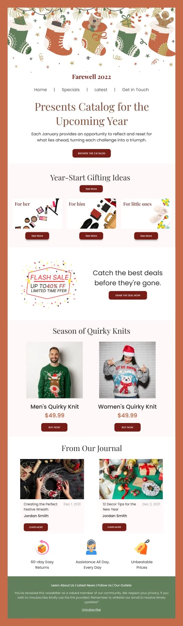
2. Two-across product row. Two products side by side, equal weight. Works when the two are genuine alternatives — two colourways, two sizes of the same thing. Usually broken by: pairing unrelated products, which reads as filler.
3. Three or four-across grid. A curated set with a stated organising idea. The idea is what separates it from a catalogue dump. Usually broken by: inconsistent crops. A row mixing a flat-lay, a studio shot on white and an outdoor lifestyle image reads as unrelated products from different sellers.
4. Editorial lookbook. Full-bleed imagery, minimal copy, one button at the end. Sells a mood rather than an item, appropriate for a collection launch. Usually broken by: no price or entry point anywhere, so an interested reader has nowhere specific to go.
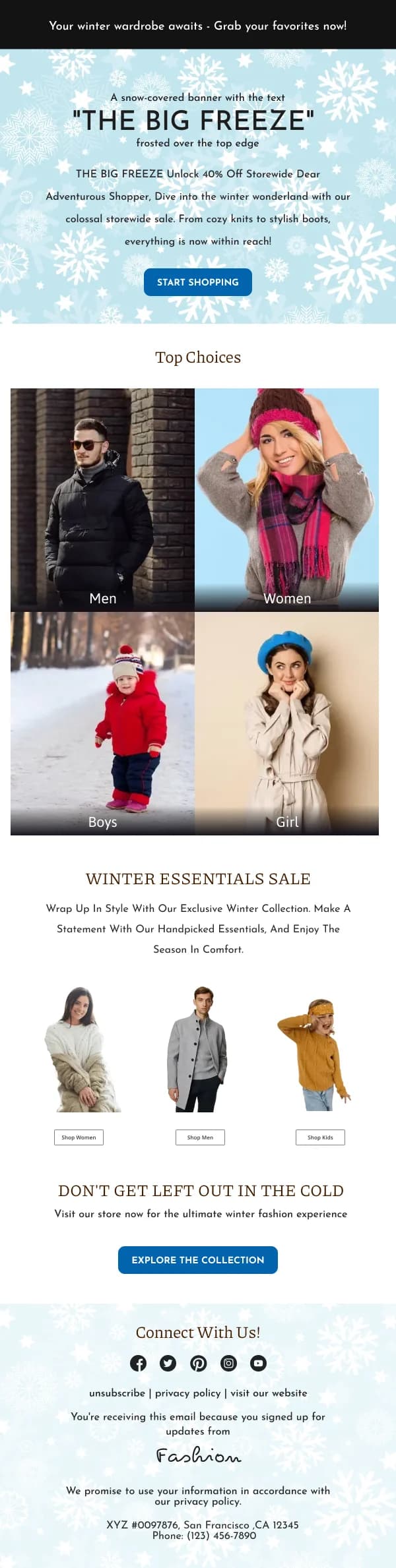
5. Category navigation. Four to six labelled routes into the catalogue, each with one representative image. Useful for a broad range where the reader needs to narrow before browsing. Usually broken by: using product photos as category images, so the reader thinks they are being shown six products.
6. Bestseller or social proof list. A numbered or ranked list with real specificity — "our 5 most-ordered items this month". Ranking is the content. Usually broken by: claiming popularity without evidence, which readers discount entirely.
Offers
7. Site-wide discount. Offer, scope, deadline, button, then the products. Clarity carries it. Usually broken by: vague scope. "Up to 40%" with no indication of what is included.
8. Coupon code send. The code as large selectable live text in its own bordered block, button adjacent. Usually broken by: baking the code into an image, so it cannot be copied on a phone.
9. Threshold offer. Free shipping or a discount above a spend level, shown as a short visual ladder of two or three tiers. Usually broken by: explaining the tiers in a paragraph. Conditional logic in prose is much harder to read than the same logic in rows.
10. Final hours. Deadline first, very short, one button. One of the highest-converting sends in any programme. Usually broken by: being as long and busy as the launch email it follows.
Triggered
11. Cart recovery. The item, the unchanged price, one button to the restored cart, one line of reassurance. Usually broken by: adding urgency, a code, alternatives and reviews until the item is buried. Also broken, fatally, by a cart link that does not restore the cart.
12. Browse abandonment. The viewed item plus two or three genuine alternatives, since a browse without an add-to-cart suggests the item was not quite right. Usually broken by: copy that makes the tracking the subject — "we noticed you were looking at…" — rather than the product.
13. Back-in-stock. The item, a line confirming availability, one button. The highest-intent trigger there is, because the reader explicitly asked. Usually broken by: being slow. The reader is comparing you against whoever else has it.
14. Price drop. Old and new price, both legible, scope stated. Usually broken by: sending broadly rather than only to readers who followed the item, which trains a discount habit.
15. Replenishment reminder. The exact product they bought, a line on when they are likely running low, one button to reorder. Usually broken by: adding three alternatives. A reader who wants the same thing again is not shopping.
Transactional
16. Order confirmation. Confirming line and order number first, then items, then totals with figures right-aligned, then the address, then an expected date. Usually broken by: a promotional banner above the order details, which makes the reader hunt for what they opened the email to check.
17. Shipping notice. Tracking link and delivery window at the top, order contents below. Usually broken by: being merged with the confirmation, so the shipping information arrives before it is true.
18. Delivered / post-purchase. Confirmation of delivery, then care or setup information, then a review request timed later. Usually broken by: asking for a review the same day the parcel arrives, before the customer has an opinion.
Retention
19. Loyalty progress. Points or progress toward a reward as a small clear element with a specific next threshold. Usually broken by: showing a balance with no indication of what it is worth or what comes next.
20. Win-back. What changed since they left, or one genuine question with a one-click answer, or a clean route out. Usually broken by: a guilt trip with a discount attached, which is the most-sent and least-effective version.
Choosing between patterns
With twenty options the useful question is not which is best but which fits the situation, and three variables decide it.
How much you know about the reader. If you know what they looked at or bought, use a pattern built on that specificity — cart recovery, back-in-stock, replenishment. A grid is what you send when you know nothing, and it converts accordingly.
How considered the purchase is. Low-consideration items tolerate grids, because the reader can evaluate several at a glance. Higher-consideration items need a single hero with room for reassurance, because the reader is deliberating rather than scanning.
Whether the reader has already decided. Cart recovery, back-in-stock and replenishment all speak to a decision already made, and their job is removing friction. Discovery patterns are trying to create the decision. Using a friction-removal layout for discovery makes it look thin; using a discovery layout for friction-removal buries the item.
A programme that gets this allocation right will outperform one with better-looking emails and the wrong pattern in each slot.
The five details that break most often
Across all twenty patterns, the same handful of failures recur:
Inconsistent crops in a grid. The single most common tell of a hastily assembled email, and the easiest to fix.
Prices that do not align across a row, because product names wrap to different line counts. Fix the name block to a consistent height.
A four-across row collapsing to a four-deep stack on mobile. Collapse to two columns, or show fewer items on mobile.
A hero tall enough to push the button out of the visible area. The usable height before scroll on a phone is roughly 350–400px, and a 500px hero has spent all of it.
Text baked into the hero image. Breaks with images blocked, which is a significant share of first opens, and is invisible to screen readers.
Applying these
The ecommerce collection contains designs for most of the patterns above, with the fashion collection covering the editorial and grid variants and order confirmation covering the transactional ones.
For the cart patterns specifically, see the abandoned cart guide; for the underlying layout numbers, the dimensions guide.