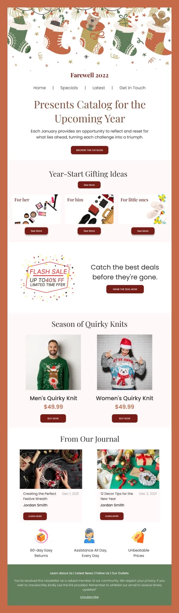
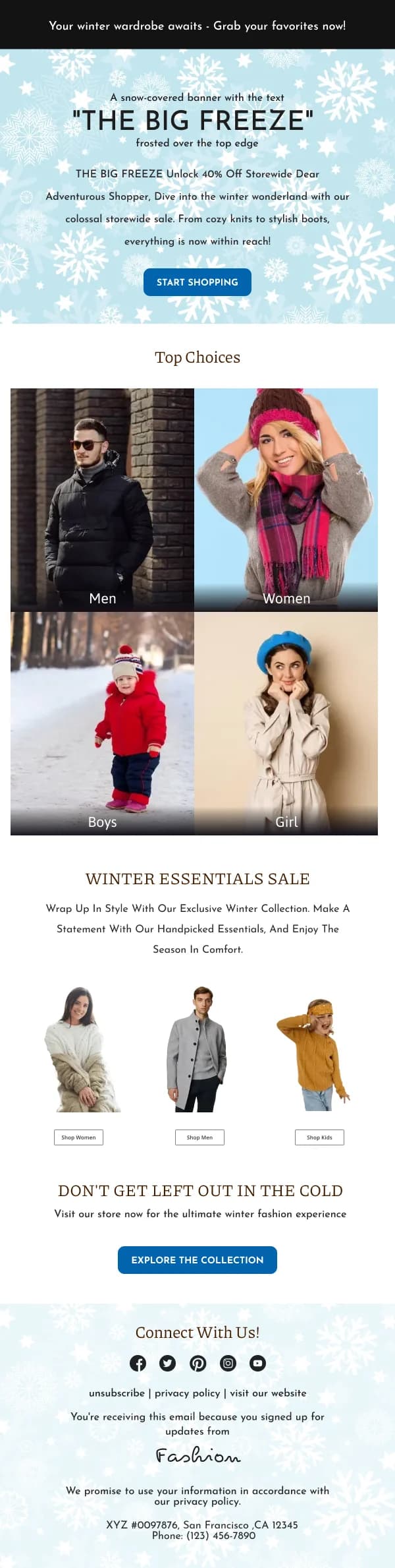
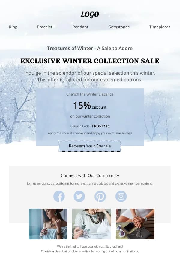
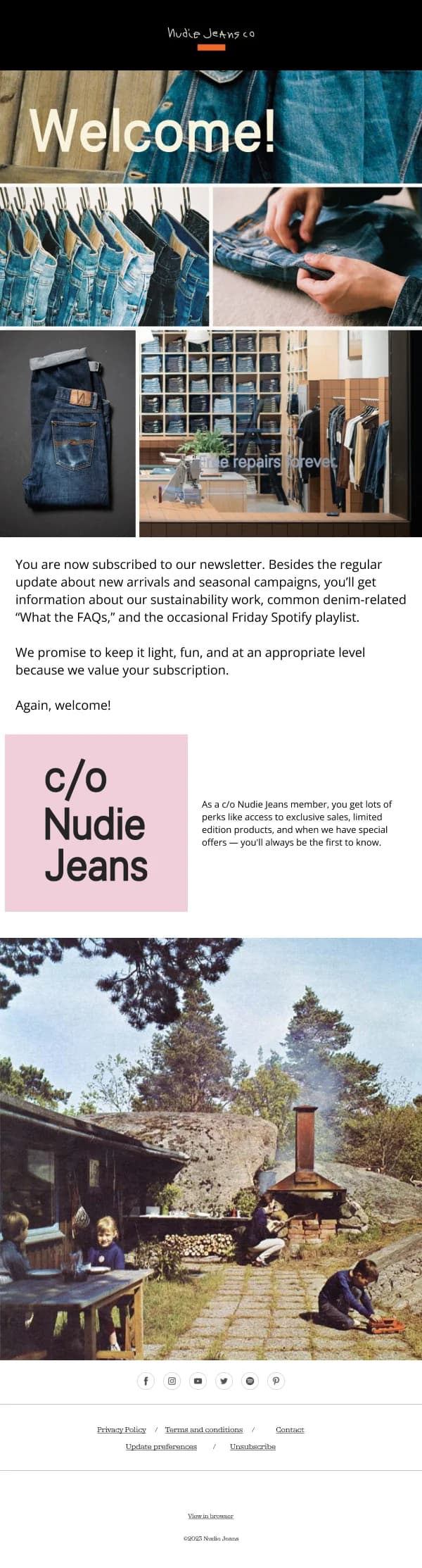
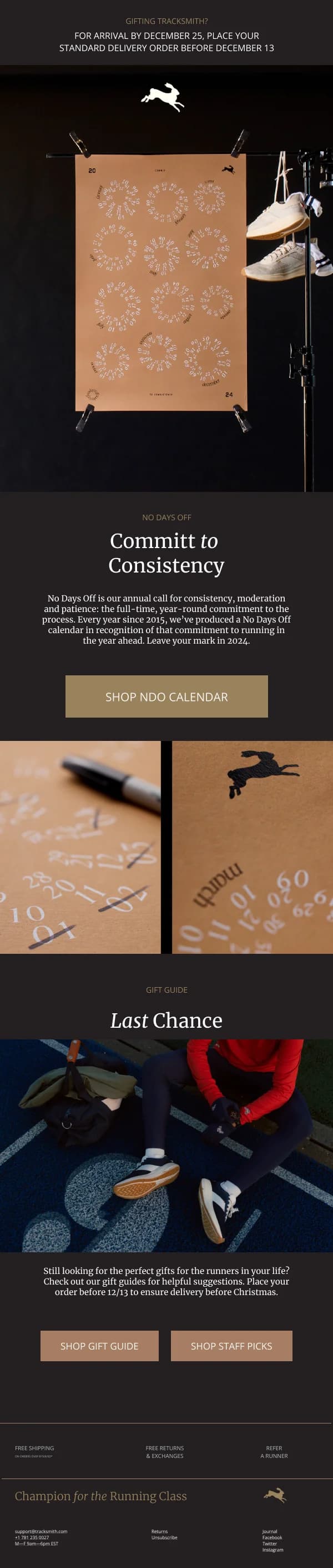
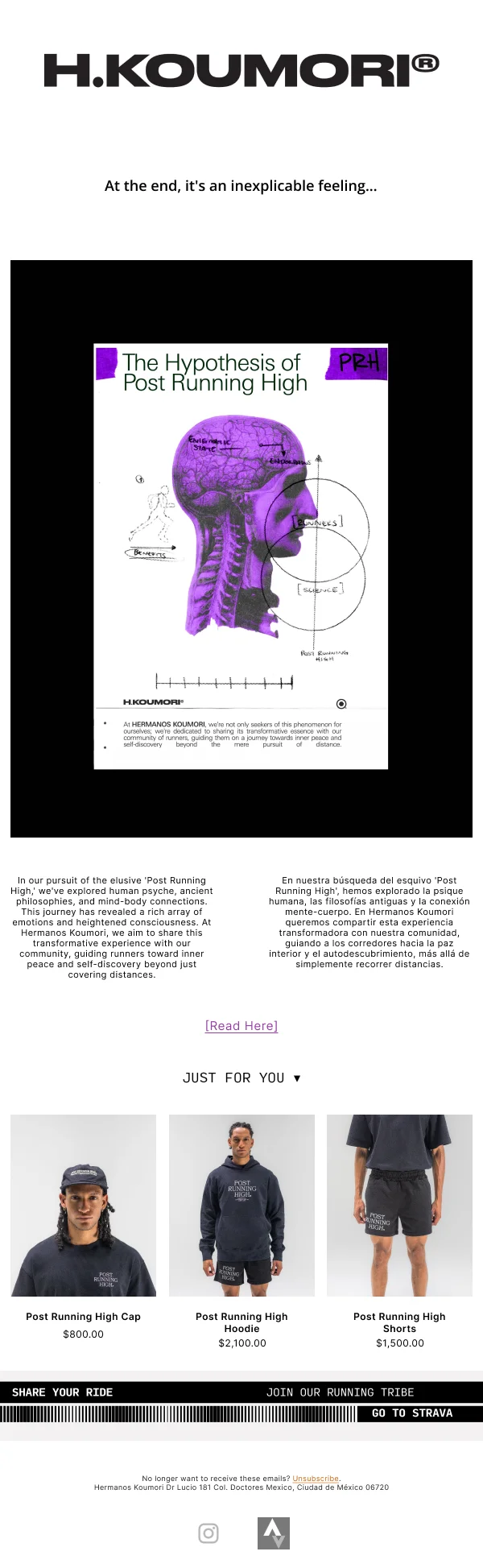
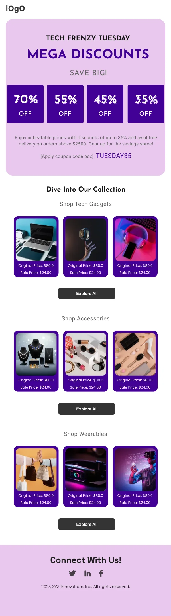
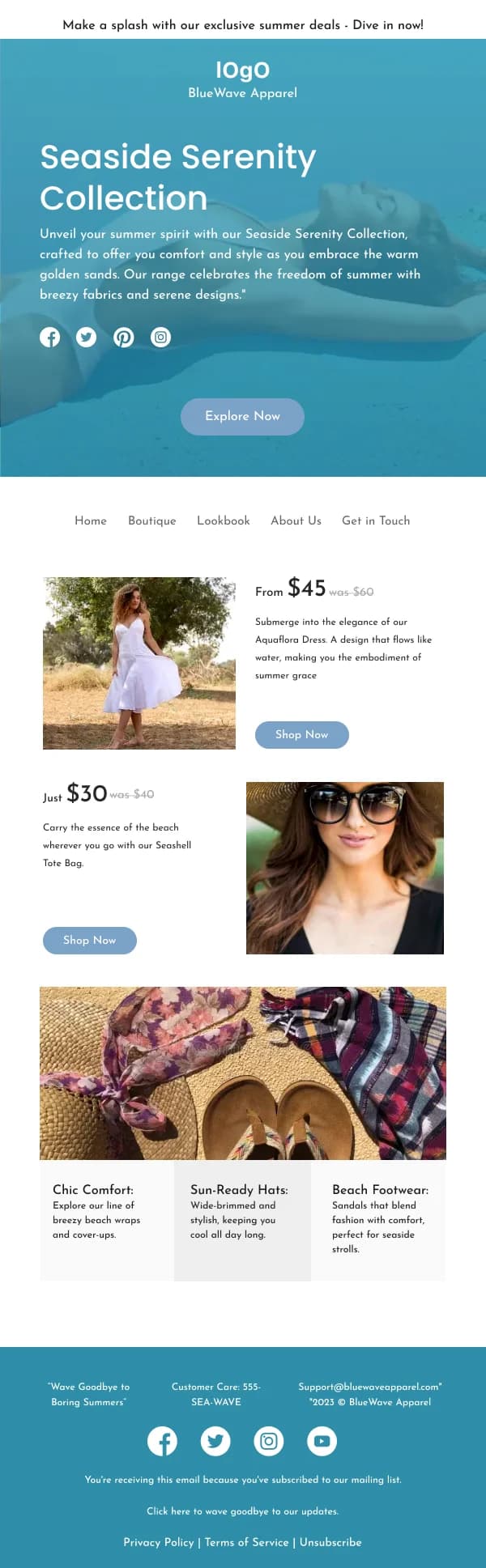
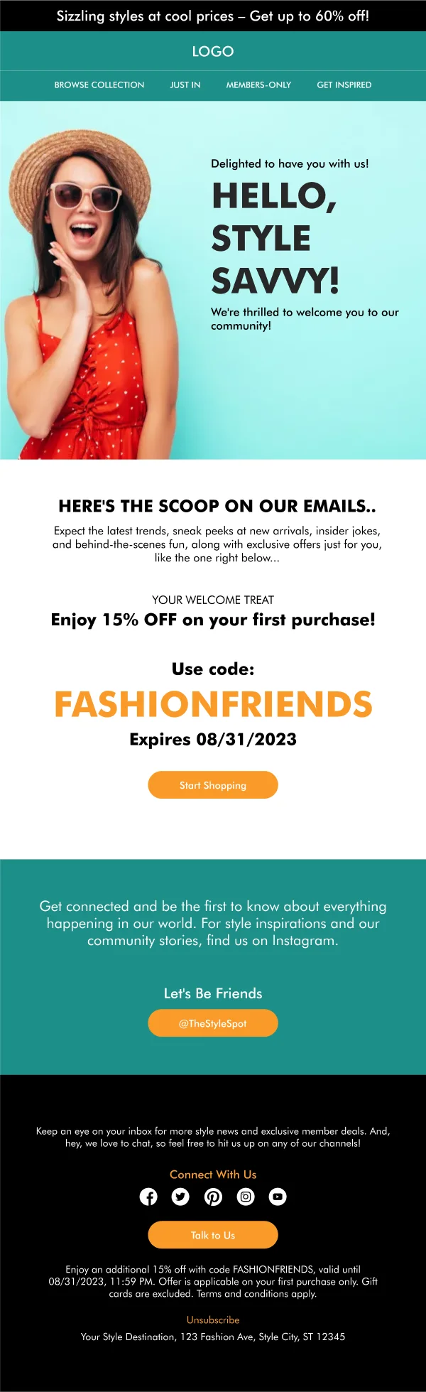
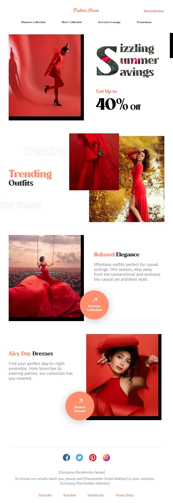
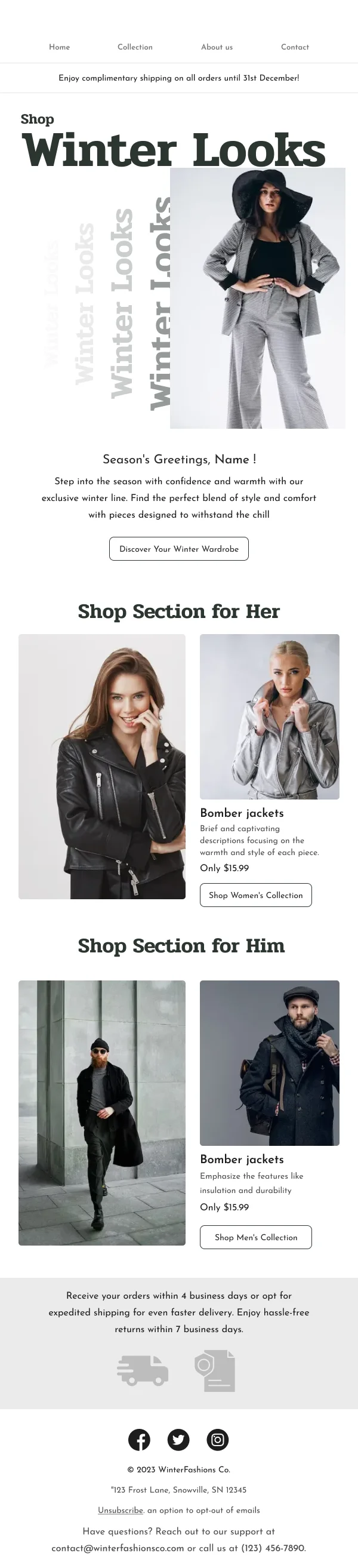
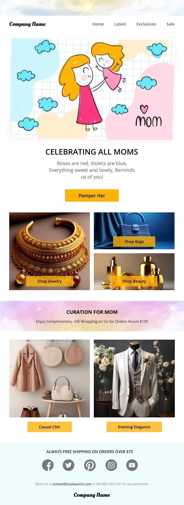
Fashion is the category where email design comes closest to being the product.
A reader deciding whether to open the next one is largely deciding whether the
last one felt like somewhere they want to shop. That makes consistency and
restraint more valuable here than novelty.
The 118 designs in this collection are built on that premise.
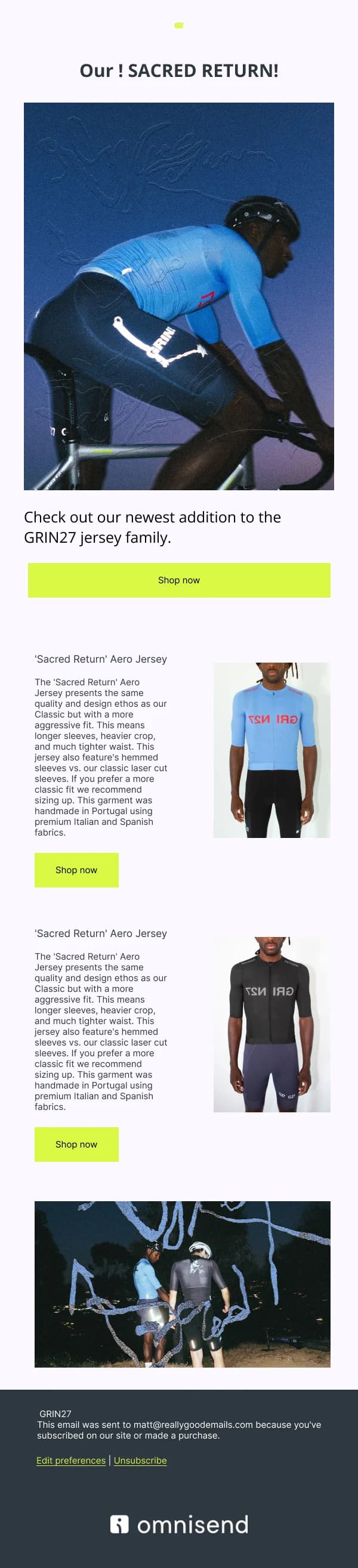
Photography sets the ceiling
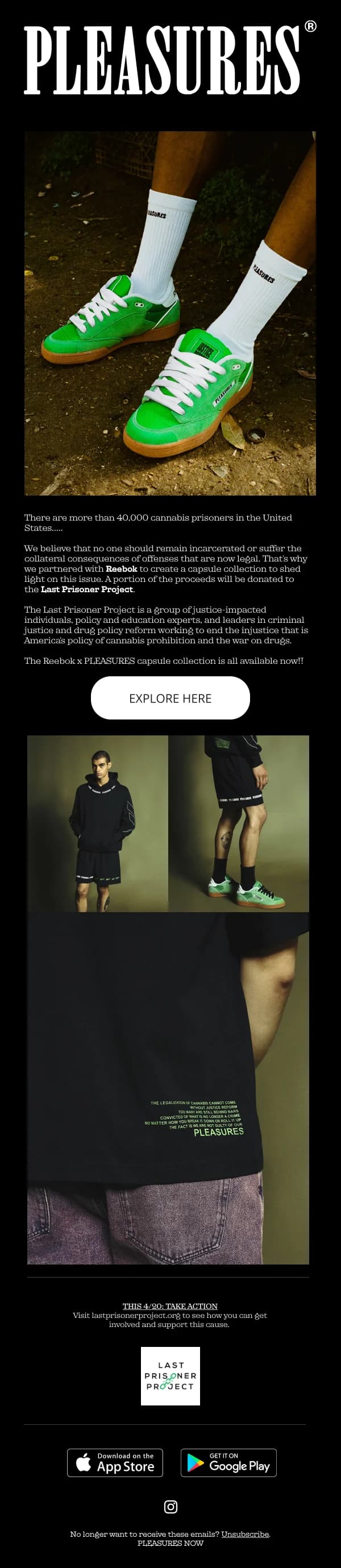
No layout rescues weak imagery, and good imagery survives a fairly plain layout.
Before adjusting spacing, the questions worth asking are about the photographs:
are they consistent in light and grade, do they crop well to the aspect ratios the
layout needs, and do they show the garment clearly enough to want it.
Where the design genuinely helps:
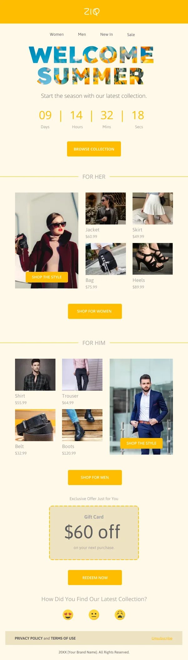
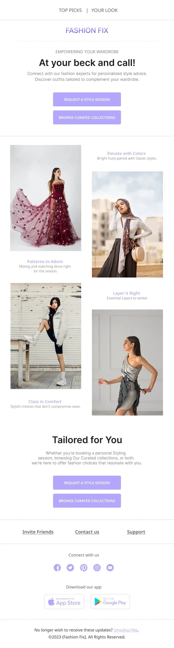
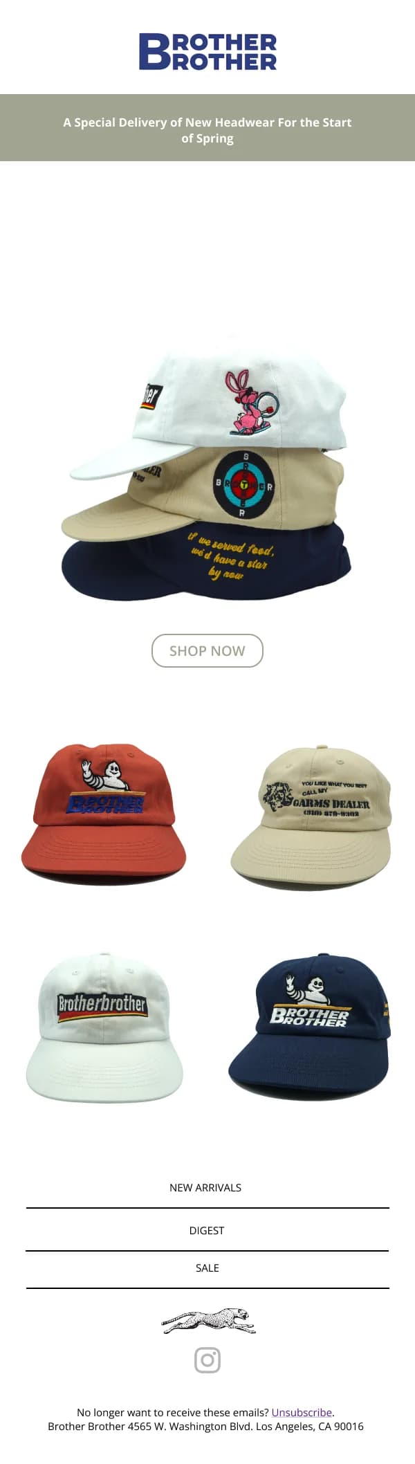
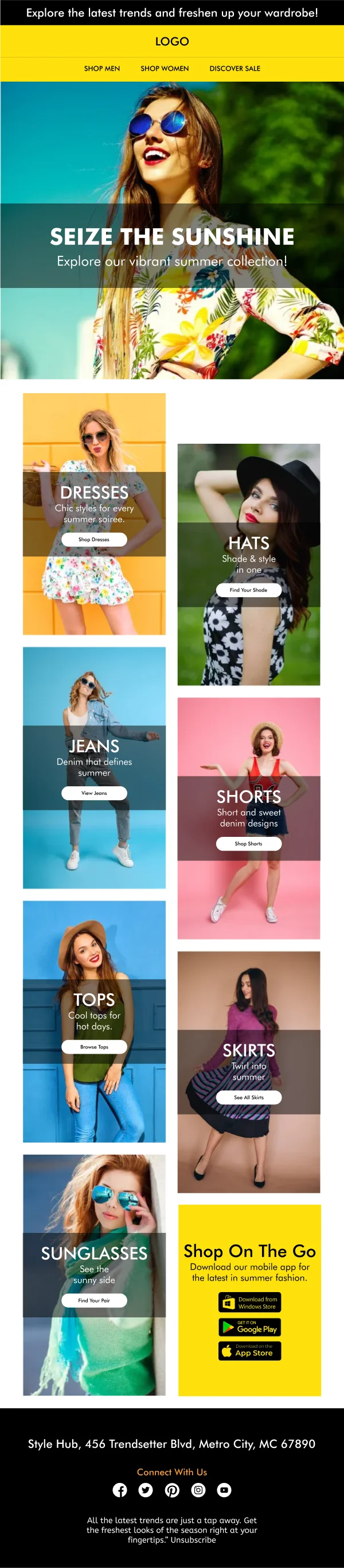
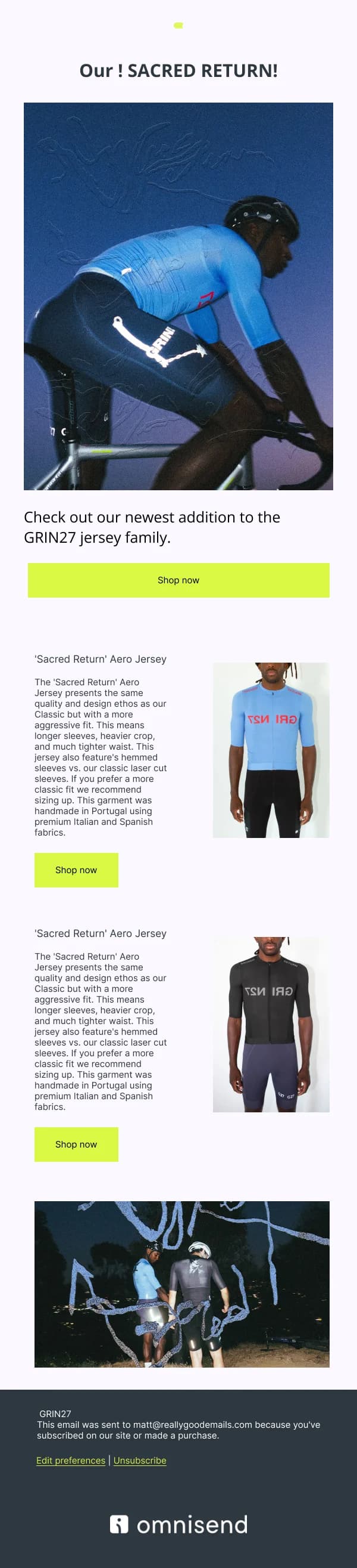
- Consistent crops within a grid. A row mixing a flat-lay, a studio shot on
white and an outdoor lifestyle image reads as unrelated products even when they
are one collection.
- Aspect ratios chosen for the collapse. A 3:4 portrait crop that works at
half-width on desktop becomes very tall at full width on a phone. Either accept
it or supply a squarer mobile crop.
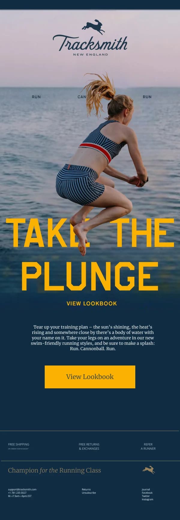
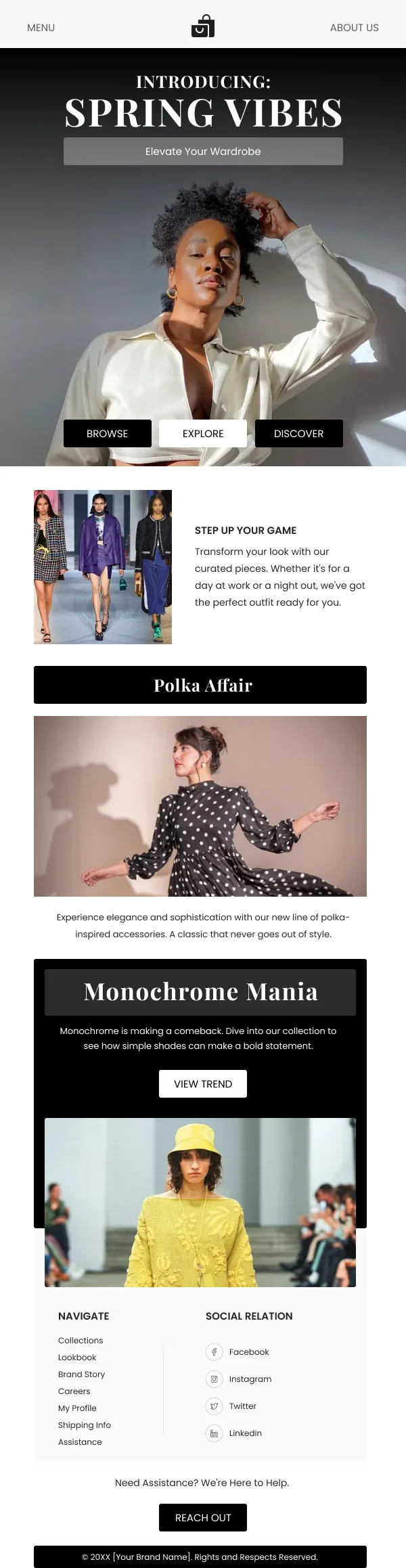
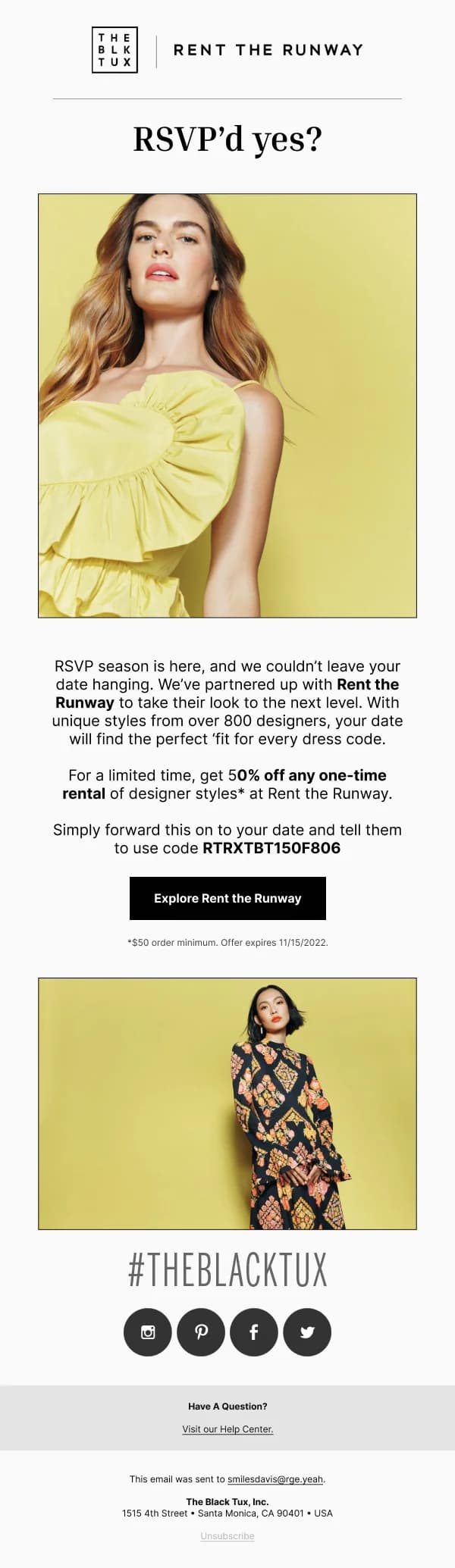
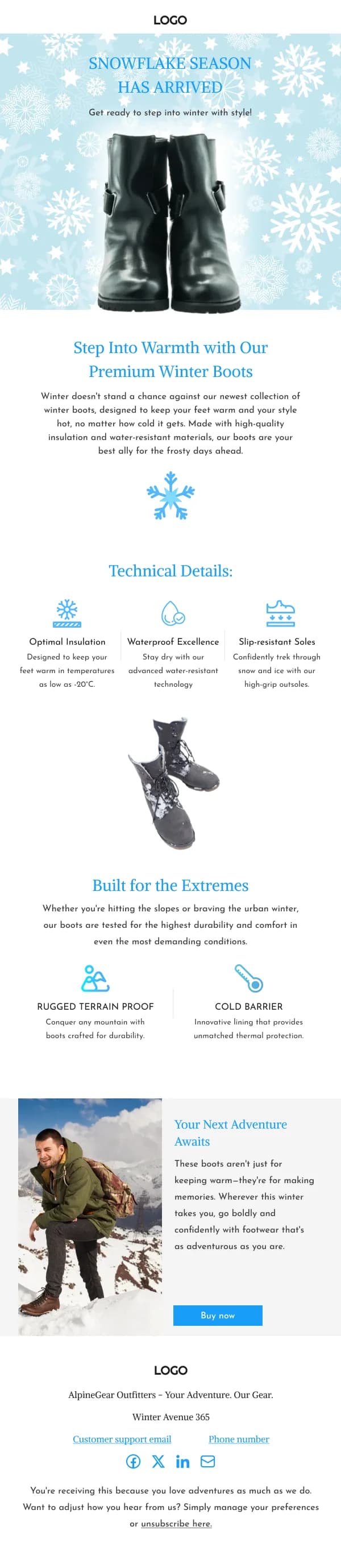
- Restrained overlay. Text on imagery works when the photograph was composed
with space for it. Adding it to a busy image at the layout stage rarely does.
The seasonal frame
Fashion email runs on a calendar — new season, mid-season, sale, end of sale,
pre-order, restock — and rebuilding the design each time is both slow and bad for
recognition.
The stronger structure, and the one most of these templates follow, is a fixed
frame with a variable interior: consistent header, footer, product-card treatment,
button shape and type scale, with the hero, the palette accent and the copy
changing per moment.
That is what lets a January sale email and an autumn lookbook read as the same
brand while still feeling different.
Grids that hold together
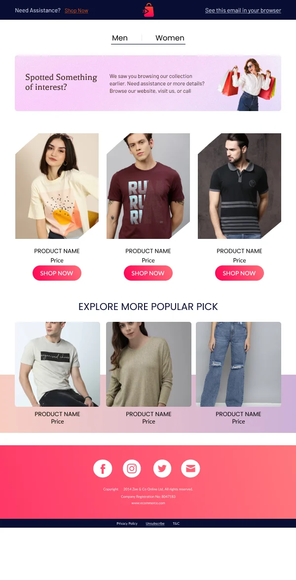
A large share of fashion email is a product grid, and the details that make grids
look considered are small and consistent:
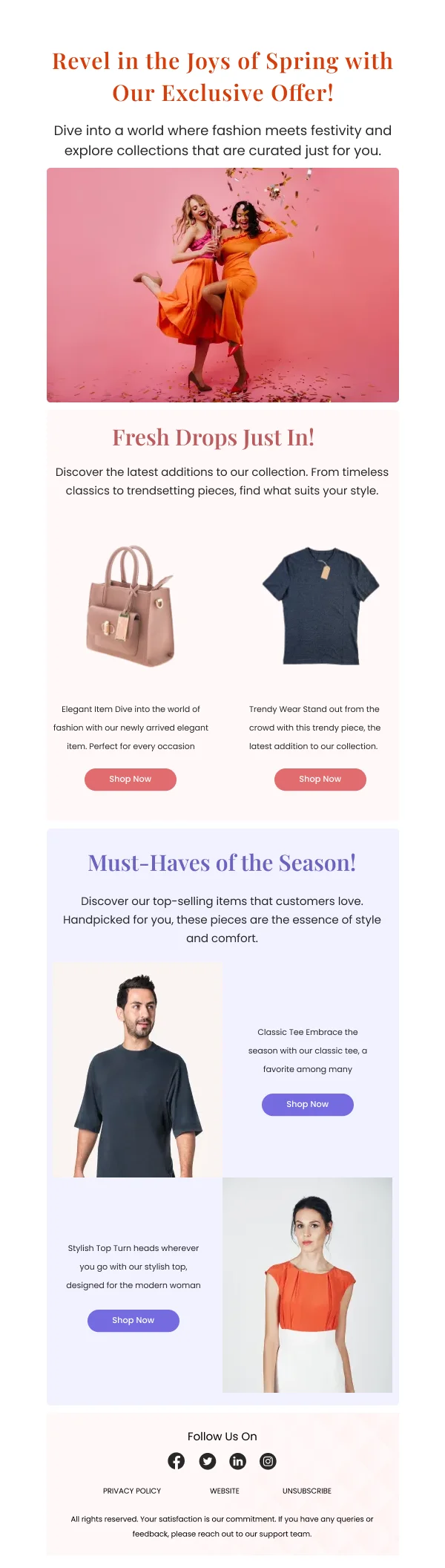
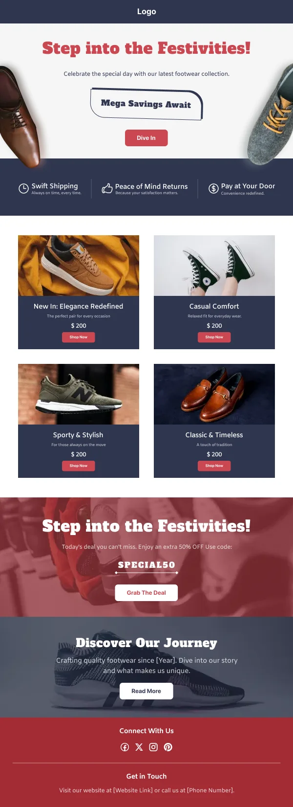
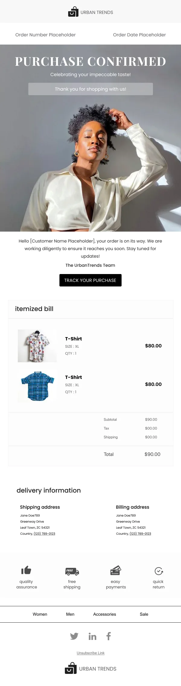
- Fix the product-name block to a set height so prices align across the row
even when names wrap to two lines. Ragged price positions are the most common
tell of a hastily built grid.
- Two columns on mobile, not one, for simple product cards. A four-product row
collapsing to a four-deep stack costs the reader four swipes to see one row.
- One price treatment. Pick strikethrough-plus-sale or a "now" label, and use
it everywhere. Two treatments in one grid looks like two designers.
Sale email without cheapening the brand
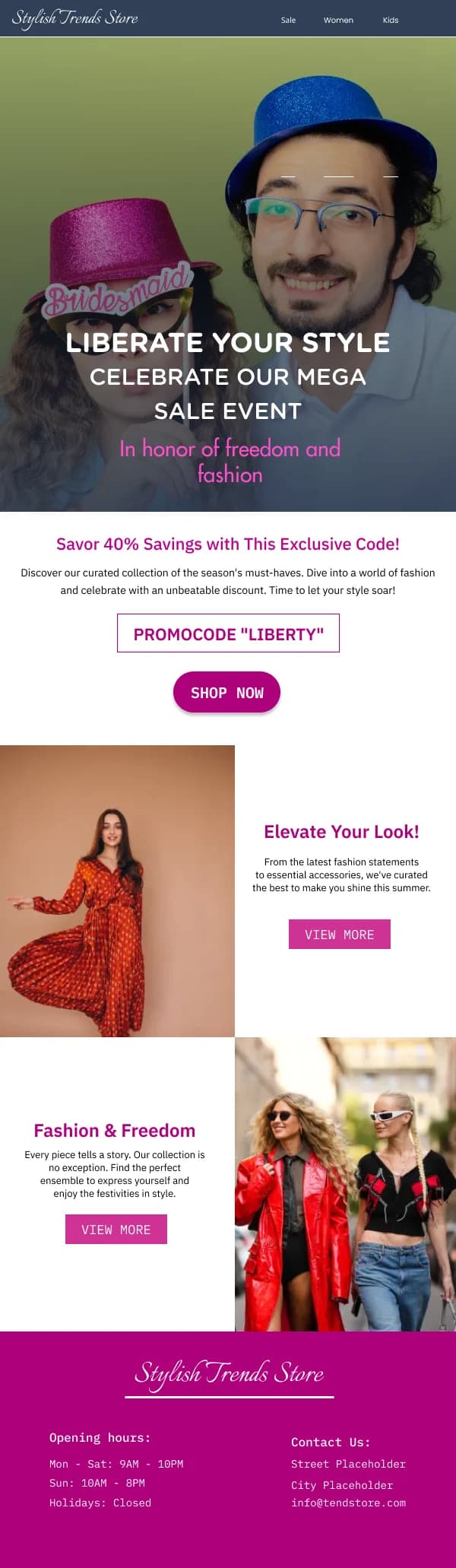
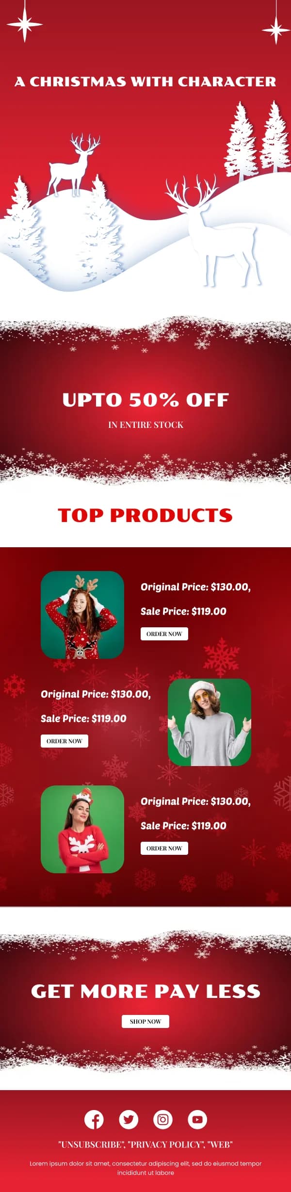
Discount sends are where fashion brands most often break their own visual
language: the accent turns red, the type gets larger and heavier, and the email
stops looking like the brand.
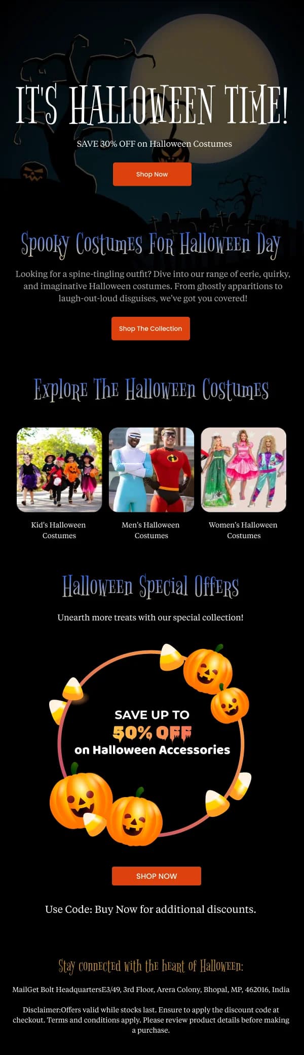
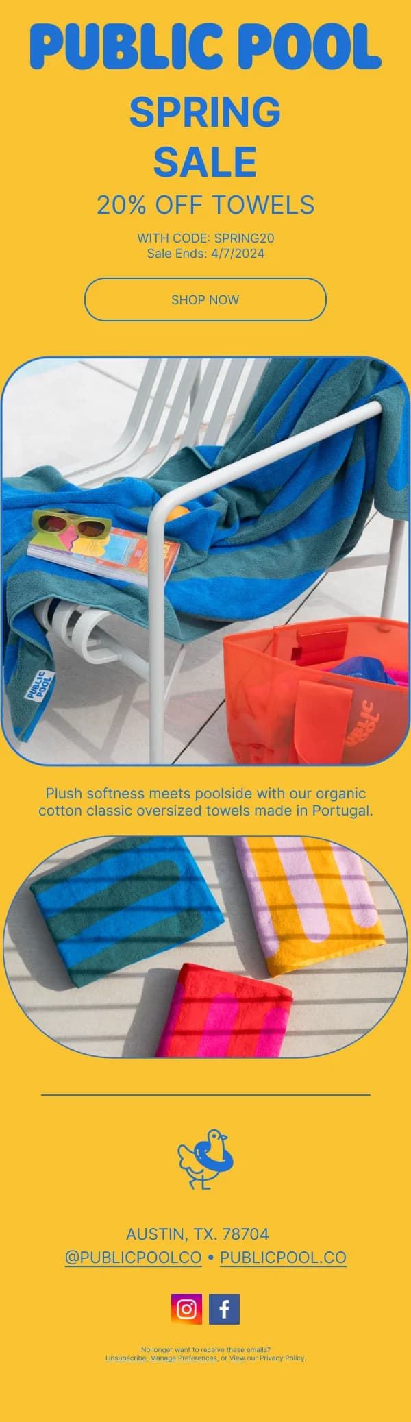
The sale designs in this collection take the opposite approach — the discount is
communicated by clear typography and placement rather than by visual volume. A
well-set "30% off, everything" in the brand's own type at the top of an otherwise
normal-looking email reads as confident. The same message in a shouting banner
reads as desperate, and it is the version customers stop opening.
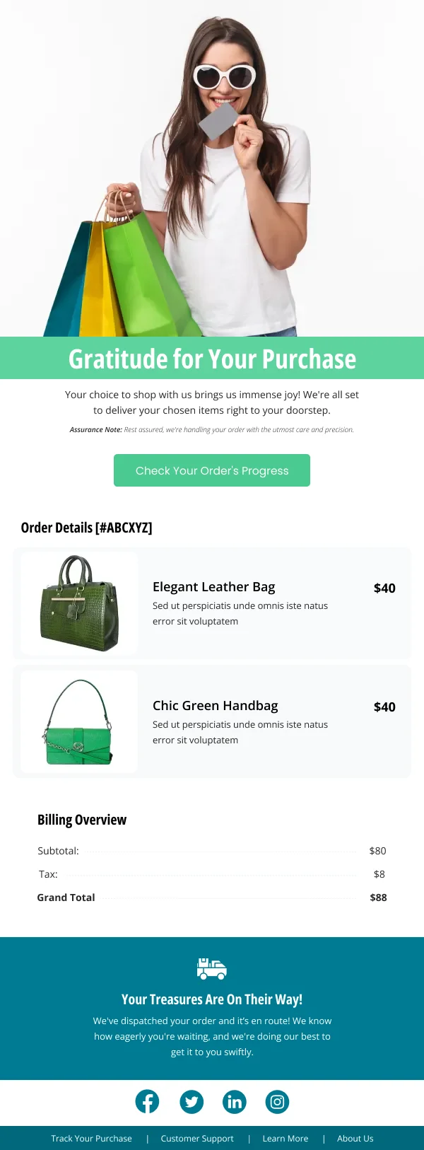
The practical detail belongs in the email
Fashion returns are driven by fit uncertainty, and email is a cheap place to
reduce it. The designs here that handle this well include a compact block below
the imagery covering the things a buyer hesitates over: fit notes, fabric,
model height and size worn, and the returns window.
It is unglamorous content in a category that prizes atmosphere, which is exactly
why most brands leave it out. It converts.
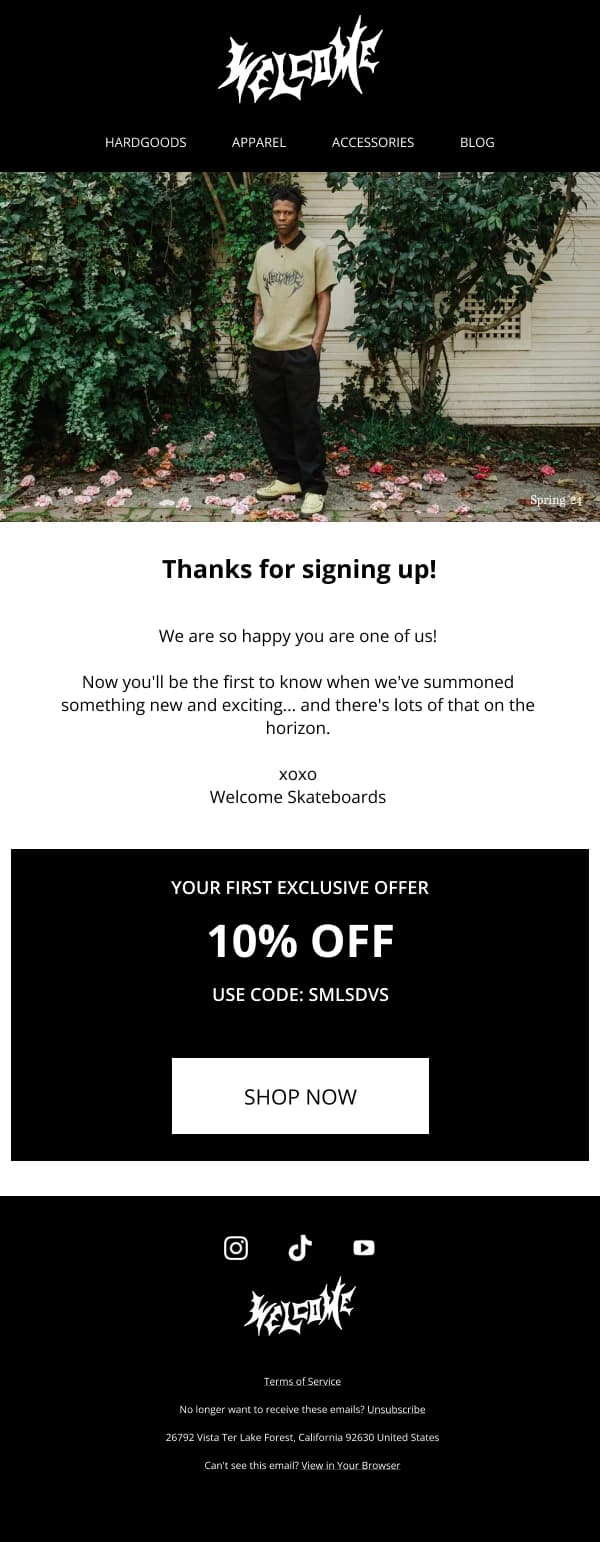
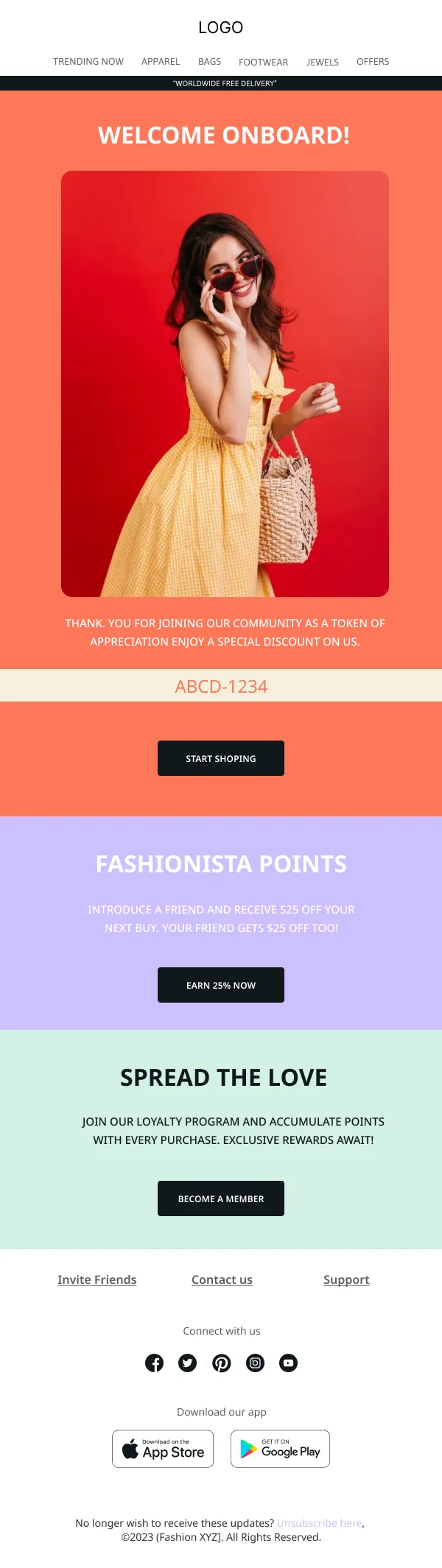
The footer is part of the brand
Fashion email footers are frequently an afterthought — a wall of small grey links.
Given how many readers scroll to the bottom looking for the returns policy or the
store locator, it is worth designing:
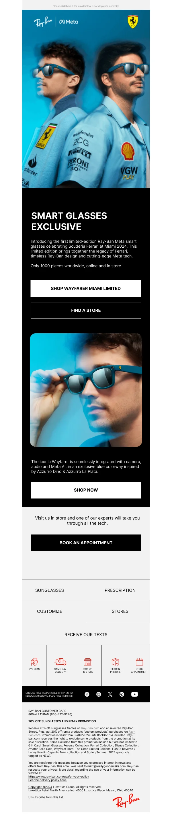
- Grouped links with real headings rather than one long run.
- Legible size. Nine-pixel grey on light grey fails both accessibility and its
actual purpose.
- Social links that are icons, not a row of identical grey squares.
- A visible, honest unsubscribe. Hiding it produces spam complaints, which cost
more than the unsubscribe would have.
Using these templates
Full-bleed and framed hero variants sit in the same file, so you can commit to one without rebuilding the layout. For fashion specifically, the checks worth running before you send: are the
crops consistent, do the prices align across each row, is the headline live text
rather than baked into the hero, and does the mobile frame avoid a stack longer
than about three products.
For worked examples of grid and hero structures from this collection, see
20 ecommerce email design examples.