Marketing email is the broadest thing an email programme sends. It is also the
easiest to get wrong, because it is the only category where the reader owes you
nothing. A shipping notification gets opened because the reader is waiting for
it. A marketing email gets opened because the sender has earned a little
attention and is about to spend it.
That framing drives every design decision in this collection. A marketing email
has one job: move a reader from not thinking about you to doing one specific
thing. Designs that try to do several jobs at once tend to accomplish none.
Start from the one decision
Before opening Figma, name the single action the email exists to produce. Not
three actions ranked by priority — one. Browse the new range. Claim the code.
Read the piece. Book the slot.
Once that is named, the layout mostly writes itself:
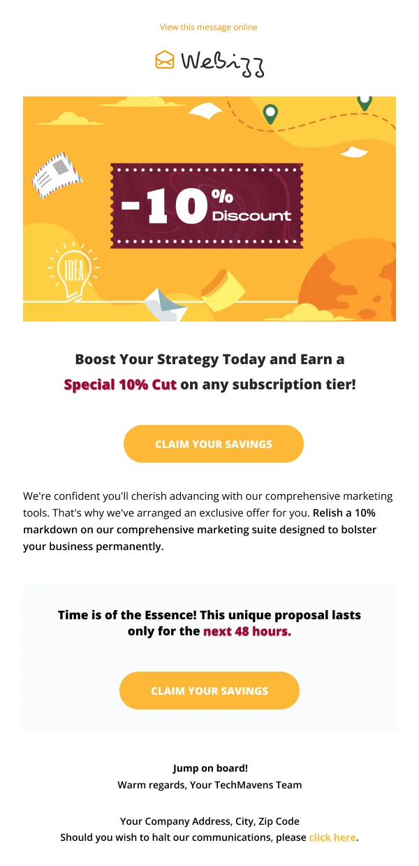
- The action goes above the fold, in a button, with a label that describes
the outcome rather than the mechanic. "See the new range" beats "Click here."
- Everything above the button earns the button. One image, one headline, one
or two lines of body copy. If a block does not make the action more likely,
it is competing with it.
- Everything below the button is for the unconvinced. Detail, proof, a
secondary angle, then the same button again.
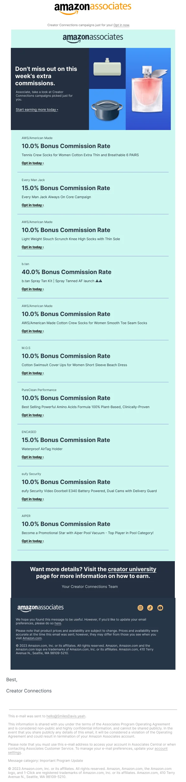
The most common failure in marketing email is not ugliness. It is a design that
gives four things equal visual weight, so the reader has to decide what matters.
They will decide by closing the email.
The fold is smaller than you think
The usable area before a reader scrolls is roughly 350–400px tall on a phone once
the client's own chrome is accounted for, on a 600px-wide canvas. That is not
much room — a logo bar, a hero image, a headline, and a button will fill it.
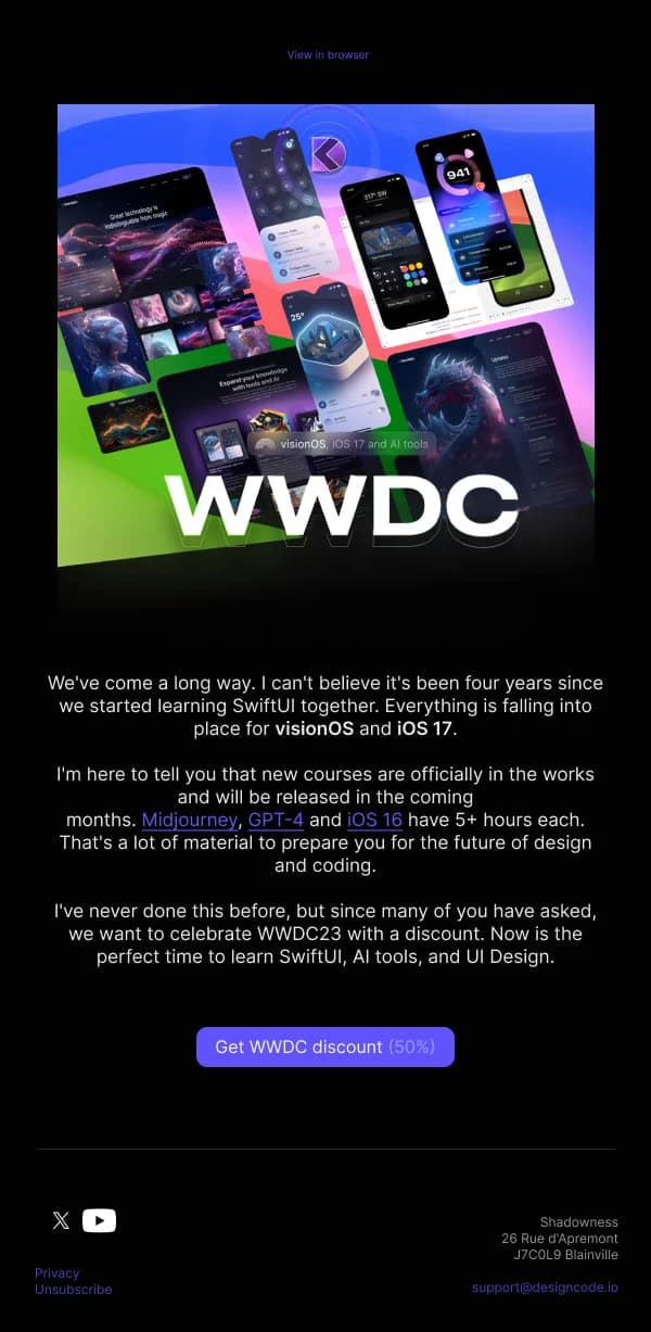
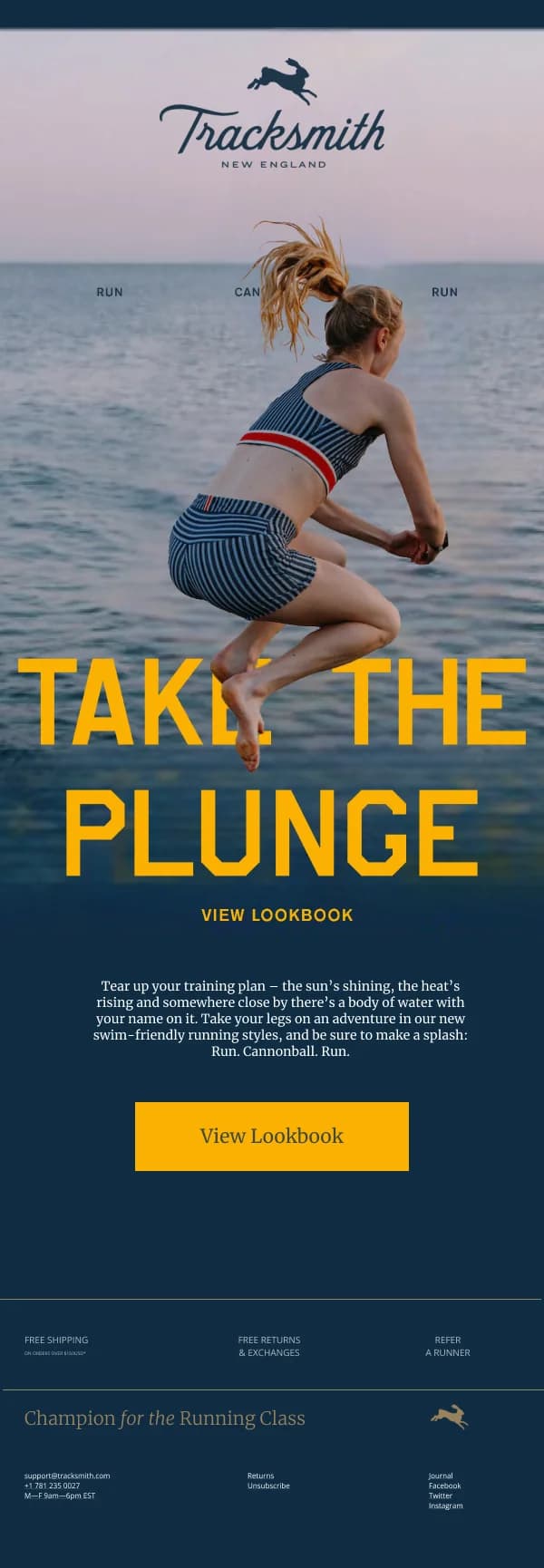
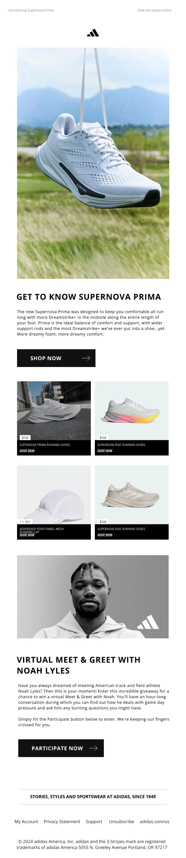
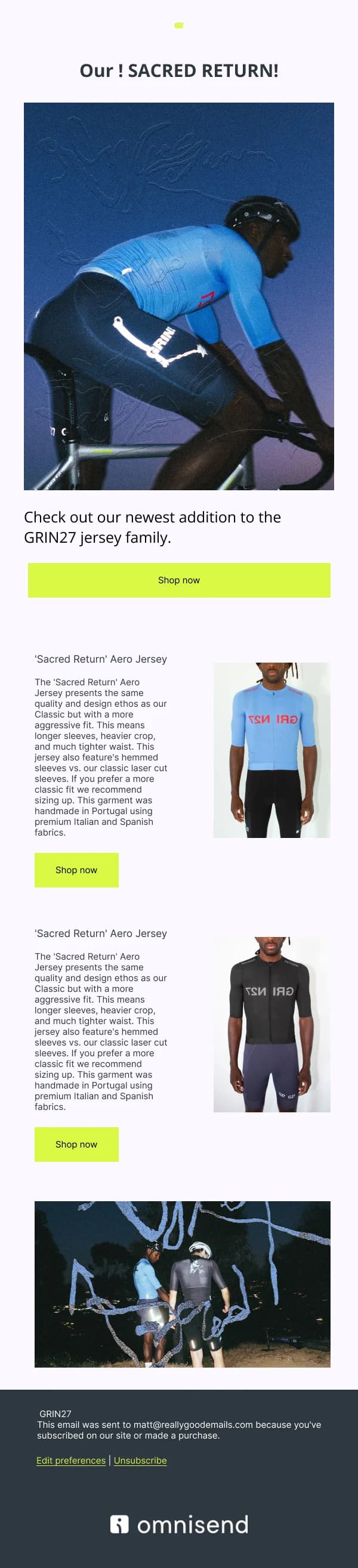
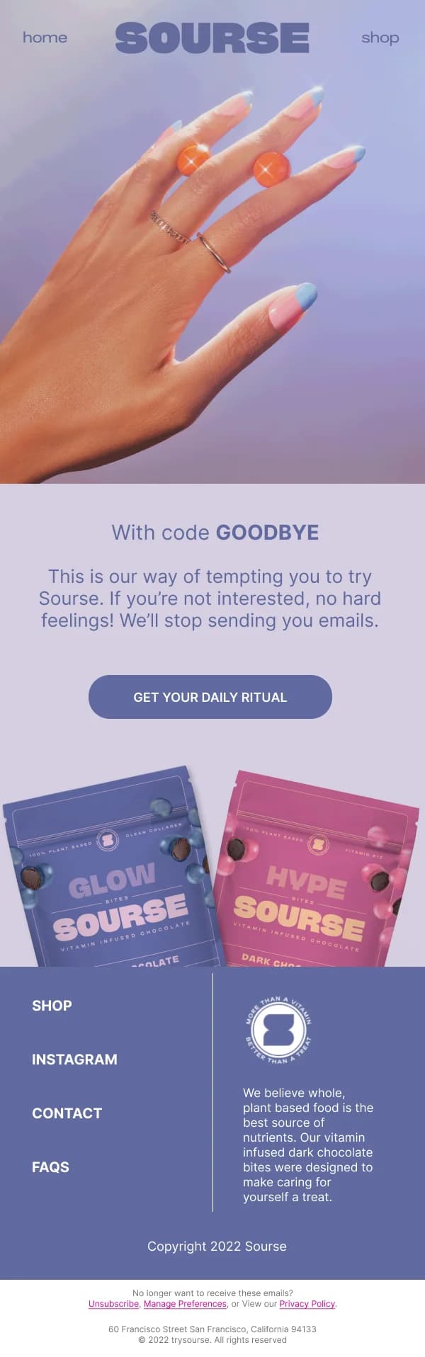
This has a practical consequence for how you design the hero. A tall, beautiful
lifestyle image that fills 500px of vertical space has pushed your headline and
your button entirely out of view. It looks superb in the Figma frame and performs
badly in an inbox. Constrain the hero, or overlay the headline on it, or accept
that the image is the message and put the button immediately beneath.
Preheader text is part of the design
The preheader is the snippet the client shows after the subject line, pulled from
the first text in the email body. Left unset, it grabs whatever comes first —
often "View in browser" or an image alt attribute, which wastes one of the three
things a reader sees before deciding to open.
Treat it as a design element with a real slot in the template: 40–90 characters
that extend the subject line rather than repeat it. If the subject is a hook, the
preheader is the reason to believe it.
Hierarchy, not decoration
Marketing designs get busy because "make it feel premium" is easier to satisfy
with ornament than with structure. Resist it. The tools that actually create a
sense of quality in email are unglamorous:
- Generous vertical spacing between blocks, so each one reads as a distinct
idea rather than part of a wall.
- Two type sizes doing most of the work — one for headlines, one for body —
with weight rather than size carrying smaller distinctions.
- One accent colour used only for actions. The moment your accent appears on
a decorative divider, it stops signalling "this is clickable."
- Alignment that holds down the whole email. Mixed left and centre alignment
between adjacent blocks reads as carelessness even when each block is fine.
Images will not always load
Many readers see the email with images blocked, at least on first open. A
marketing design that lives entirely inside one large image becomes a blank
rectangle for those readers — including the ones whose clients block images by
default until a sender is trusted.
Practical protections, all visible in these templates:
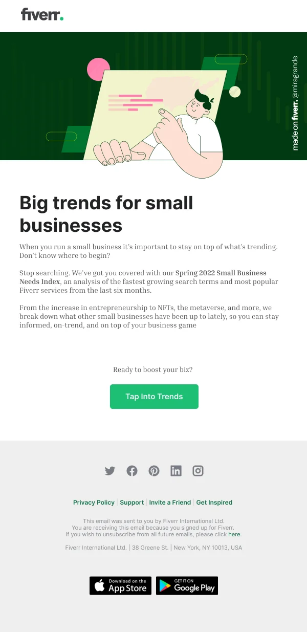
- Keep the headline and the button as live text, not baked into the image.
- Write alt text that carries the message, not the filename. "Spring collection —
now in three new colourways" is useful when the image fails; "hero-image-final"
is not.
- Give the design a background colour that still looks intentional when the
images behind it are gone.
Where the templates differ
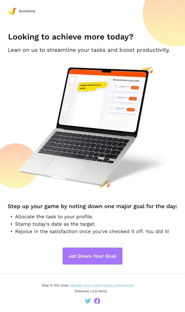
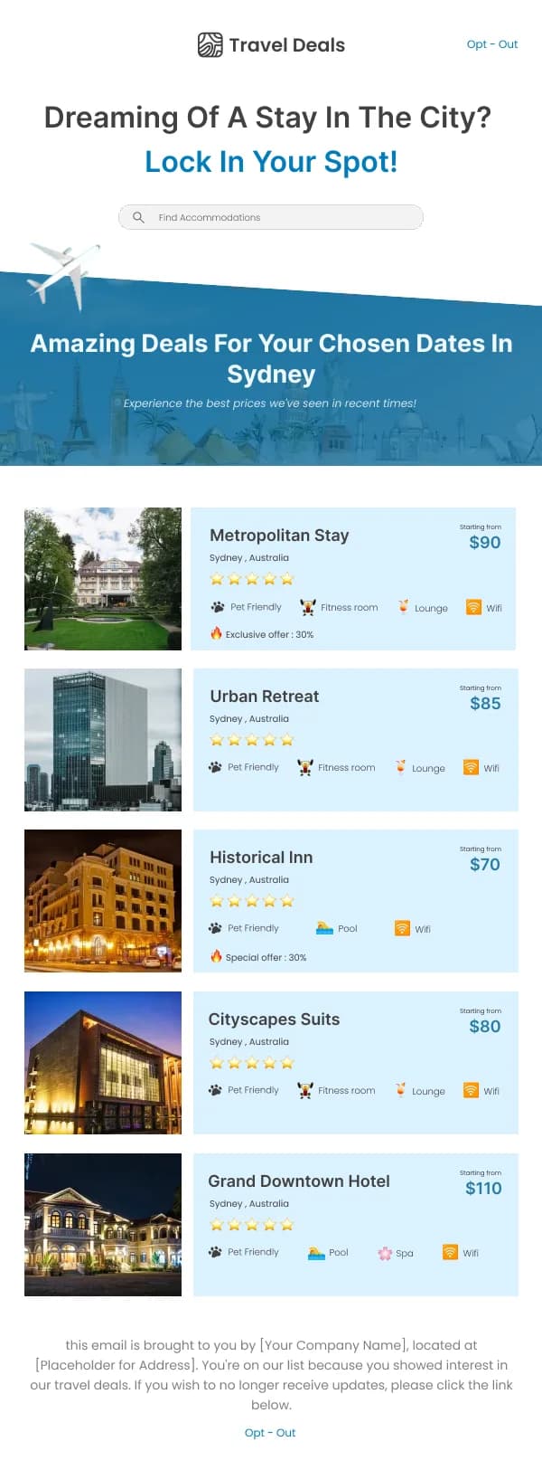
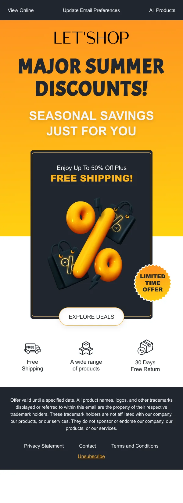
The 233 designs in this collection split roughly along how hard the ask is.
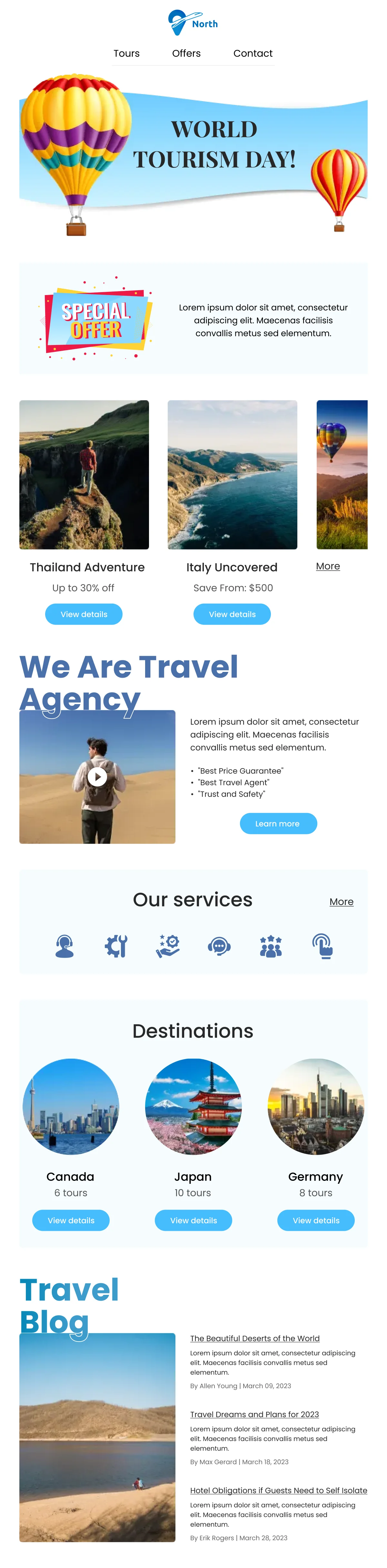
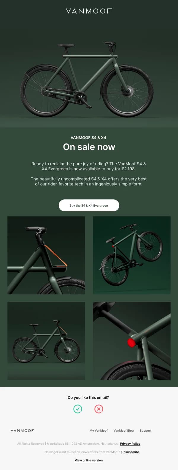
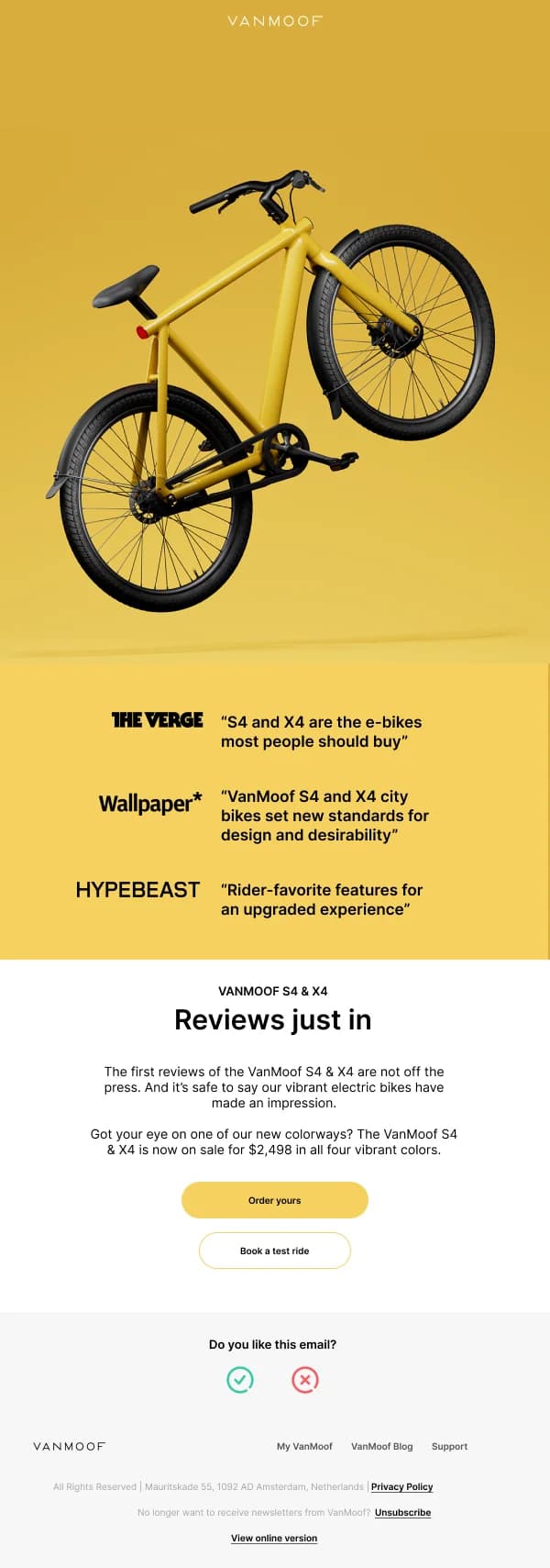
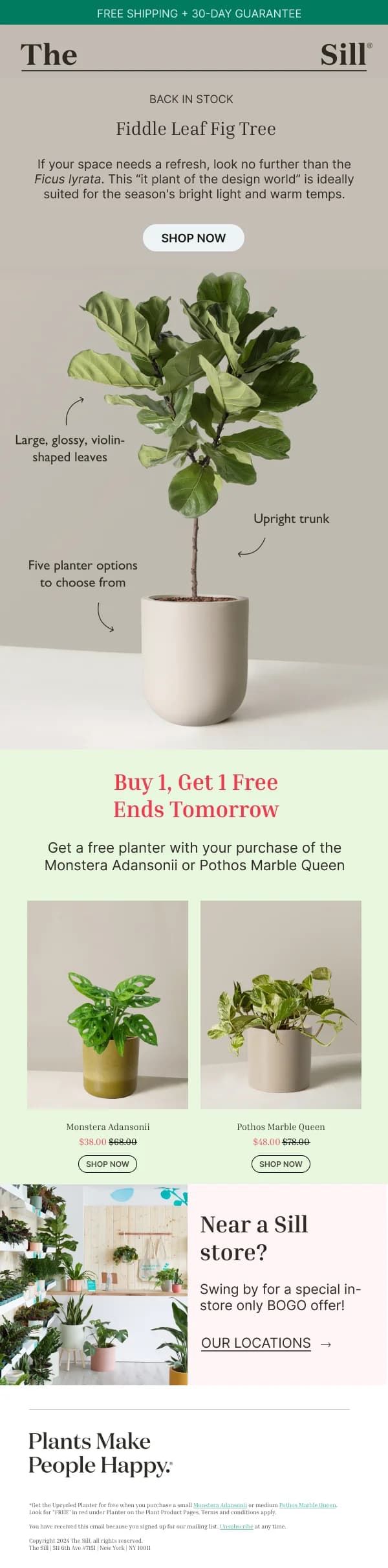
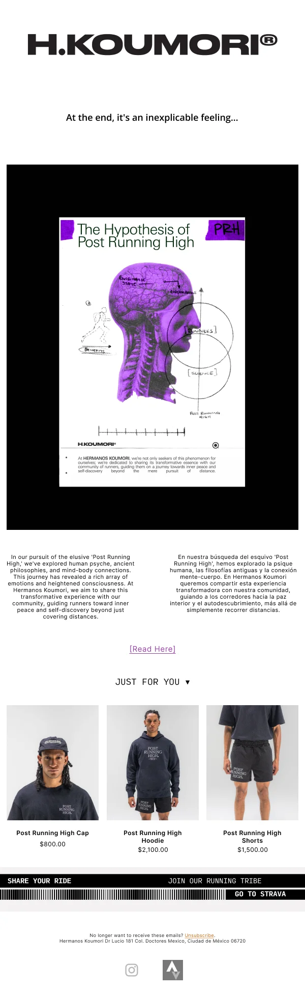
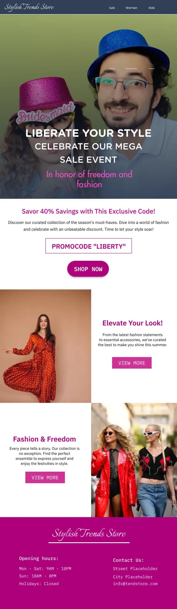
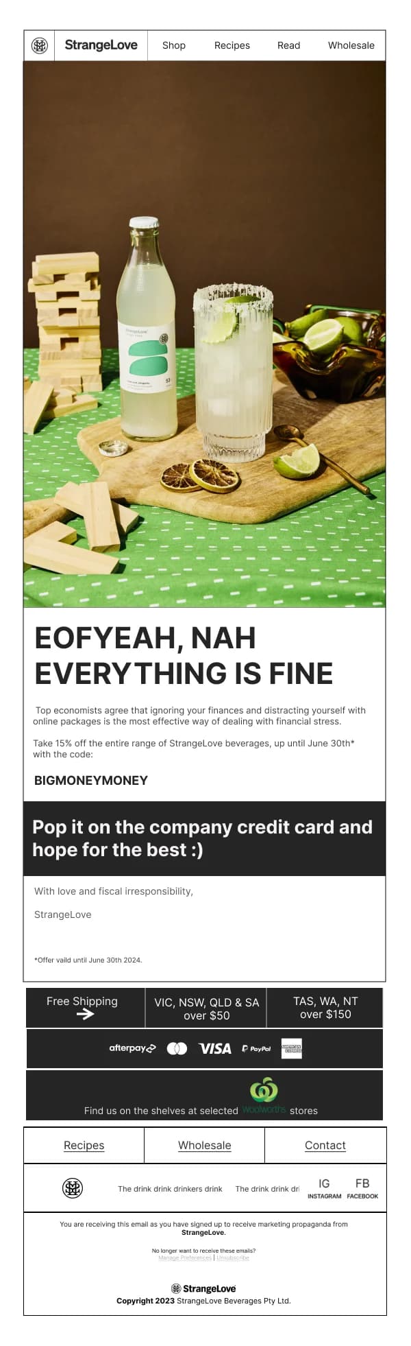
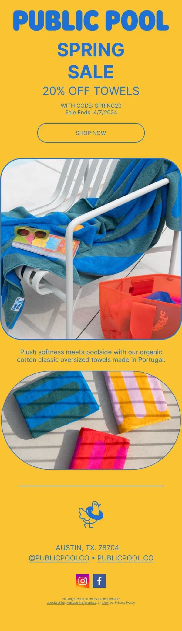
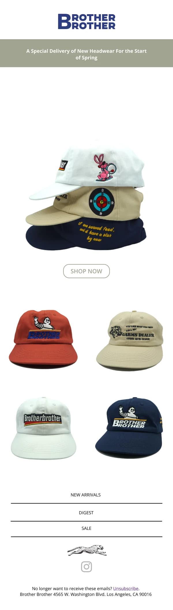
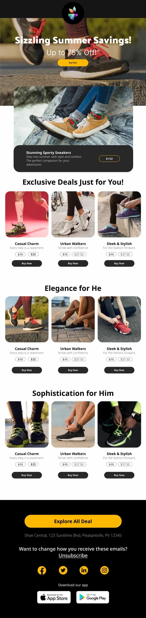
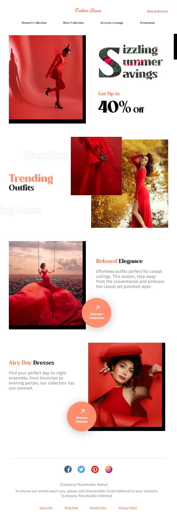
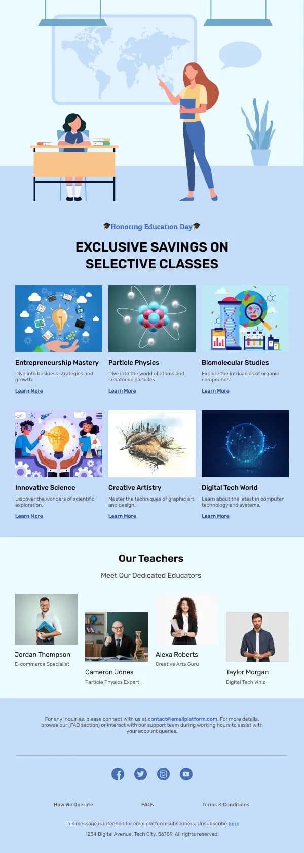
Low-commitment sends — a new range, a seasonal edit, a roundup — lean visual.
The imagery does the persuading, copy stays short, and the layout is a grid or a
stack of equal-weight product cards. These are the ones where a strong photo
carries the email and the design's job is mostly to stay out of the way.
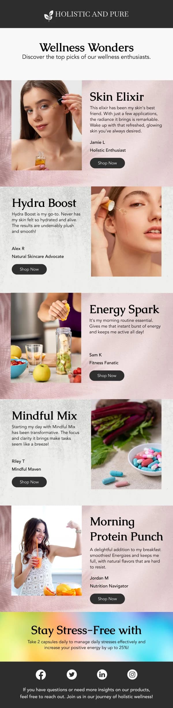
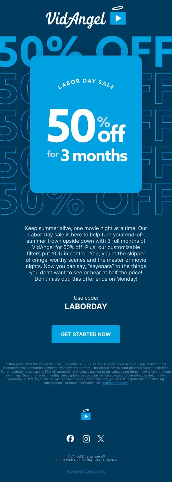
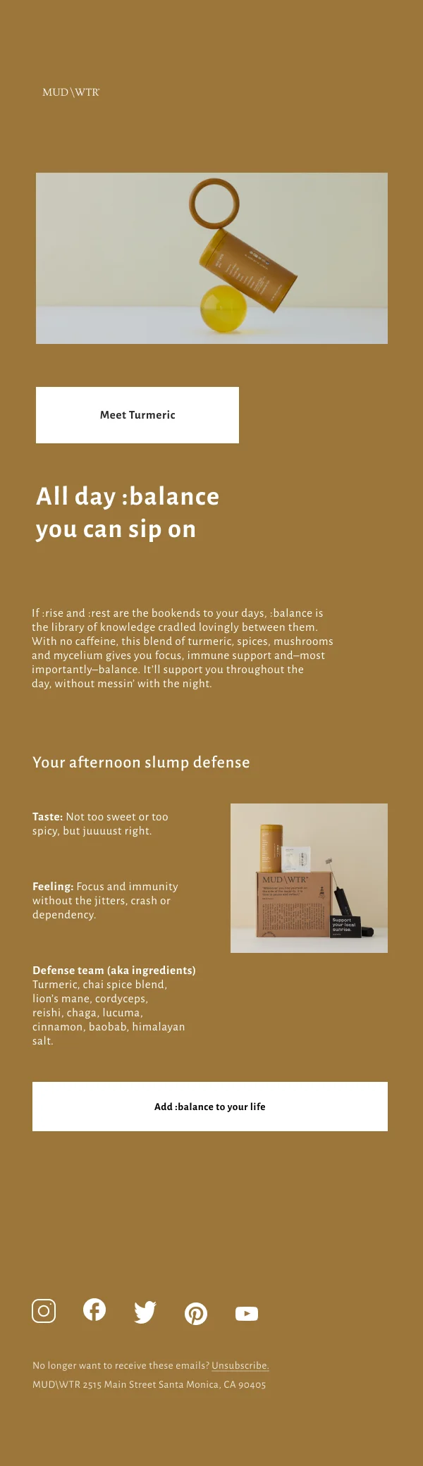
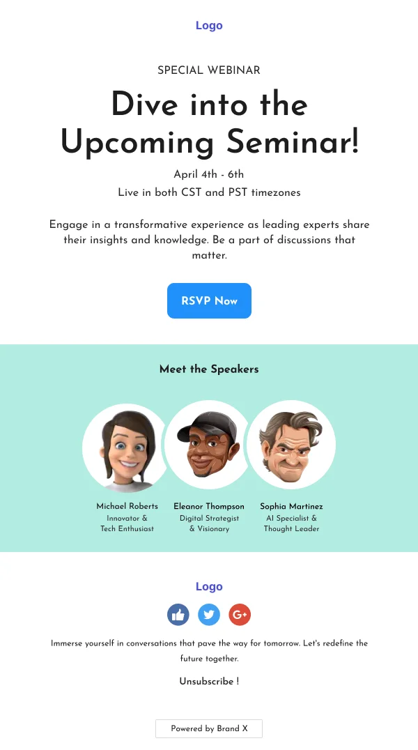
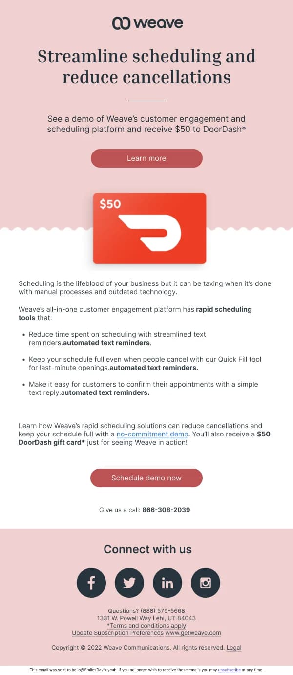
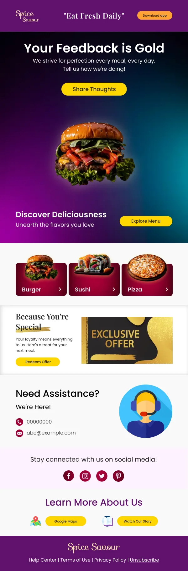
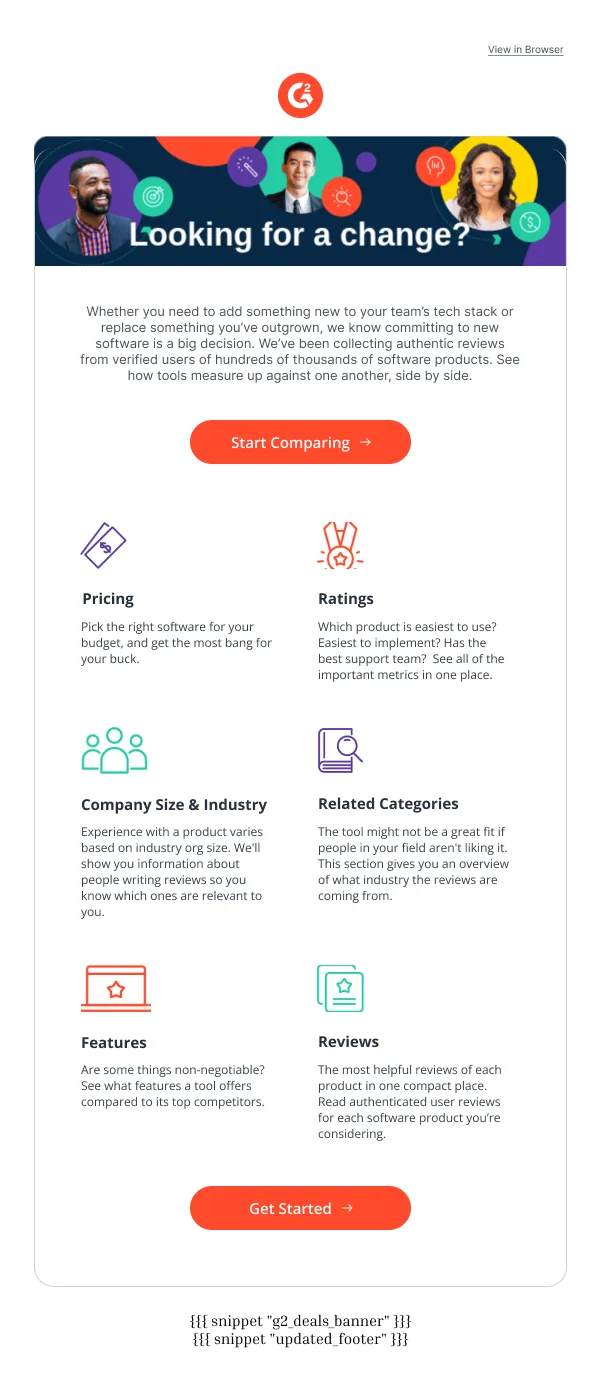
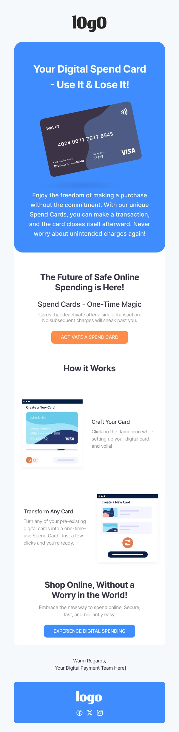
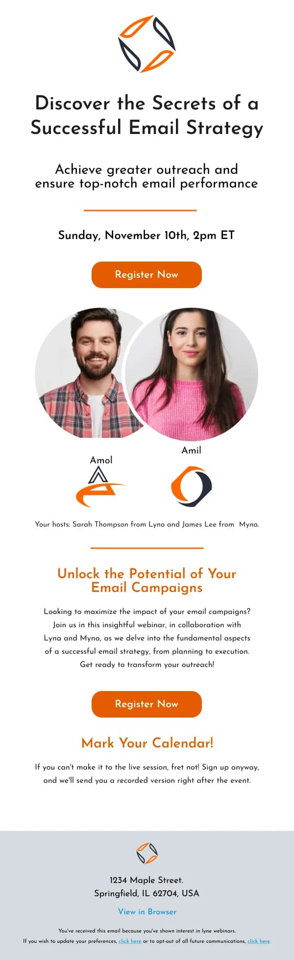
Higher-commitment sends — a paid upgrade, a booking, an event registration —
carry more copy and more structure: a clear benefit statement, some form of
proof, an objection handled, then the action. The design has to hold a longer
argument without becoming a wall of text, which is what the alternating
image-and-text blocks in those templates are for.
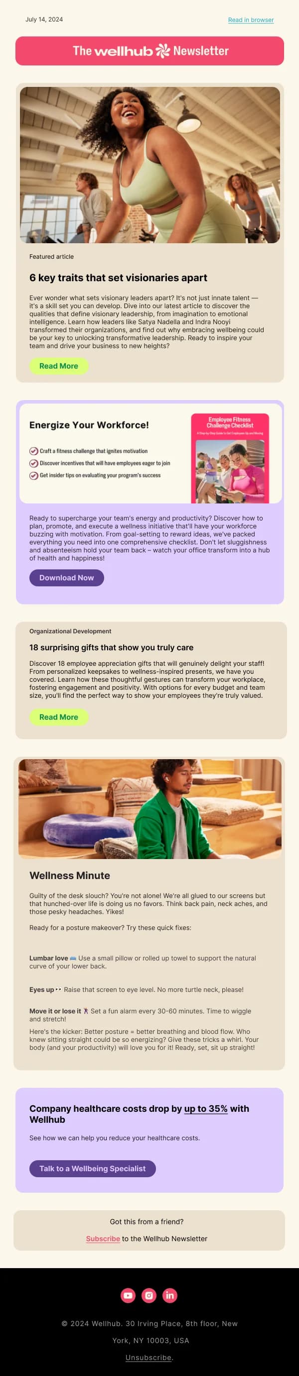
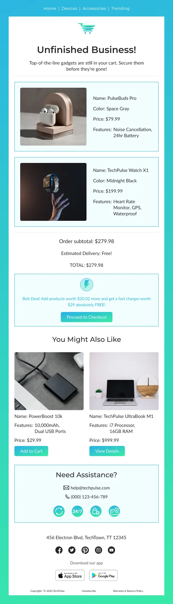
Repeat-contact sends — a series rather than a one-off — are built to survive
being seen five times. That means a recognisable frame with a genuinely variable
middle, which is a different problem from making one email look good once.
Measuring the design, not the campaign
Open rate tells you about the subject line. Click rate tells you about the offer
and the audience. What tells you about the design is narrower:
- Click position. If most clicks land on the second button rather than the
first, the top of the email is not doing its job.
- Click-to-open rate. A healthy open rate with a weak click-to-open usually
means the email looked promising and then failed to make the action obvious.
- Mobile versus desktop click rate. A gap that favours desktop is almost
always a layout problem in the single-column collapse.
Those three, read together, will tell you more about whether a template works
than any amount of internal opinion.
Using these templates
Every design here is a Figma file with named layers and a mobile frame. Duplicate
it, replace the content, and check three things before you hand it on: that the
button is visible without scrolling, that the headline is live text, and that the
mobile frame still reads as one clear column.
If you are new to building email in Figma, the guide on
how to design an email in Figma covers the
frame setup, and the dimensions guide
covers the widths and safe areas these templates are built to.