Travel is a two-register category. Before booking, the email sells a feeling and
photography does most of the work. After booking, the same programme has to deliver
precise logistics that a reader will return to, sometimes on a phone with no signal.
The 36 designs in this collection cover both, and they look quite different from
each other on purpose.
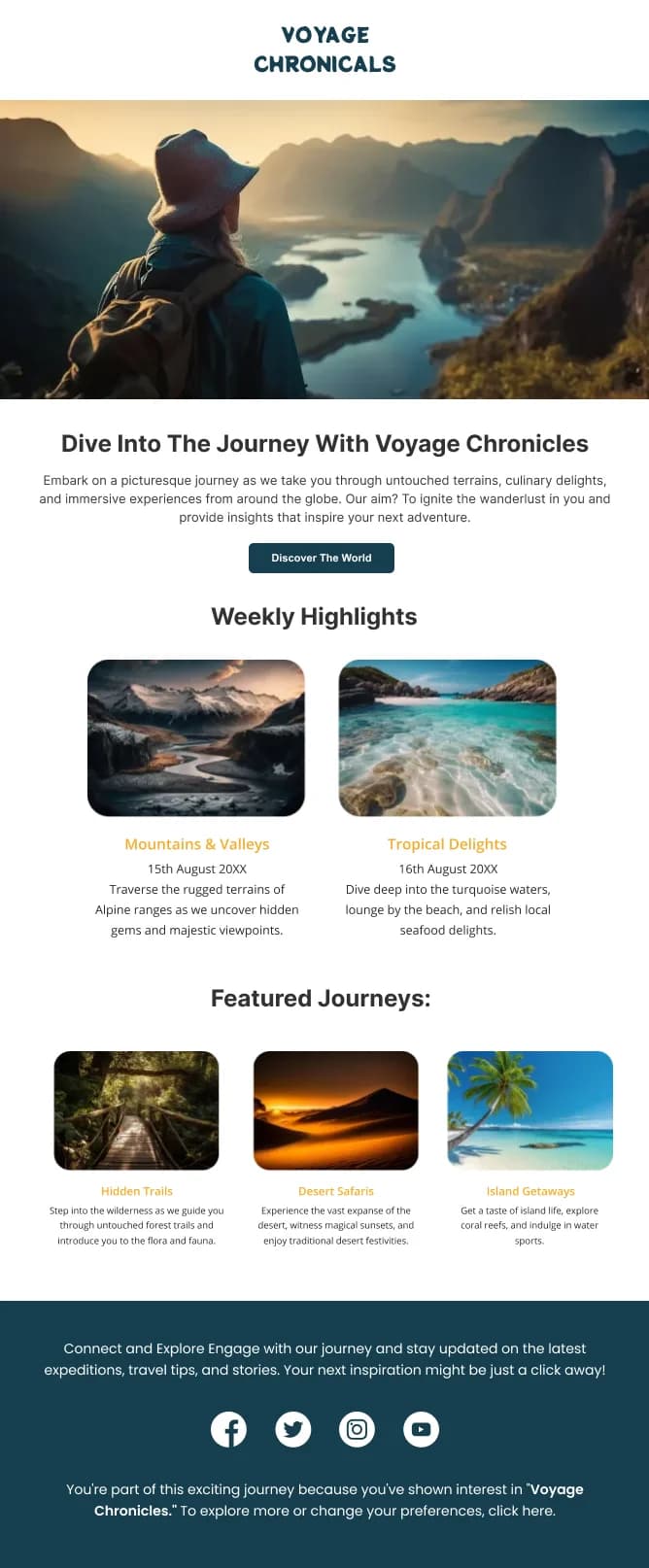
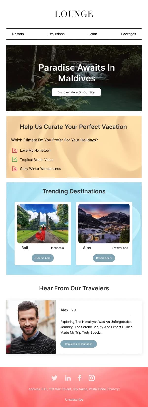
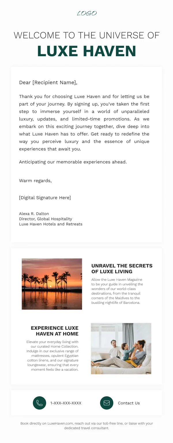
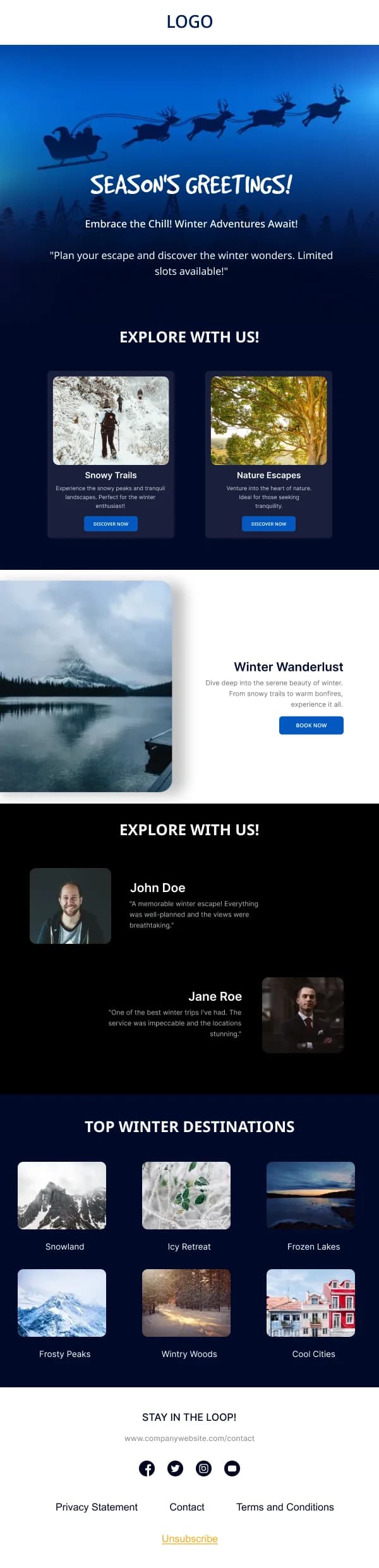
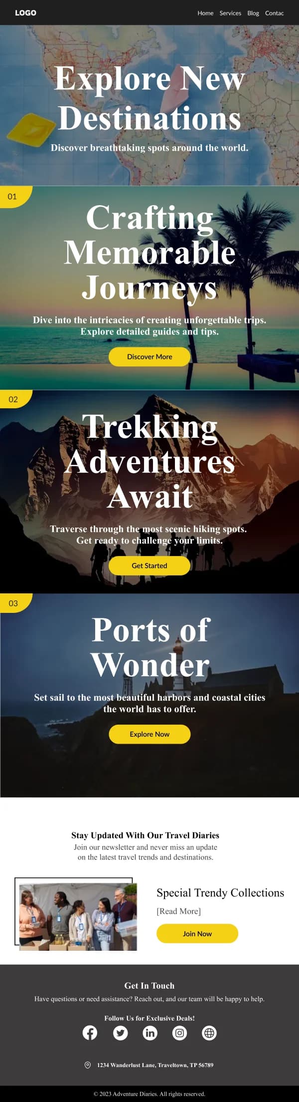
Inspiration: one place at a time
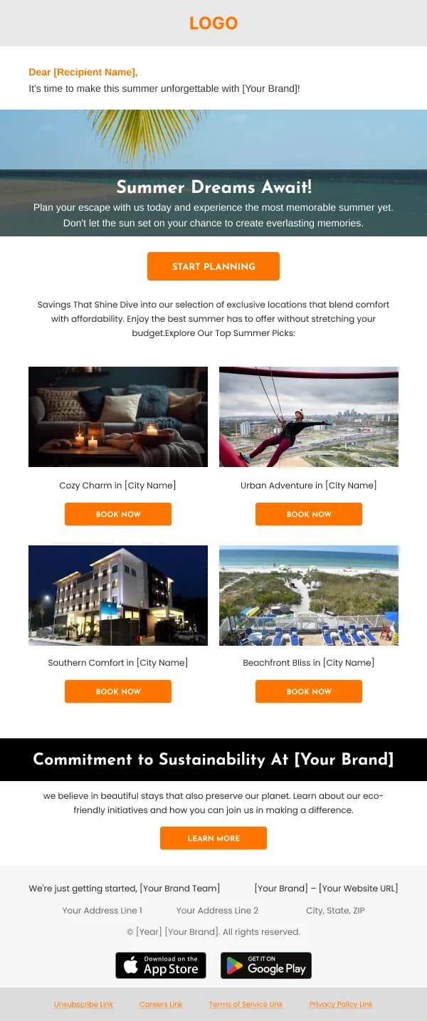
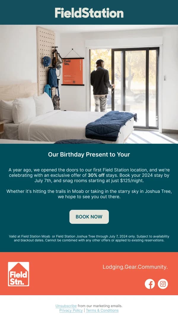
A destination email works when it commits. One place, one large photograph, a
price, a travel window, one button.
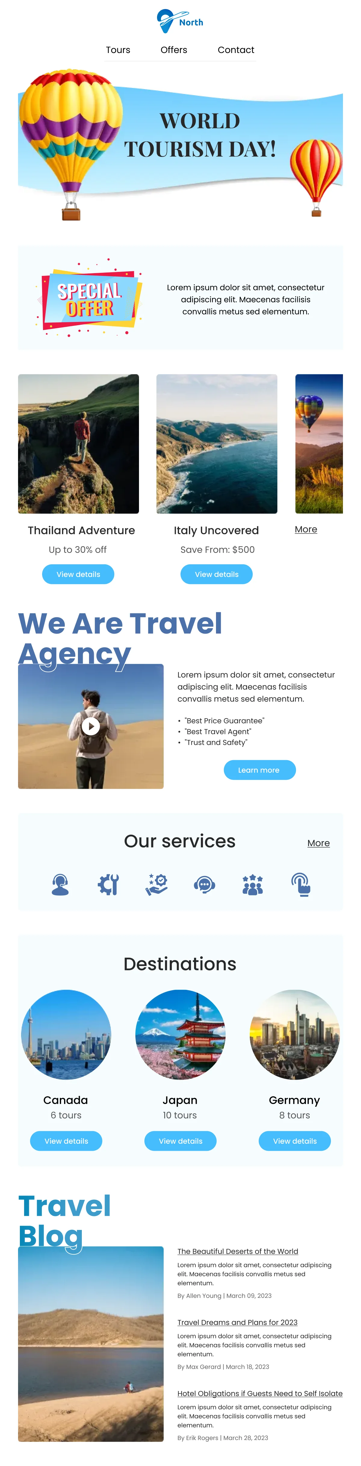
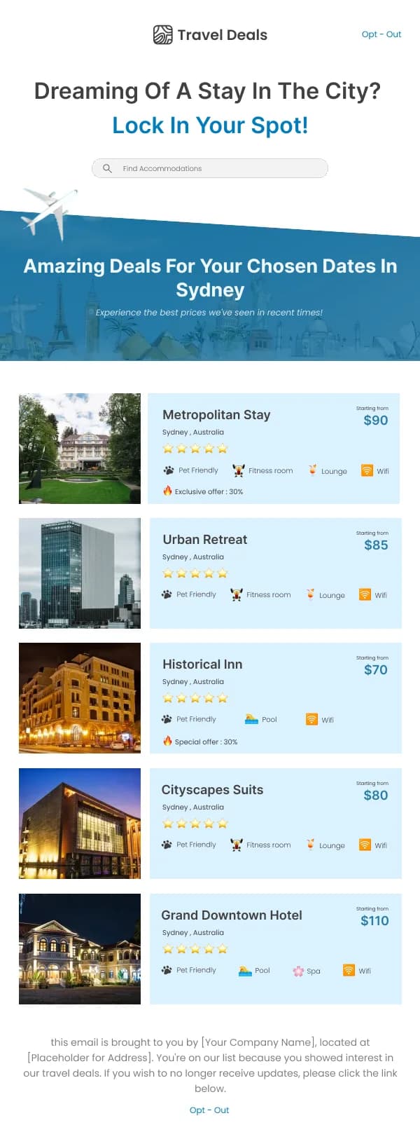
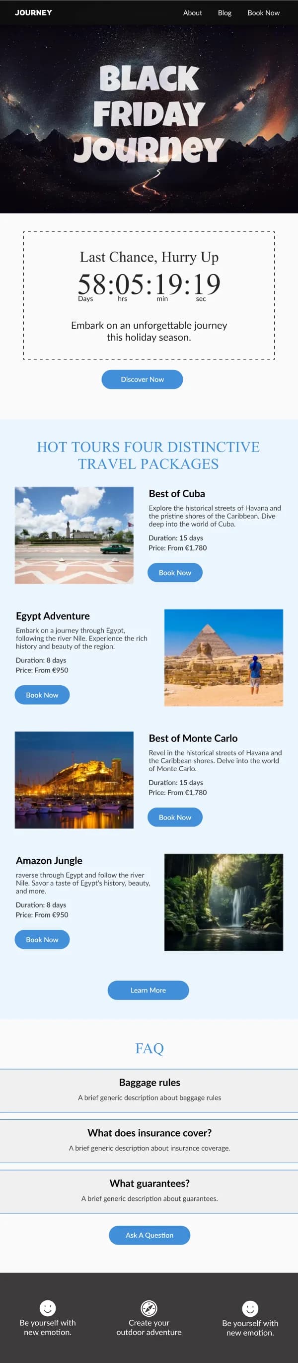
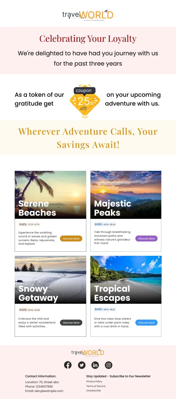
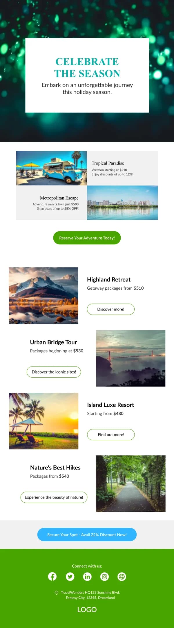
Multi-destination roundups have a role — a seasonal edit, a category like city
breaks — but they convert by narrowing, so they need a stated organising idea and
no more than four or five options with consistent crops.
What consistently fails: nine destinations, mixed photographic styles, prices in
different formats, and no dates.
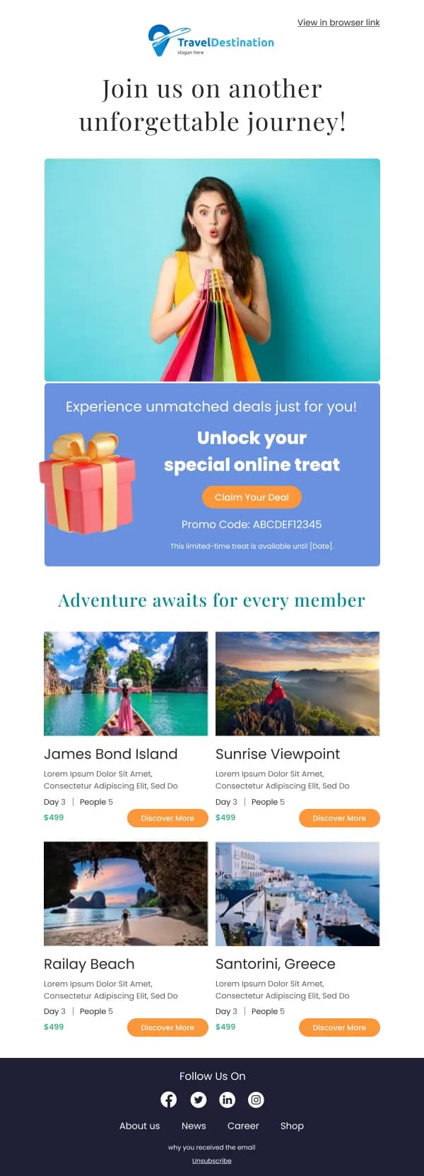
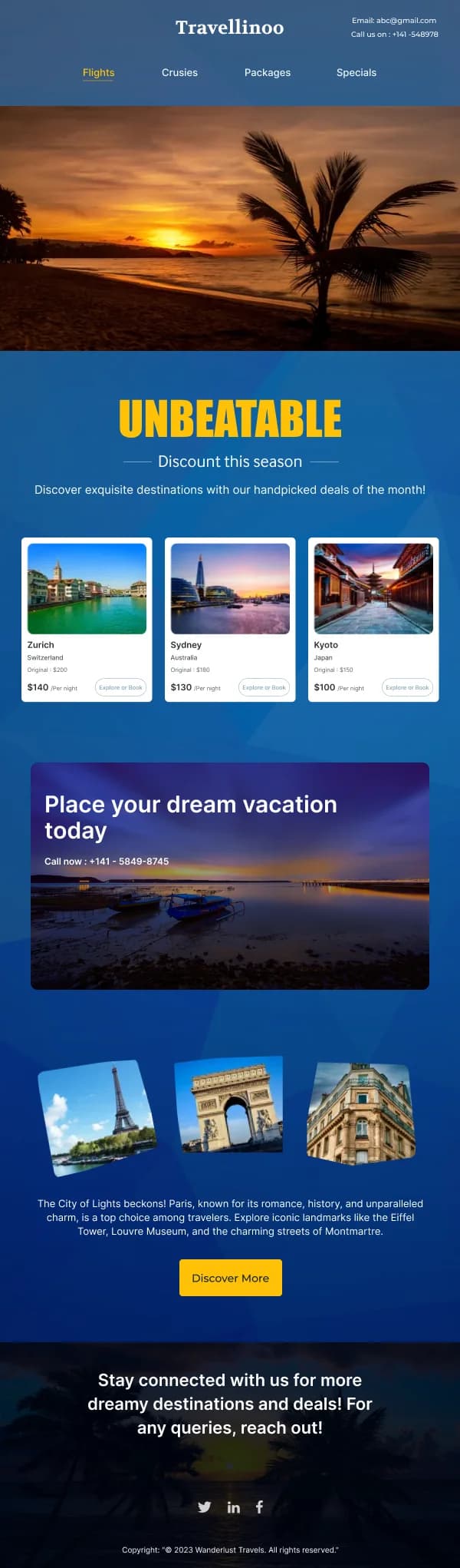
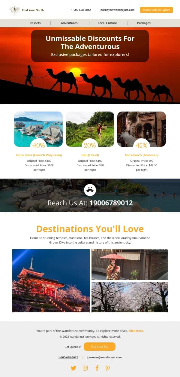
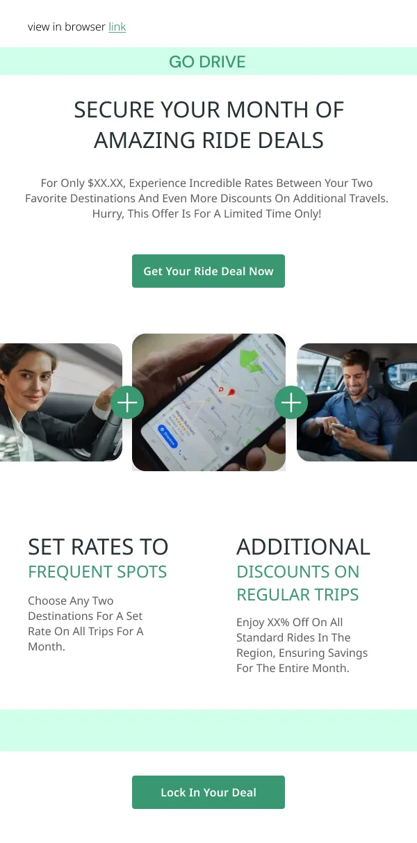
Make the price meaningful
Travel pricing is the most trust-sensitive part of the category. A headline figure
needs immediate scope:
- Per person or total, stated.
- What is included — flights, transfers, board.
- The travel window the price applies to.
- Whether taxes and fees are in the figure.
A large number with the qualifications in small grey type below is the pattern
readers have learned to distrust, and it costs conversions further down the funnel
even when the price is genuine.
Confirmations are reference documents
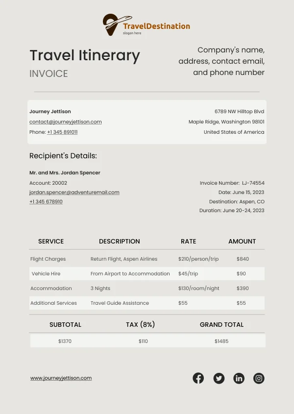
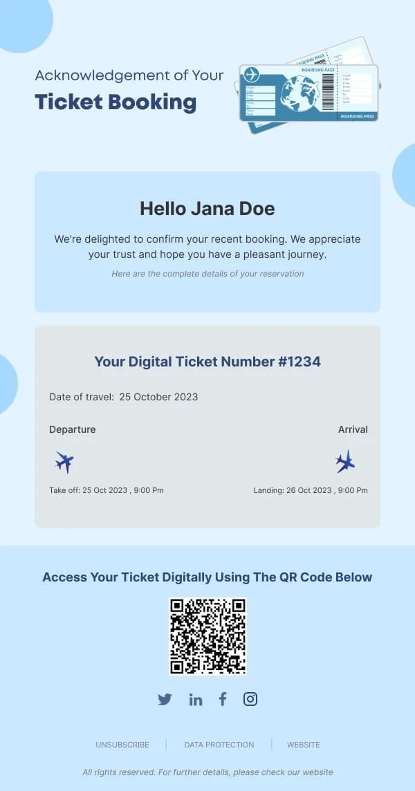
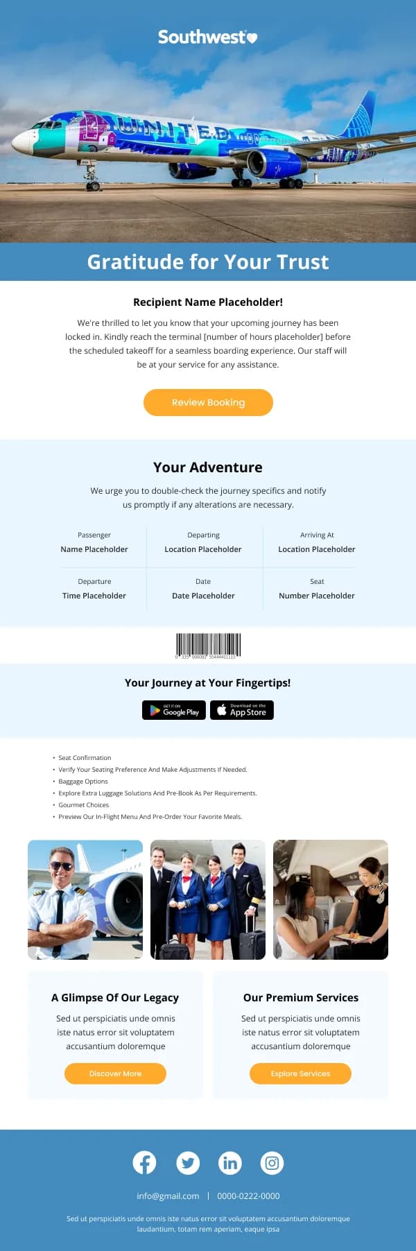
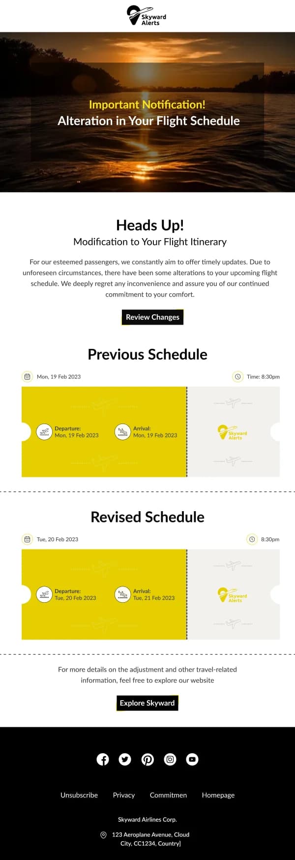
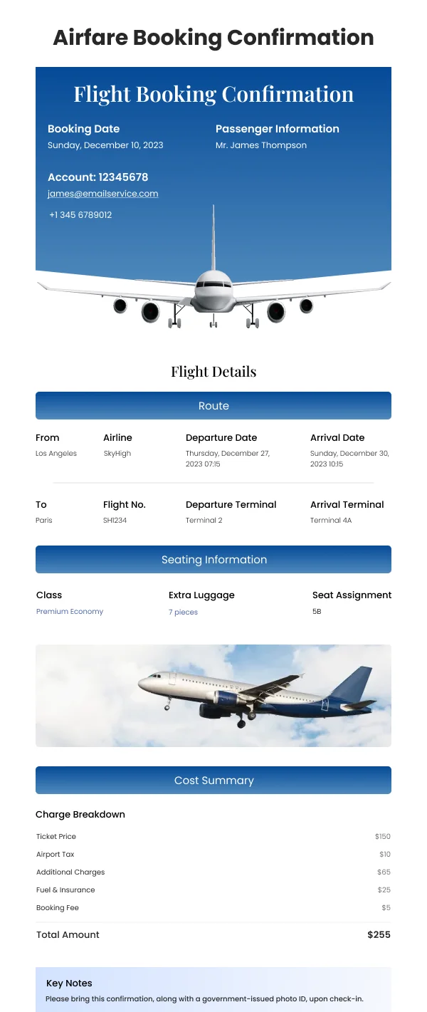
A booking confirmation gets saved, forwarded and re-read. It should be complete and
structured:
- Reference number, prominent and near the top.
- Dates and times, with the day of the week spelled out.
- The exact property, carrier or service, with the address.
- Traveller names as booked, so errors are catchable.
- Cancellation and change terms in one plain sentence, with a link to the full
terms.
These emails should be legible when printed and when read on a phone in a low
signal area, which argues for live text throughout and against a design that
depends on images loading.
Pre-departure
The send a few days ahead is the most useful email in the sequence and the one most
often skipped: what to bring, check-in details, local practicalities, contact
numbers, weather. It reduces support contact and it reads as care rather than
marketing.
Keep it to a scannable list rather than prose, and lead with anything time-critical
like check-in windows or visa requirements.
Using these templates
Confirmations are built to stay readable with images off and when printed, since travel documents get saved and re-opened. Checks: does a deal email
state what the price includes and the travel window, is the confirmation complete
enough to stand alone, and does the confirmation remain readable with images off.
Common questions
- What makes a travel inspiration email work?
- A single place, photographed well, with a price and a date range. Emails showing six destinations at once produce browsing rather than booking, because the reader has to choose before they can want.
- How much practical detail belongs in a deal email?
- Enough to make the price meaningful — what is included, the travel window, and whether the figure is per person or total. A headline price with no scope is the fastest way to lose trust in the category.
- What do booking confirmations need?
- The reference number, dates, times, the exact property or carrier, and the cancellation terms in a plain sentence. Travel confirmations are kept and re-read more than any other transactional email, often offline, so completeness matters more than brevity.