Nothing else in an email programme gets opened like a welcome. The reader just
signed up, they are expecting to hear from you, and their attention is at its
highest point in the whole relationship. Which is why it is unfortunate that most
welcome emails spend it on a feature tour.
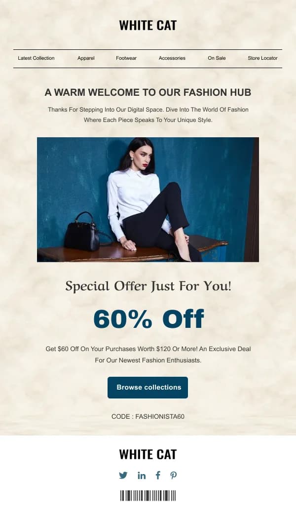
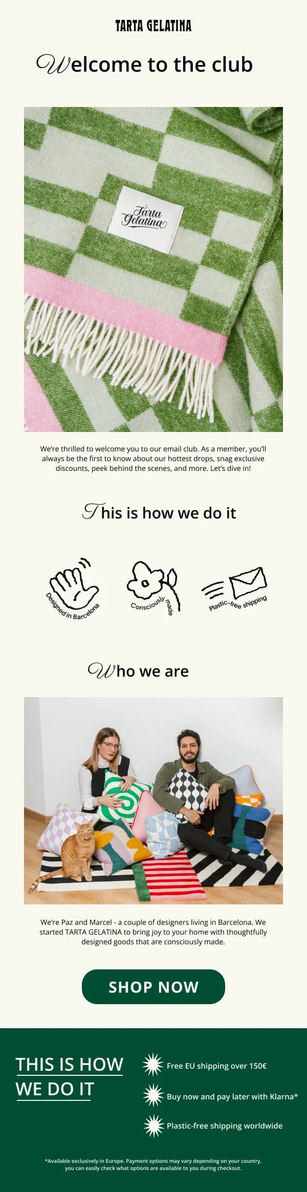
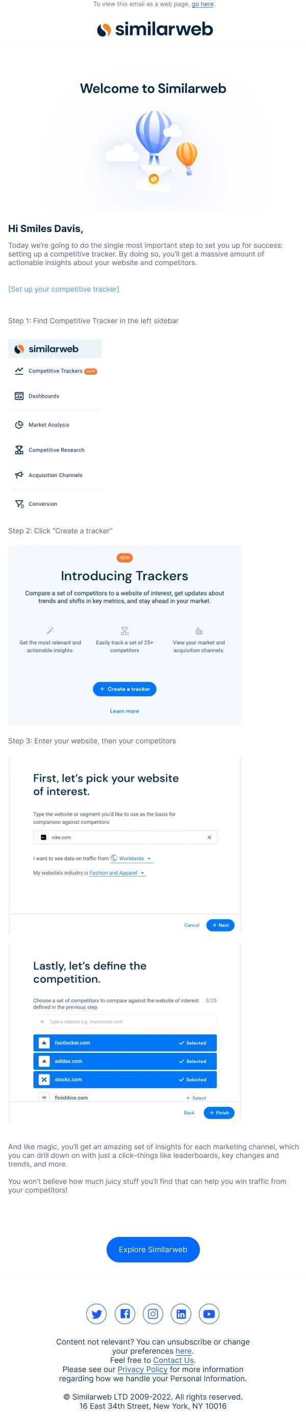
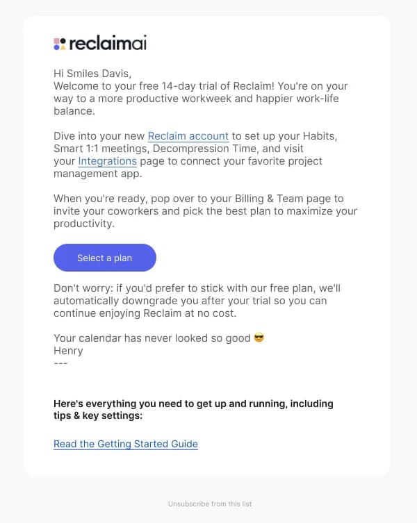
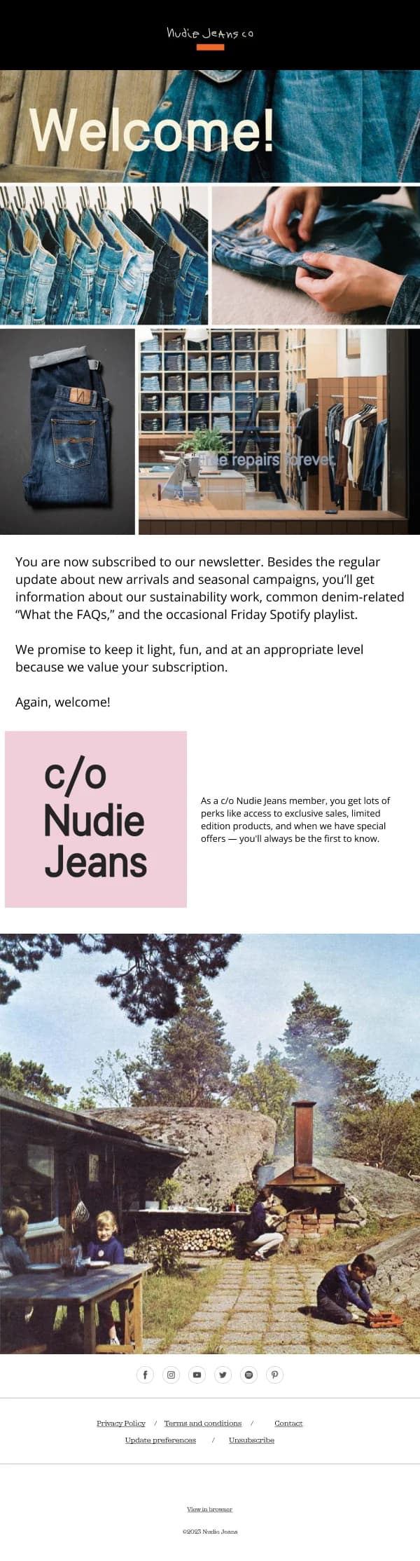
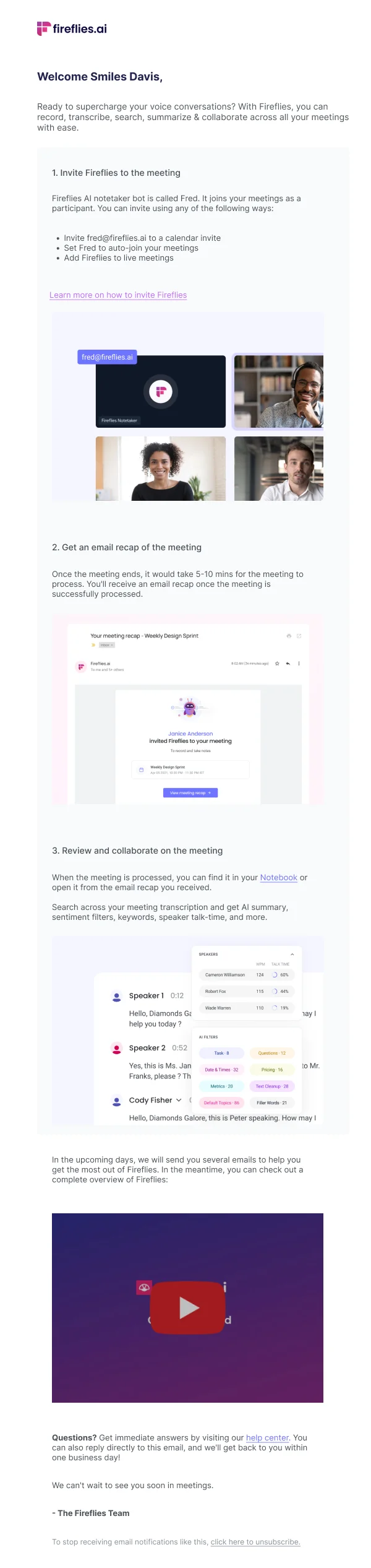
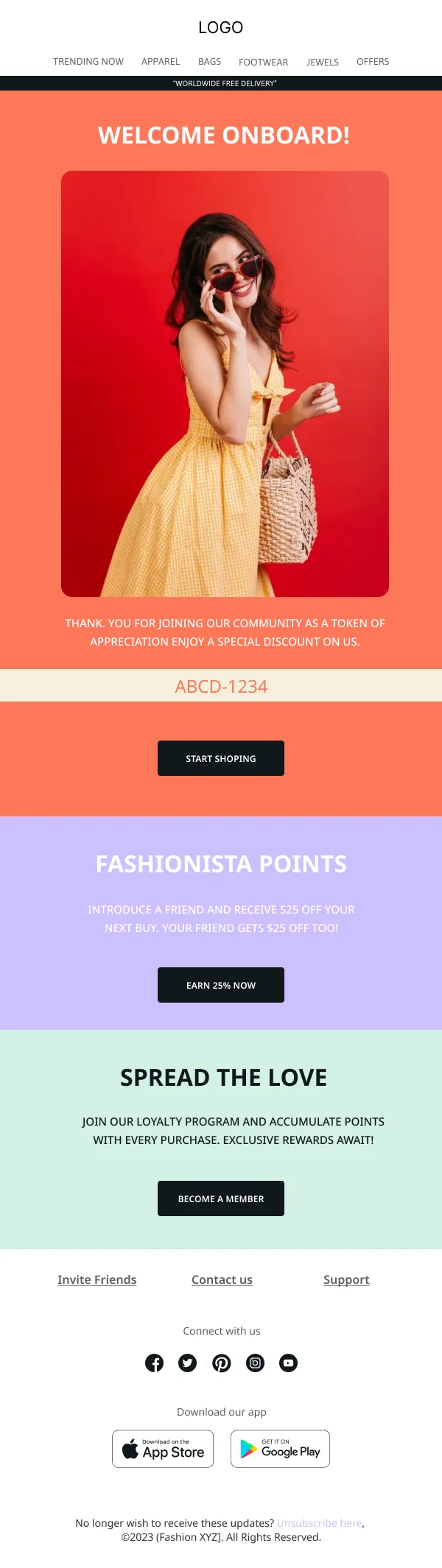
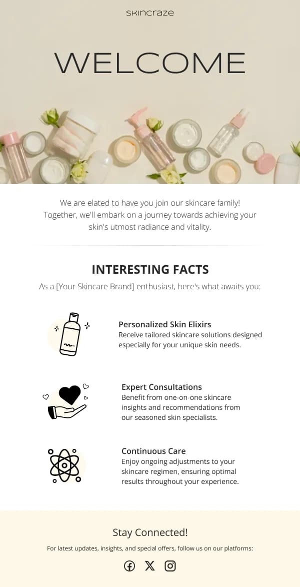
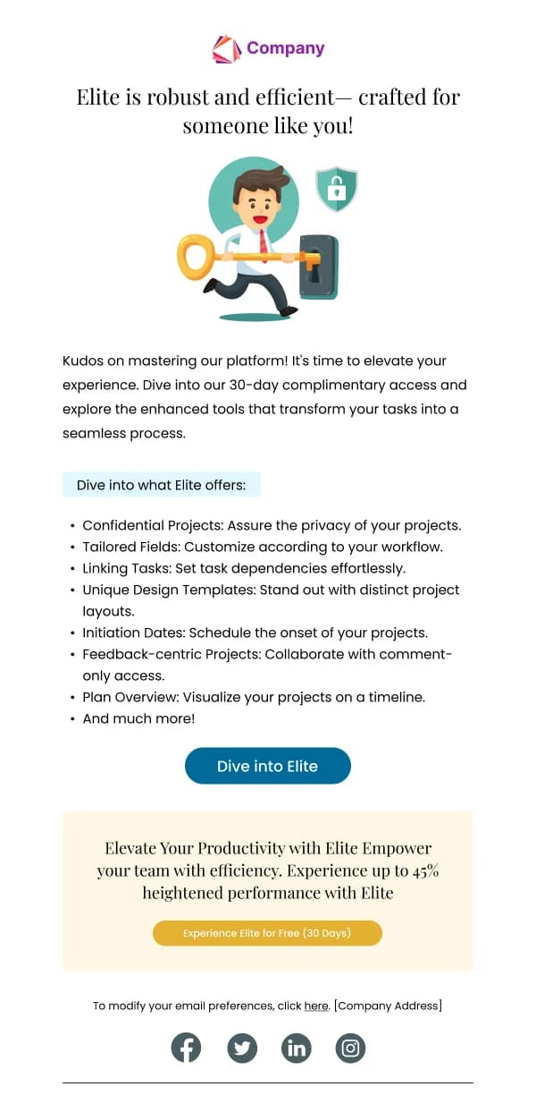
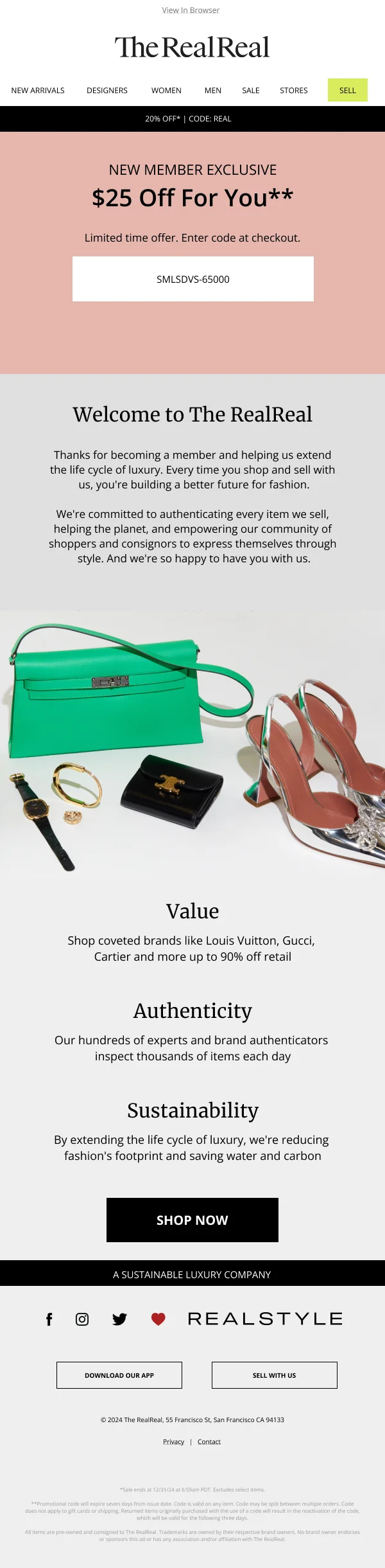
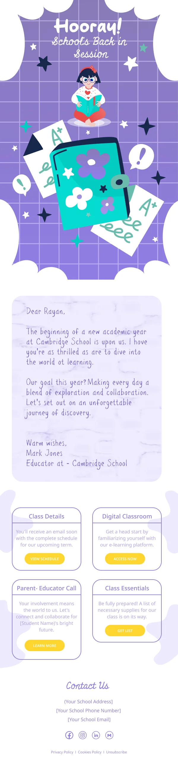
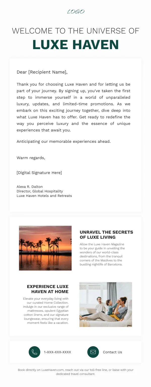
The 26 designs in this collection are built around a narrower brief.
Three jobs, in order
Confirm. The reader wants to know the thing worked. First line, unambiguous.
Set expectations. What will you send, and how often. This single line reduces
unsubscribes across the whole programme more effectively than any later
optimisation, because it converts a vague apprehension into a known quantity.
Ask for one action. Not three ranked by priority. The one that gets the reader
to their first bit of real value.
Everything else — the brand story, the founder's note, the social links, the full
range — is optional and belongs below those three.
Pick the action carefully
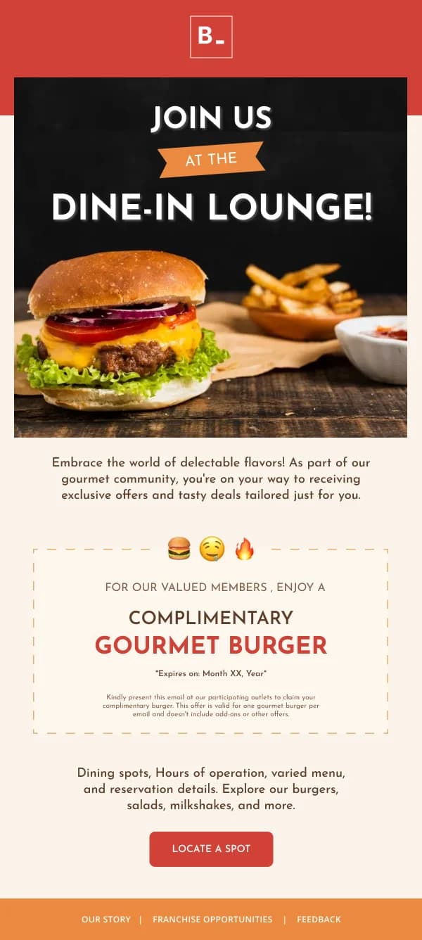
The action worth asking for is the one that benefits the reader soonest, not the
one that benefits you most. Those are sometimes the same and often not.
A profile completion helps your data. A first successful use helps the reader. If
you can only have one, the second produces a customer and the first produces a
record.
Design register
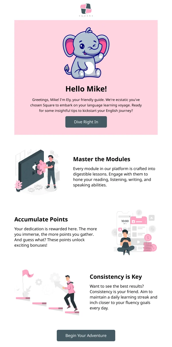
Welcome emails work better when they feel like the start of a conversation than
when they feel like a brochure:
- Restrained layout. One hero, a short block of copy, one button.
- A human voice, and where credible, a named sender rather than a brand.
- Live text for the headline, so the email still works with images blocked —
which matters more here than usual, because many clients block images from a
sender they have not yet established trust with.
- A visible reply path. A welcome that comes from a no-reply address undercuts
its own friendliness.
The series version
Where a single welcome is not enough, the sequence version splits the jobs: the
first email confirms and asks for the one action, and the following two or three
each address a distinct next hurdle.
Built as component variants on one frame, the whole sequence reads as one voice
rather than four unrelated sends. Several designs here are drawn as sets for that
reason.
Using these templates
Kept short and single-column, because the welcome is the one email where restraint outperforms a feature tour. Before sending, check: does
the first line confirm the signup, is there a line saying what to expect, is there
exactly one button, and does the email survive with images off.
The anatomy of a welcome email breaks the structure
down further, with specifics on subject lines and timing.
Common questions
- How soon should a welcome email arrive?
- Immediately. A welcome that lands an hour later reads as an automated afterthought, and the attention it would have caught is gone. Immediate delivery matters more than anything in the design.
- Should the welcome email include a discount?
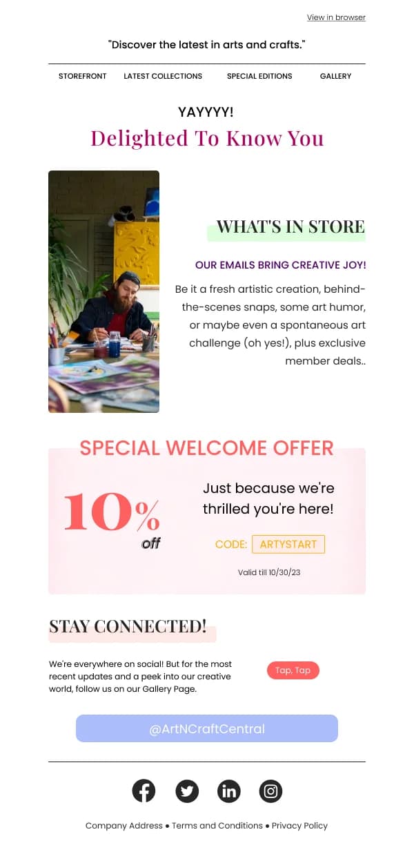
- If you promised one at signup, yes, and it should be the most prominent element. If you did not, a discount as a surprise works but sets an expectation that the next email will carry one too. Decide which programme you are running before you decide the design.
- What should the welcome email ask for?
- One thing, and preferably the action that produces the reader's first real bit of value rather than the one that helps you most. Complete a profile, place a first order, set a preference, try the one feature that makes the product click.