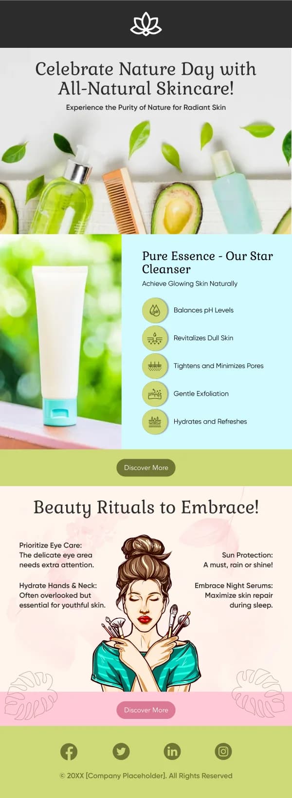
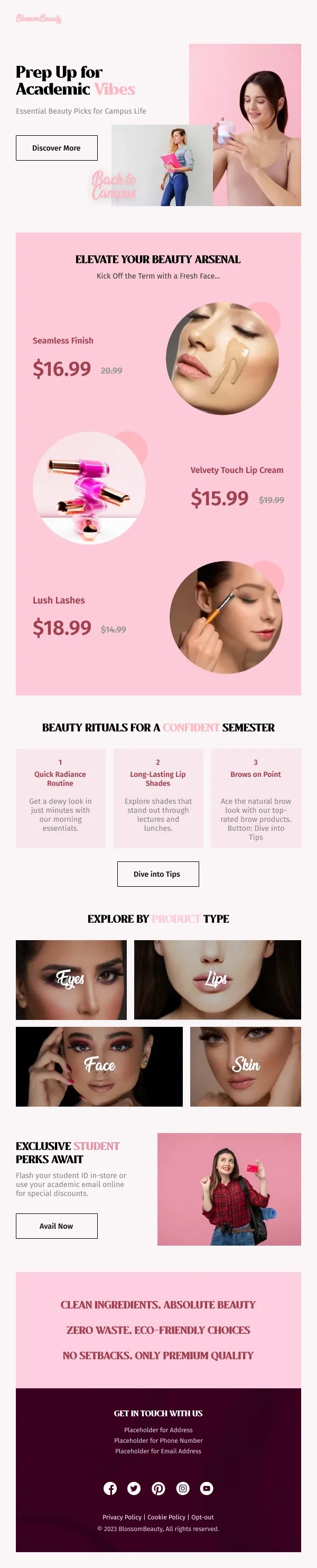
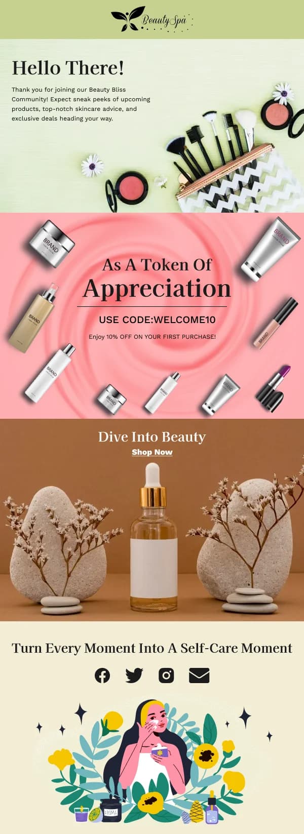
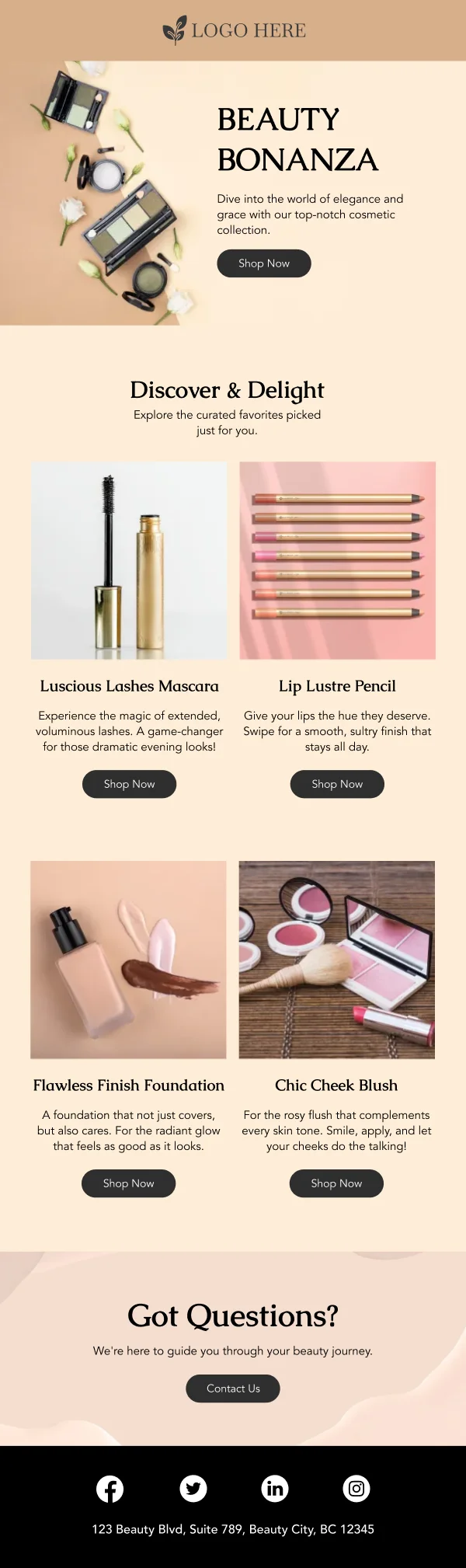
Beauty is unusual in ecommerce email because the reader's central question is not
"is this good" but "is this for me". A foundation, a serum or a shampoo can be
excellent and entirely wrong for the person reading about it, and an email that
ignores that produces clicks and then returns.
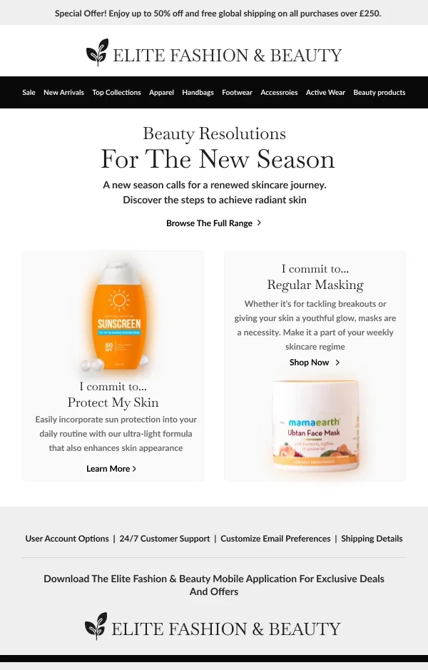
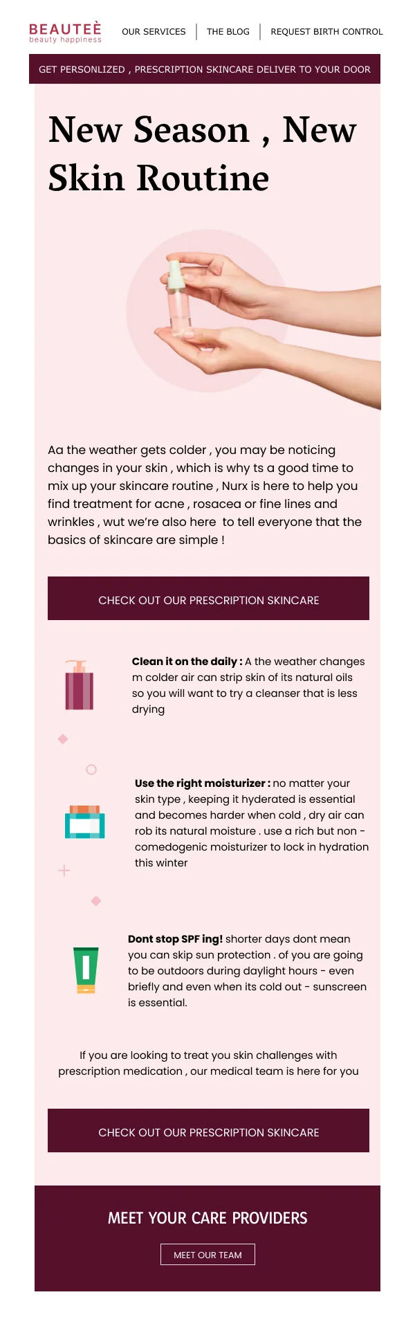
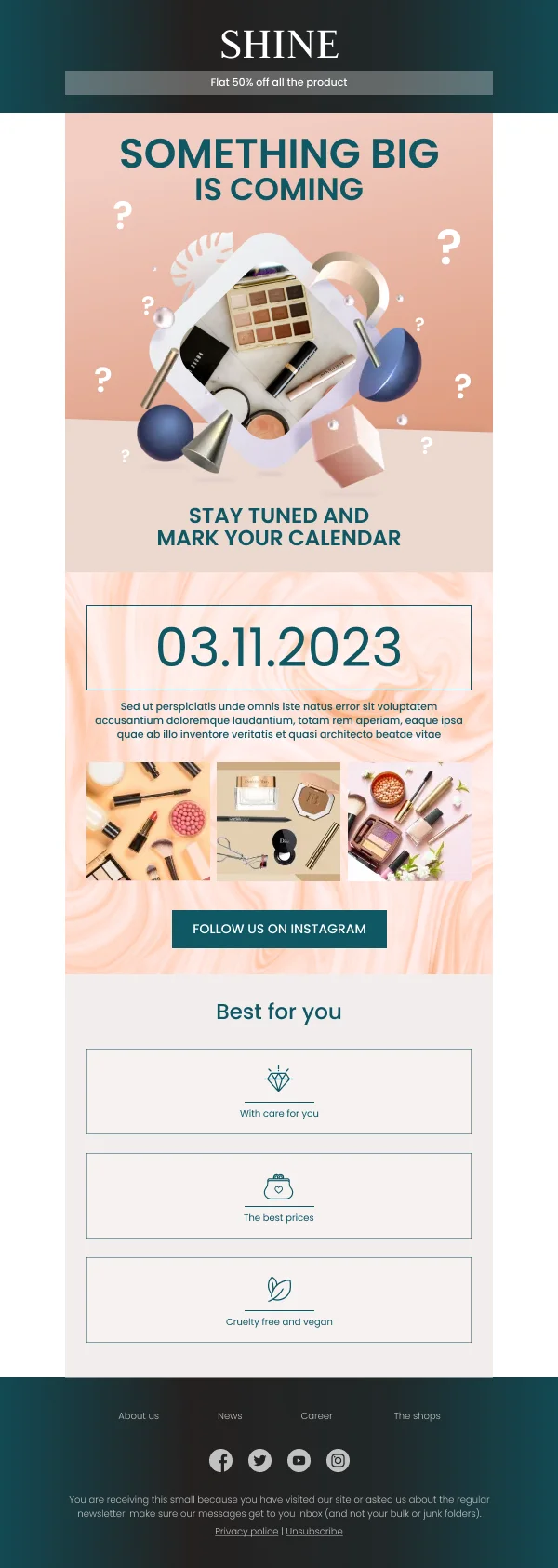
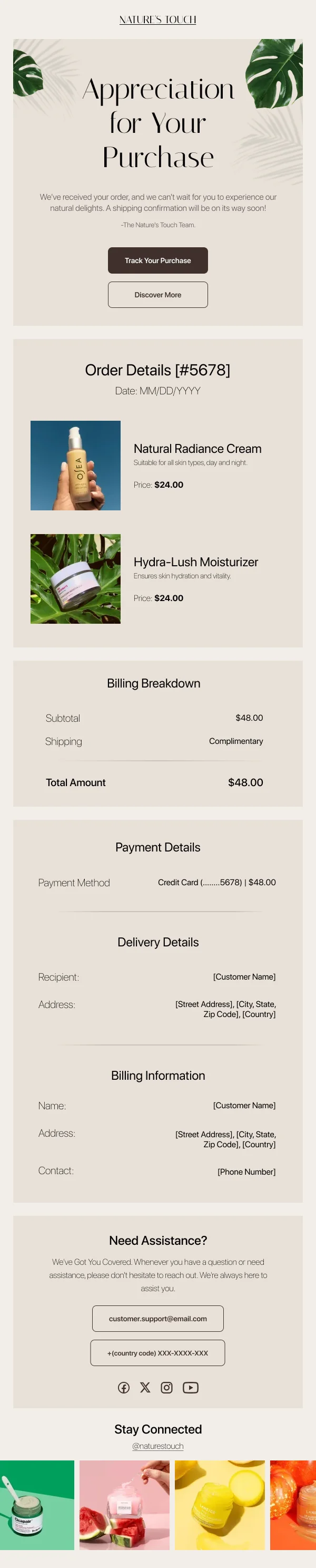
The 51 designs in this collection are shaped around answering the fit question
early.
Say who it is for
The most valuable block in a beauty email is often the plainest: a short, specific
statement of who the product suits. Dry and sensitive skin. Fine hair that goes
flat. Deeper skin tones with warm undertones.
Placing that near the top does two things. It gives the right reader a reason to
keep going, and it lets the wrong reader leave without a return. Both are wins,
which is not obvious until you look at return rates.
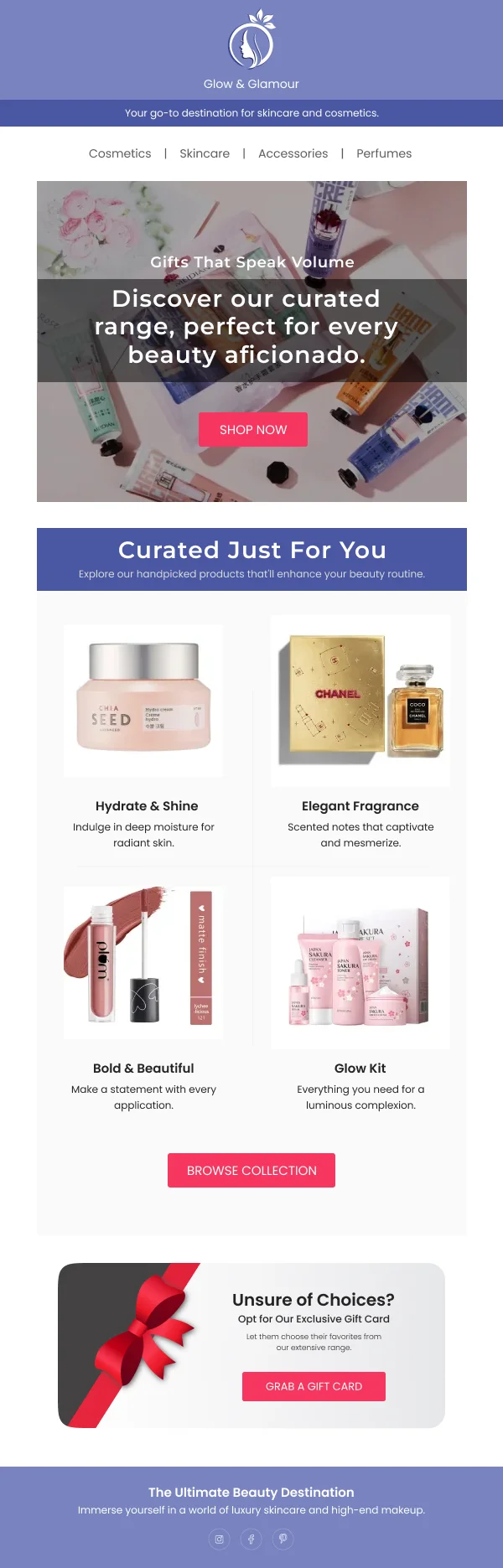
Product photography carries a specific load
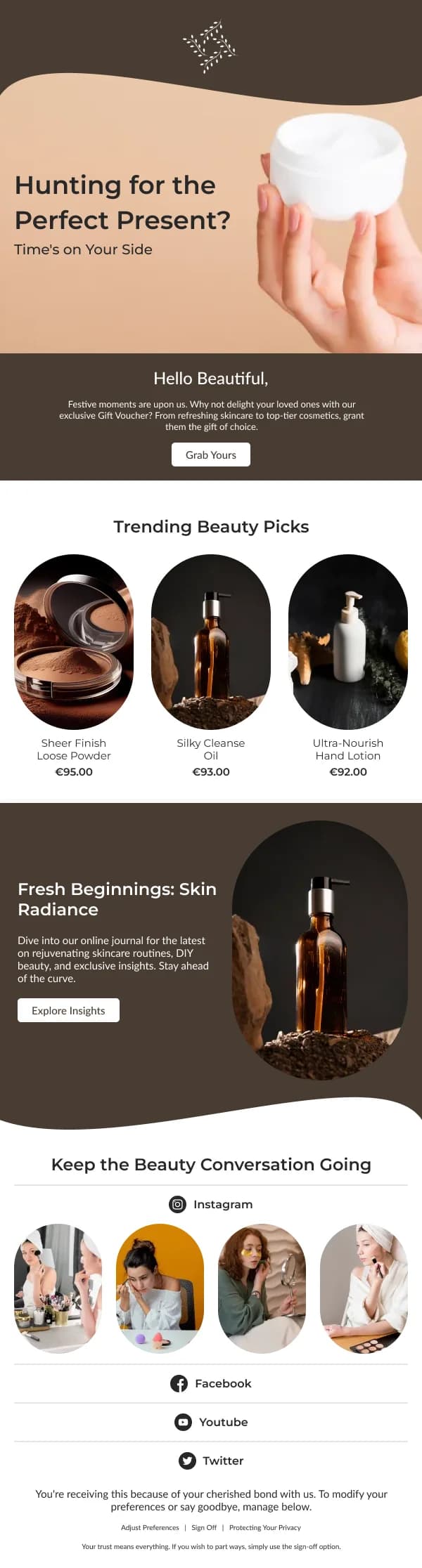
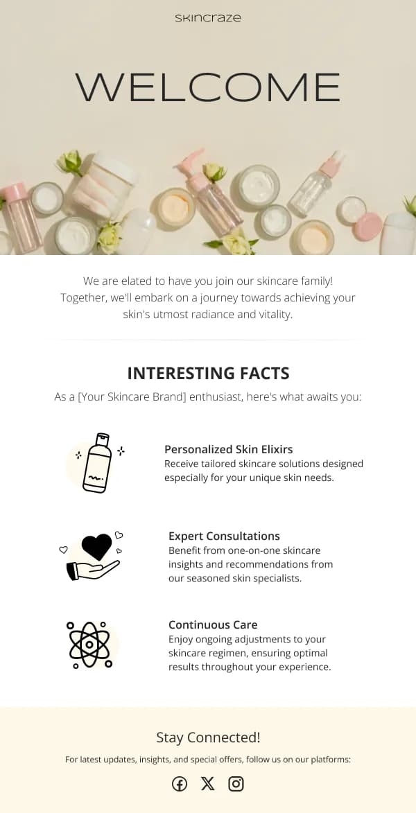
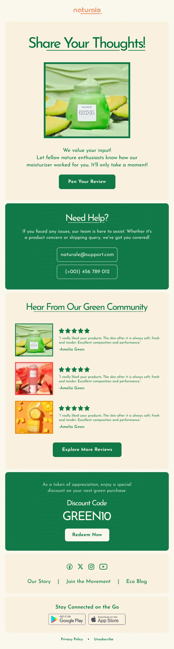
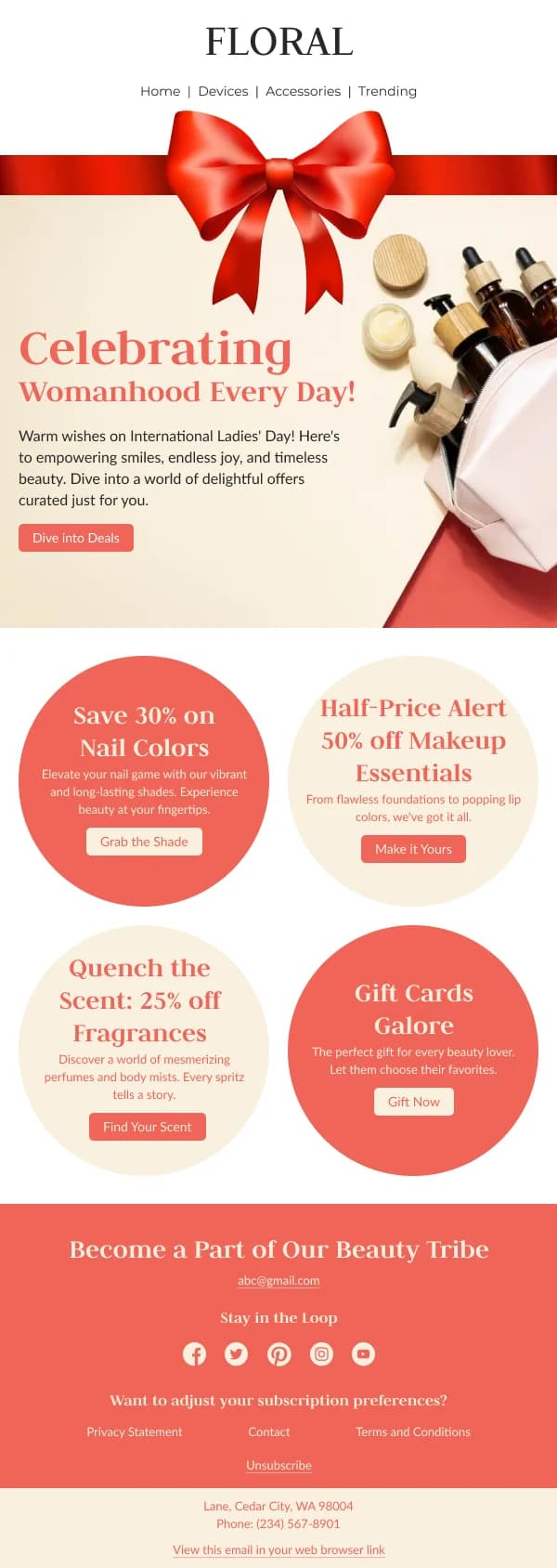
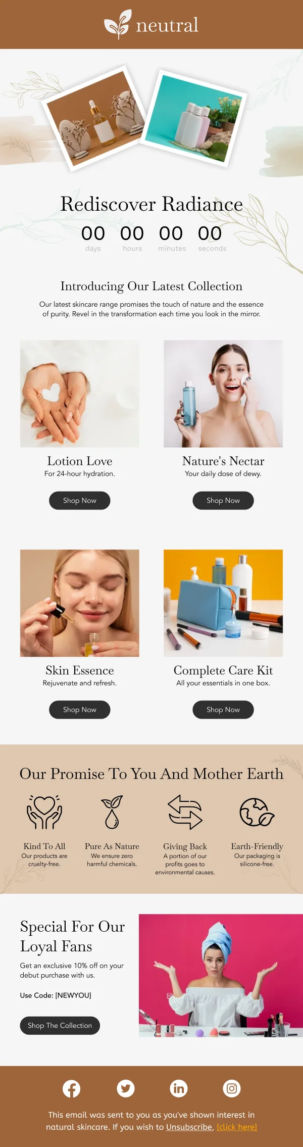
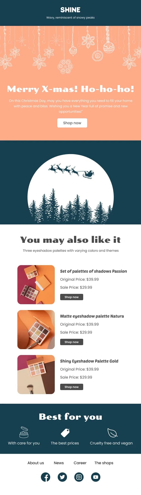
Beauty photography has to do more than look attractive; it has to communicate
texture, finish and colour accurately.
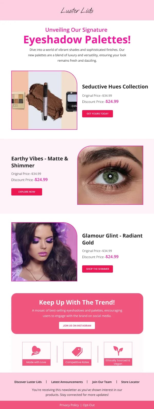
- Show the texture. A swatch, a smear, a drop. The packaging alone tells the
reader nothing about what the product is like to use.
- Keep colour honest. Heavily graded imagery that makes a shade look different
from reality is the most direct route to a return and a lost customer.
- Consistent lighting across a grid. In a category where the reader is
comparing colour, inconsistent lighting makes comparison impossible.
Shade and range design
Ranges are a real layout problem. What works in these templates:
- Swatches large enough to distinguish, in a grid, each labelled with its
name.
- Grouped by family — light, medium, deep, or warm and cool — rather than
presented as one long undifferentiated run.
- Never rely on colour alone. A reader with a colour-vision difference, or one
seeing the email on a poorly calibrated screen, needs the name too.
- A link to a fuller guide where the range is large, rather than trying to
render forty swatches in an email.
Routine and education content
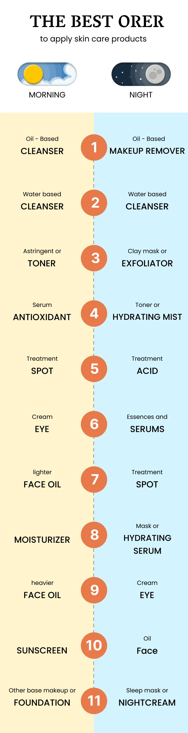
Beauty has a genuine educational dimension — order of application, frequency, what
not to combine — and it makes some of the most-read email in the category.
The design register for it is instructional:
- Numbered steps, one action each.
- One image per step, showing the step rather than the packaging.
- Times or frequencies where relevant: morning, evening, twice weekly.
- Warnings where they matter — actives that should not be layered, patch testing.
This is deliberately less atmospheric than a launch email, and that is correct.
A reader following instructions wants clarity.
Replenishment is the quiet engine
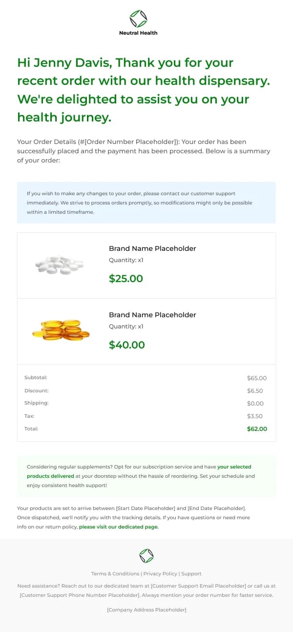
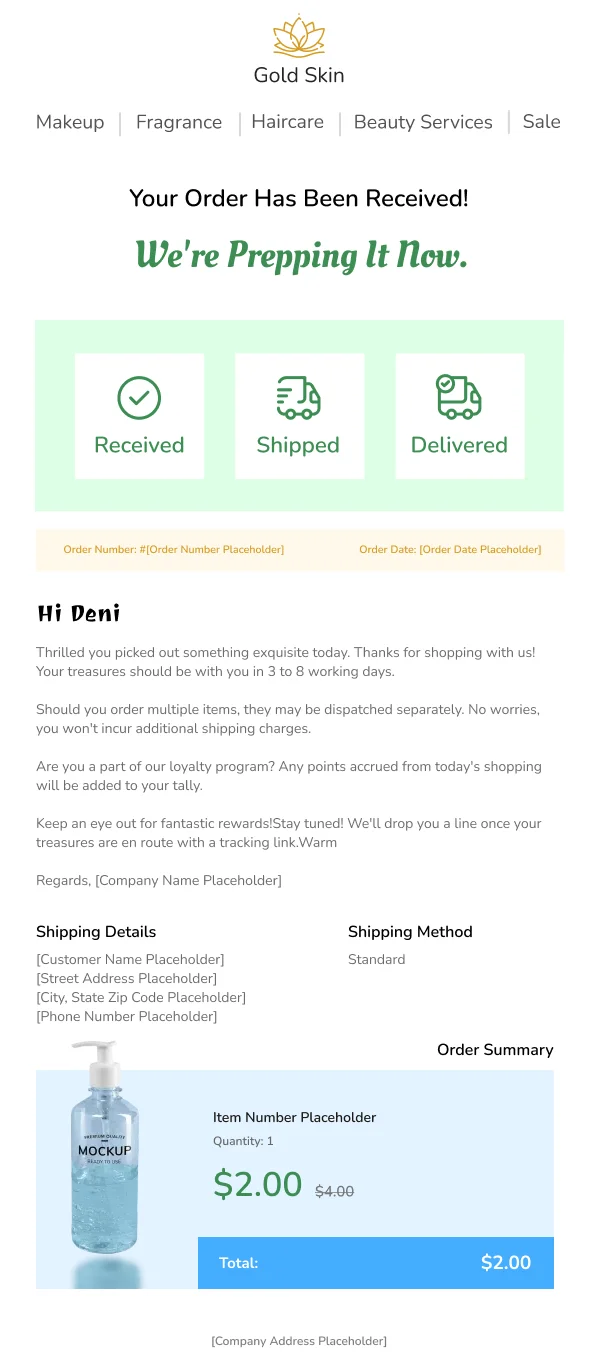
Beauty products run out on a fairly predictable schedule, which makes replenishment
reminders one of the highest-converting sends in the category and one of the
easiest to design:
- Name and show the exact product they bought.
- One line: roughly when they are likely to be running low.
- One button, straight to reorder.
The temptation is to add three alternatives and a discount. Resist it — a reader
who wants the same thing again is not looking to be sold something else.
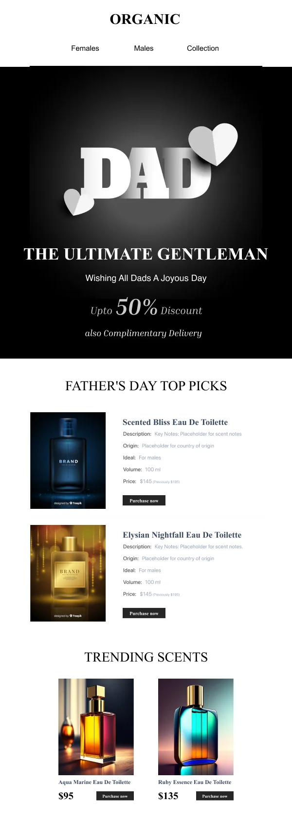
Sensitivity in gifting sends
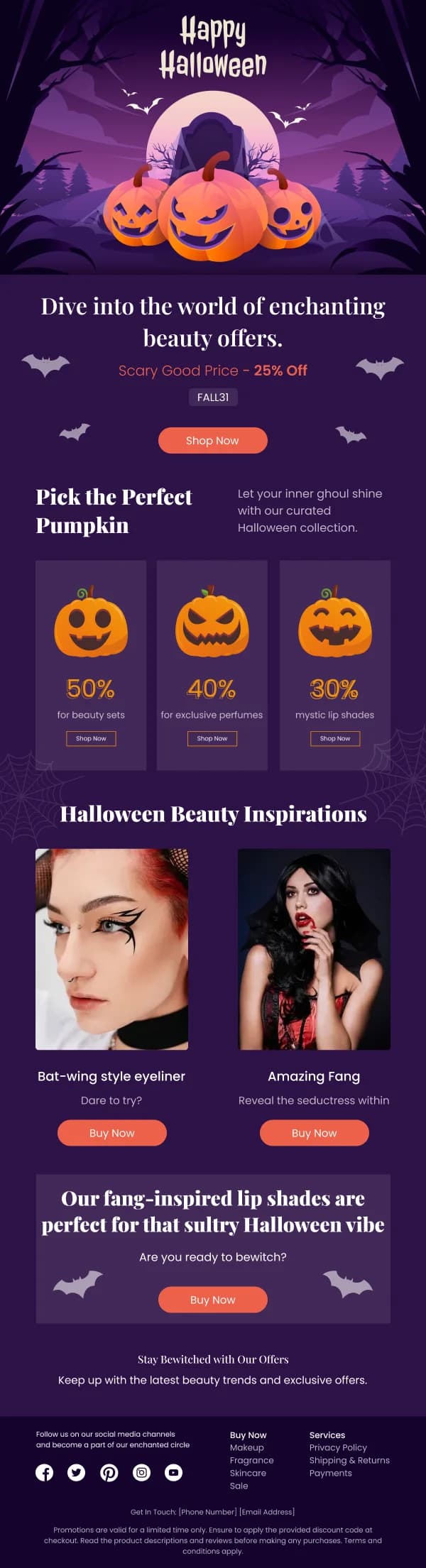
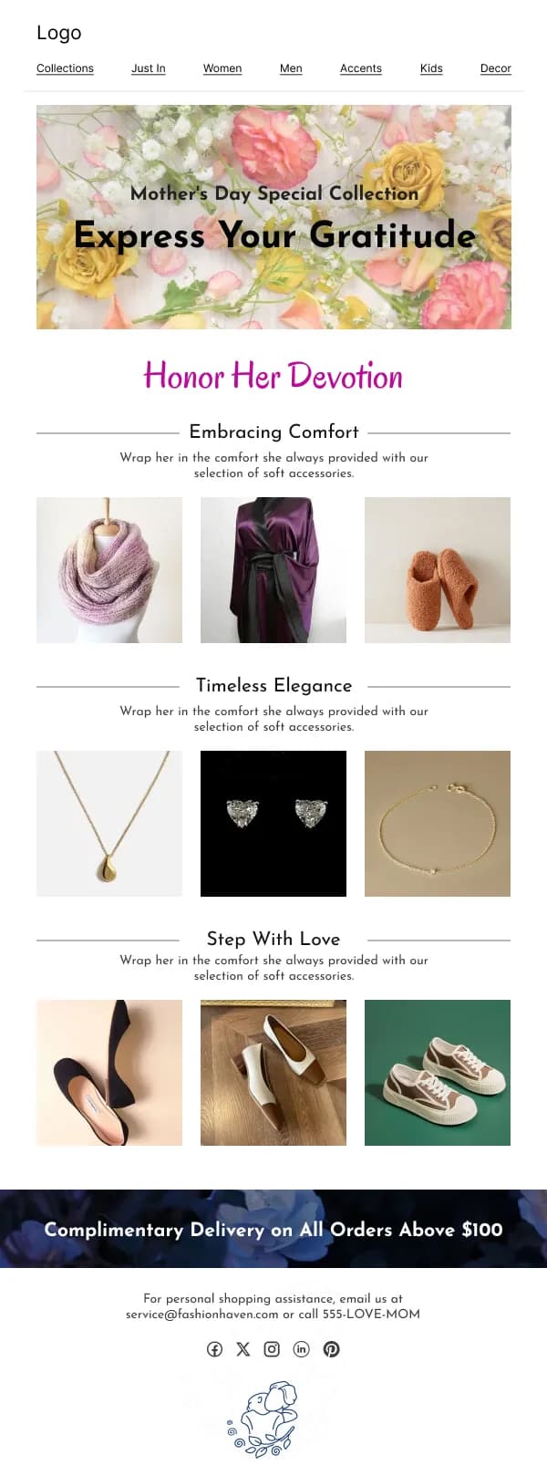
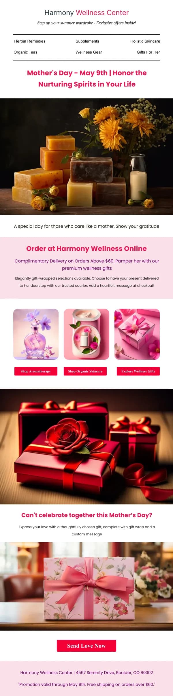
Mother's Day and Father's Day are significant moments for beauty retail and they
land badly for some readers. An opt-out line specifically for that campaign,
placed visibly in the email, is a small piece of design that readers genuinely
remember.
Using these templates
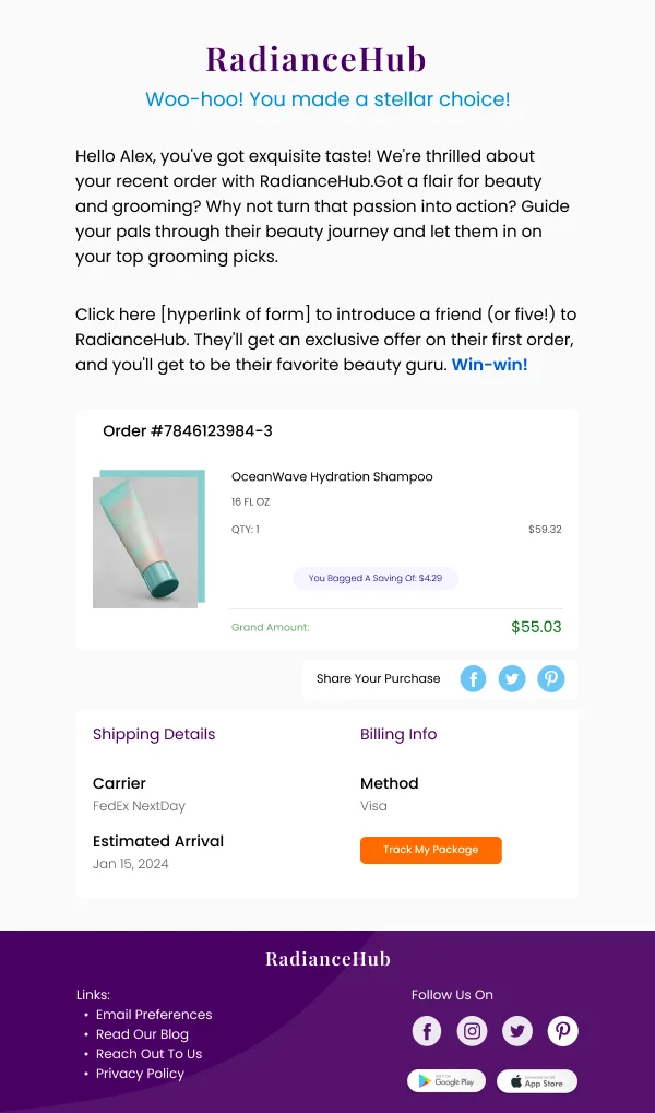
Swatch grids and routine steps are built as repeatable components, since both change every time you use them. The beauty-specific
checks before sending: is there a clear statement of who the product is for near
the top, are swatches large enough and labelled, is texture visible somewhere in
the imagery, and does the lighting stay consistent across any grid.
Common questions
- What makes beauty email different from general ecommerce?
- The purchase is conditional on personal fit — skin type, shade, hair texture, sensitivity — so an email that shows a product without helping the reader locate themselves in it converts poorly. The successful designs here spend real space on who a product is for.
- How do I show shade ranges in an email?
- As swatches with names, arranged in a grid, at a size where the differences are actually visible. Four tiny circles are worse than none, because they imply a range while hiding it. Where the range is large, show a representative spread and link to the full set.
- Do before-and-after images belong in email?
- They are persuasive and they carry risk. Regulatory expectations around cosmetic claims vary by market, and an unrealistic pairing damages trust more than it sells. Where used, keep the lighting consistent between the two frames — inconsistent lighting is the tell that makes readers dismiss the whole email.
- How should routine or how-to-use content be laid out?
- As numbered steps with one image each. Beauty routine content is instructional, and instructions want sequence and structure rather than atmosphere. This is one of the few places in the category where a plain layout beats a beautiful one.