Black Friday is the only week in the calendar where the constraint is not attention
but differentiation. Every sender is discounting, every subject line has a
percentage, and every email is red. The design problem is standing out in a set of
emails that all made the same choices.
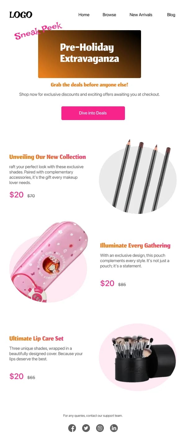
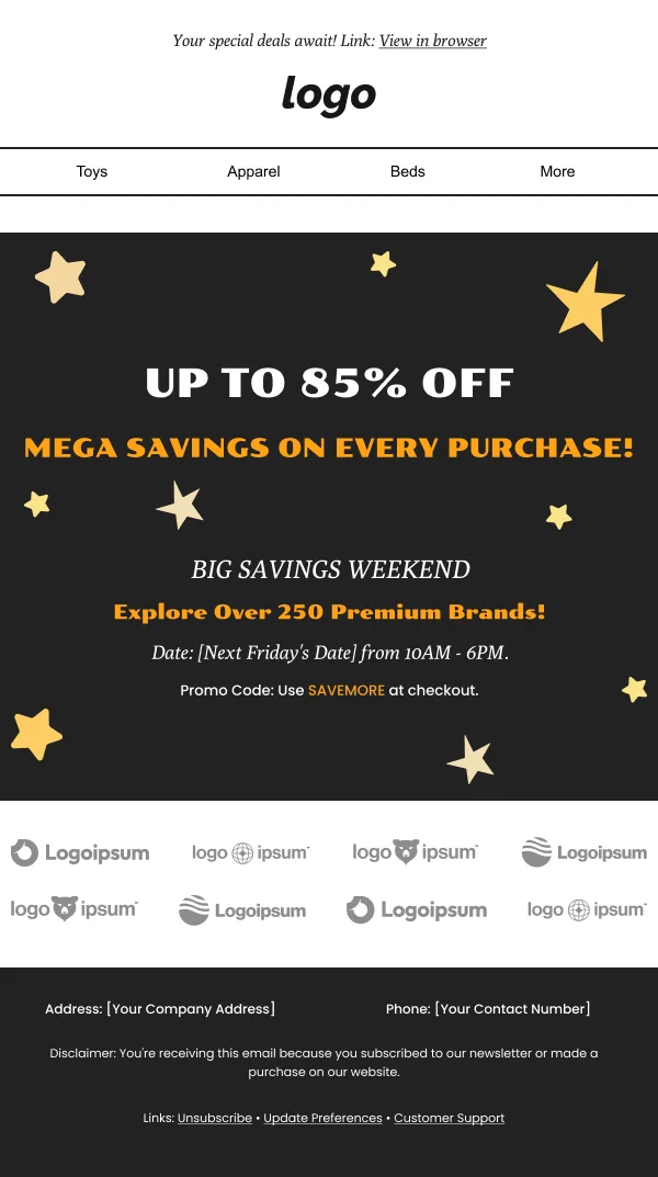
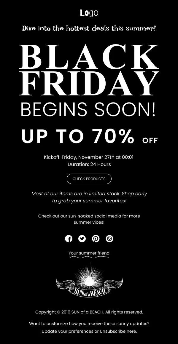
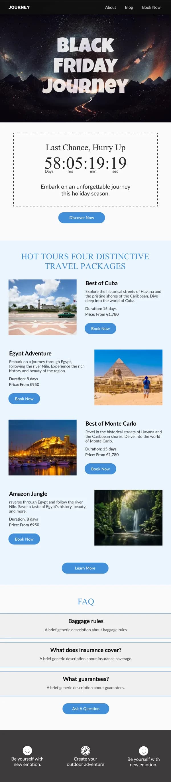
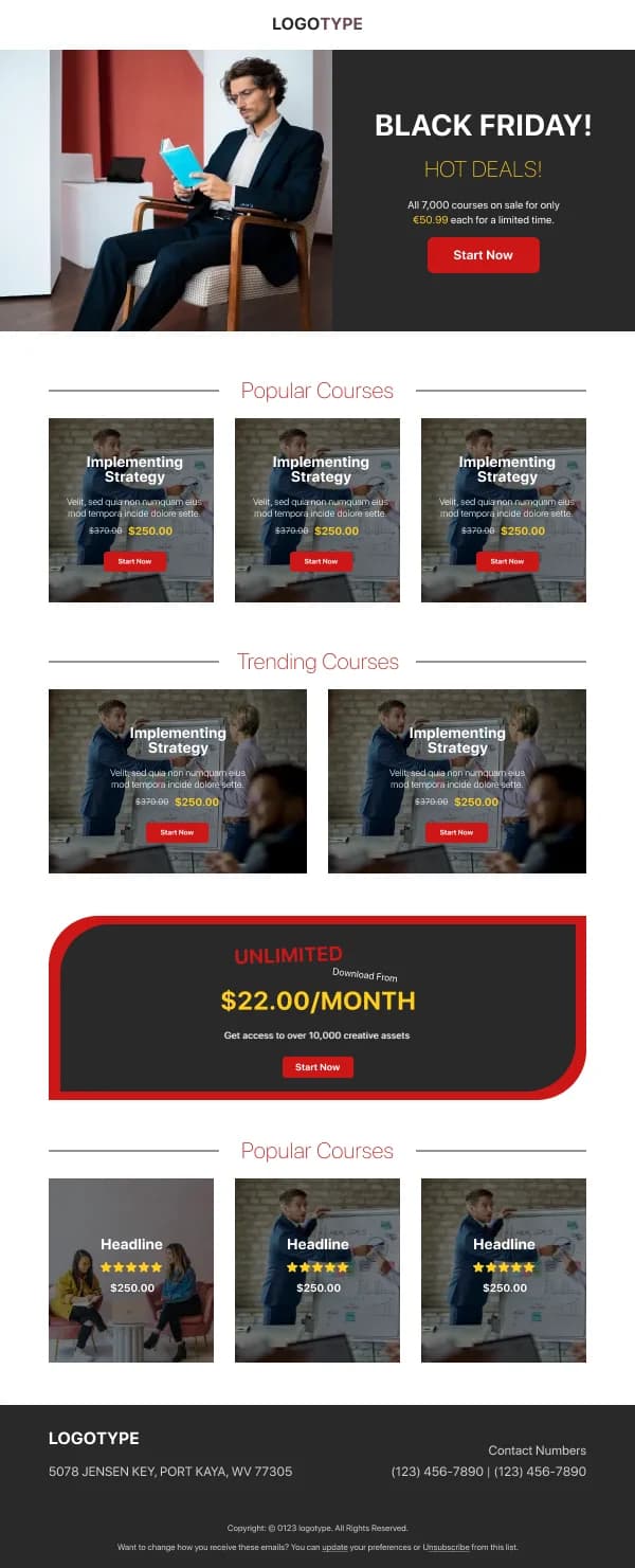
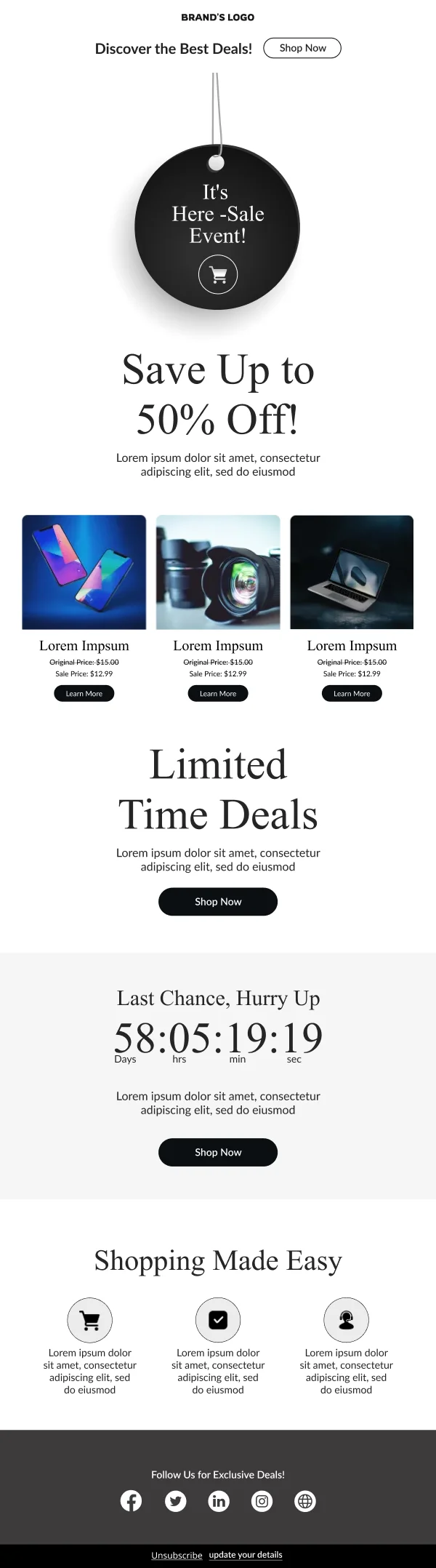
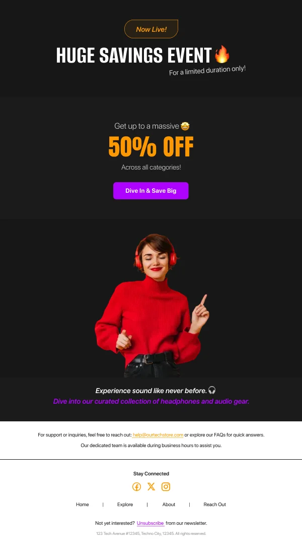
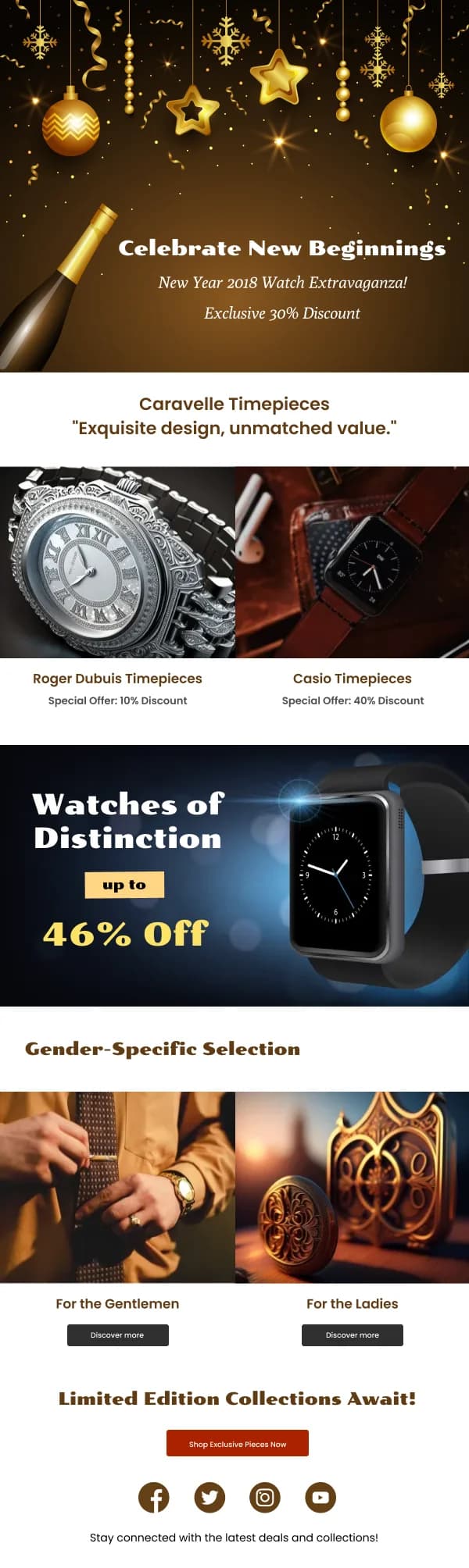
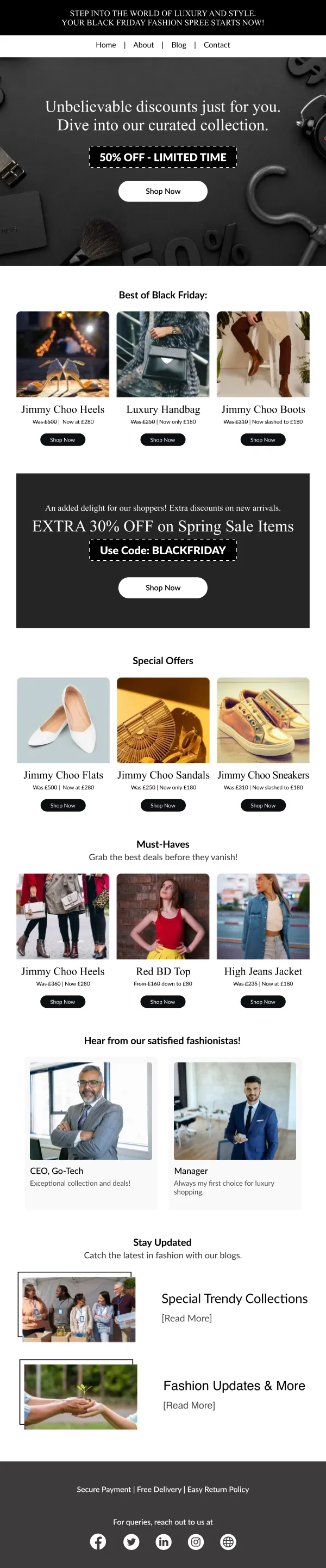
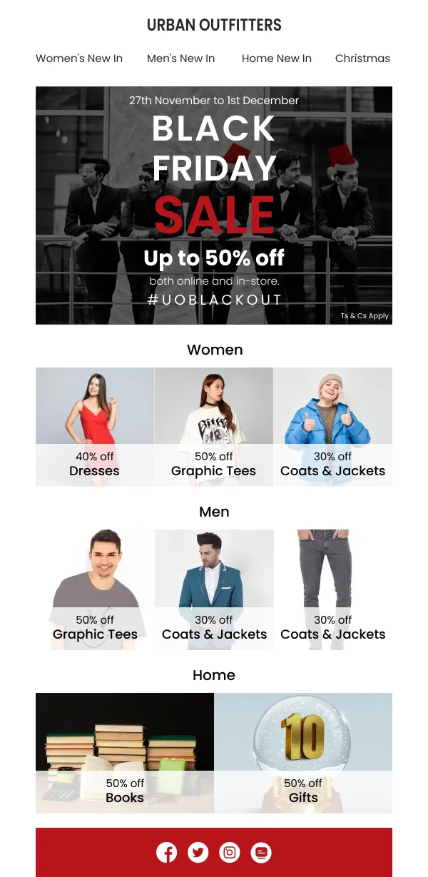
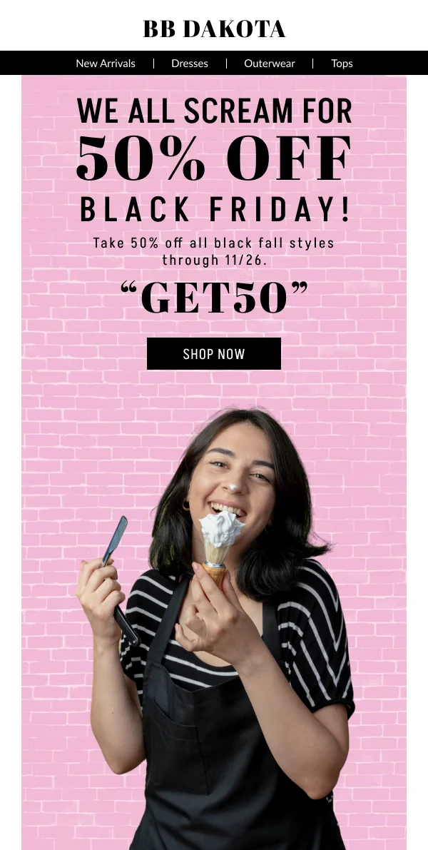
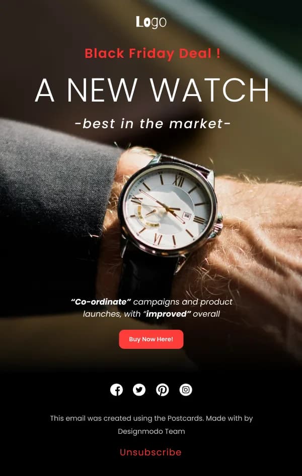
The 12 designs in this collection take clarity as the differentiator.
The offer, unambiguous
Four facts, at the top, in the first screen:
- The discount, with the number.
- The scope — everything, or which categories, and whether it excludes
full-price or sale items.
- The window, with dates and a closing time.
- The action.
Scope is the one most often fudged, and fudging it produces support volume and
returns during the busiest week of the year.
Calm reads as confident
The counterintuitive play, and the one most of these designs make: keep the brand's
normal type, spacing, button style and footer, and let the offer be prominent
through position and hierarchy rather than through volume.
In a scroll of shouting emails, the restrained one is the one that looks like a
business with a real product rather than a discount aggregator. It is also the one
that still looks like you in December.
Where the season claims your accent colour, move the button to a contrasting
neutral so the action does not disappear into the palette.
The sequence
Teaser, a few days ahead: something is coming, and when. Builds a small amount
of anticipation and warms the sending reputation before the volume spike.
Launch: the full offer, clearly, with the products.
Mid-window reminder: a different angle — a category, a bestseller list,
something selling out.
Final hours: consistently one of the highest-converting sends of the year. Lead
with the deadline, keep it short, one button.
Extension, if genuine. If it is not genuine, skip it — readers notice a
permanent last chance.
Deadlines and cut-offs
Two separate dates matter in this window and both need designing: when the offer
ends, and when the shipping cut-off for delivery falls. Confusing them, or omitting
the second, generates the most predictable complaint of the season.
Sending volume
A large spike in volume during the busiest email week of the year is where
deliverability problems surface. Warming up with the teaser and keeping the list
clean beforehand does more for inbox placement than anything in the design — worth
noting because an email that lands in spam has no design at all.
Using these templates
Built to be adapted in an afternoon, because the sending window for this weekend does not wait for design revisions. Checks: is the discount and
its scope legible in the first screen on mobile, is the end time stated with a
date, is the button distinguishable from the seasonal palette, and is the shipping
cut-off present where relevant.