The Black Friday and Festive Email Design Playbook
The full seasonal sequence from teaser to final hours, why calm designs beat loud ones in a crowded inbox, and how to handle cut-offs.
For roughly six weeks a year, email design operates under a different constraint. Attention is not the problem — everyone opens their inbox. Differentiation is, because every sender is discounting, every subject line has a percentage in it, and every hero is red.
This is the sequence that works and the design decisions that separate a brand from a discount aggregator.
The counterintuitive part: be calmer
The instinct in a crowded inbox is to be louder. It fails, because loudness has stopped being a differentiator — everyone has it.
Scroll a Black Friday inbox and the emails that read as real businesses are the ones that kept their own typography, their own spacing and their own footer, and put a clear offer at the top. The ones that replaced their entire visual language with starbursts and 90px red numerals are indistinguishable from each other.
There is a second reason beyond differentiation. The brand recognition you built over eleven months is an asset, and a completely transformed email spends it. A reader who cannot tell the email is from you has to evaluate it as a stranger's offer.
The offer, unambiguous
Four facts in the first screen:
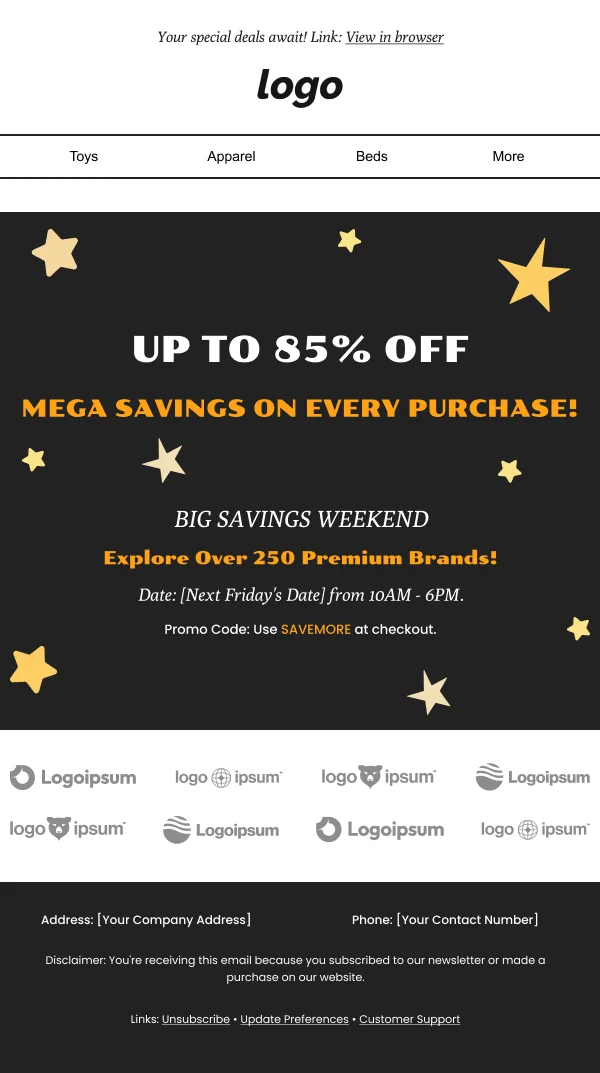
- The discount, with the number. Not "our biggest sale ever."
- The scope — everything, or which categories, and whether full-price-only or sale items are excluded.
- The window, with dates and a closing time.
- The action.
Scope is the one most often fudged and it is the one that generates support volume and returns during your busiest week. "30% off everything" and "up to 30% off selected lines" are very different promises and readers can tell which one you are being vague about.
The sequence
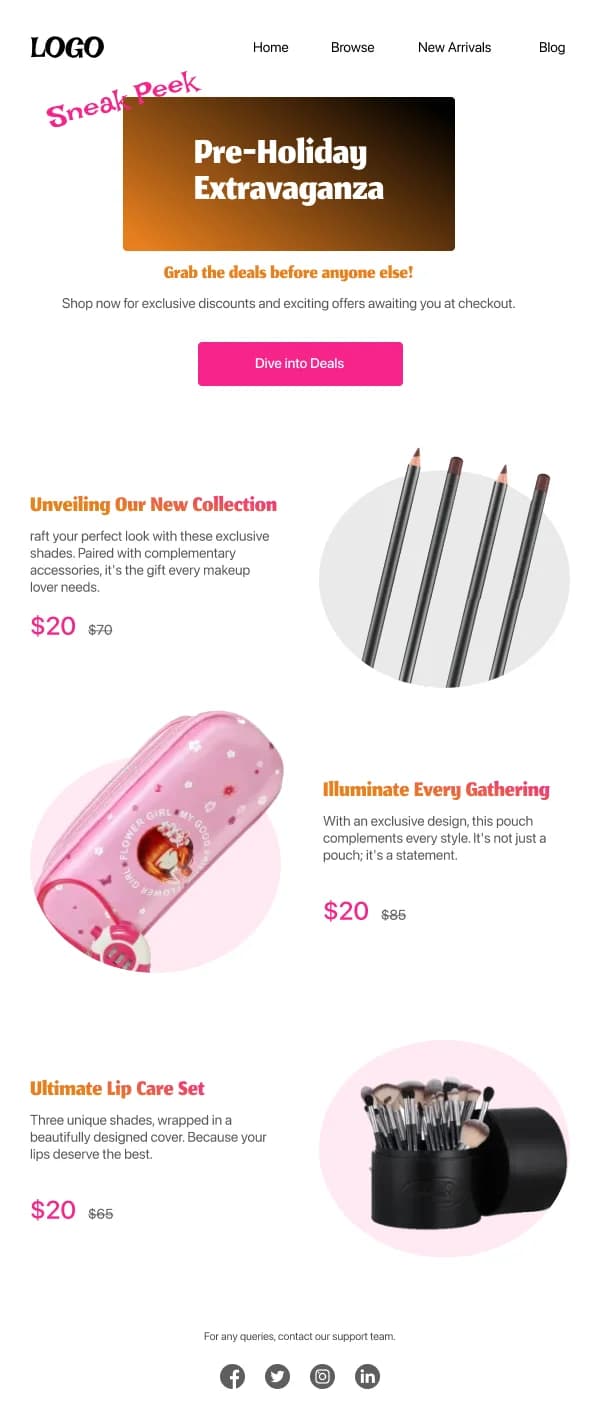
Teaser — 2 to 4 days before. Something is coming, and when. One image, one line, a date. It builds a small amount of anticipation, and it warms your sending volume before the spike, which matters for deliverability.
Launch — day one. The full offer, clearly, with the products. This is the most designed email of the set.
Mid-window reminder. A different angle, not a repeat: a category focus, a bestseller list, what is selling out. Resending the launch with a new subject line is what readers ignore.
Final hours. Consistently one of the highest-converting emails of the entire year. Lead with the deadline, keep it very short, one button. This send routinely outperforms the launch, and it is the one most often skipped.
Extension — only if genuine. If the offer really was extended, say so and say why. If it was always going to run longer, do not pretend otherwise; readers notice a permanent last chance and it devalues every future deadline you set.
Cyber Monday needs a different angle
By Monday the reader has seen four days of discount email including yours. Fatigue, not attention, is the problem.
What works: a narrower focus (one category, one collection), a genuinely different mechanic (a bundle, free shipping, a deeper discount on a smaller range), or honest final-chance framing. And speak to the specific reader still shopping on Monday — they did not find what they wanted on Friday, which is useful information.
Keep visual continuity with the Friday send so the two read as one event, and change the hero and headline.
Two deadlines, both needing design
Seasonal commerce runs on two dates and confusing them produces the most predictable complaint of the year:
The offer deadline. When the discount ends.
The shipping cut-off. The last day to order for delivery by the holiday.
For Christmas particularly, the shipping cut-off decides more purchases than the discount does. Give it its own block, state the date with the month in words, and repeat it near the button. Plan a reminder a week out, one two days out, and a final-day send — the last of these is frequently the highest-converting email of the season.
After the cut-off passes, switch to gift cards and digital options rather than going quiet. Readers still shopping on the 22nd are highly motivated and most brands have stopped talking to them.
Palette and the button problem
Seasonal palettes create a specific, avoidable failure: the season claims your action colour.
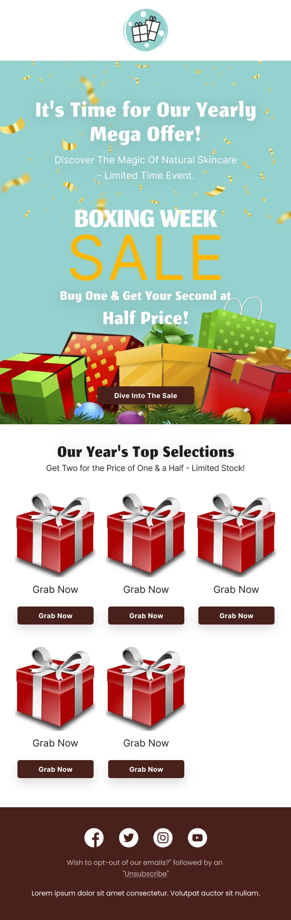
A red button on a red-accented Christmas email disappears. An orange button on a Halloween email disappears. When the palette takes your accent, move the button to a contrasting neutral — a dark charcoal, a cream, a white — so the action remains findable.
The other recurring failure is contrast. Gold on cream, white on pale pink, gold on maroon, and orange on black are all seasonal signatures and all frequently below a readable ratio at body sizes. The headline usually survives; the body copy often does not. Check it with a tool.
Gift guides are navigation, not catalogues
A gift guide serves someone who knows the occasion but not the gift. That makes it a wayfinding problem, and the organising principle is what makes it work:
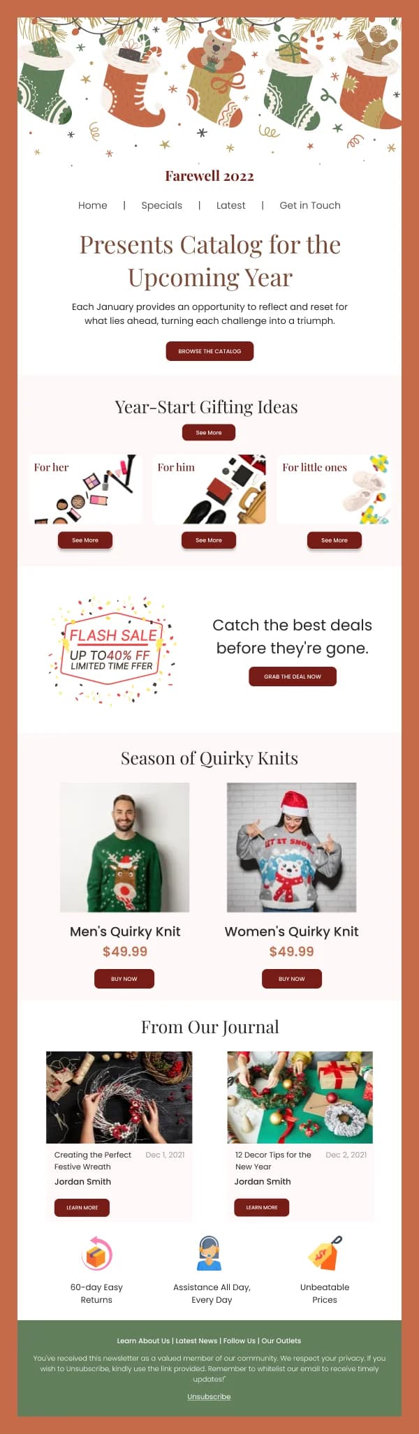
- By recipient — for her, for him, for children, for the host, for the colleague.
- By price band — under £25, under £50. Genuinely the most useful cut and consistently the least used.
- By interest — for the cook, the reader, the runner.
Three to five clearly labelled routes, two or three products each, and a link to more. A twenty-product grid under a festive header is a catalogue page in an email.
Deliverability during the spike
Worth stating because it makes every design decision irrelevant if it goes wrong: a large volume increase during the busiest email month of the year is when placement problems surface.
- Warm up with the teaser rather than jumping straight to full volume.
- Clean the list beforehand. Sending to long-dormant addresses during a high scrutiny period is the fastest route to the spam folder.
- Segment the final sends to engaged readers. Complaint rates matter more in this window than reach.
An email in a spam folder has no design at all.
Build the variants, not new emails
The seasonal sending window is narrow and every competitor occupies it, so the design work has to be finished before it opens.
That argues strongly for building seasonal treatments as variants on your existing template: palette as Figma variable modes, one motif layer, one hero frame to swap. A recolour then takes minutes rather than an afternoon, and the December email still looks like the September one.
After the season
The two weeks following the seasonal window decide how much of the acquisition holds.
Most senders acquire a large number of first-time buyers during a sale and then treat them identically to their long-standing list in January. A first purchase made at 30% off is weak evidence of loyalty, and the follow-up has to earn the second purchase rather than assume it.
What works: a genuine post-purchase sequence for the seasonal cohort — delivery, care or setup information, and a reason to return that is not another discount. What does not work is dropping them straight into the January clearance send, which teaches the entire cohort that your prices are negotiable and that waiting is rational.
This is a programme decision rather than a design one, but it is worth planning alongside the seasonal designs, because the templates for it need to exist before the season ends.
Sequence checklist
- Teaser sent, volume warmed
- Discount, scope, window and action in the first screen
- Button colour distinguishable from the seasonal accent
- Body contrast checked against the seasonal palette
- Shipping cut-off treated as a prominent element with its own block
- Mid-window send has a genuinely different angle
- Final-hours send written and scheduled
- Gift guide organised by recipient or price band
- Post-cut-off gift card send prepared
- Extension only if real
Starting points
The Black Friday, Cyber Monday, Christmas and festive collections cover this sequence, built as palette-and-hero variants on stable frames. For the discount mechanics specifically, see the discounts and coupons collection.