An ecommerce email programme is not a series of campaigns. It is a set of
responses to things a customer has done or not done — browsed and left, bought
and waited, lapsed and gone quiet. Designing for it means designing for a known
context, which is a considerable advantage over generic marketing email.
The 127 designs in this collection are organised around that idea: each one
assumes a specific thing just happened.
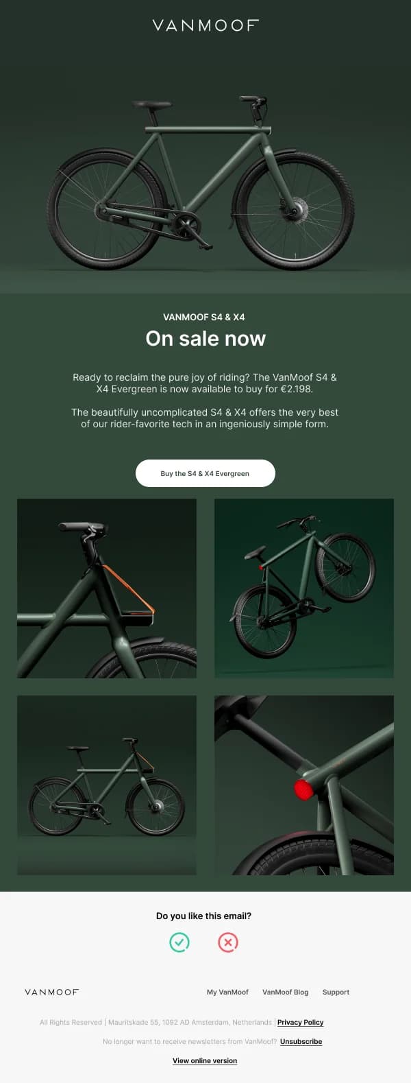
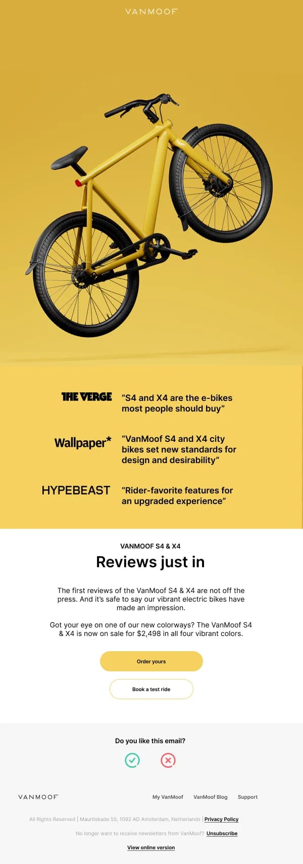
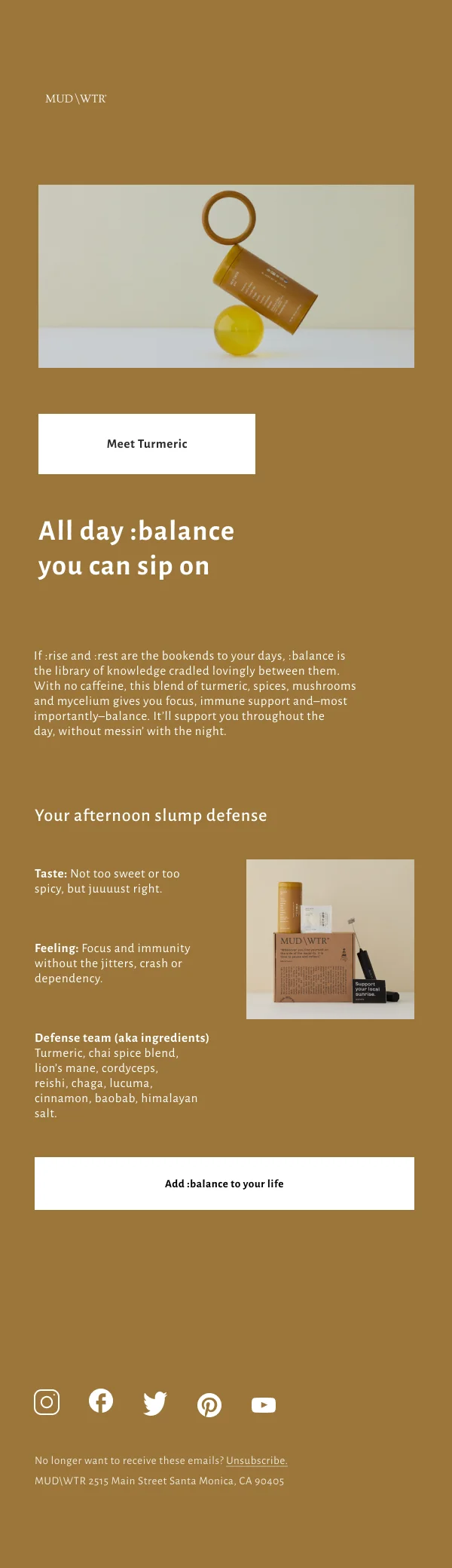
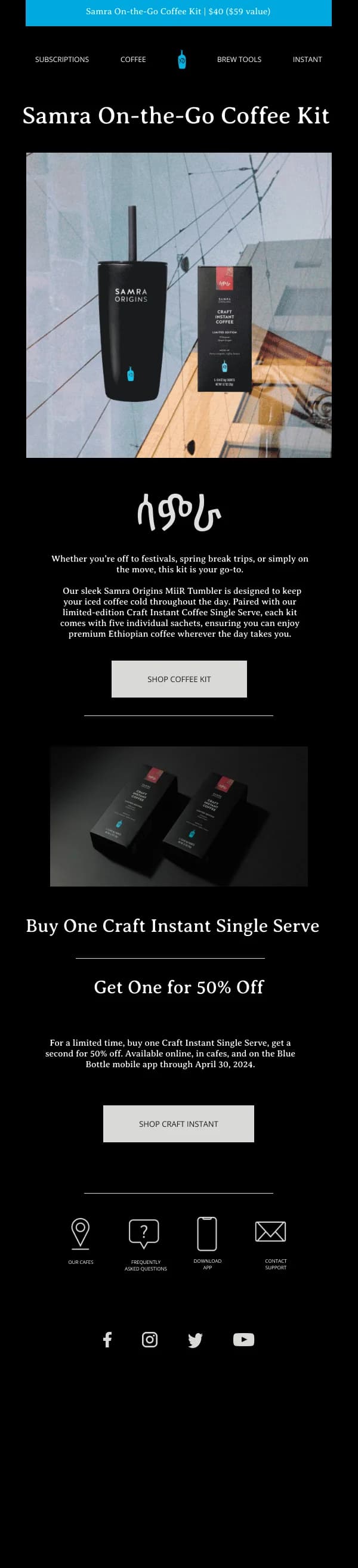
The product image is the design
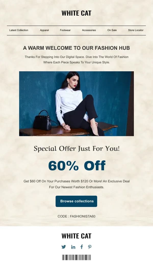
In most ecommerce email, the photography is doing the persuading and the layout's
job is to present it without interference. This inverts the usual advice about
visual hierarchy — here the image legitimately outranks the headline, because the
reader is evaluating an object.
What that means in practice:
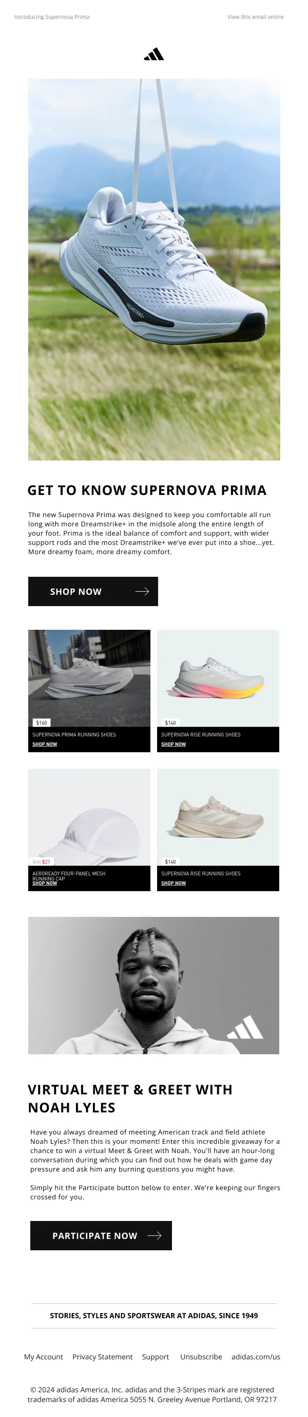
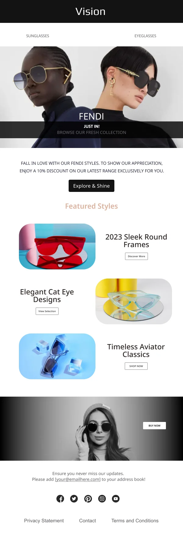
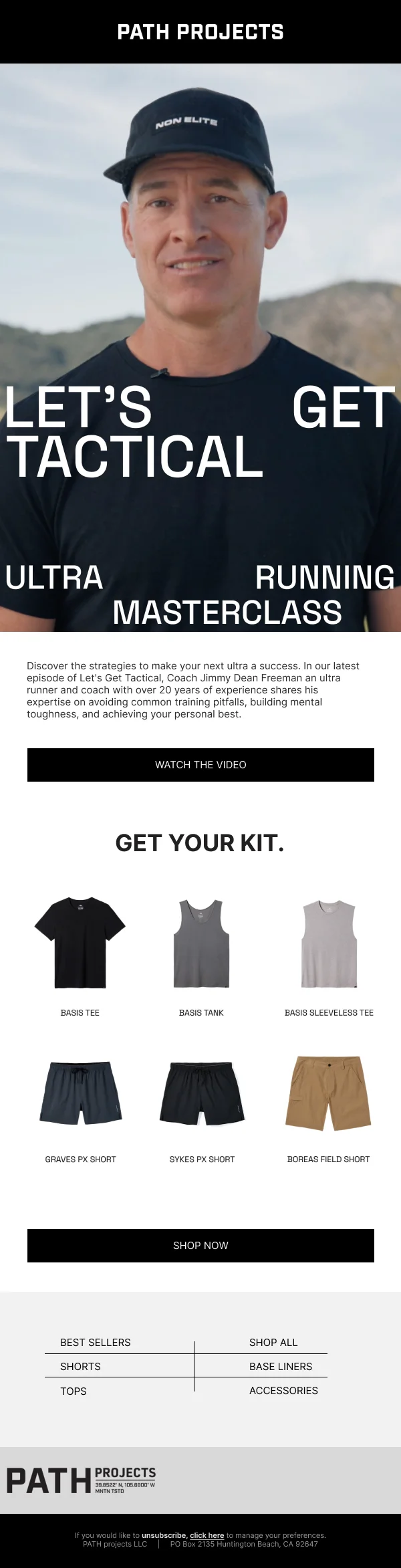
- Give the product real space. A cramped product shot with copy crowding it
reads as cheap regardless of how good the photo is.
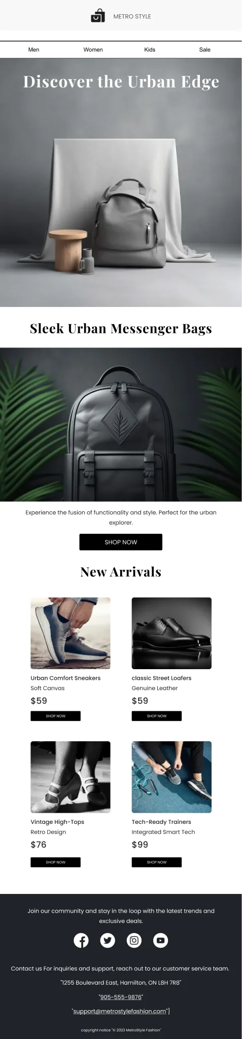
- Crop consistently across a grid. Mixed crops — one product shot on white,
one lifestyle, one at a different zoom — make a curated grid look like a
scrape. This is the single most common flaw in ecommerce grids.
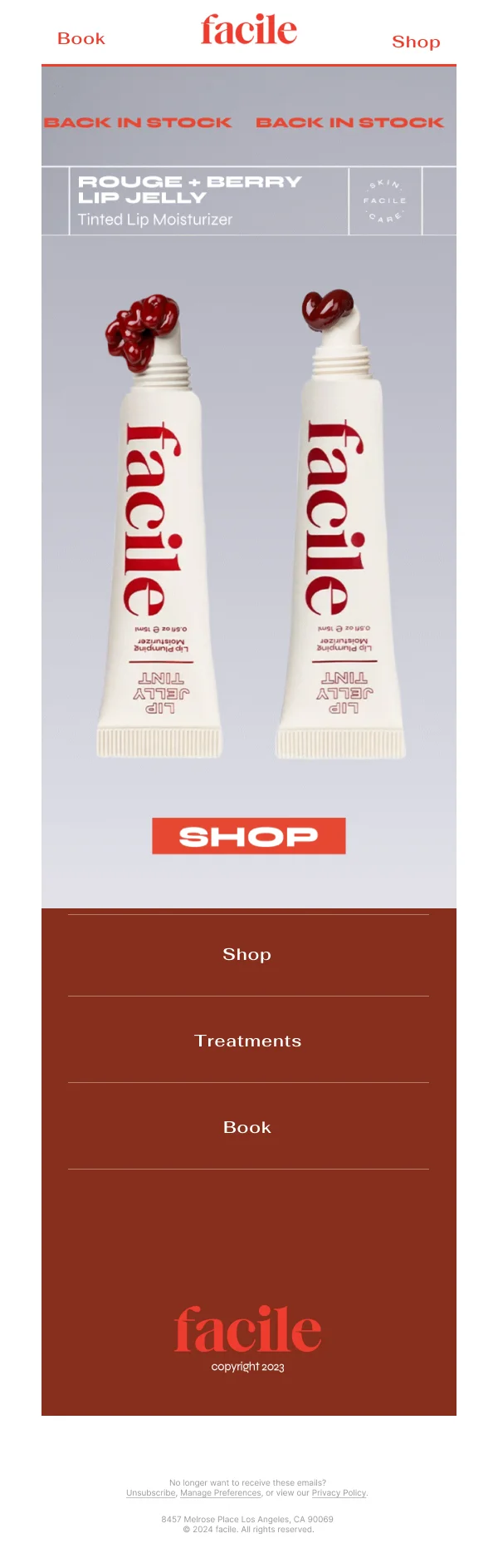
- Do not put text on the product image unless it is genuinely part of the
composition. It breaks when images are blocked, and it usually looks worse at
mobile width than it did in the Figma frame.
Design the price, not just the number
Price is a design element and it carries a lot of weight. A few things that
consistently matter:
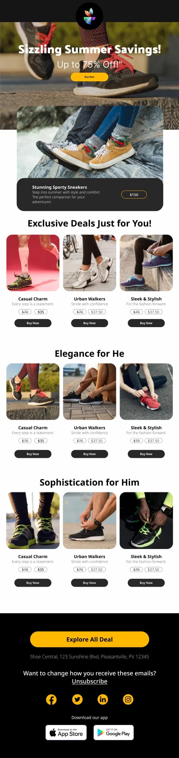
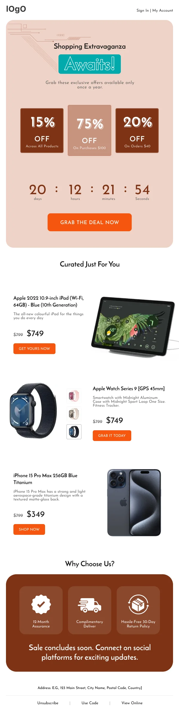
- A struck-through original next to a sale price works, but only when both
are legible. Tiny grey strikethrough text next to a large red number reads as
a trick even when the discount is real.
- Alignment matters in grids. Prices that sit at different vertical
positions across a row, because product names wrap to different line counts,
make the whole grid feel unfinished. Fix the name block to a consistent height.
- Currency and tax context belong near the price, not in the footer, for
anything sold across borders.
The transactional sends are the underrated ones
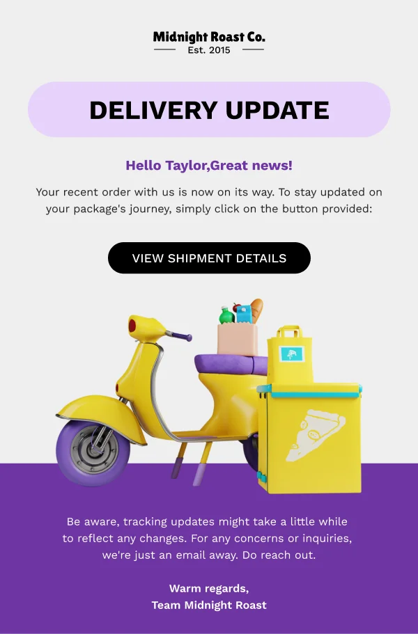
Order confirmations, shipping notices and delivery updates get opened at rates
marketing email cannot approach, because the customer is waiting for them. The
designs in this collection treat them as real design work:
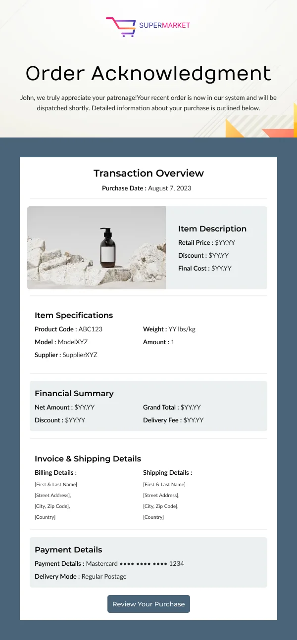
- Lead with the thing the reader opened for. For a confirmation, that is
"your order is placed" plus the order number. For a shipping notice, it is the
tracking link and the date. Put it above everything else, including the logo
bar if necessary.
- Then, and only then, add something useful. A related product, a care guide,
a referral offer. This is the highest-attention moment a store gets — but the
cross-sell goes below the information the reader came for, never above it.
- Keep the order summary scannable. Item, quantity, price, total, address.
A customer checking a confirmation is verifying, not reading.
Winning back a lapsed browse
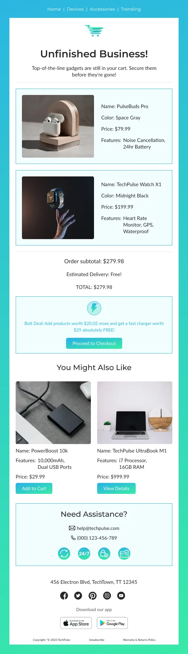
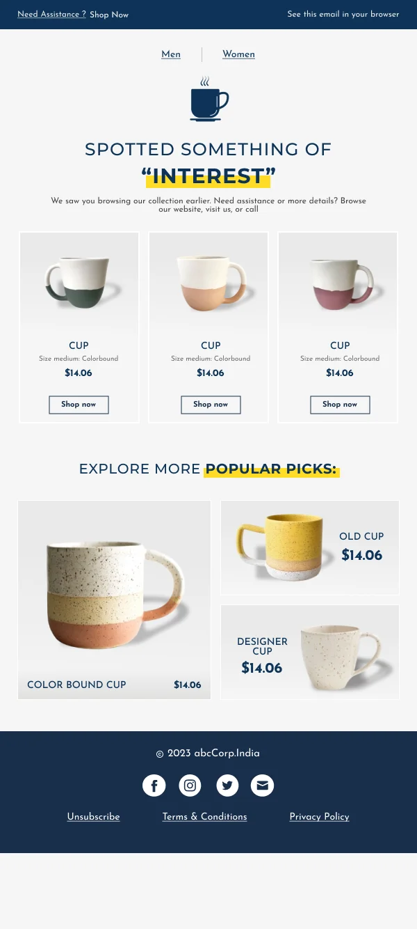
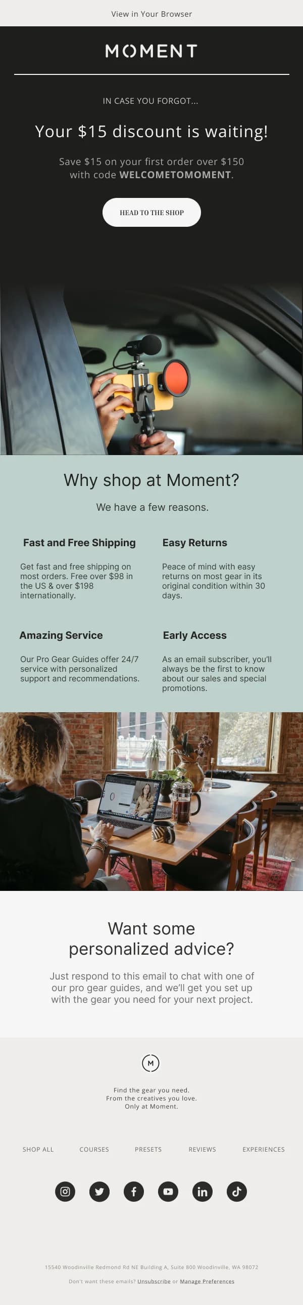
Abandoned cart and abandoned browse designs share one discipline: show the actual
thing. The reader's interest is already established; the email's only job is to
remove the friction between that interest and the checkout.
The strongest versions in this collection do four things and stop:
- Name the item and show it at a decent size.
- Show the price, unchanged.
- One button, going back to the cart rather than the homepage.
- A single line of reassurance — returns, shipping, stock.
Discount-led cart recovery works, but it trains a segment of your customers to
abandon deliberately. The designs here put the discount variant in a separate
frame so it is a considered choice rather than the default.
Grids that survive the collapse
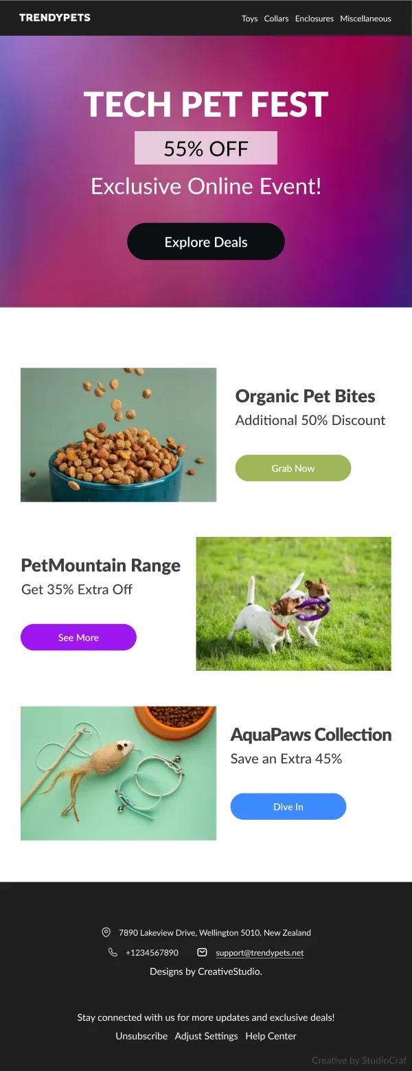
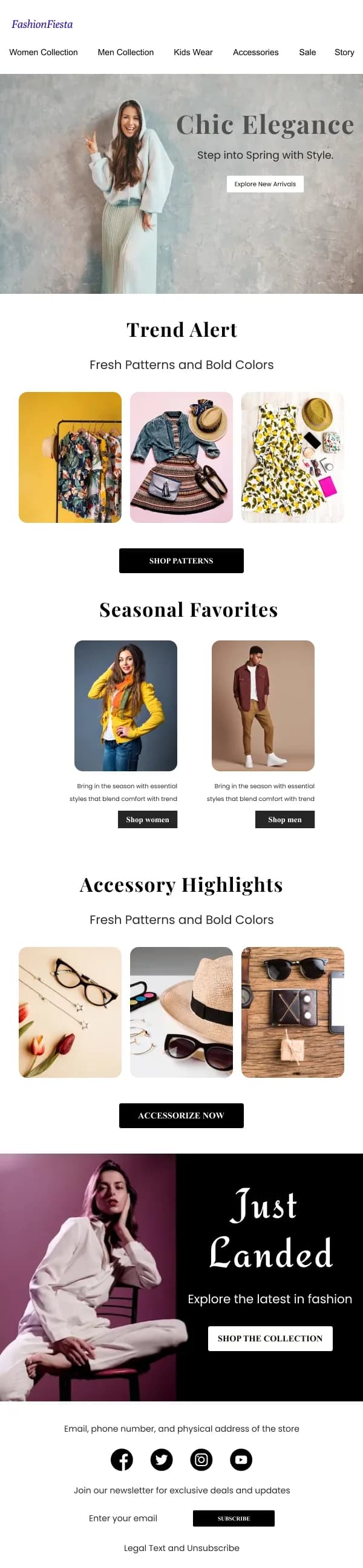
Ecommerce email loves a three- or four-across product grid, and the single-column
collapse is where those grids fall apart. A four-across row of products becomes a
four-deep stack on a phone — four full-height product cards before the reader
reaches anything else, which is usually three too many.
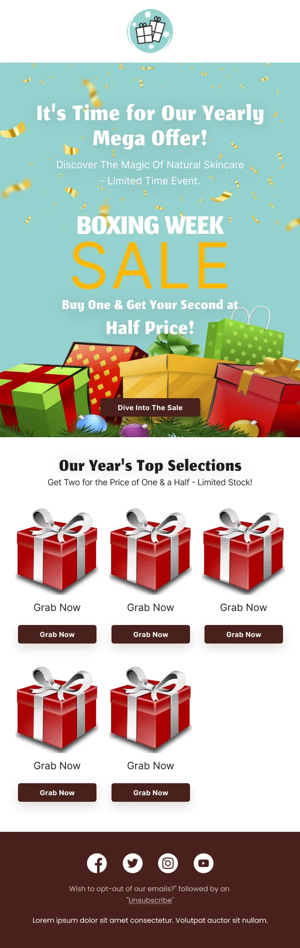
The templates here handle it in one of two ways: either the grid collapses to two
columns rather than one on mobile (viable for simple product cards with short
names), or the mobile frame shows fewer products than the desktop frame. Both are
better than a stack that takes six swipes to clear.
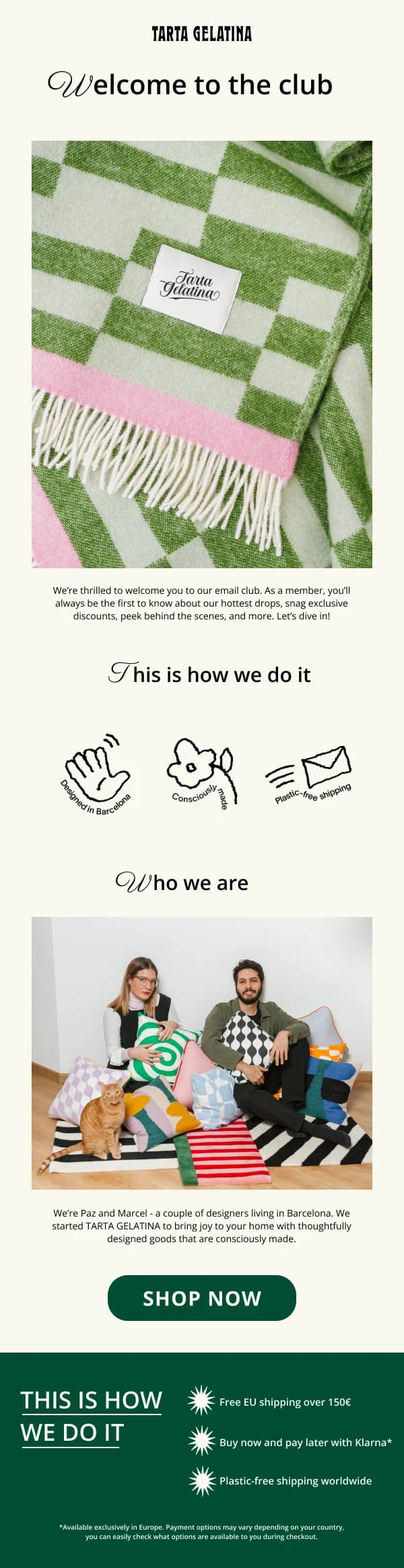
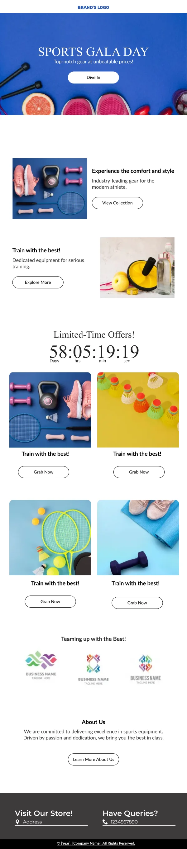
Seasonality without a redesign
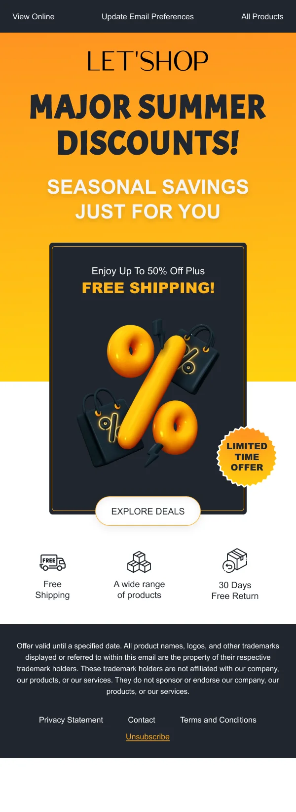
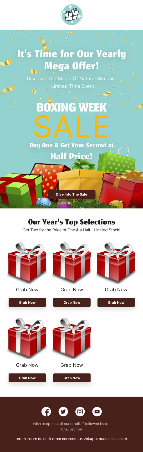
Ecommerce runs on a calendar, and the temptation is to rebuild the template for
every moment. A better structure — and the one most of these designs use — is a
stable frame with a variable band: consistent header, footer, product-card
treatment and button style, with one hero area and one accent colour that change
per season.
That is faster to produce, and it means a customer who sees your Black Friday
email and your January email recognises both as you.
Using these templates
Product grids are built on a fixed card height, which is what keeps prices aligned when names wrap to two lines. When adapting one, the checks that matter most for ecommerce are: are the
crops consistent across the grid, do the prices align, is the primary button
reachable without scrolling, and does the mobile frame avoid a stack that runs
longer than three products.
For a breakdown of specific designs in this collection and why they work, see
20 ecommerce email design examples. For
cart recovery specifically, the
abandoned cart guide goes deeper on
structure and timing.
Common questions
- How many products should one email show?
- Fewer than feels natural. A single hero product with one clear action consistently outperforms a grid of nine, because a grid asks the reader to choose while a hero asks them to decide. Grids earn their place when the reader has already told you what they like — a restock, a category they browsed, a wishlist.
- Should prices be in the email?
- Usually yes, for anything framed as an offer. Withholding price to force a click reads as a trick, and it costs you the readers who would have bought at that price and now will not find out. The exception is genuinely variable pricing, where a starting-from figure is more honest than a single number.
- What makes an abandoned cart email work?
- Showing the actual item, at the actual price, with one button back to the cart. The design problem is restraint — the temptation is to add urgency, a discount, alternative products and social proof to the same email. Every addition dilutes the one thing the reader already wanted.
- Do transactional ecommerce emails need design?
- They deserve it more than marketing emails do, because they get opened. An order confirmation is the most reliably read email a store sends; treating it as a receipt wastes the one moment a customer is actively pleased to hear from you.