Transactional email is the only category where the reader is actively waiting.
That inverts the usual problem: attention is guaranteed, so the design's job is
to deliver information cleanly rather than to earn a look.
The 27 designs in this collection are built for verification rather than
persuasion.
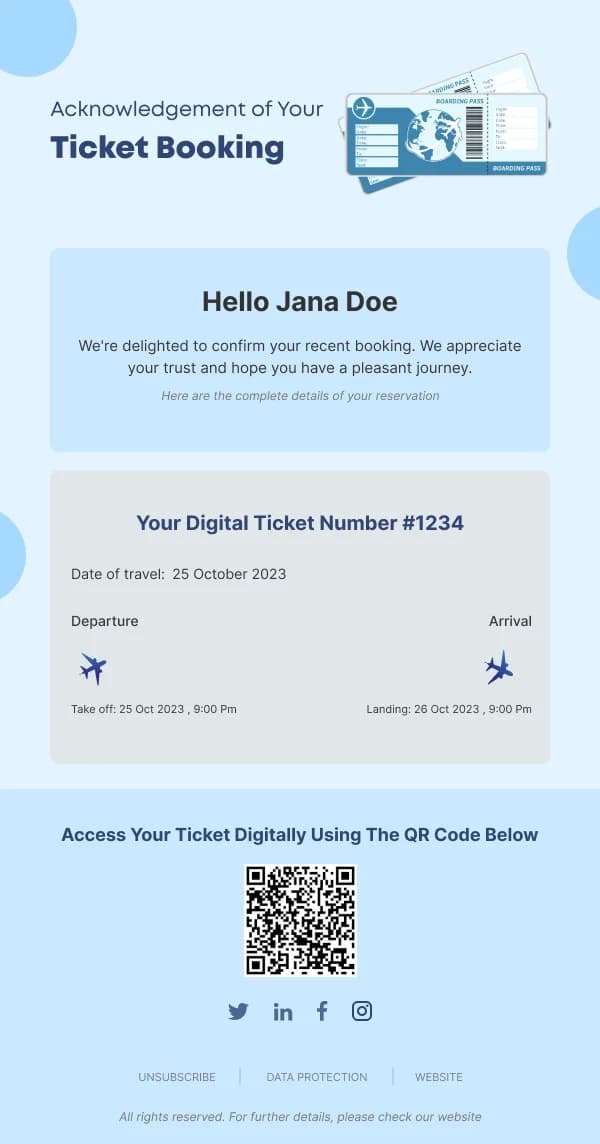
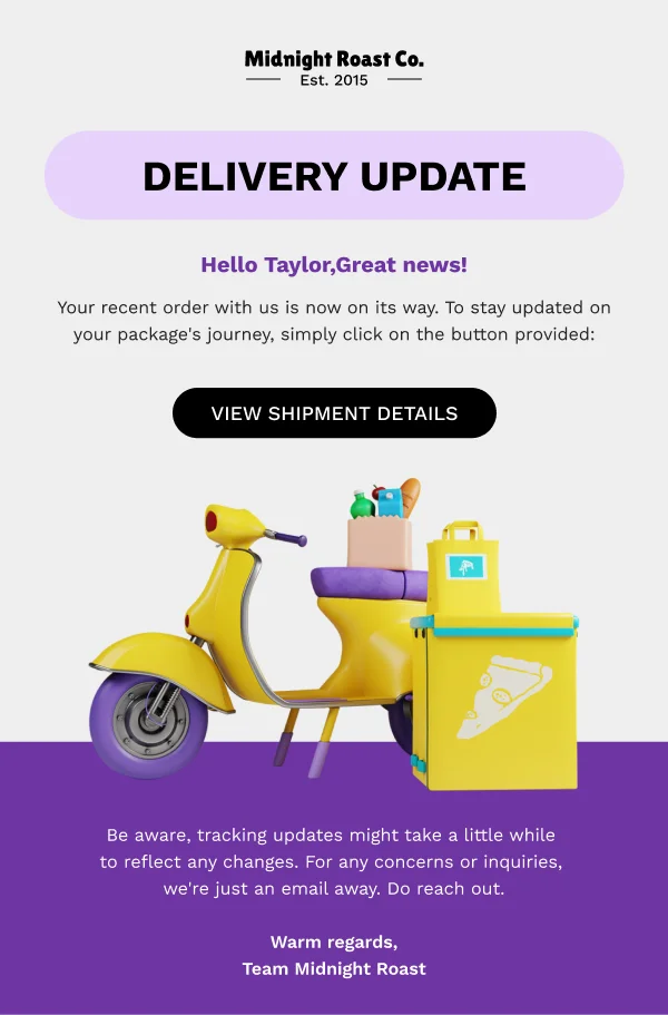
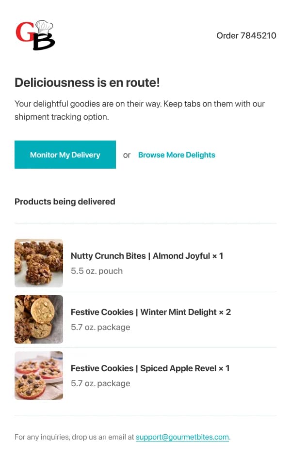
Lead with the fact
The first line answers why the email arrived. "Your order is confirmed." "Your
payment was received." "Here is your reset link." Not a greeting, not a logo band
occupying the first screen, not a promotional banner.
Everything the reader opened for should be visible without scrolling. On a phone
that is roughly 350–400px of vertical space, which a decorative header can consume
entirely.
Structure structured data
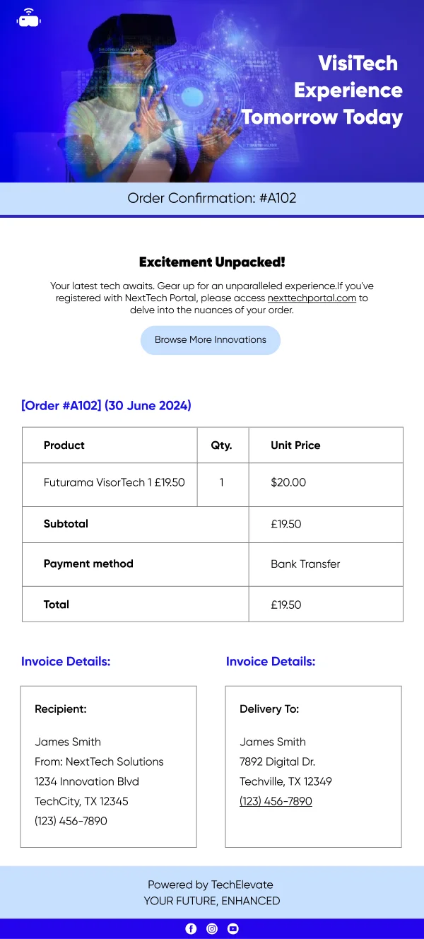
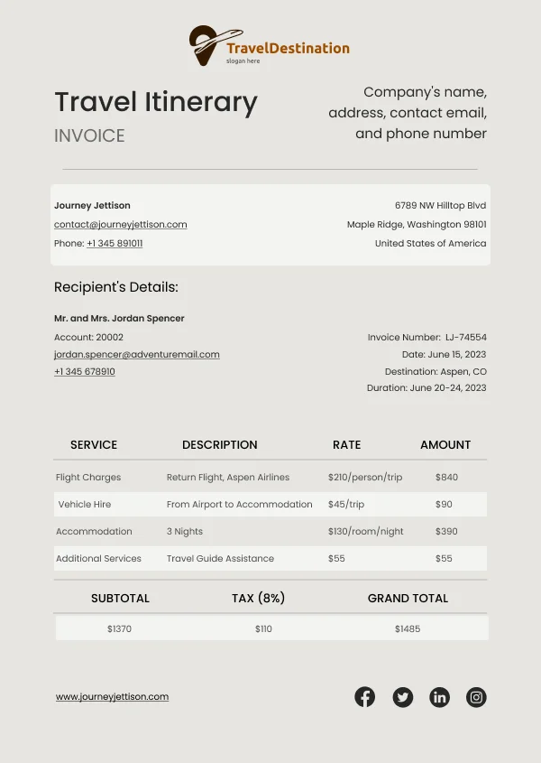
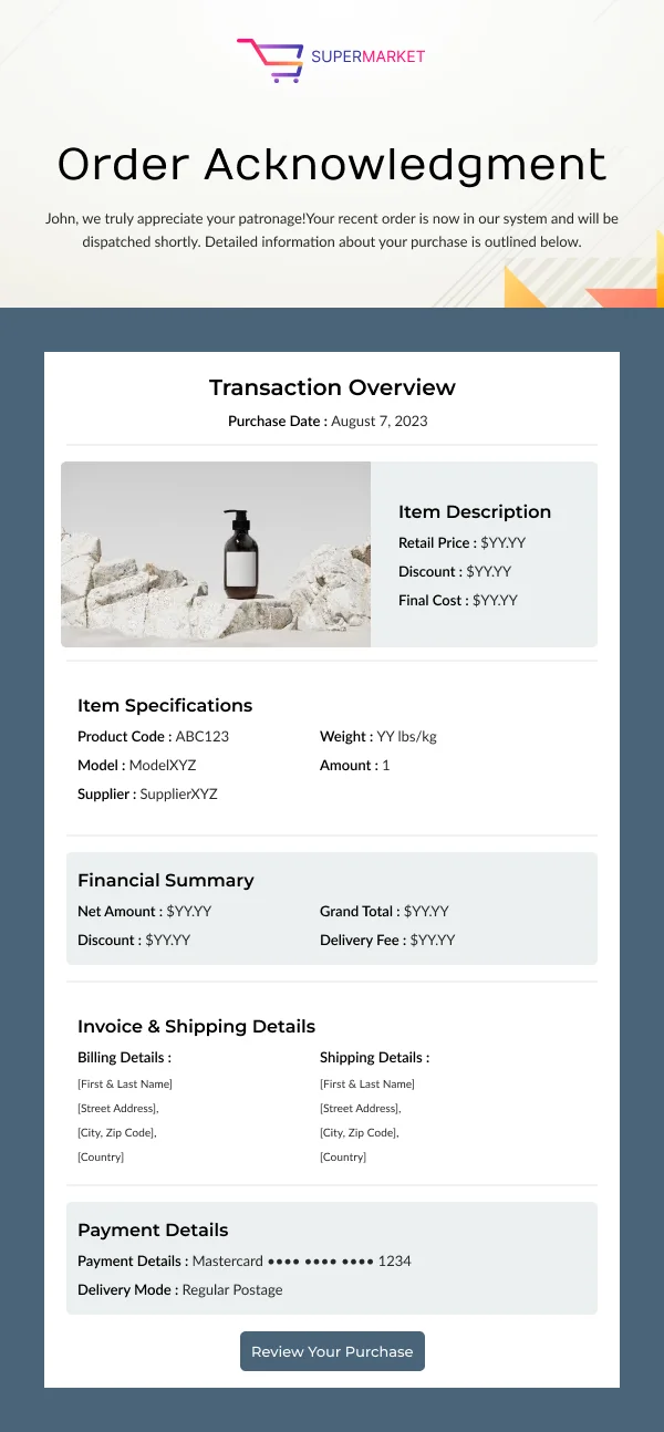
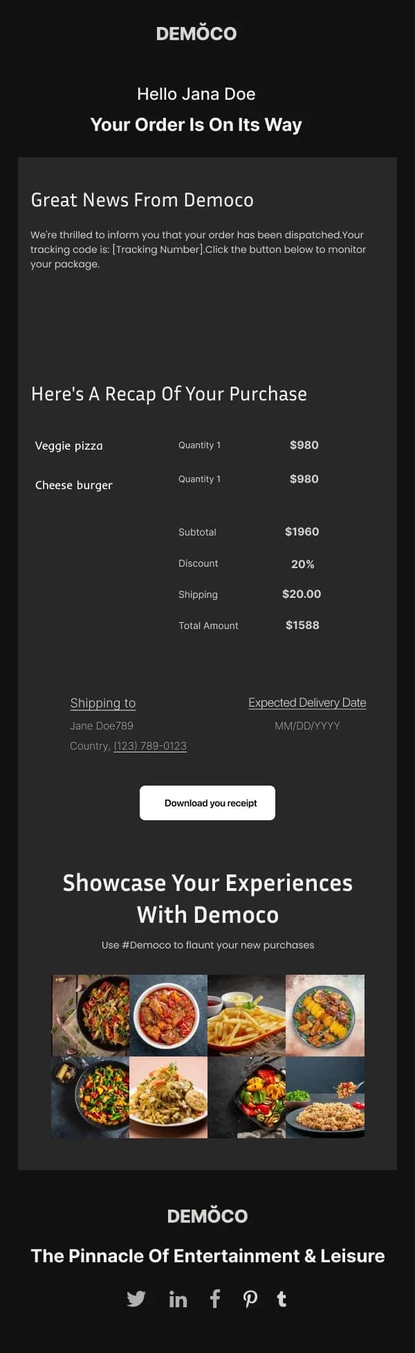
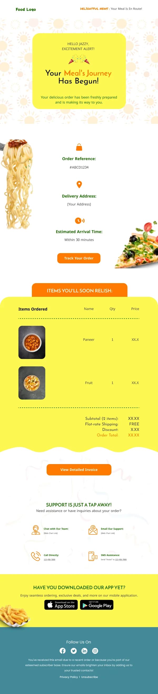
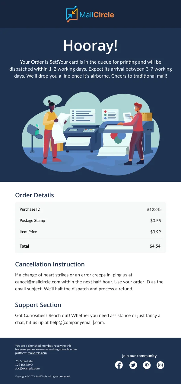
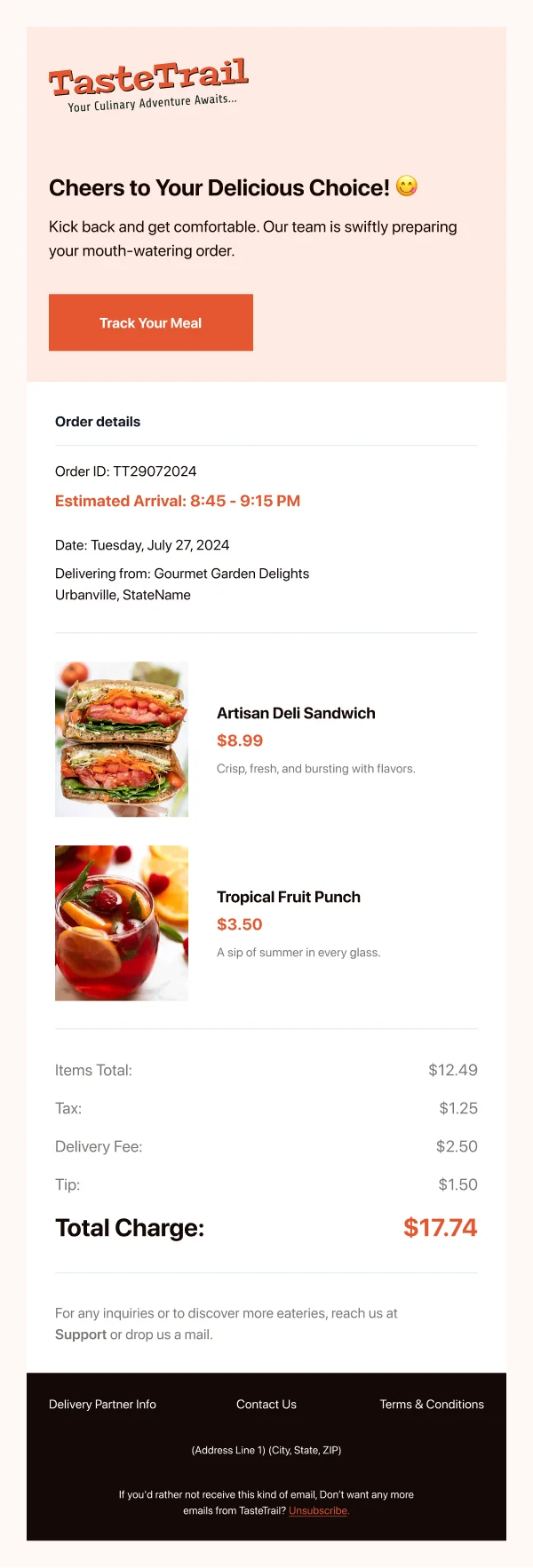
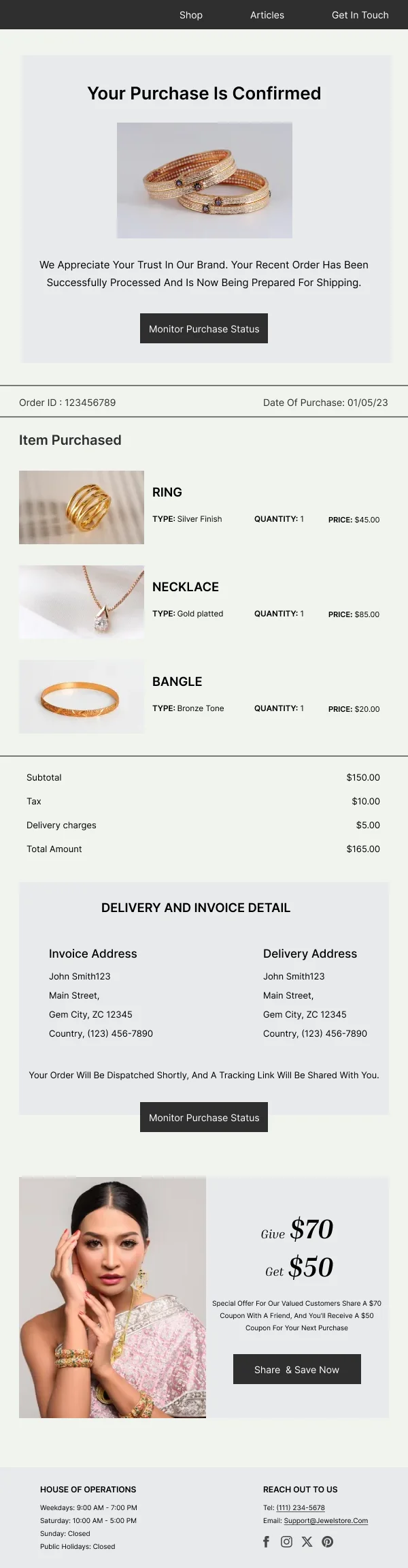
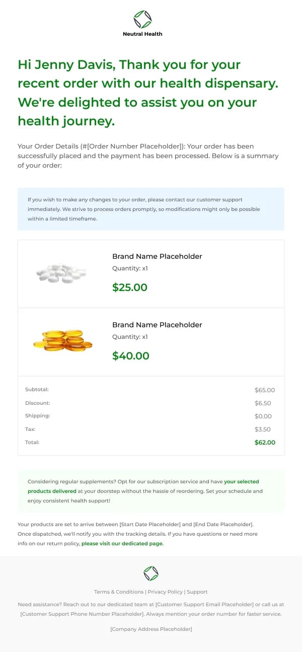
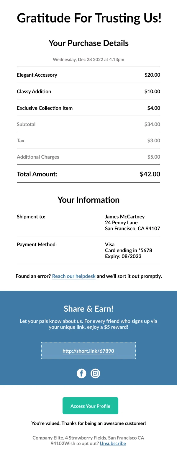
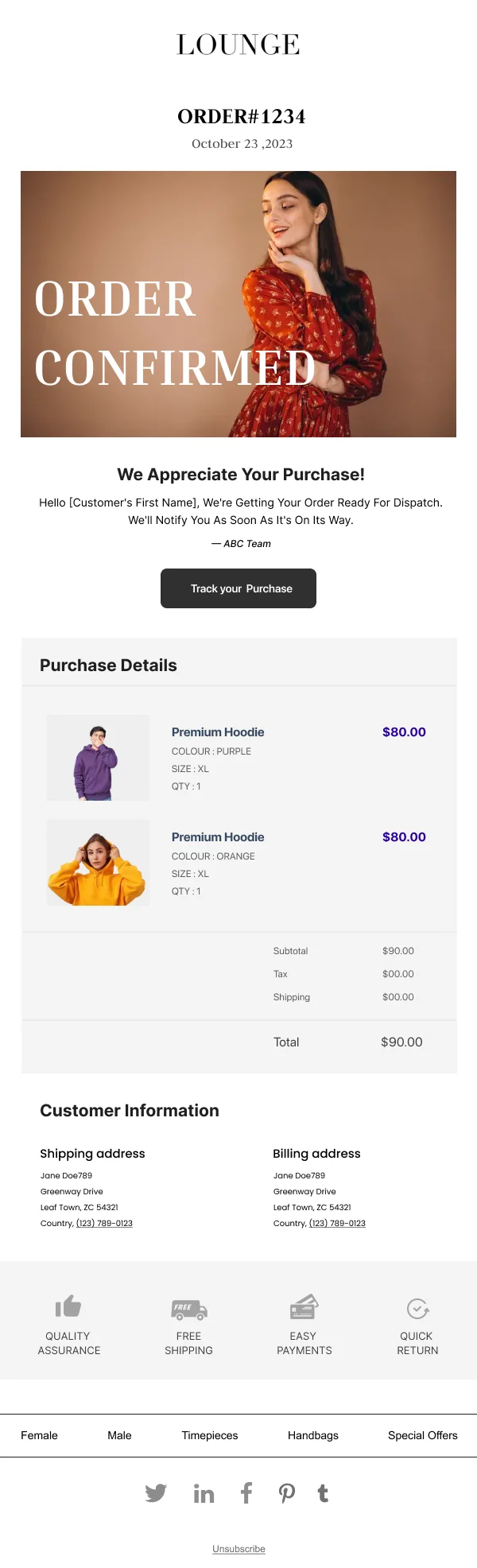
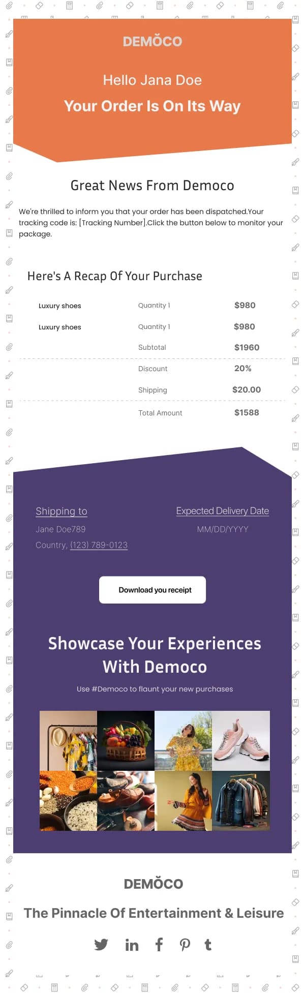
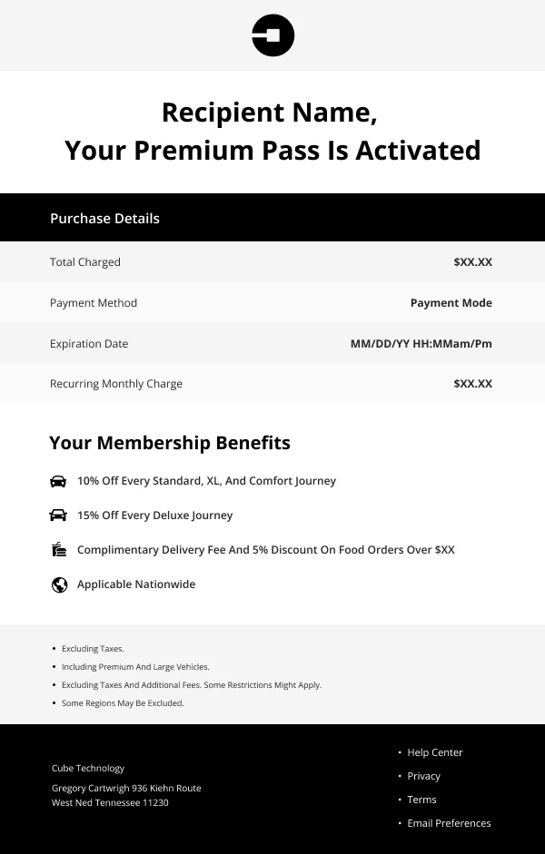
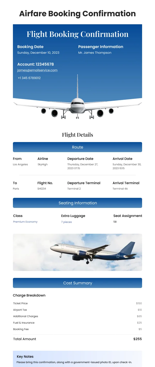
Receipts, confirmations and invoices carry data with real relationships — items,
quantities, totals, addresses, dates. That wants a table or a labelled list, not
a paragraph.
What makes those blocks readable:
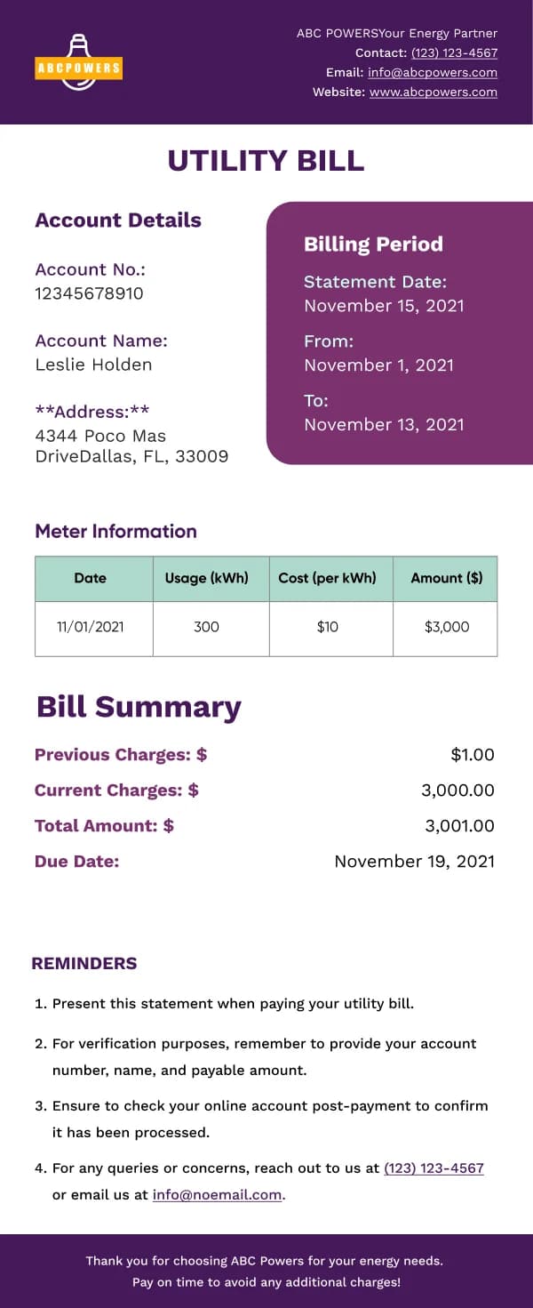
- Labels beside values, consistently aligned.
- Right-aligned figures so totals line up and can be scanned vertically.
- The total visually distinct from the line items.
- Adequate size. These blocks are frequently set too small because they feel
like fine print. They are the content.
Security-sensitive sends
Password resets, email-change confirmations and login alerts are the emails most
closely imitated by attackers, so a few things are non-negotiable:
- One action only. Extra links in a reset email teach readers to click
whatever is in one.
- An explicit expiry. "This link works for the next 30 minutes."
- A what-if line. "If you did not request this, you can ignore it — your
password has not changed."
- Visual consistency with the rest of your email. Consistency is what lets a
reader recognise the fake.
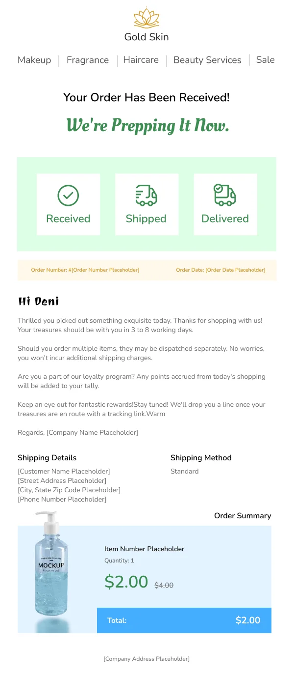
Restraint on promotion
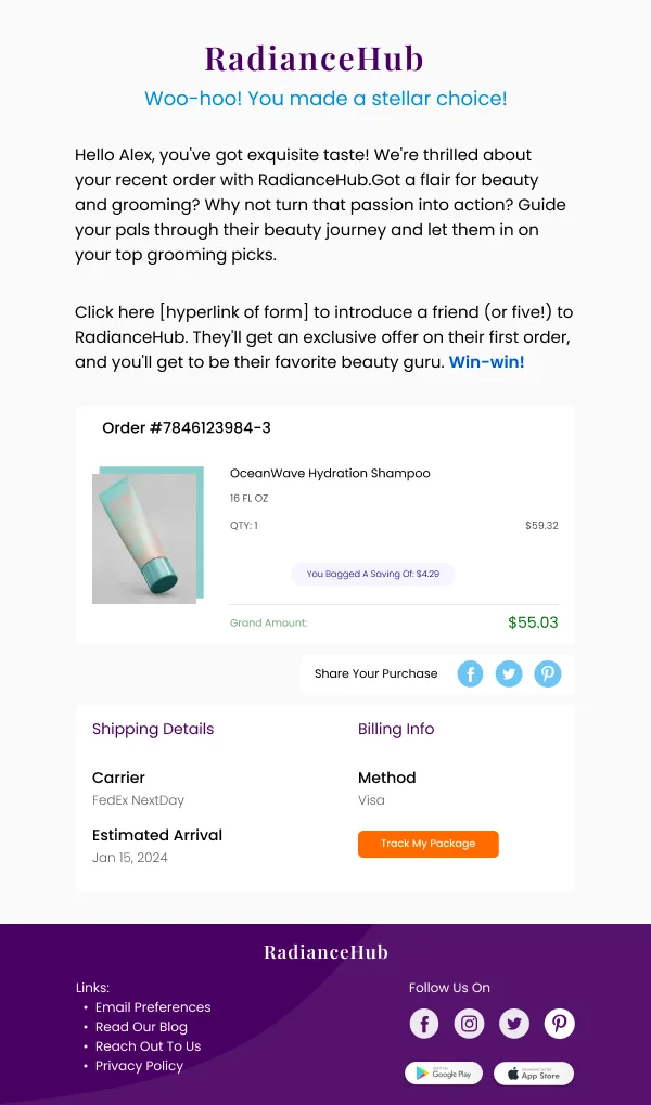
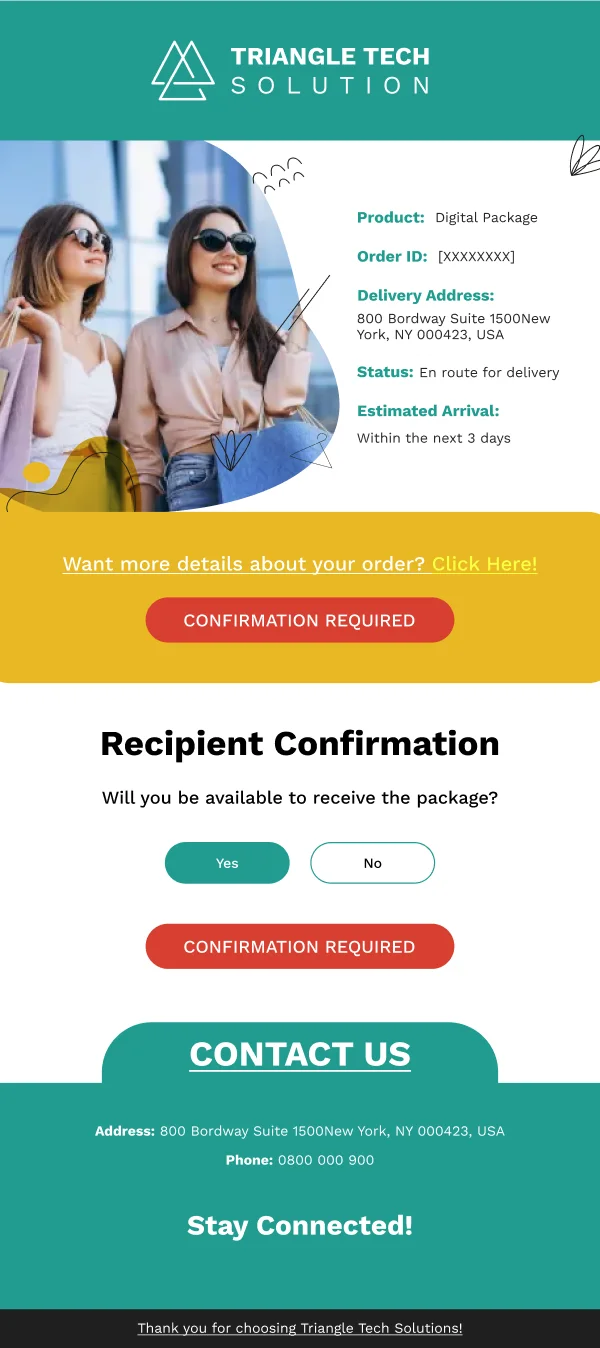
Transactional email is tempting real estate precisely because it gets opened, and
the discipline is to place any promotion strictly below the transactional content.
A confirmation that opens with a sale banner before the order number is worse for
both purposes — the reader has to hunt for what they came for, and they resent the
banner.
Using these templates
Data blocks are laid out for verification rather than reading — labels beside values, figures aligned, totals distinct. The checks: is the confirming
fact in the first line, is the reference number or link visible without scrolling,
do figures align, and is any promotional block clearly below the transaction.
Common questions
- Can transactional emails contain marketing?
- A small amount, below the information the reader opened for, and never above it. There are also legal limits in some jurisdictions on what a transactional message can carry, so the safe design puts the transaction first and keeps any promotion clearly secondary.
- Why design a receipt at all?
- Because it gets opened, and because a clear one prevents support enquiries. A receipt is read to verify something, so its design goal is scannability — the reader is checking a number, not reading prose.
- What makes a password reset email trustworthy?
- Consistency with everything else you send, one unmistakable action, an explicit expiry time, and a line telling the reader what to do if they did not request it. Password resets are the most imitated email in phishing, so a sloppy real one is a genuine liability.