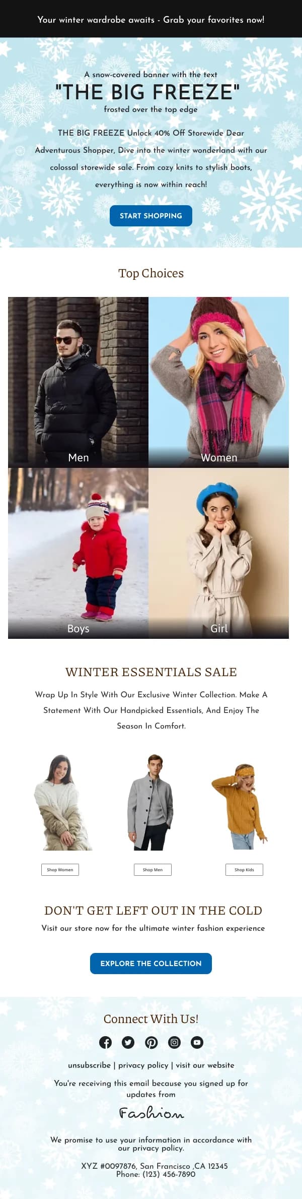
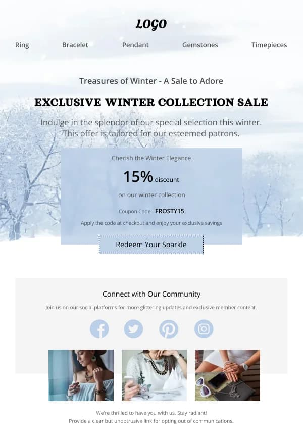
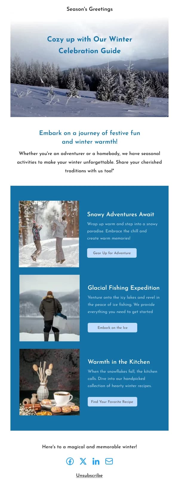
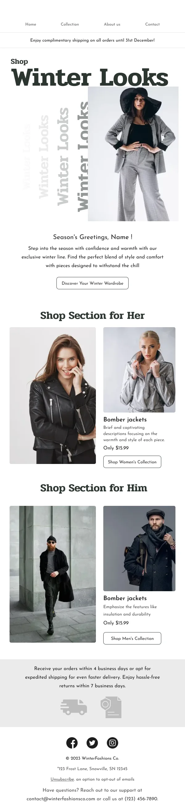
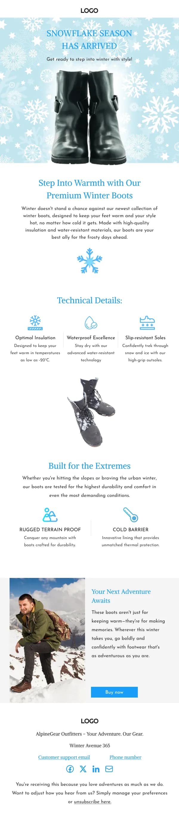
Winter is the most useful seasonal frame in the calendar precisely because it is
not tied to a date. It covers the weeks before the festive rush, the gap between
Black Friday and Christmas, and the long stretch of January and February when
there is no holiday to hang a send on.
The 11 designs in this collection are built for that duration.
Winter, not Christmas
The visual separation matters. Winter reads as seasonal rather than festive when it
uses cool neutrals, deep blues and greys with a single warm accent, and avoids the
red-and-green pairing and the ornamental motifs.
That distinction is what lets the same frame run in February without looking like a
mistake.
Product framing
Cold-weather products have a functional story — insulation, waterproofing, warmth,
protection — and winter email is one of the few places where practical benefit
outperforms atmosphere. A coat email that specifies temperature range and
weatherproofing converts better than one that only shows the coat in snow.
Mid-season sale
The February clearance is an unglamorous but reliable send: end of season, reduced
lines, remaining sizes. Honest framing works better than urgency here because
readers know what a February sale is.
Using these templates
Cool palettes tested for contrast, since pale-on-pale is where winter designs most often fail legibility. Checks: does the palette read
as winter rather than Christmas, is there a functional benefit stated for
cold-weather products, and does the design still work in February.
The post-festive gap
The stretch from early January to late February has no holiday to anchor a send, and
it is where most seasonal programmes go quiet. A winter frame covers it: restocks,
functional product stories, mid-season clearance and the practical sends that do not
need an occasion. Having a design that reads as seasonal without reading as festive
is what makes sending through that gap possible at all.
Common questions
- How is a winter email different from a Christmas email?
- It is not anchored to a date, so it can run for months and does not need festive motifs. That makes it more useful than it looks — a winter frame carries the weeks between Black Friday and Christmas, and the long stretch of January and February afterwards.
- What palette works for winter without looking festive?
- Cool neutrals, deep blues and greys, with one warm accent. Avoiding red and green is most of what separates winter from Christmas visually.