An invoice email has two readers: the person checking whether the amount is right,
and whoever has to process the payment. Both are scanning, and neither wants to open
an attachment to find out how much is owed.
The 8 designs in this collection are built for that.
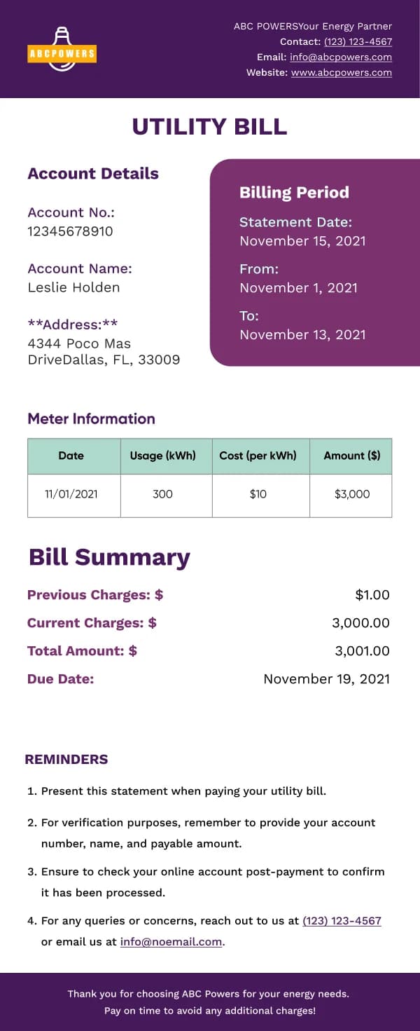
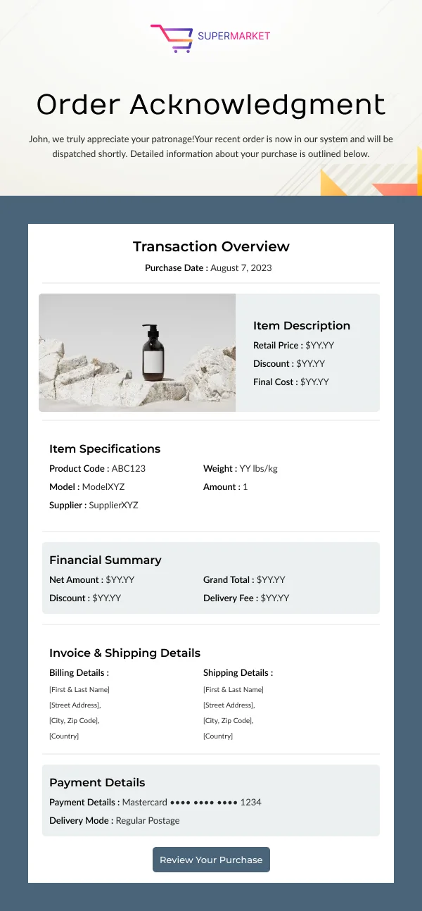
The summary block
Visible without scrolling:
- Amount due, as the most prominent figure on the page.
- Due date, in its own space, with the month in words.
- Invoice number and date issued.
- A payment button.
Everything else — line items, tax breakdown, terms, bank details — sits below.
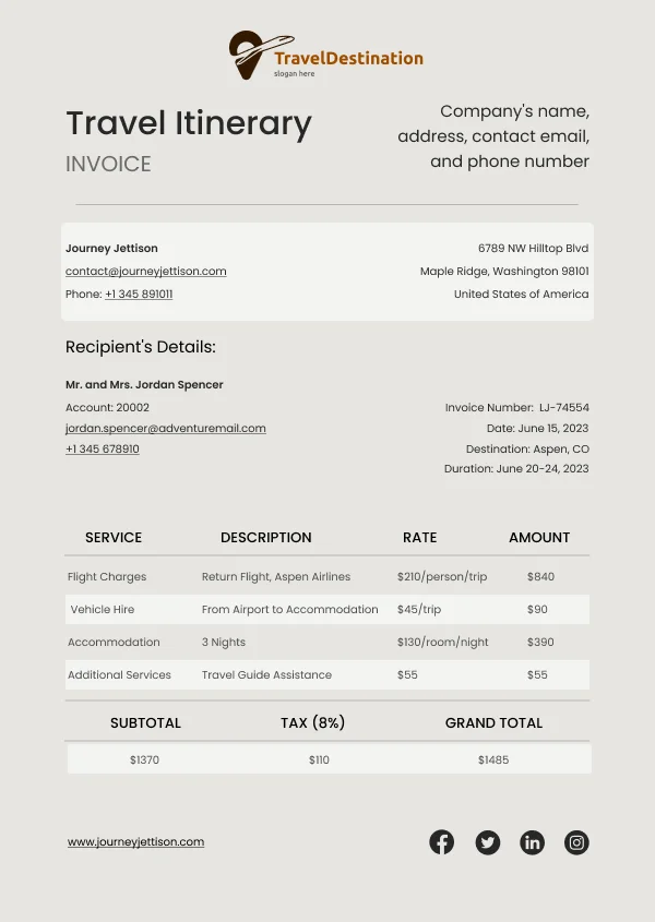
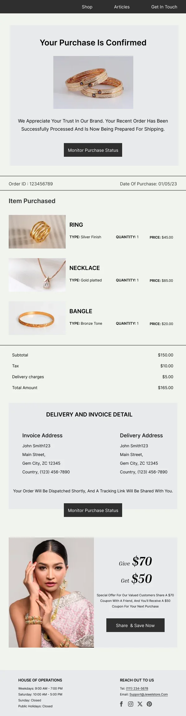
Line items
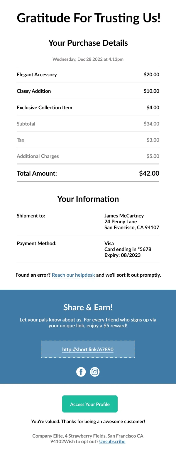
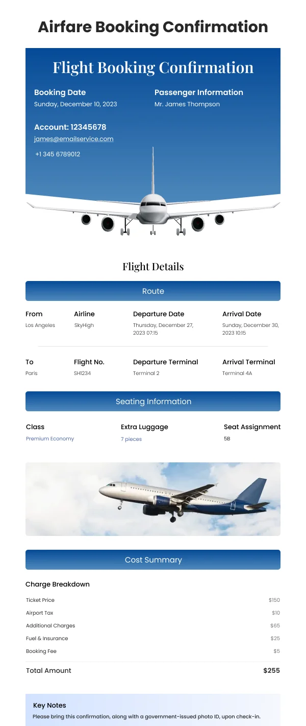
Structured as a table, right-aligned figures, subtotal, tax and total clearly
separated with the total visually distinct. This block is often set too small
because it looks like fine print; it is the substance of the document.
Reduce payment friction
Most late payment is friction. What helps:
- A payment link that requires no login.
- Multiple payment routes stated plainly — card, transfer, direct debit.
- Bank details as selectable live text, not inside an image.
- A reference the payer should quote, prominently, so reconciliation works.
Reminders
Overdue reminders should stay factual. The amount, the original due date, how many
days have passed, and the payment button. Escalating tone rarely accelerates
payment and it damages the relationship; a clear statement of any late fee or
service consequence does more.
Using these templates
Line items, totals and due dates are laid out for scanning, with figures right-aligned so a column reads vertically. Checks: are the amount and due
date visible without scrolling, do the figures align, are bank details selectable
text, and is there a payment action in the first screen.
Common questions
- Should the invoice be in the email or attached?
- Both. A clear summary in the email body lets the recipient verify the amount without opening anything, and a PDF attachment or download link gives them the document their accounts process needs.
- What makes an invoice get paid faster?
- The amount and the due date visible immediately, and a payment button that works in one tap. Most late payment is friction rather than reluctance, and friction is a design problem.