Lifecycle email is the highest-leverage part of most programmes and the most
frequently neglected, because it requires designing a sequence rather than a send.
The reward is that every email arrives with context: you know what the reader did,
so you can be specific in a way a broadcast never can.
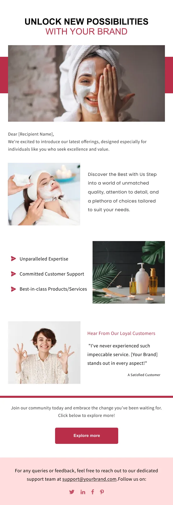
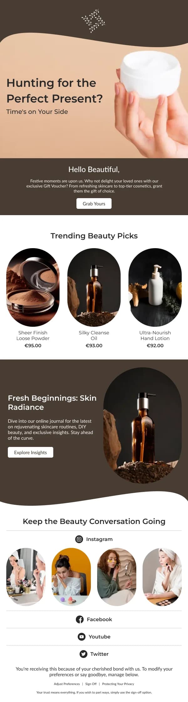
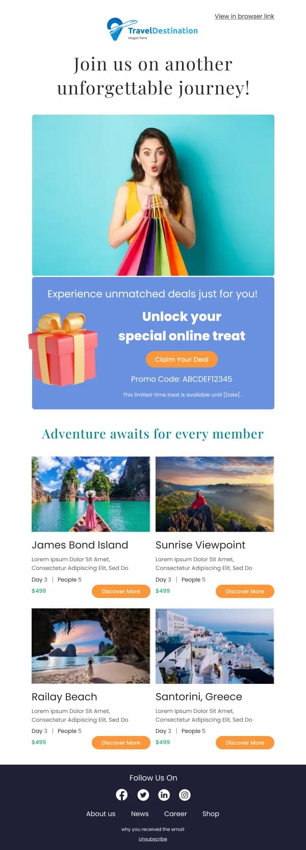
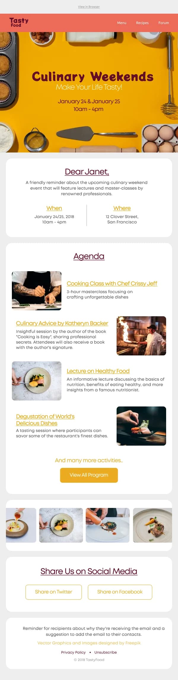
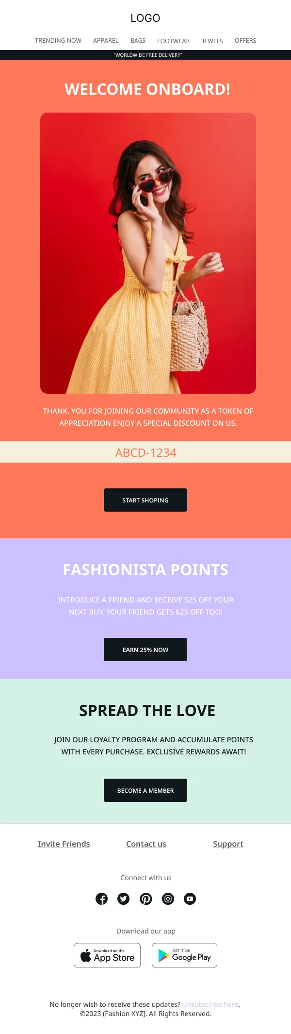
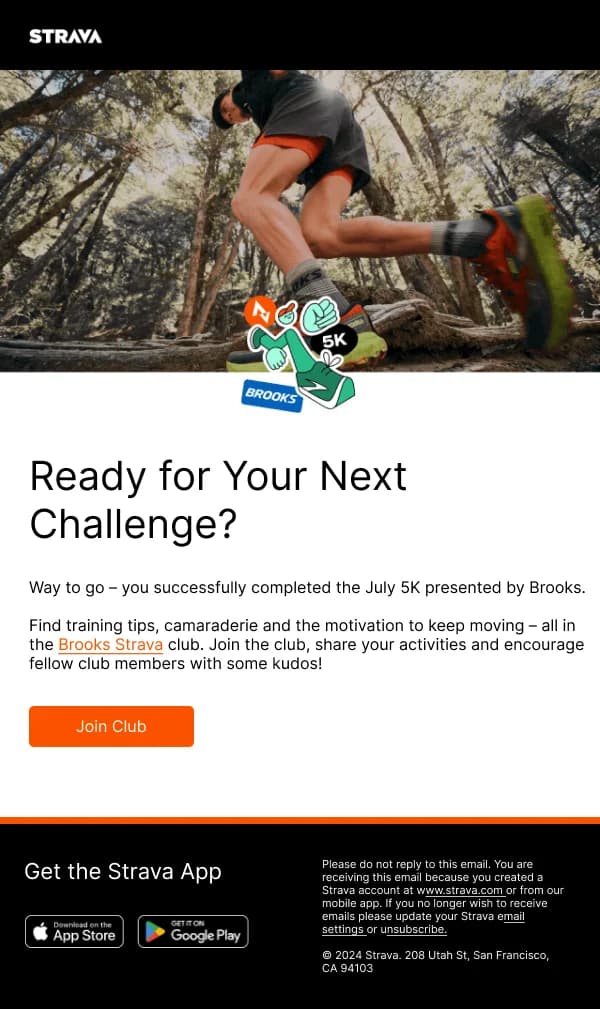
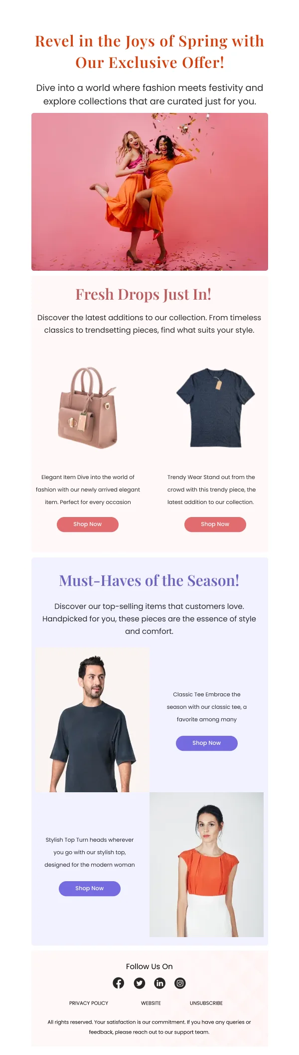
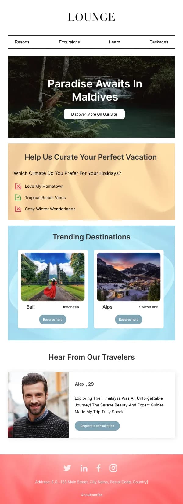
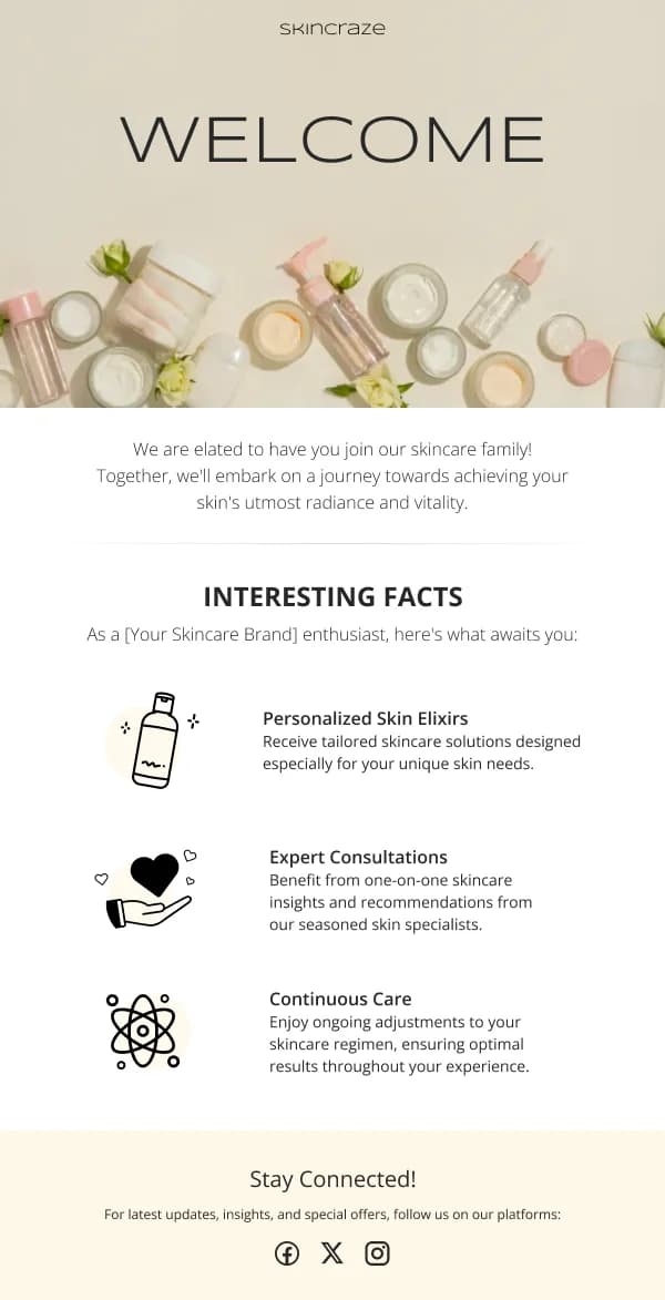
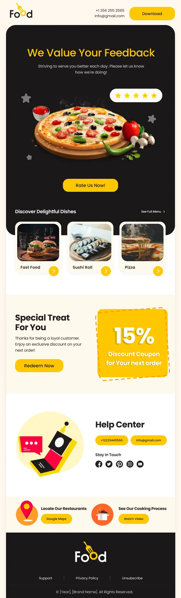
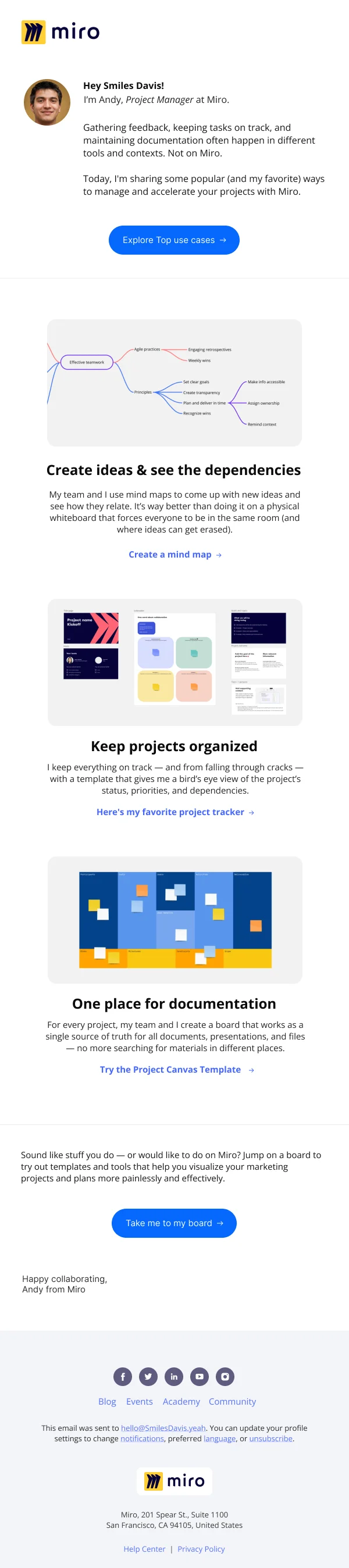
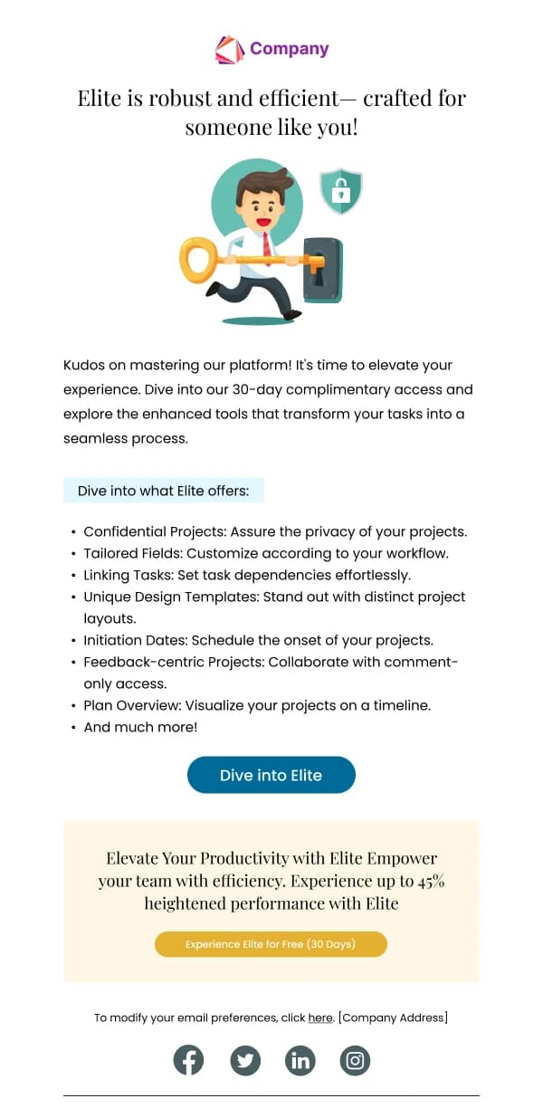
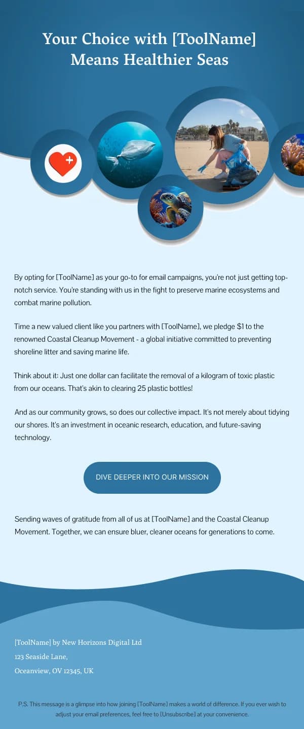
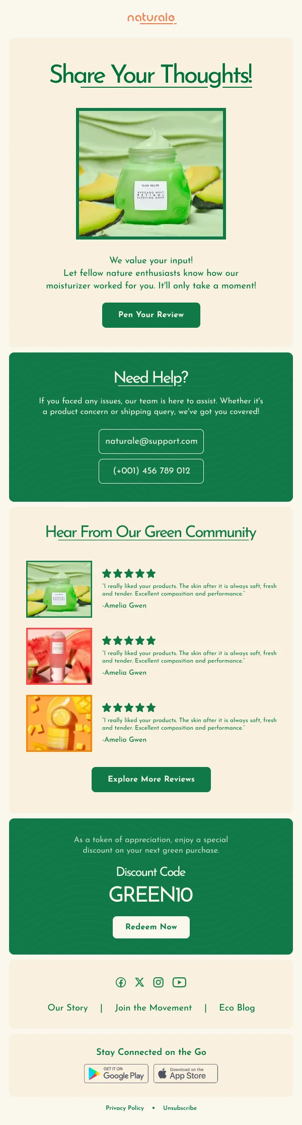
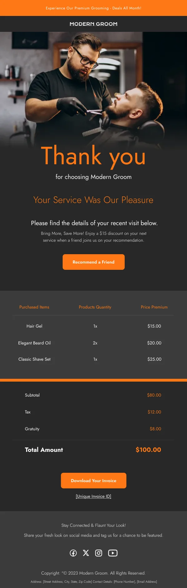
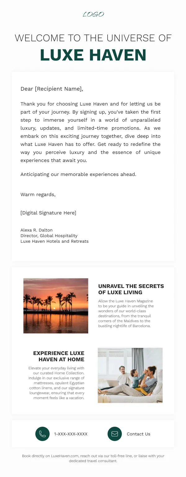
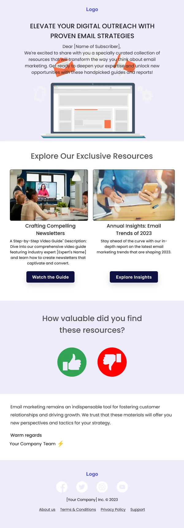
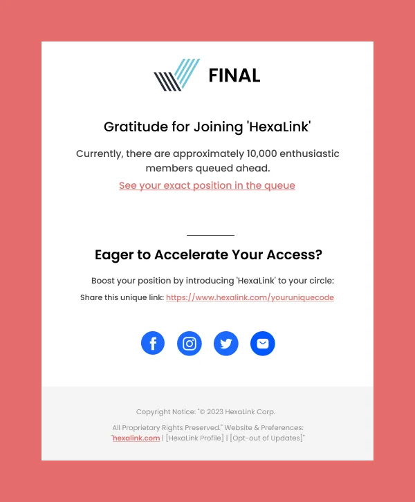
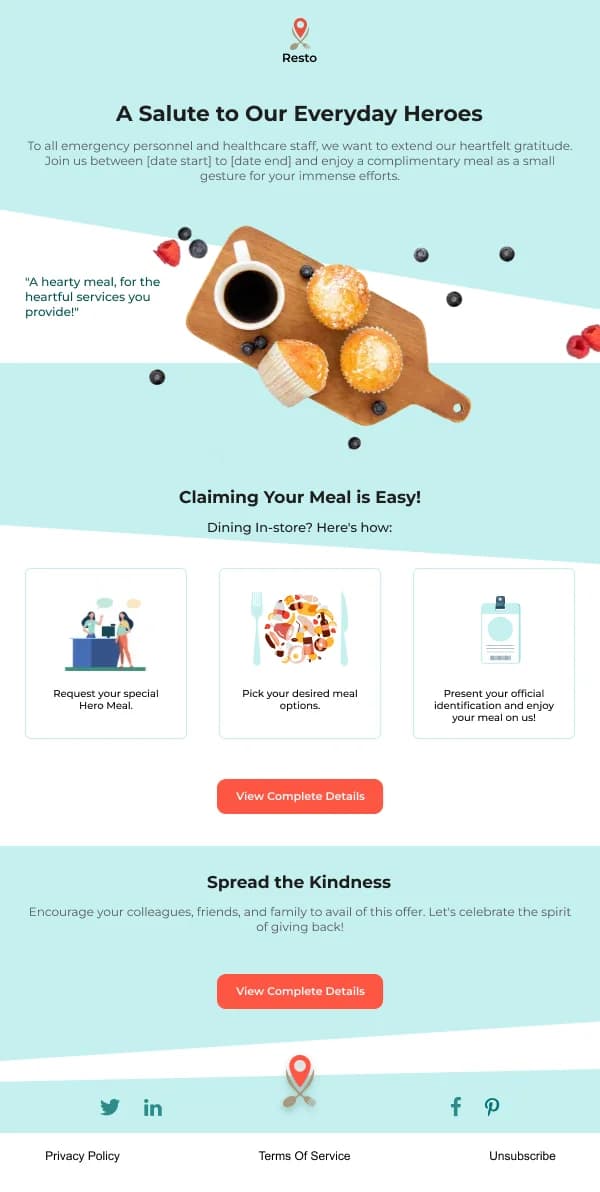
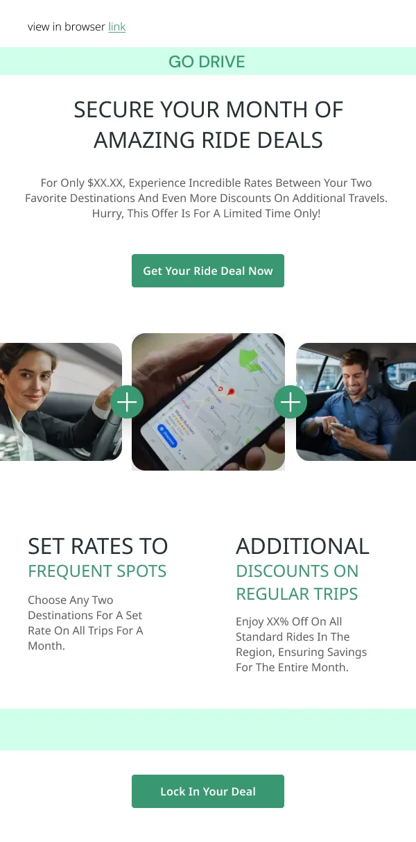
The 78 designs in this collection map to the stages of that arc.
The arc
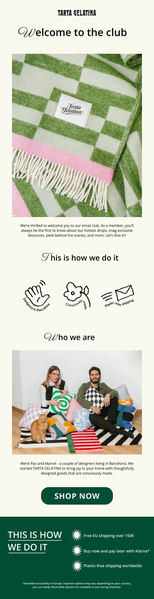
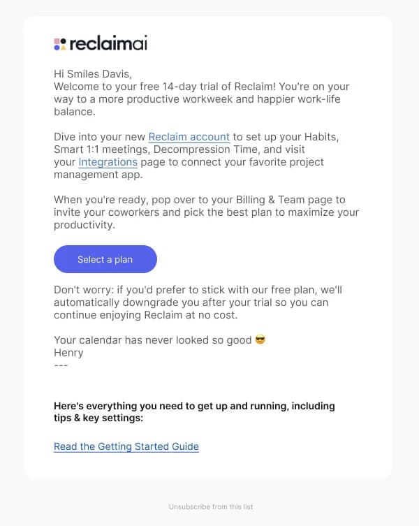
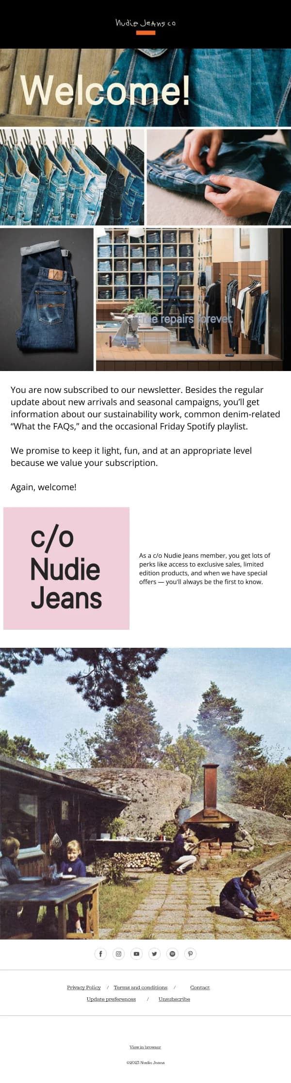
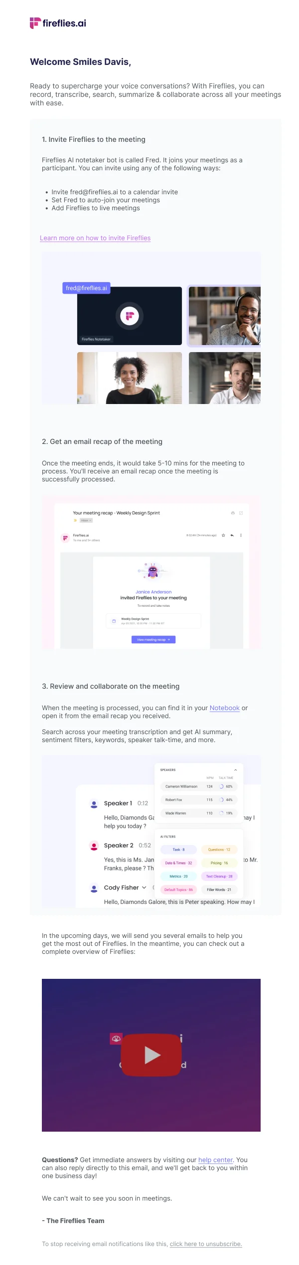
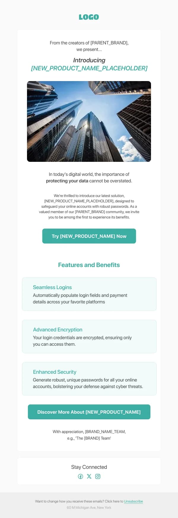
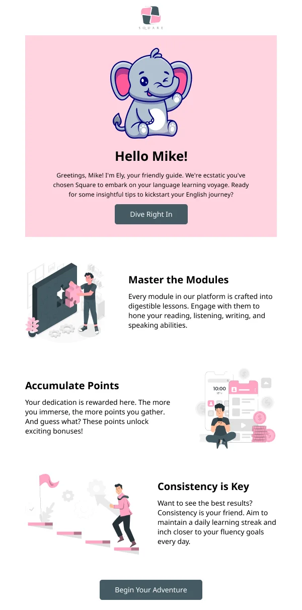
Welcome. The most-opened email in the whole programme. Confirm the
relationship exists, set expectations for what comes next, and name one action
that produces the first real bit of value. Not a feature tour.
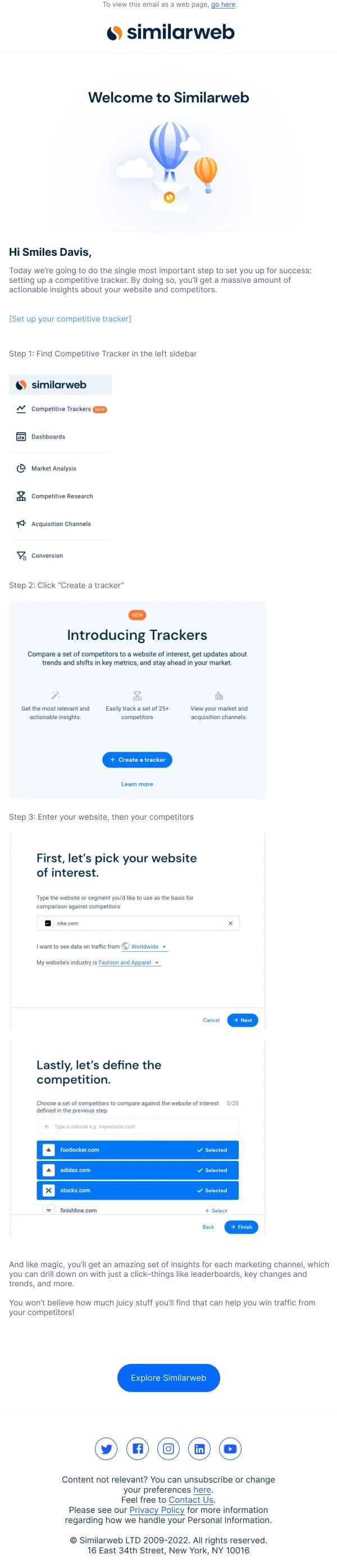
Activation. The reader signed up and stopped. This email addresses the
specific step where people stall, which means it needs product knowledge rather
than design flourish. It is usually the highest-value email in the sequence and
the least visually elaborate.
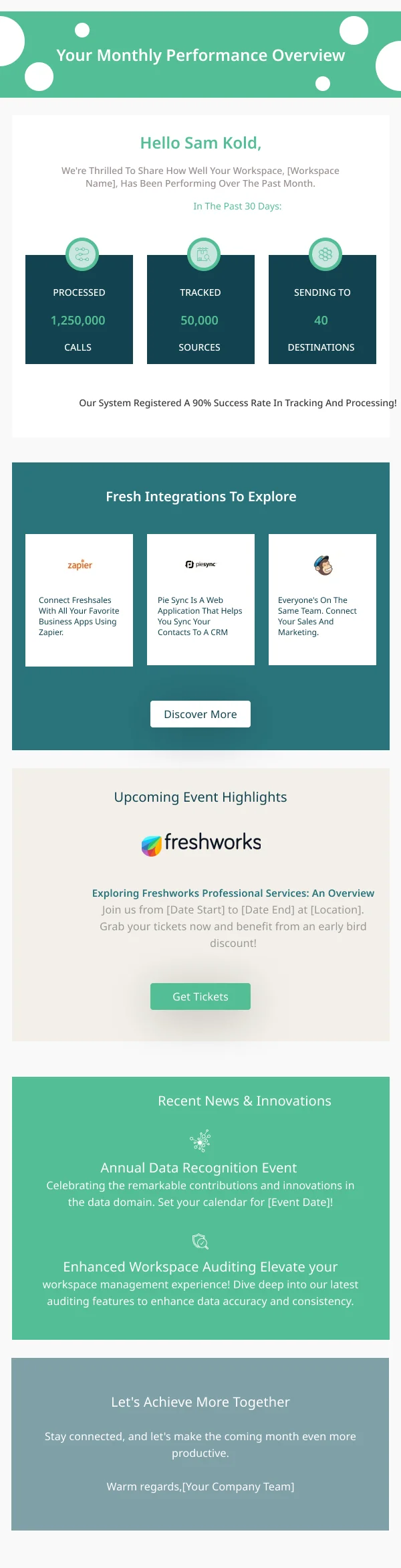
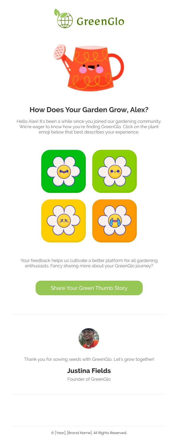
Retention. They are using the product. This is where a usage summary, a
capability they have not found, or a genuine tip earns its place — content that
makes the habit stickier.
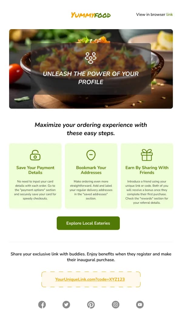
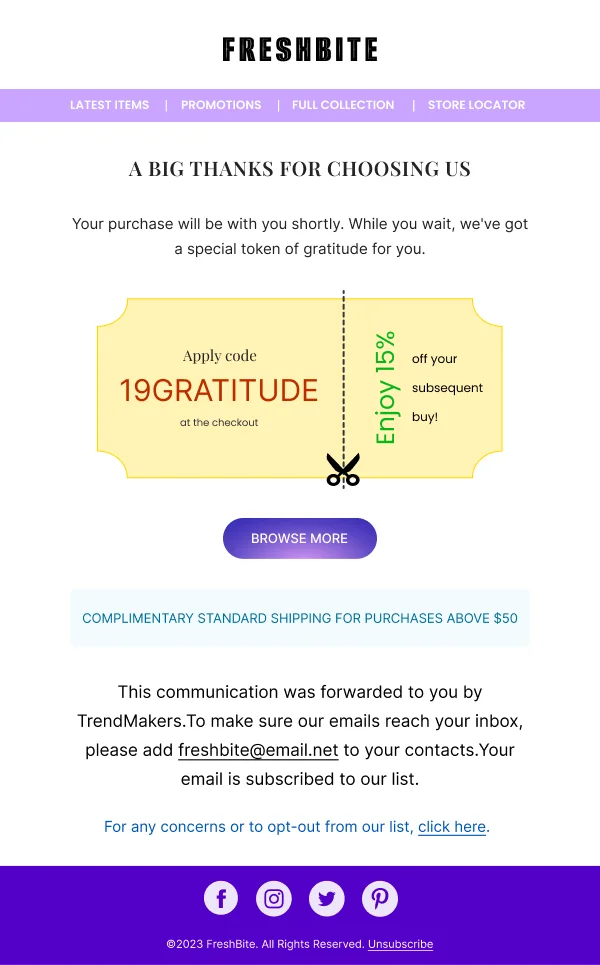
Expansion. They are getting value and could get more. Upgrades, adjacent
products, higher tiers. Timing matters more than design here; sent before value
has landed, it reads as a shakedown.
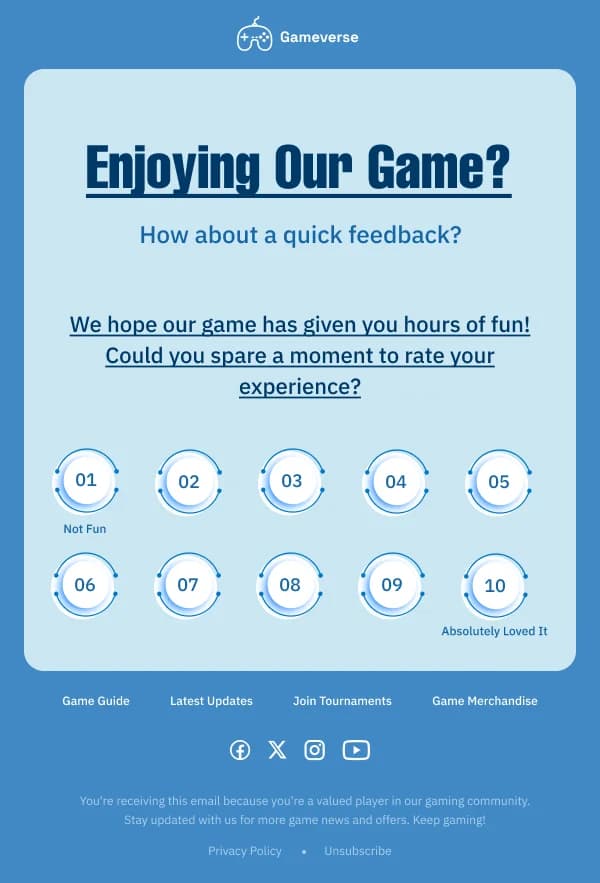
Lapse and win-back. They stopped. Show what changed, ask a real question, or
make leaving clean. All three are legitimate; a guilt trip with a discount is
not.
Design the sequence, not the email
The mistake that costs the most is designing each stage as a standalone email.
A reader who receives four emails in ten days should perceive one coherent voice.
What makes a sequence read as a sequence:
- A shared frame. Same header, footer, type scale, button treatment.
- A genuinely different middle. If two emails in a sequence have the same
content shape, one of them is redundant.
- Visible progression. Email three can refer to what email one asked for.
That reference is what turns four sends into a conversation.
In Figma this is a component set with content variants, not four files.
One action per email
Lifecycle emails fail by offering a choice. An activation email with three
suggested next steps produces fewer completions than one with a single step,
because the reader has to evaluate rather than act.
This is harder than it sounds — internally there is always a reason to add the
second link. The discipline is to pick the action that unlocks the most for the
reader and let the others wait for their own email.
Timing is a design constraint
A trigger fires at a moment, and the moment shapes what the email can assume.
- Immediate for confirmations and welcomes. Delay here reads as broken.
- Hours, not days, for cart and browse abandonment, while intent survives.
- Days for activation nudges, so the reader has had a real chance to act.
- Weeks for lapse detection, calibrated to the product's own rhythm.
Where this touches design: an email arriving an hour after an action can reference
it directly. One arriving three weeks later cannot assume the reader remembers,
which means it needs to re-establish context before asking for anything.
Say what happens next
The single most useful line in a lifecycle email — and the one most often absent —
tells the reader what to expect. "We'll send you one setup tip a day for the next
three days." "You'll hear from us when your order ships, and not otherwise."
Expectation-setting reduces unsubscribes and complaints more effectively than any
visual improvement, and it costs one line and one small design slot.
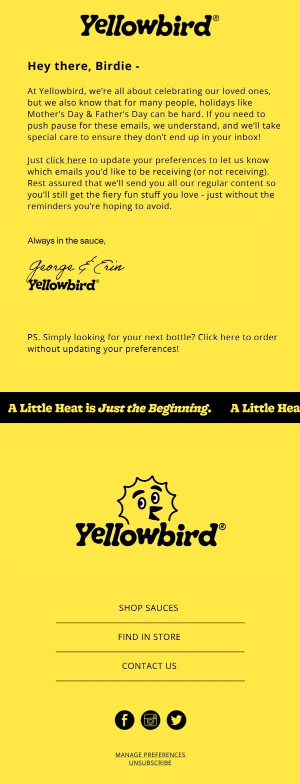
Making the exit clean
A prominent, honest unsubscribe in lifecycle email improves the list you keep. A
reader who is done and cannot easily leave marks you as spam, which damages
deliverability for everyone still engaged.
Better still, where the product supports it, is a preference option: fewer emails,
or only the important ones. Several designs in this collection include that block,
because "less" retains people that "none or all" loses.
Using these templates
Designed as component sets rather than separate files, so a four-email sequence reads as one voice. When building a
sequence from them, the checks that matter: does each email have exactly one
action, do the frames share a header and footer, is there a line telling the
reader what comes next, and is the unsubscribe visible rather than hidden.
For the opening email specifically, the
anatomy of a welcome email breaks down the
structure in detail.