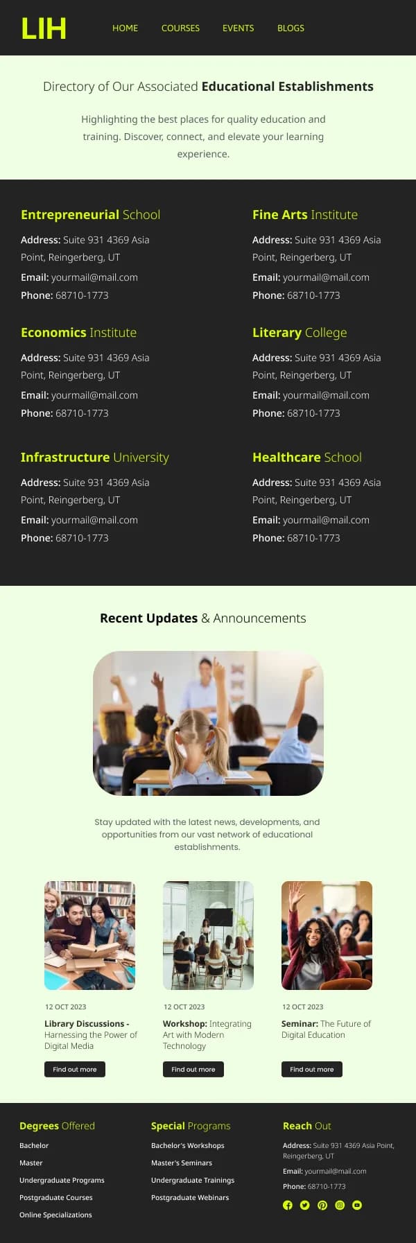
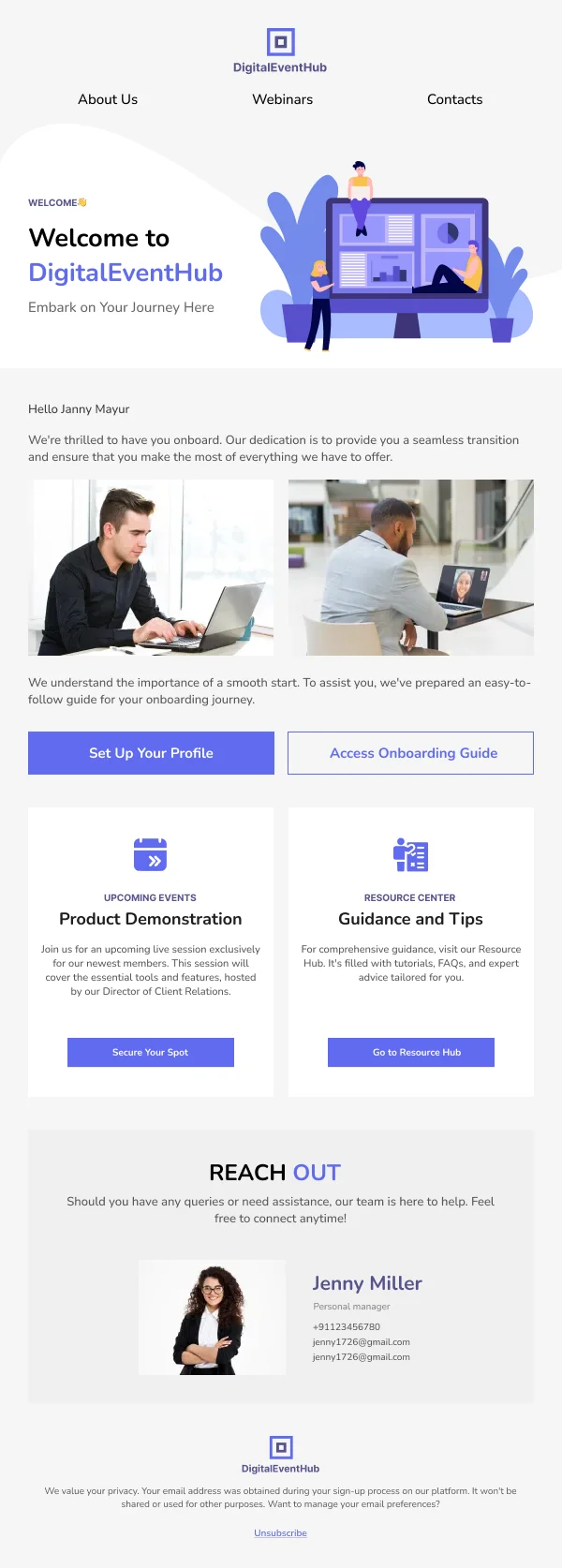
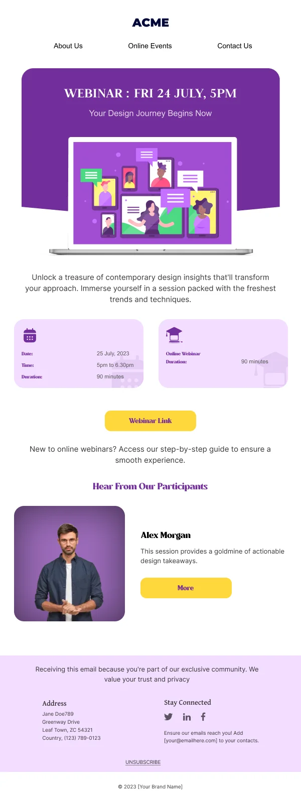
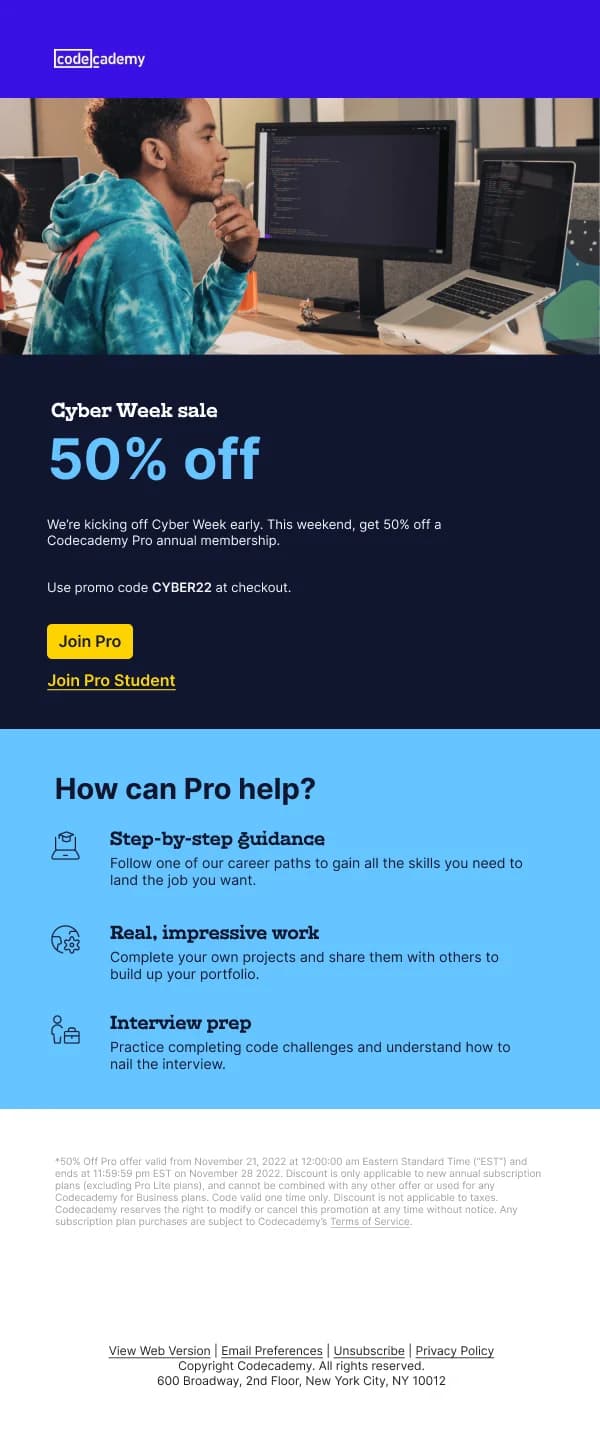
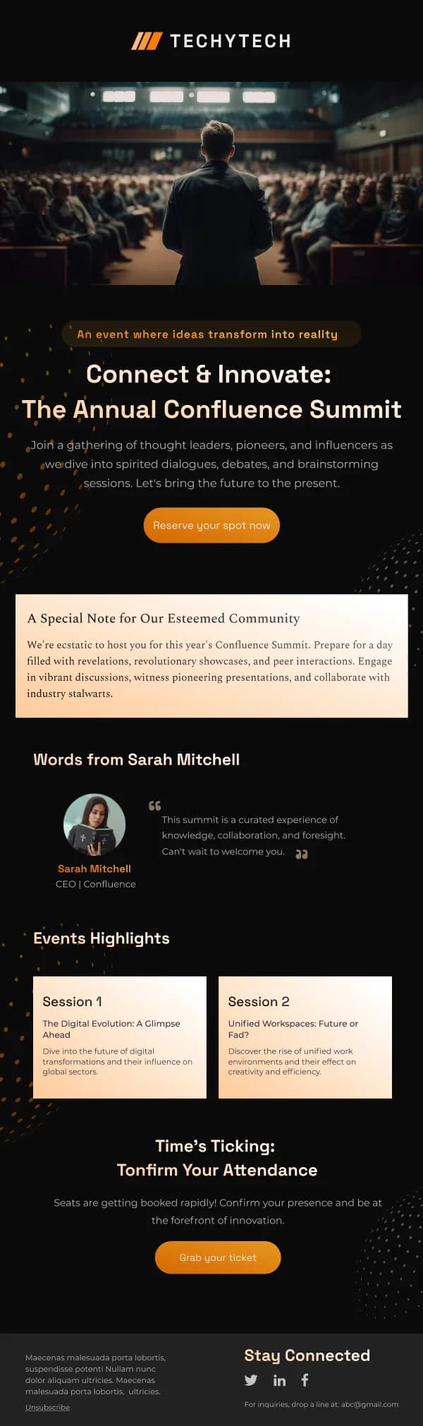
Education email has an unusually mixed audience. A single institution sends to
prospective students weighing a decision, enrolled learners who need logistics, and
parents who need reassurance. Those are three different design briefs and treating
them as one is the most common problem in the category.
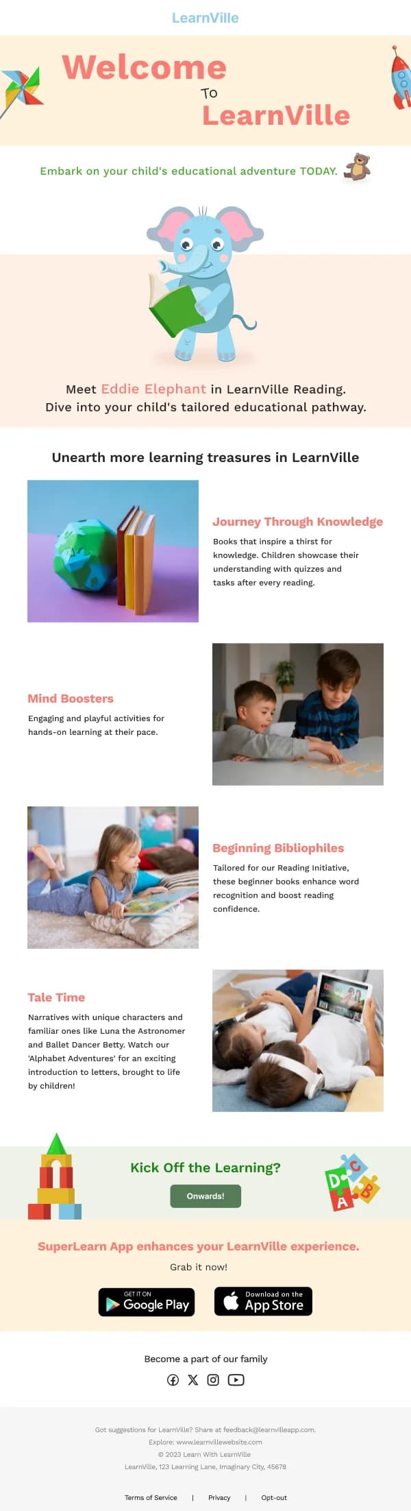
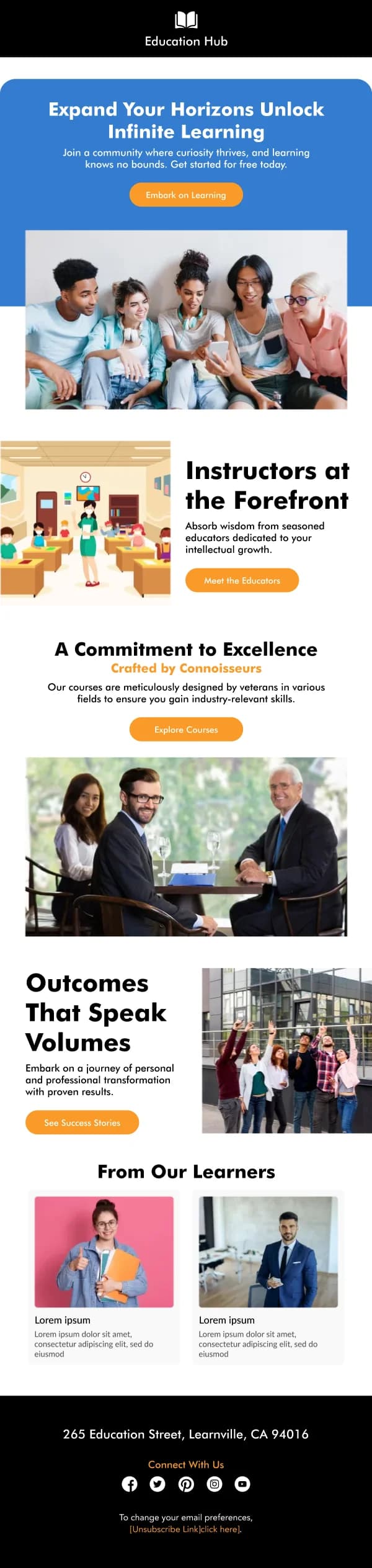
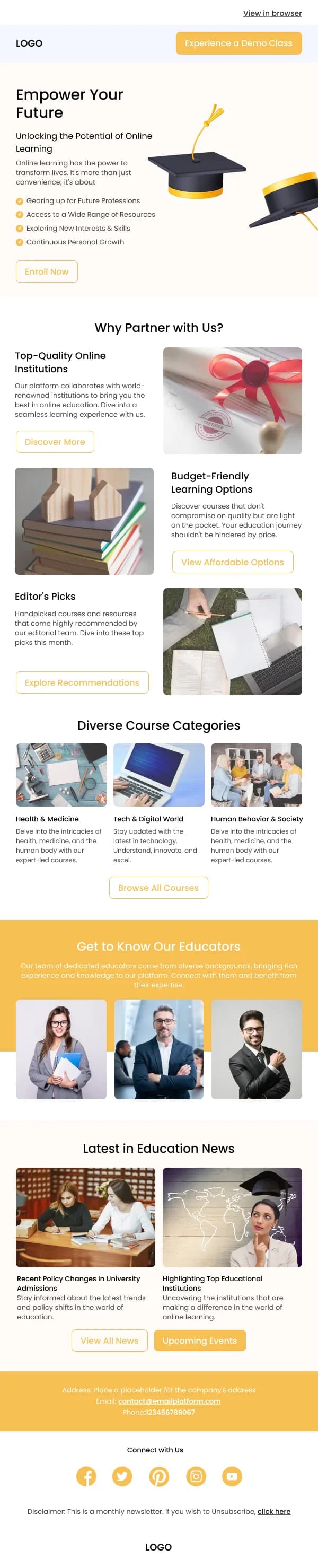
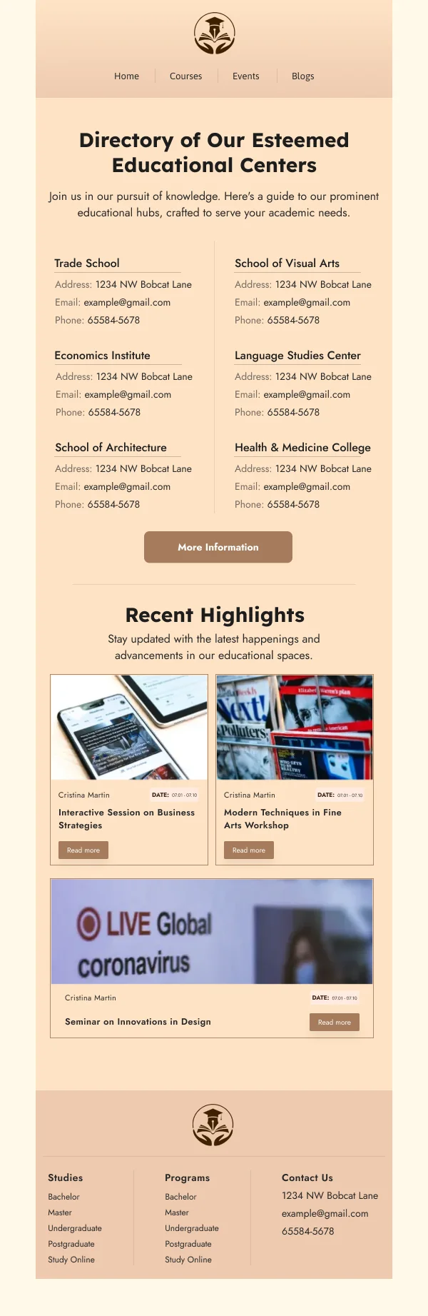
The 33 designs in this collection separate them.
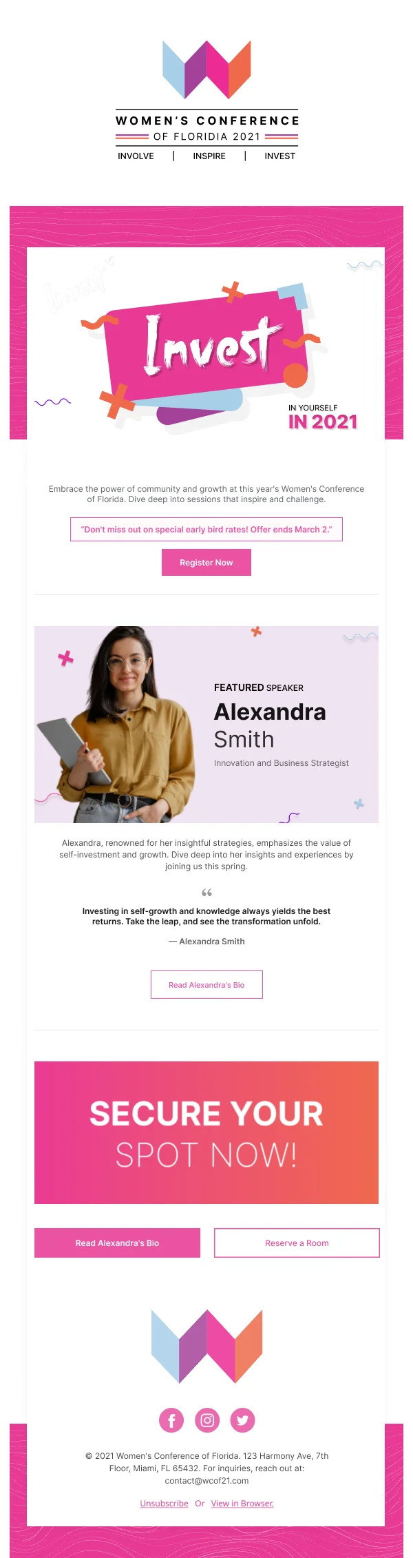
Promotion: lead with the outcome
For prospective learners, the persuasive content is what they will be able to do
afterwards. Not the syllabus, not the institution's history — the capability.
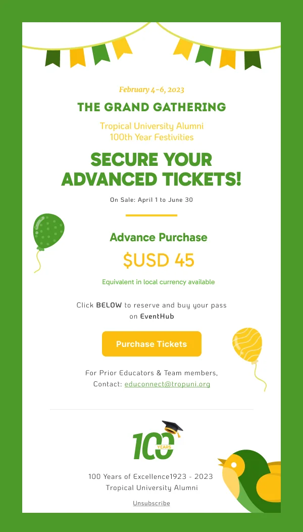
Then, immediately, the practicalities that decide it:
- Time commitment. Hours per week and total duration. The most common omission
and the most decisive factor.
- Format. Live, self-paced, in person, hybrid.
- Start date and application deadline.
- Cost, including any payment options.
- Prerequisites, so the wrong applicants self-select out.
Schedules want structure
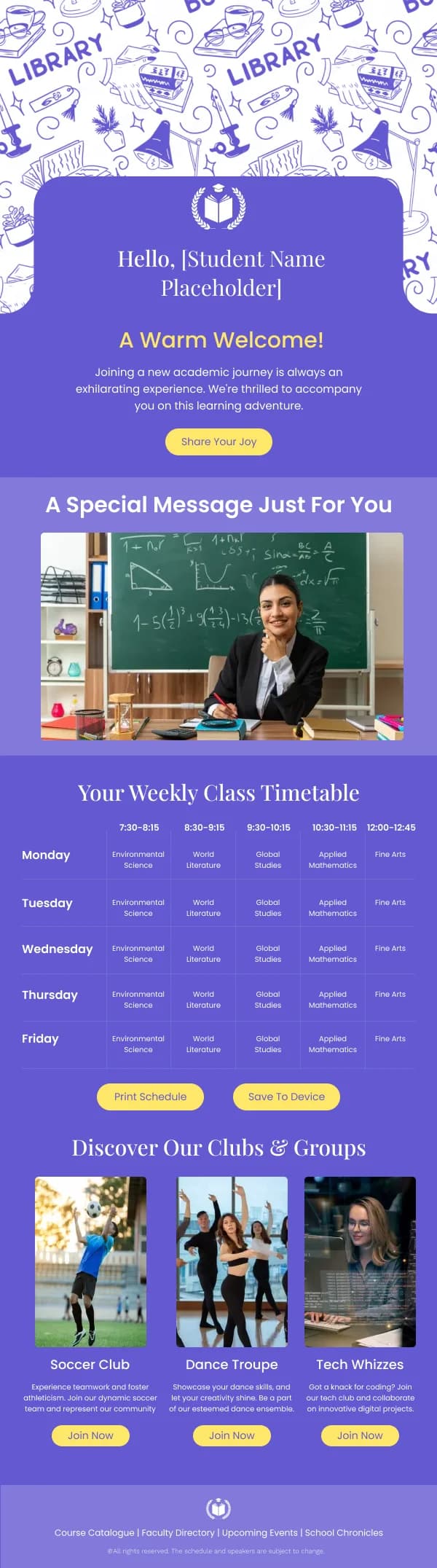
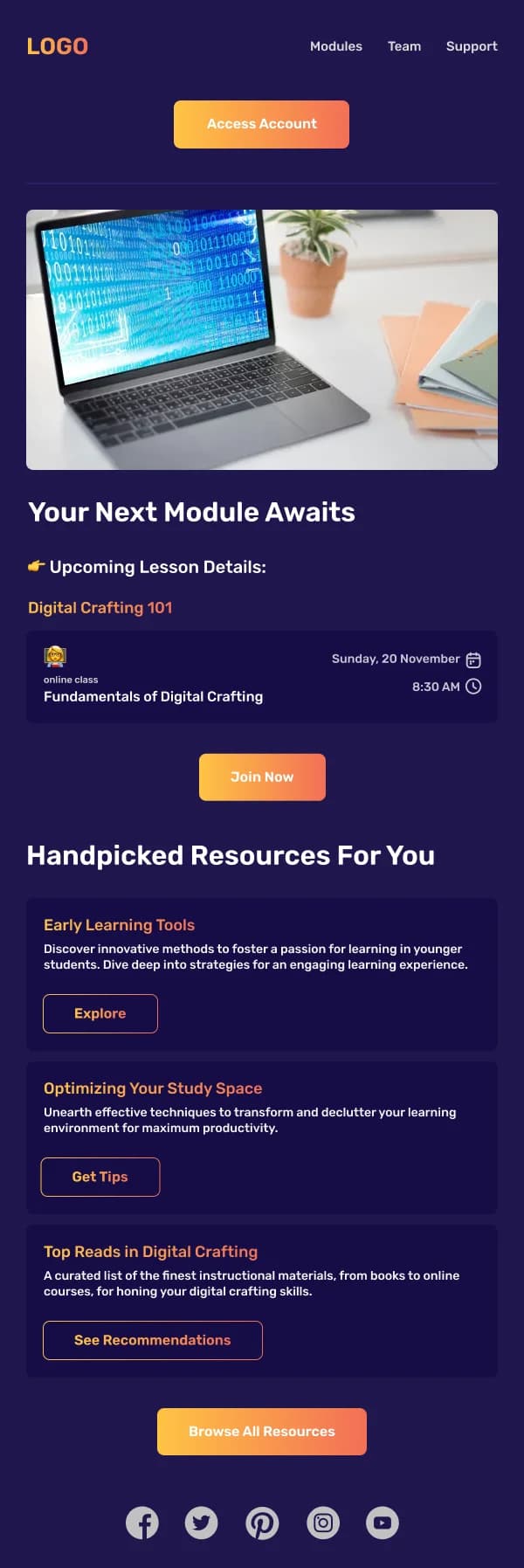
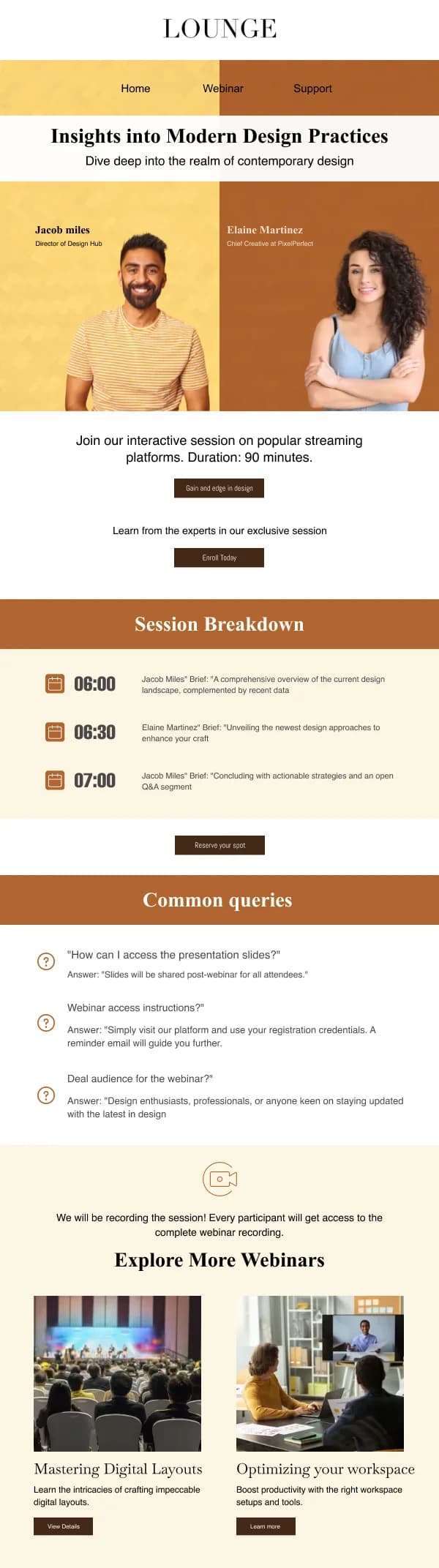
Enrolled learners need dates and topics, and that is a table. One row per session,
with date, time and subject. Where the schedule is long, group by week with real
headings.
Two things to avoid: a schedule rendered as an image, which fails with images
blocked and is inaccessible to screen readers, and a schedule in prose, which is
unreadable on a phone.
Progress and results
Emails reporting progress should be plain, structured and unambiguous. Where a
result is disappointing, the design should not dress it — a clear figure and a
concrete route to support is better than encouraging language wrapped around a bad
number.
Include what happens next and by when.
Institutional communication
Term dates, closures, policy changes, safety notices. These follow announcement
discipline: the fact and the date first, the consequence second, the reasoning last.
Formality expectations are higher than in commercial email, and clarity matters more
than warmth.
For parent audiences specifically, an explicit "what you need to do" line — even
when the answer is nothing — prevents a large share of follow-up enquiries.
Using these templates
Schedules are laid out as real tables rather than images, so they survive both a screen reader and a blocked-image inbox. Checks: does a course email
state time commitment and cost, are schedules real tables rather than images, and
does institutional communication lead with the fact and the date.
Common questions
- What does a course promotion email need?
- What the learner will be able to do afterwards, the time commitment, the format, the start date, and the cost. Outcome and commitment are the two that decide, and commitment is the one most often left out.
- How should schedules be laid out?
- As a table or a consistent list of rows, one session per row, with date, time and topic. Schedules in prose are unreadable, and schedules as images fail for anyone with images blocked or using a screen reader.
- What is different about emailing parents rather than learners?
- The reader is deciding on behalf of someone else, so practical logistics and reassurance outrank aspiration. Dates, costs, supervision, safety and what is required of them tend to matter more than the aspirational framing that works for adult learners.