Healthcare email carries a constraint no other category shares: the content is
sensitive, the channel is not secure, and the reader may be anxious. Every design
decision follows from that.
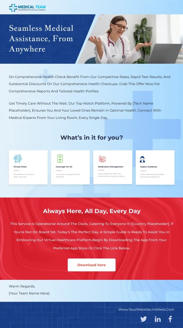
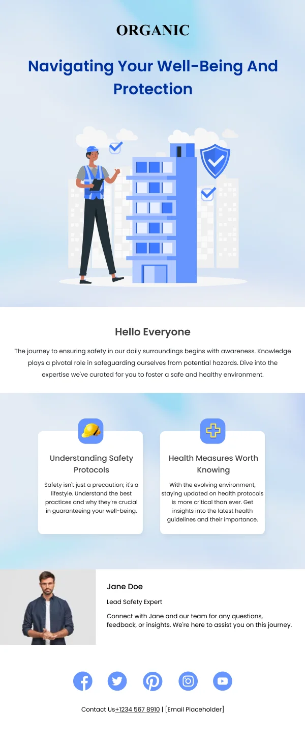
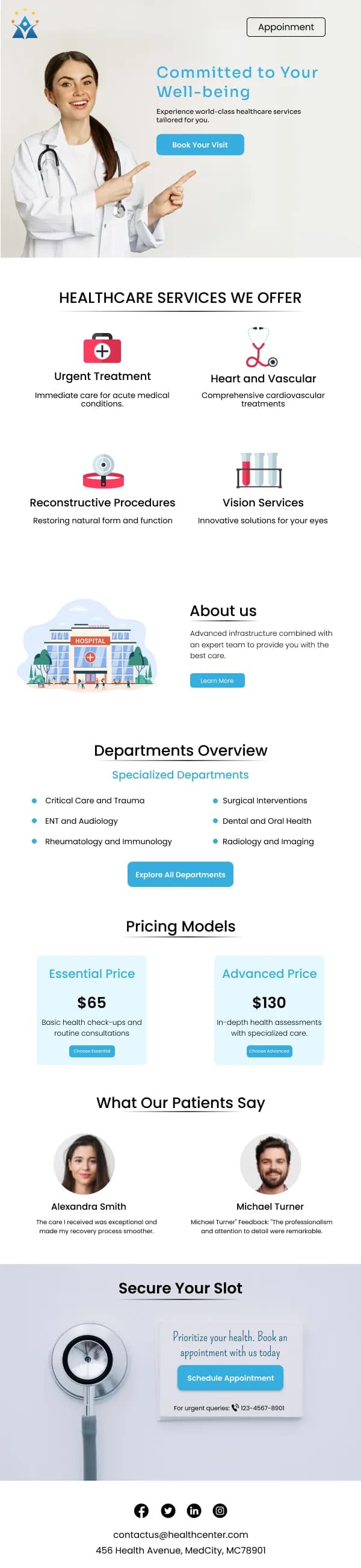
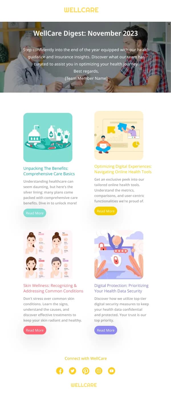
The 15 designs in this collection are deliberately plain.
Notify, do not disclose
The governing principle: email announces that information exists and provides a
route to it. It does not carry the information.
That means results notifications say results are available and link to a secure
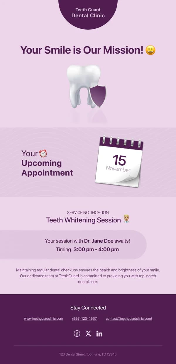
portal. It means appointment reminders can carry time and place but not the reason
for the appointment. Inboxes are shared between family members, viewed on lock
screens, and forwarded — a design that assumes privacy is a design that will
eventually cause harm.
Appointment reminders
The most common send in the category and the one with the clearest brief:
- Date, time, location, clinician in the first screen.
- What to bring or prepare, if anything, including fasting or medication
instructions.
- How long to allow.
- One-tap confirm, reschedule or cancel.
Making cancellation prominent feels counterproductive and is not. A patient who
cannot easily cancel simply does not attend, and the slot is lost entirely rather
than reallocated.
Tone and typography
Plain language throughout, and larger type than a commercial email would use.
Healthcare audiences skew older on average and may be reading in distress, so
body copy below about 16px is a genuine accessibility failure rather than a
stylistic choice.
Contrast should be tested rather than assumed, and the accent colour should be
reserved for actions.
Service and practice updates
Opening hours, closures, new locations, staffing changes, service availability.
These follow announcement discipline — the fact and the date first, then what it
means for the patient, then the detail. An explicit "no action needed" where true
saves a meaningful volume of calls.
Restraint on marketing
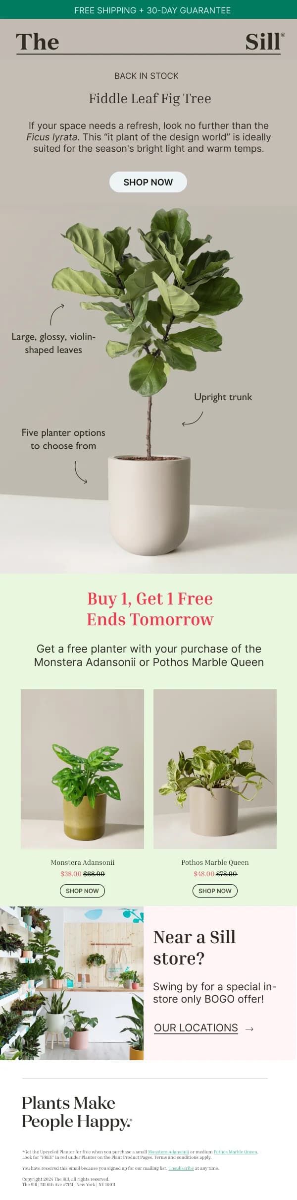
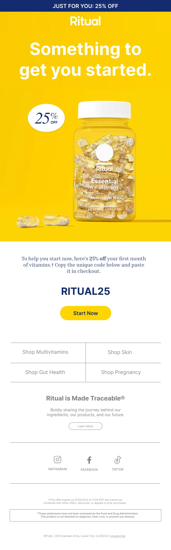
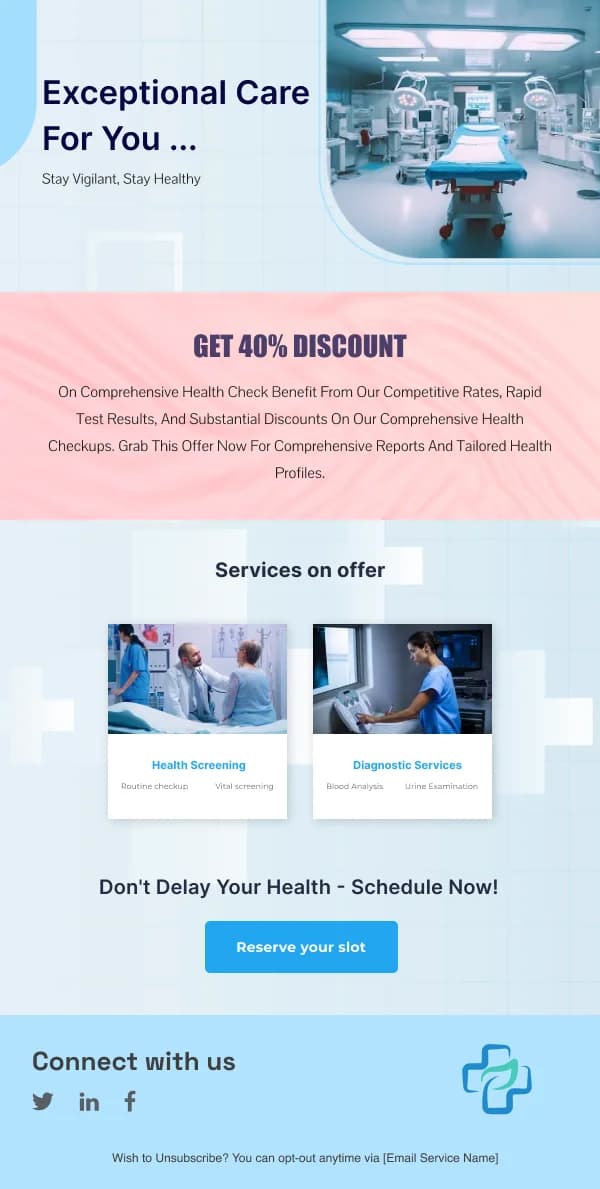
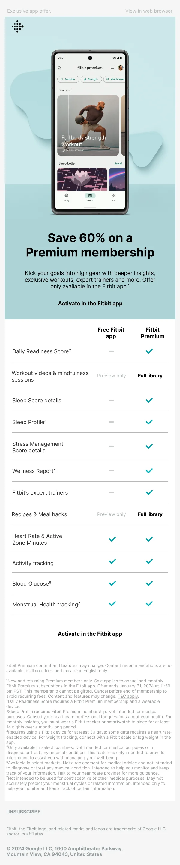
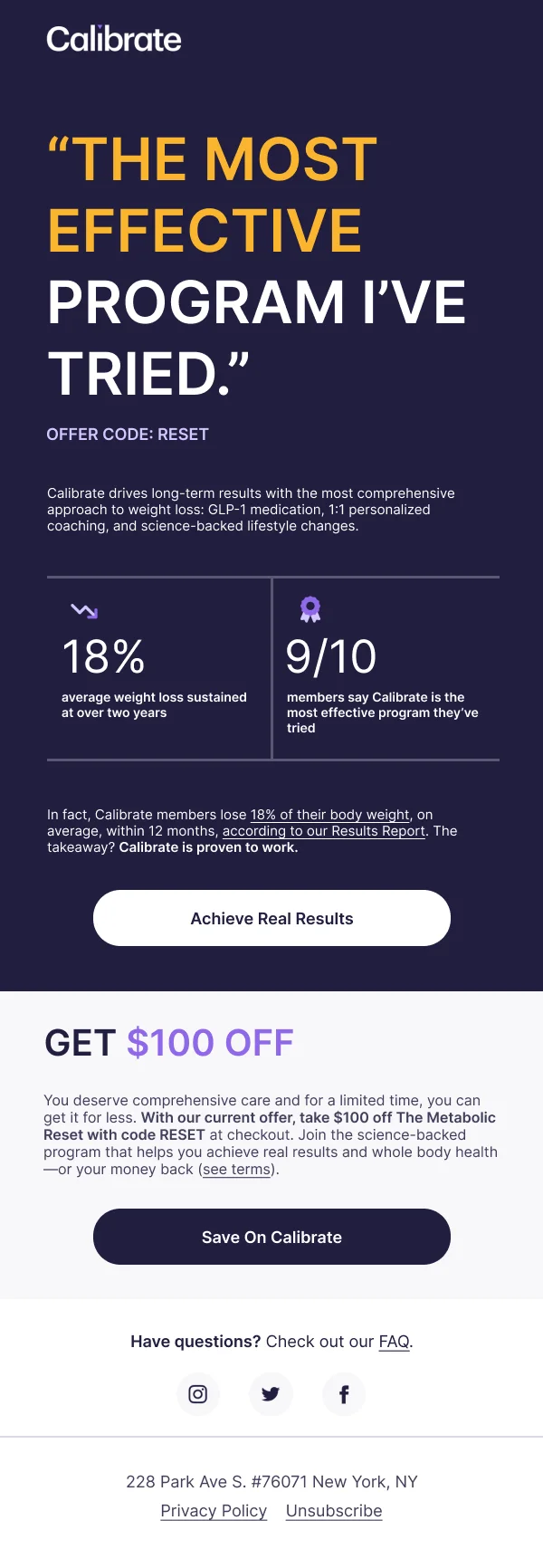
Some services in this category are commercial, and promotional email within them
is legitimate. It should still be plainer, quieter and more factual than the
equivalent send in another sector, and it should never be attached to a clinical
notification.
Using these templates
Deliberately the plainest files in the library — larger type, no decorative imagery, and nothing that implies clinical detail. Checks: does the email avoid
clinical detail, is body type at least 16px, are date and time in the first screen,
and is there a visible route to reschedule or cancel.
Common questions
- What should a healthcare email never contain?
- Clinical detail. Email is not a private channel, and inboxes are shared and forwarded. Notify that something is available and send the reader to a secure portal; do not put results, diagnoses or medication detail in the message body.
- How should appointment reminders be designed?
- Date, time, location and clinician in the first screen, with a one-tap route to confirm, reschedule or cancel. Making cancellation easy reduces missed appointments, which is the actual goal.
- What tone works?
- Plain and calm. Enthusiastic marketing language in a health context reads as inappropriate, and anxious readers need information rather than reassurance-by-adjective.