Food email has an advantage no other category enjoys: appetite is immediate. A
good photograph of a good dish creates want in under a second, with no argument
required. It also has a specific disadvantage — the purchase is bounded by
geography and time, so an email that inspires someone who cannot act on it has
achieved nothing.
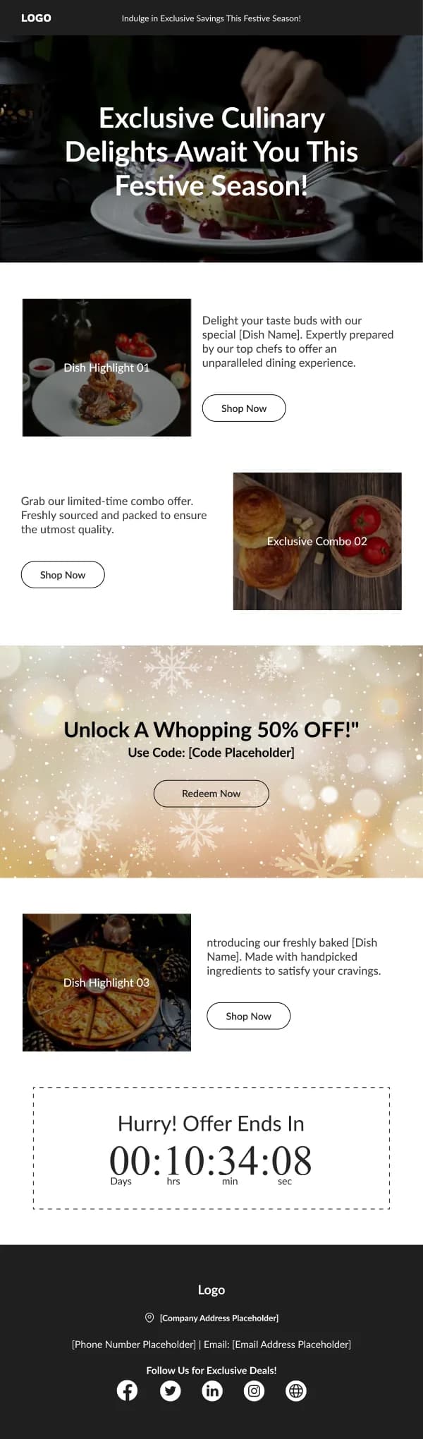
The 48 designs in this collection are built to do both jobs: create the appetite
and remove the practical friction.
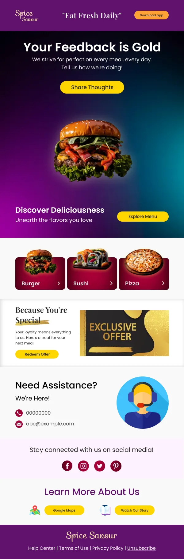
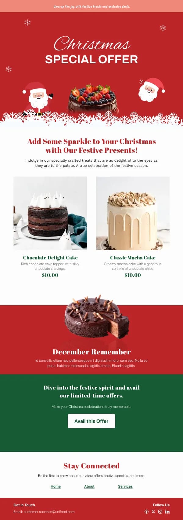
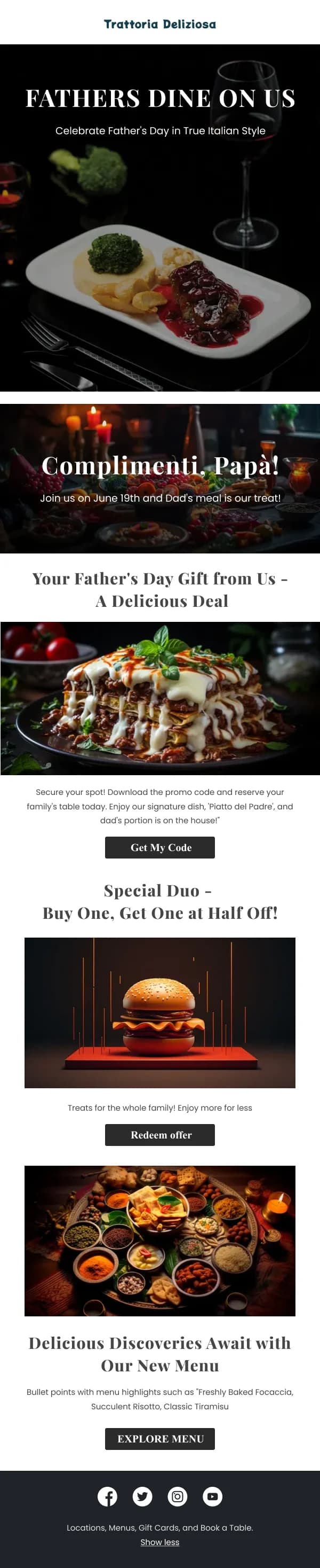
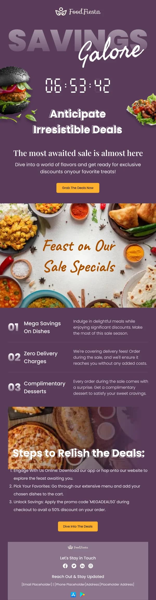
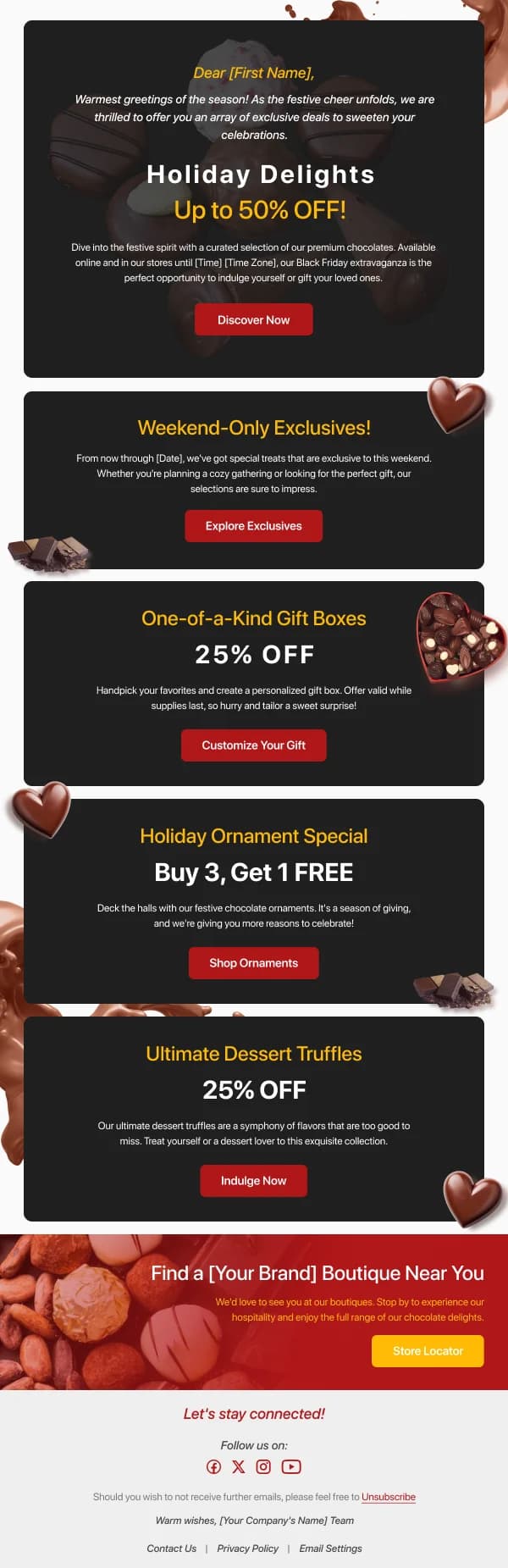
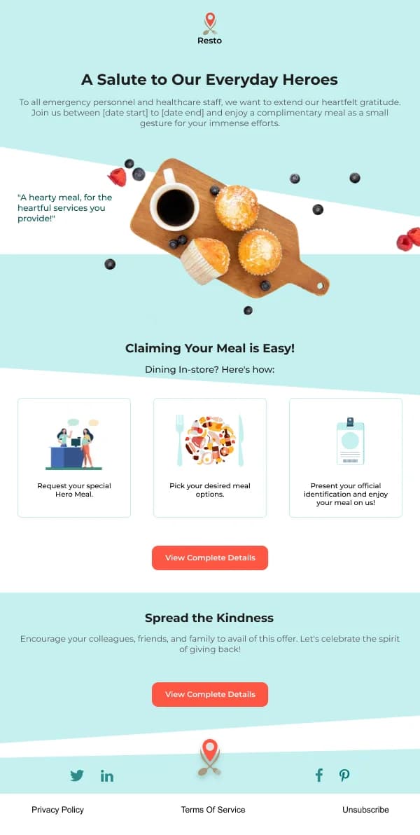
The photograph is the argument
There is no layout that compensates for a bad food photograph, and a good one
survives an ordinary layout. Where the design helps:
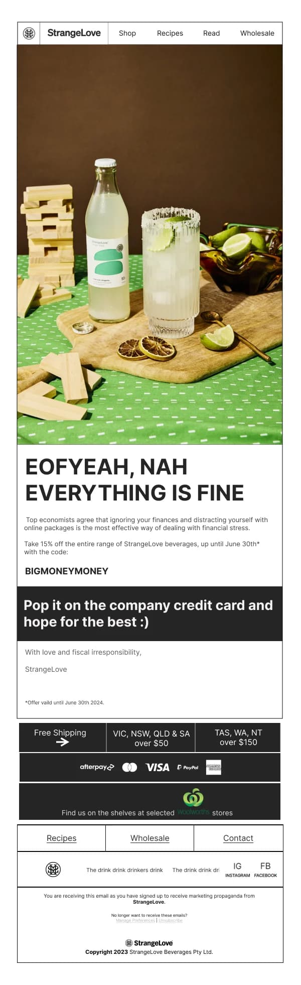
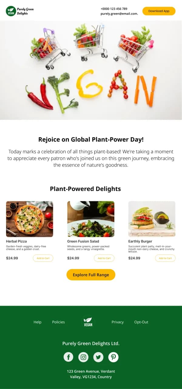
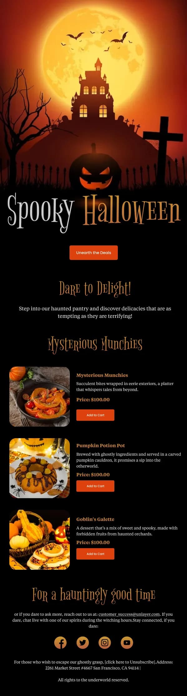
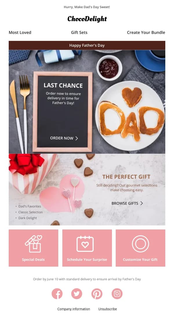
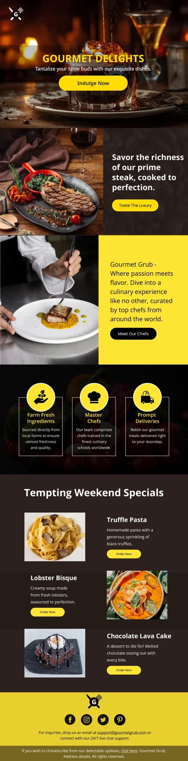
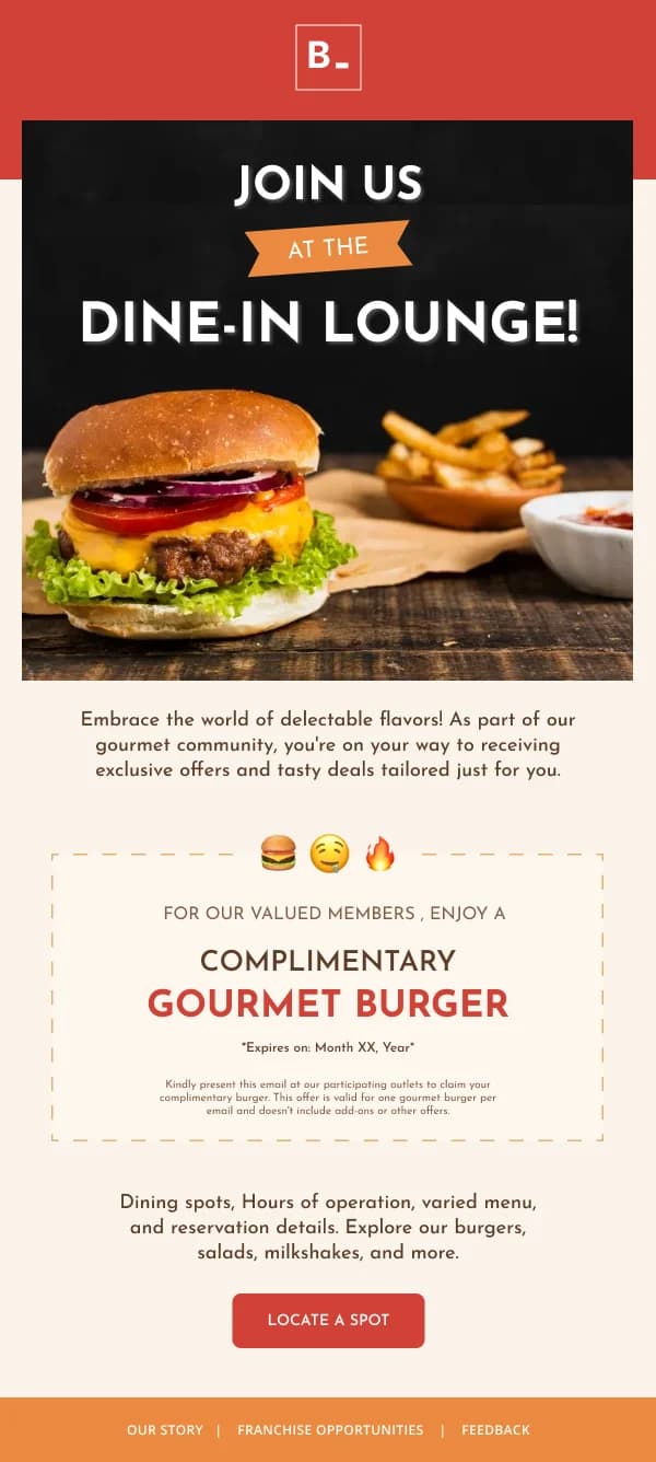
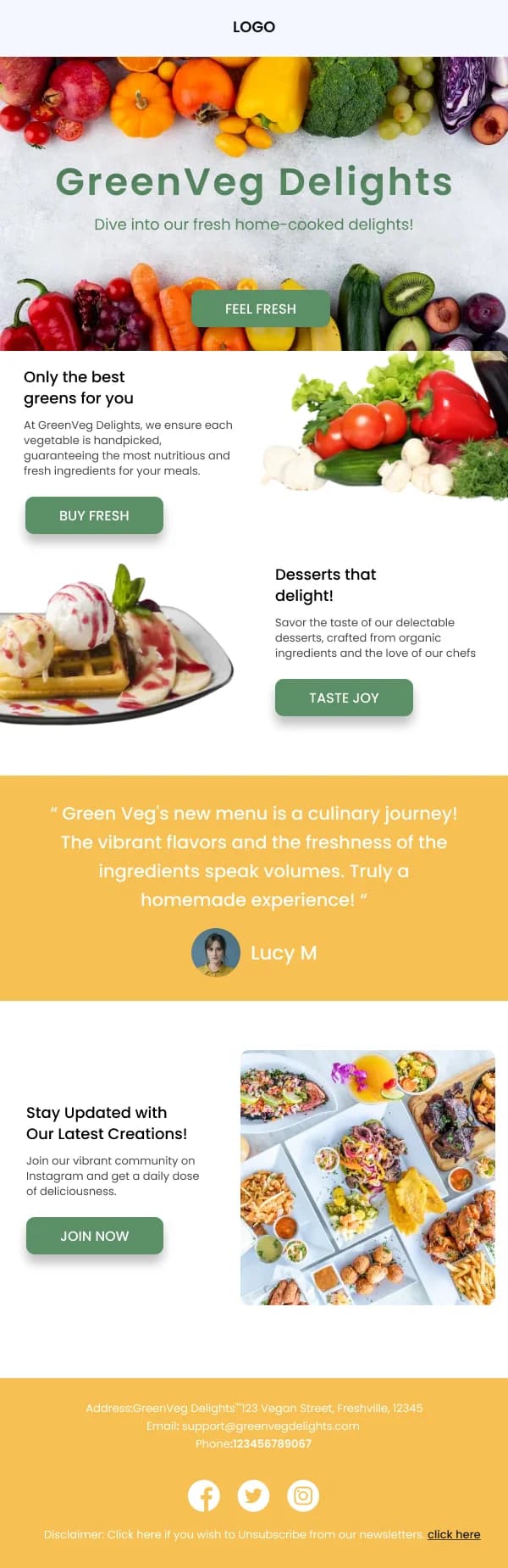
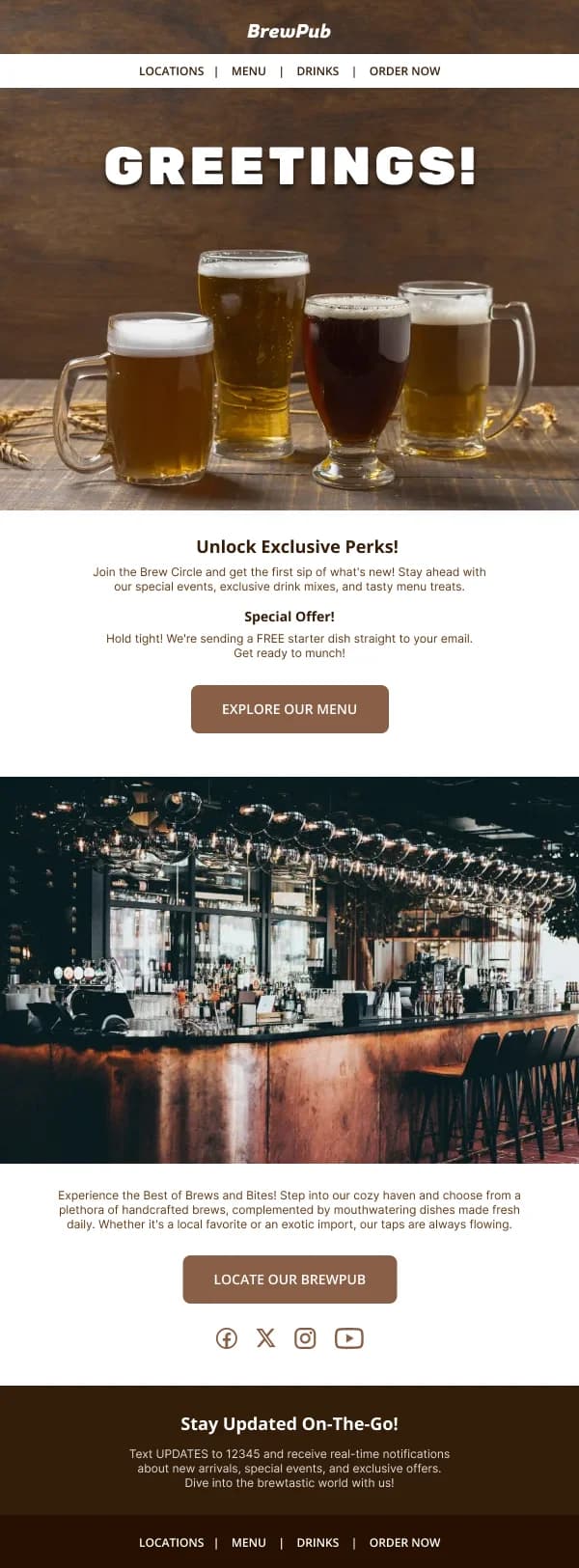
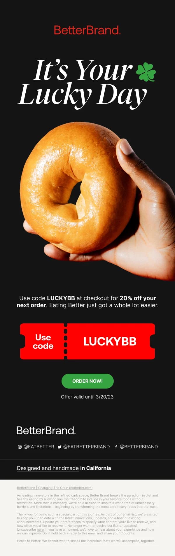
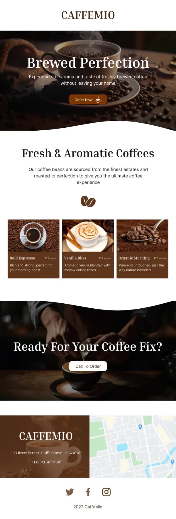
- Give the dish the full width in the hero. Food photography cropped small
and surrounded by copy loses most of its effect.
- Warm, natural light. Cool or heavily filtered food imagery reads as
unappetising in a way that is hard to articulate and easy to notice.
- One dish per image. A photograph of six plates communicates variety and
sells nothing specific.
The practical block is not optional
The most common gap in restaurant email is an email that makes the reader hungry
and then does not tell them what to do about it. Every send in this collection has
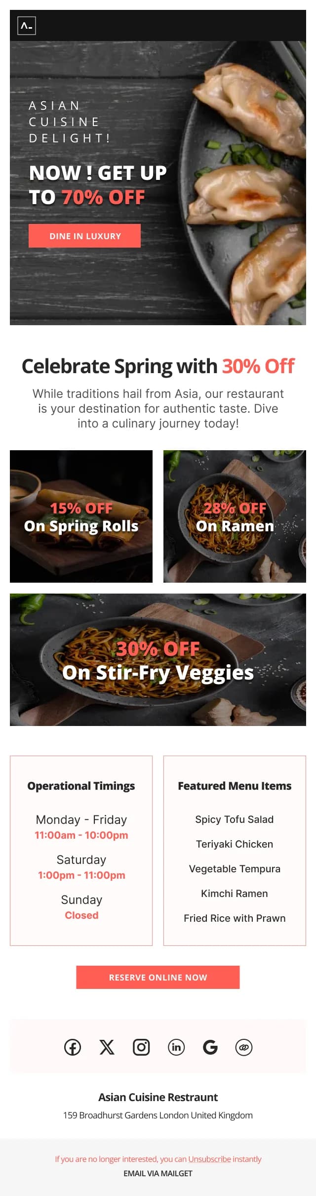
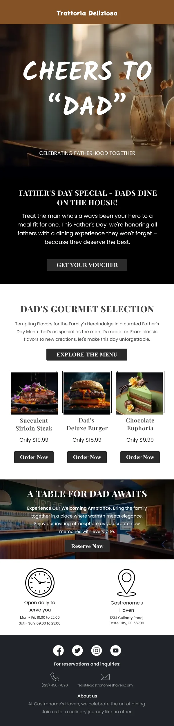
a slot for the operational facts:
- Where — the address, and a link that opens a map rather than a page.
- When — the opening hours relevant to this send, and any change to them.
- How — book, order, walk in. One primary action.
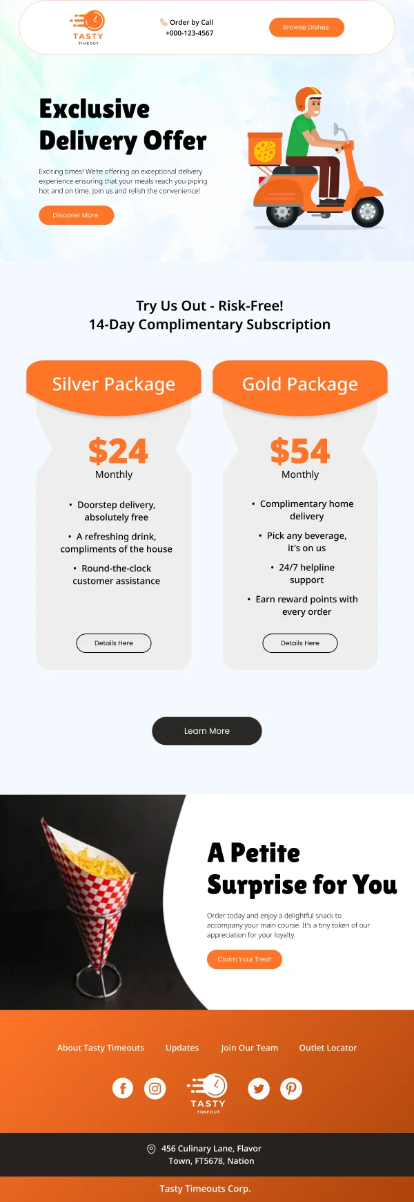
- Delivery scope, where relevant, stated rather than implied.
For a reader who is deciding about tonight, that block is the email.
Menu changes and seasonal launches
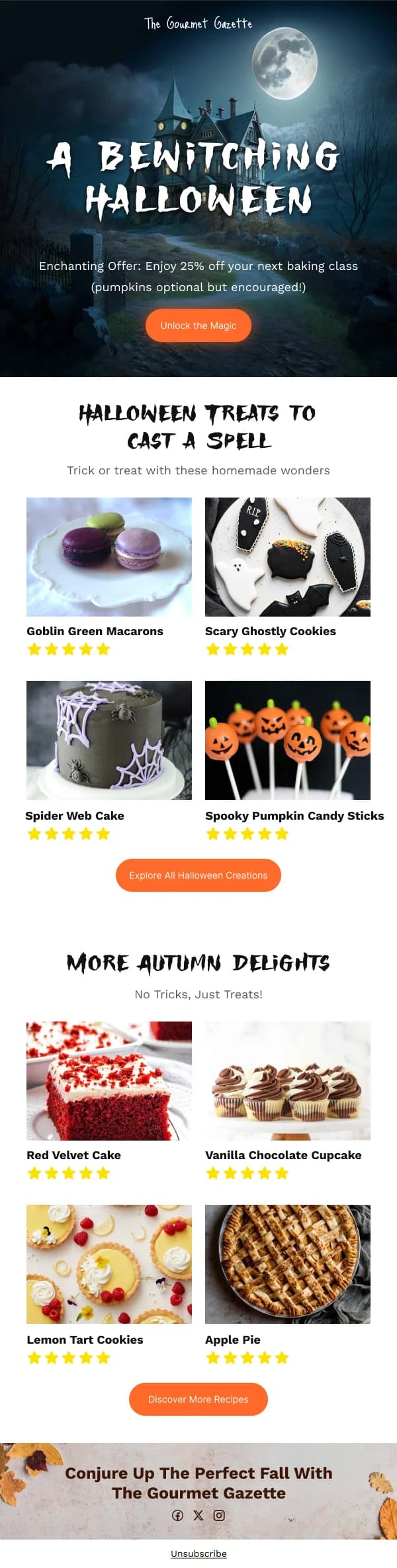
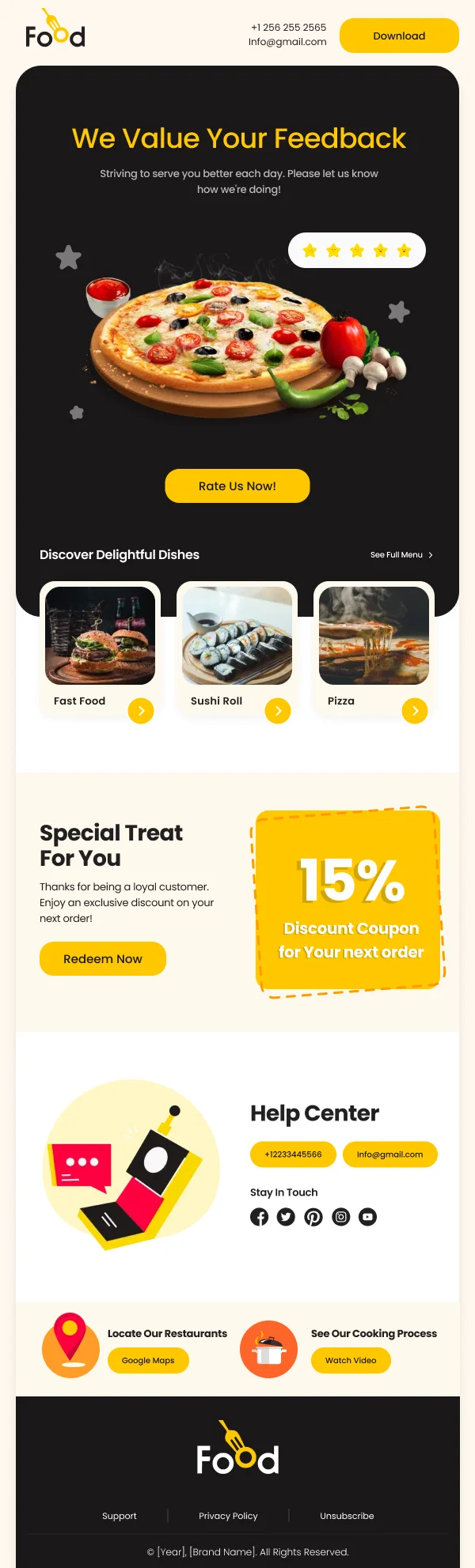
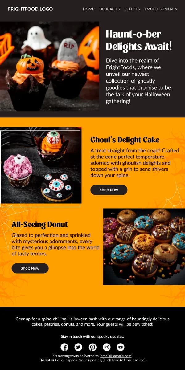
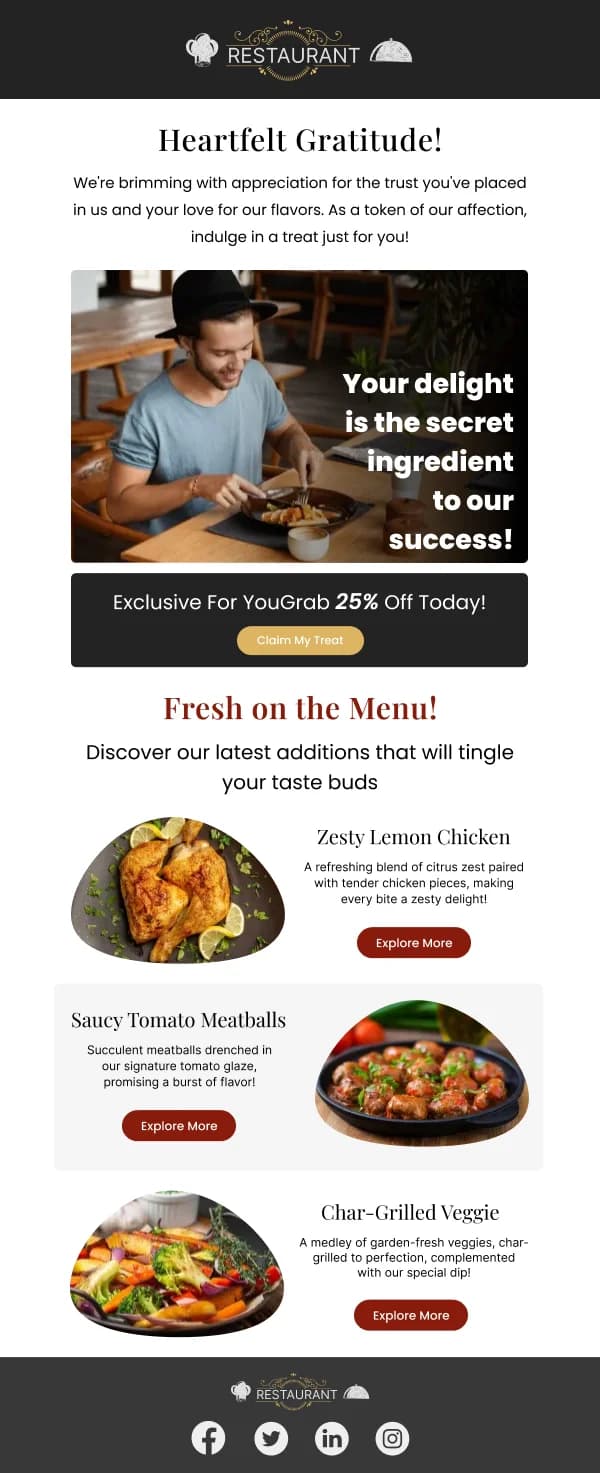
New-menu sends work best when they are specific rather than comprehensive. Three
or four new dishes, each with a photograph and one line, and a link to the full
menu. A complete menu in email form is unreadable on a phone and it dilutes the
new items.
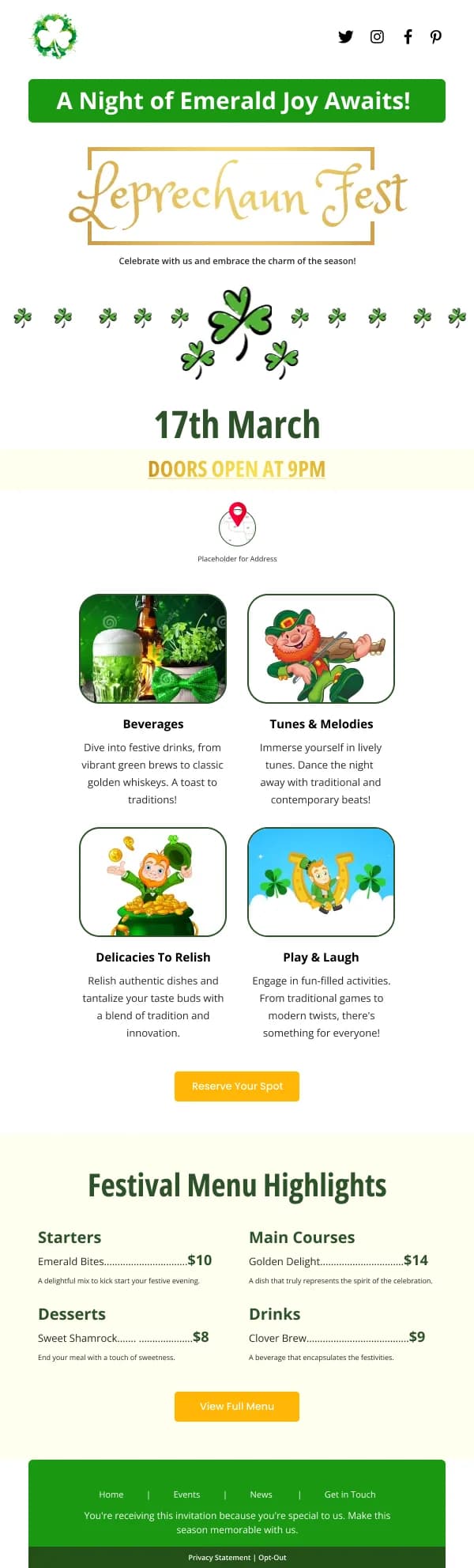
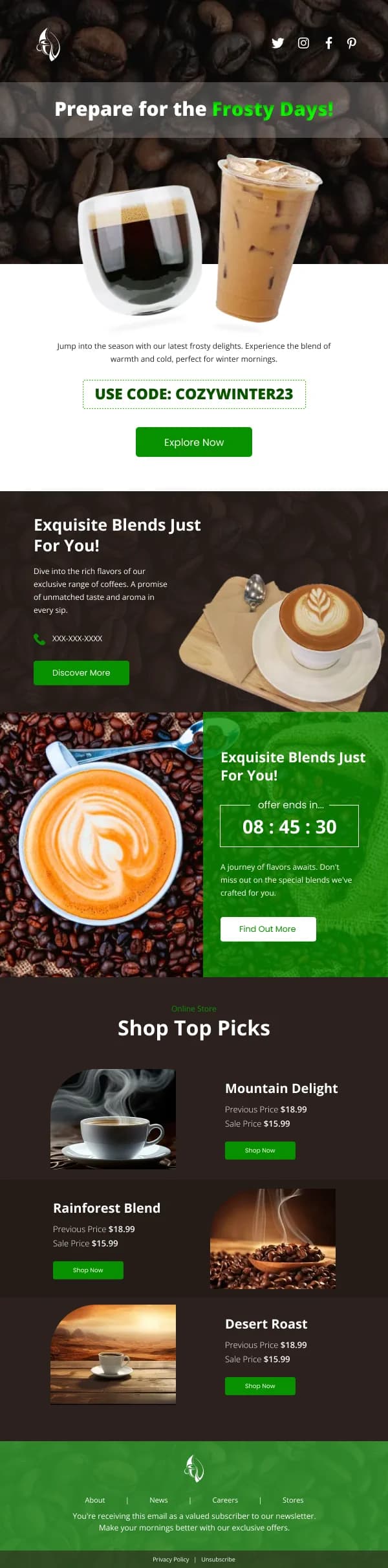
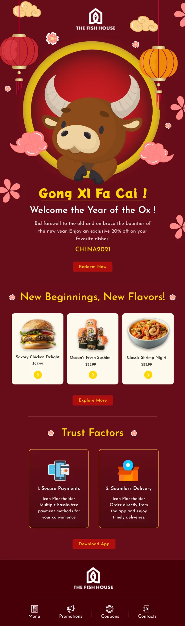
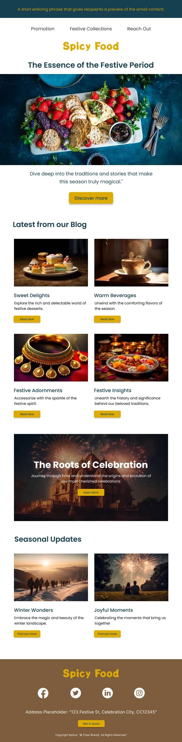
Seasonal launches — a summer menu, a festive set, a limited run — benefit from a
stated window. "Until the end of August" gives the reader a reason to act rather
than to file the email.
Order and delivery status
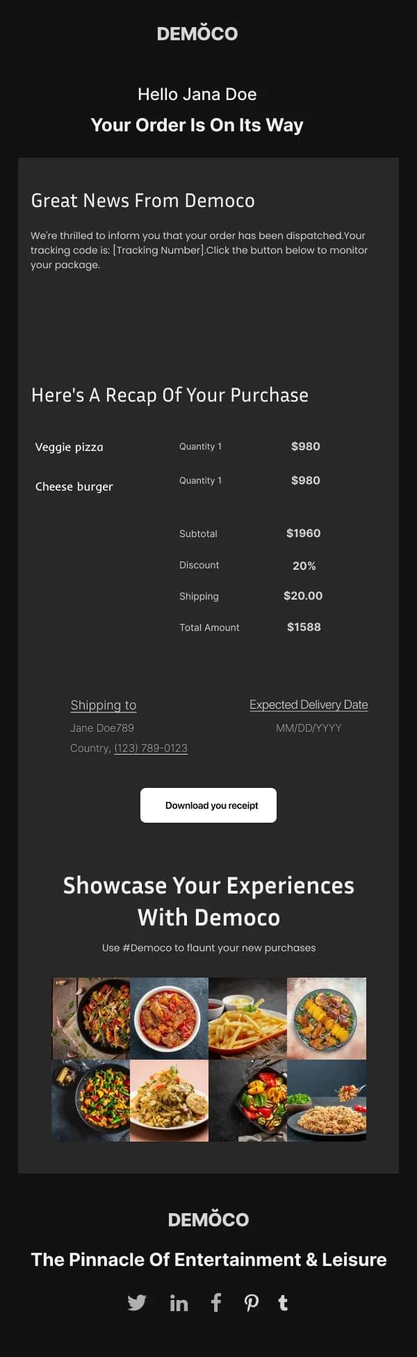
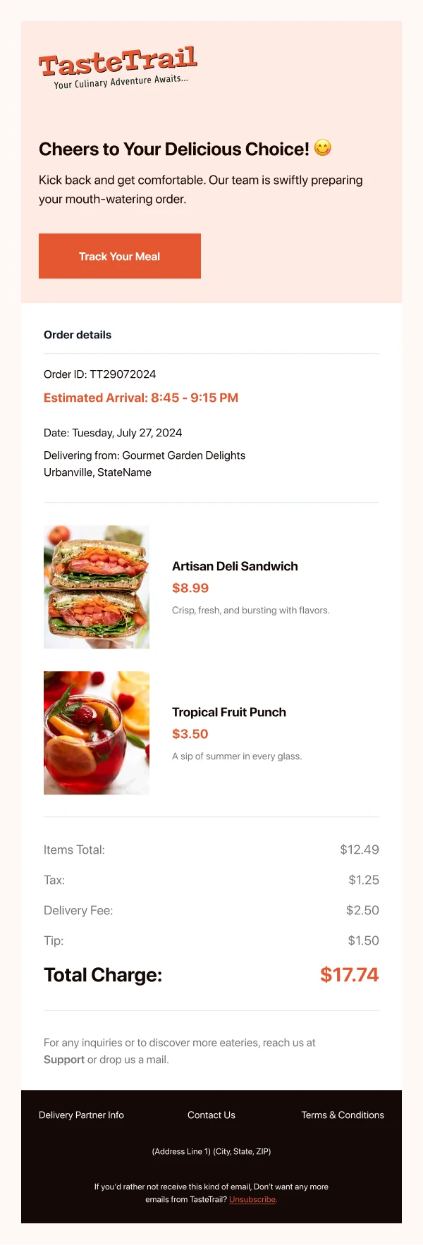
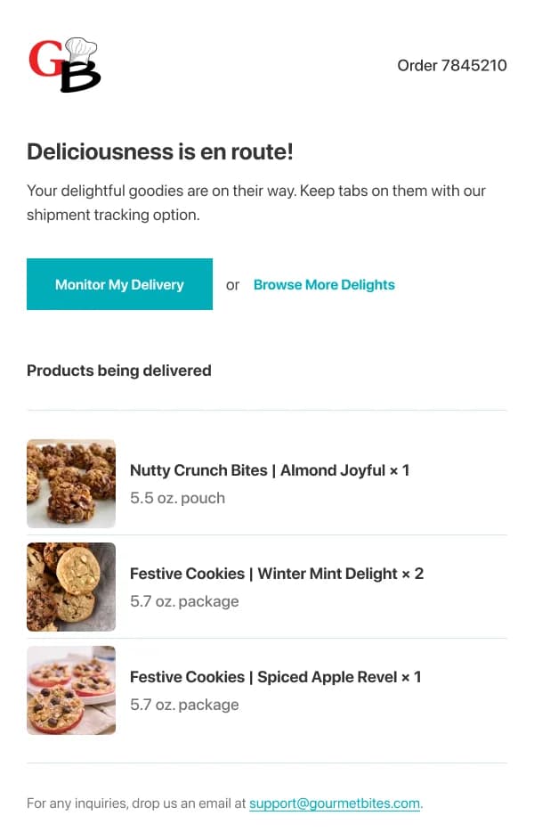
These are the most-read emails a food business sends, and they follow the
transactional discipline:
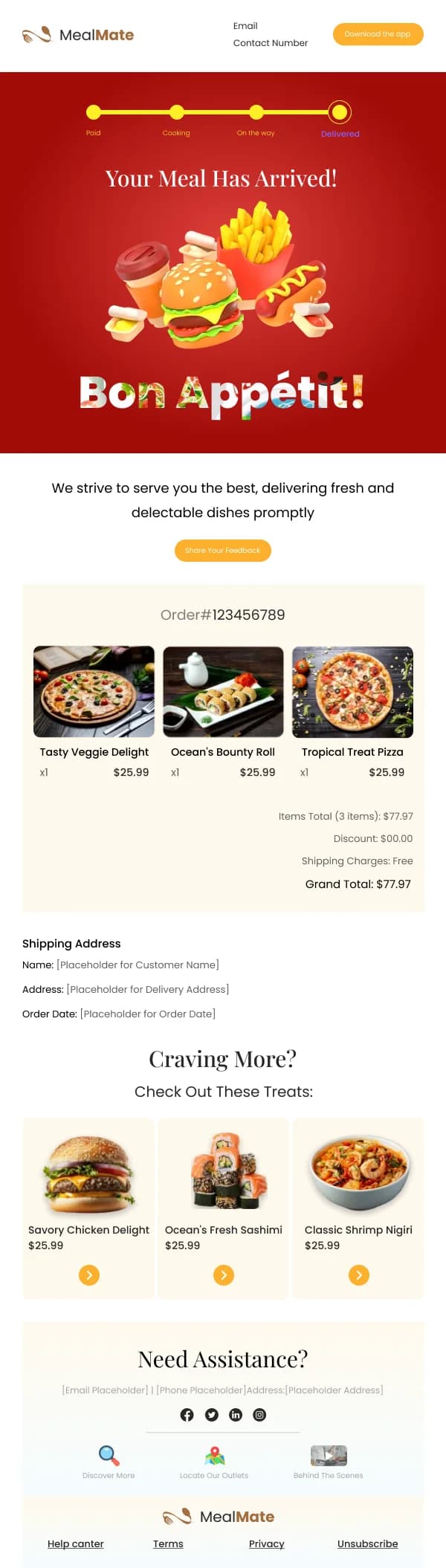
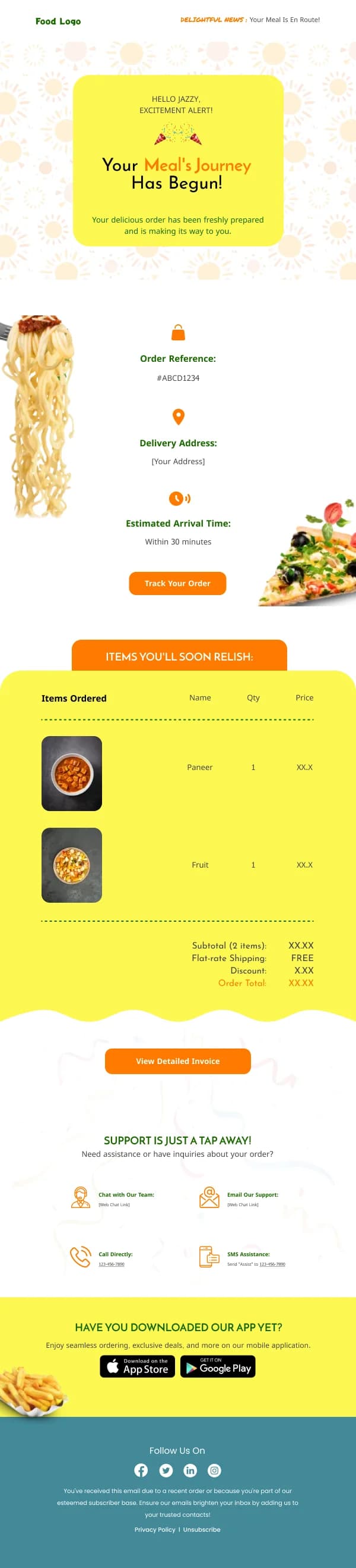
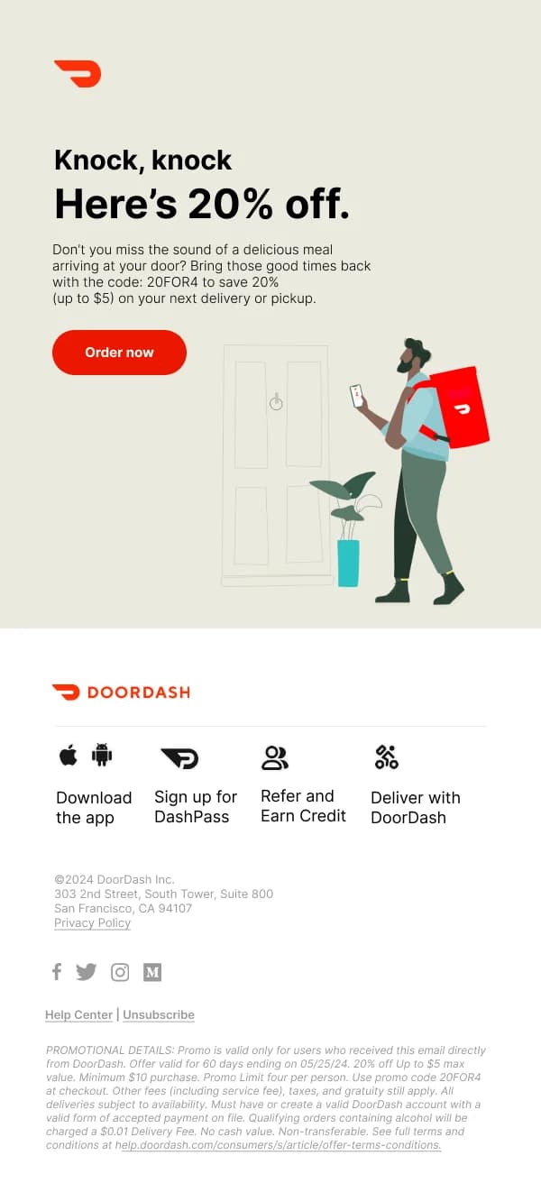
- Status and time first. "Your order is on its way, arriving by 19:40."
- Order contents below that, scannable, for verification.
- Anything else — reorder, loyalty, review — below that. The cross-sell in a
delivery email works precisely because it is not competing with the status.
A confirmation that opens with a marketing banner before the order number is a
design failure, even though it is the most commercially tempting layout.
Loyalty and reorder
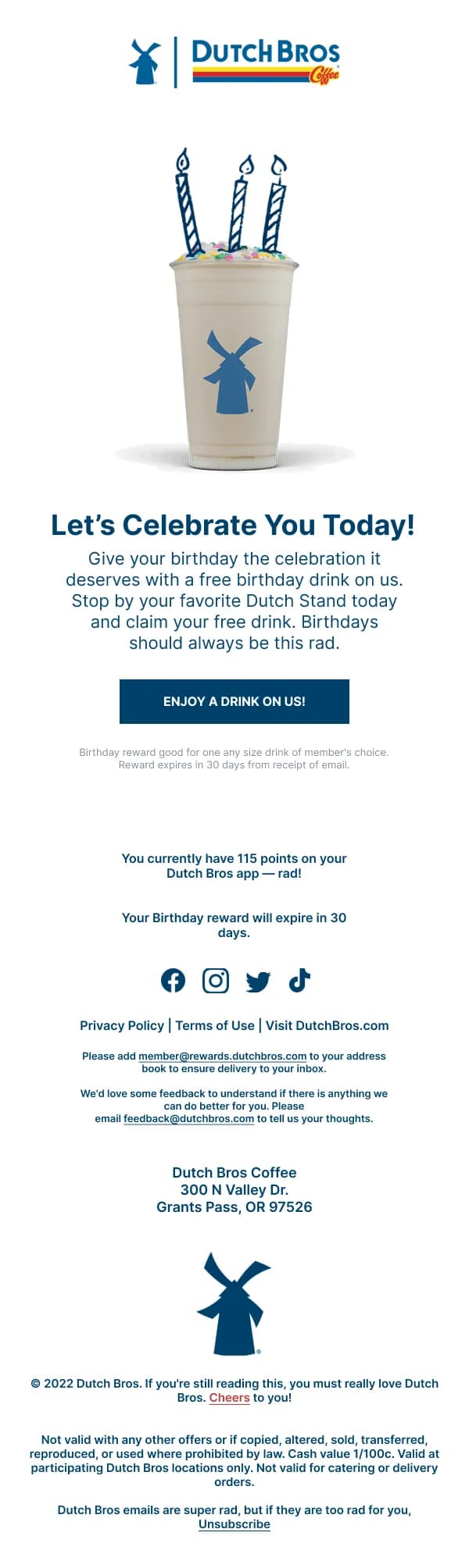
Food purchases repeat on a rhythm, which makes reorder prompts effective and easy
to design badly. What works:
- Show the exact thing they ordered before, photographed.
- One button to repeat it.
- Loyalty status, if any, as a small clear element — points, stamps, progress to
the next reward.
Progress toward a reward is the one gamification element that consistently earns
its space in food email, because it is genuinely information the reader wants.
Reservations and events
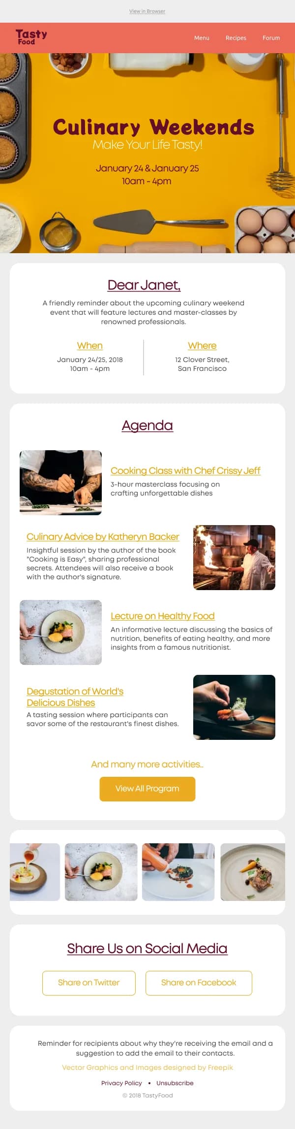
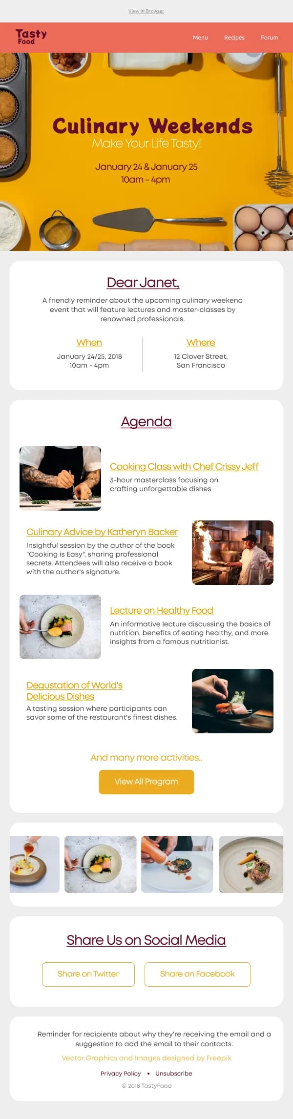
Booking-led sends need the date and time treated like a price: distinct, large,
unambiguous, with the month in words. Confirmations should include everything the
reader needs to arrive — time, party size, address, and the cancellation policy in
a plain sentence.
Reminder sends the day before have a high practical value and a low design
requirement: the detail, the map link, and a one-tap way to change or cancel.
Using these templates
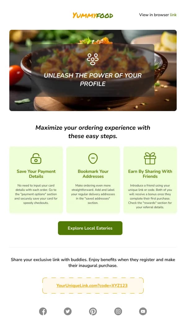
The practical block — address, hours, delivery scope — is a component, because an appetising email that omits it converts nothing. The category-specific
checks: is there a real photograph of a specific dish, does the email carry
location and hours, is there exactly one primary action, and — for status emails —
does the status appear above any promotional content.
Common questions
- What matters most in a restaurant email?
- The food photograph and the practical detail. Appetite gets the reader interested; opening hours, location, delivery radius and how to book are what turn interest into a visit. Emails that nail the first and omit the second are the most common failure in the category.
- Should the whole menu be in the email?
- No. A menu is a reference document and an email is a prompt. Three or four dishes with real photographs and a link to the full menu outperforms a text list of forty items, which nobody reads on a phone.
- How do I handle multiple locations?
- Segment by location if you can, and design for a single location per send. Where that is not possible, put the location selector high and keep the shared content generic — a reader in one city reading about another city's offer will simply stop opening.
- What about delivery and order status emails?
- They are the most-opened emails a food business sends and they should lead with status and time. Everything else — a reorder prompt, a loyalty nudge, a review request — goes below that, never above.