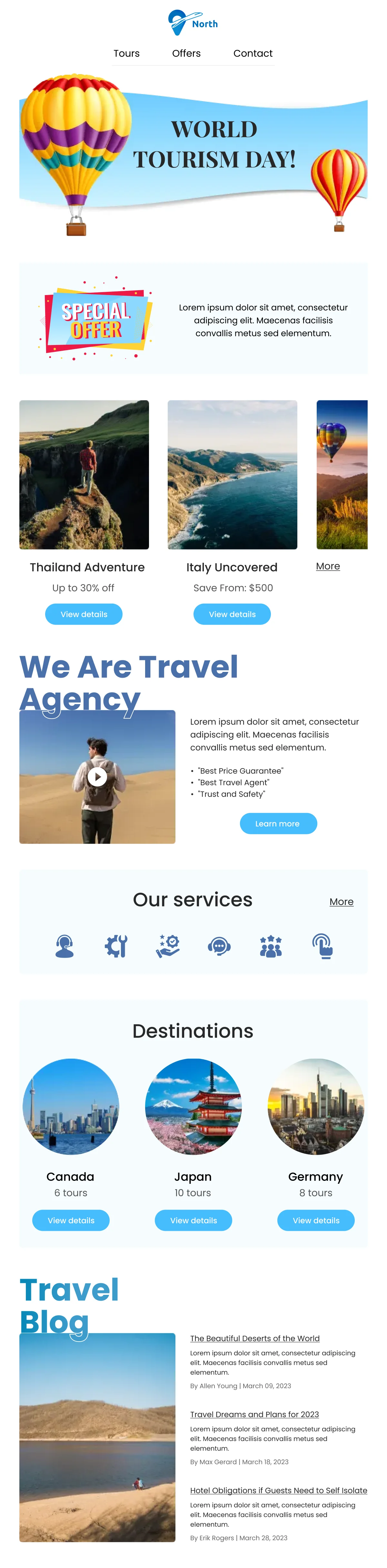
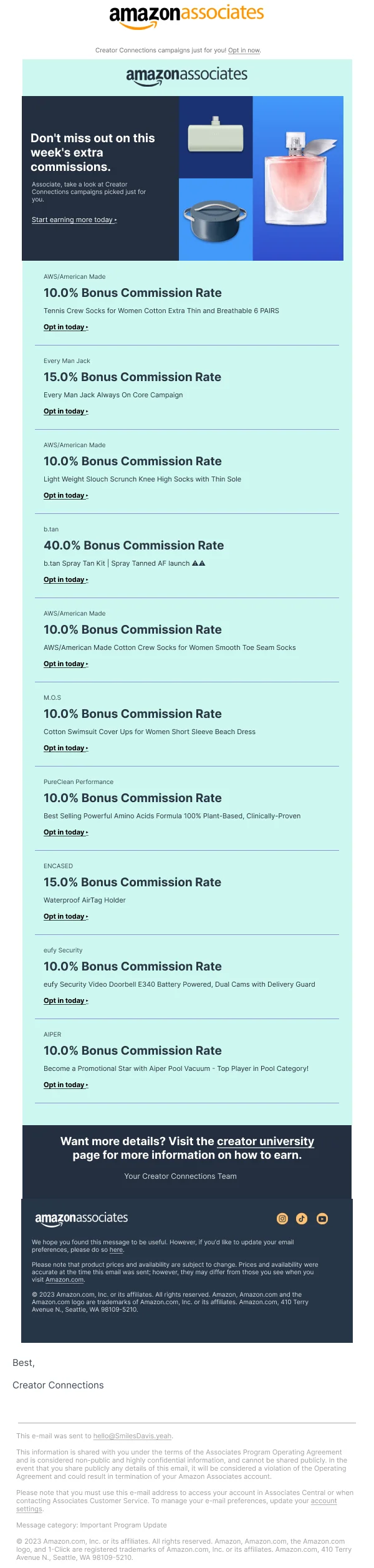
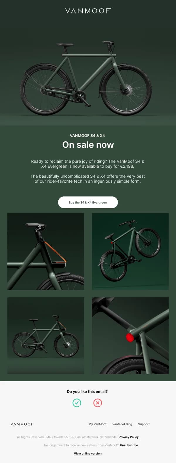
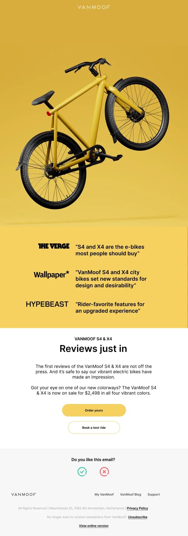
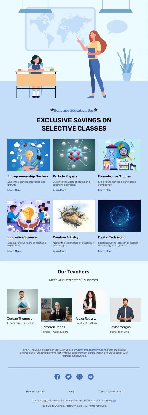
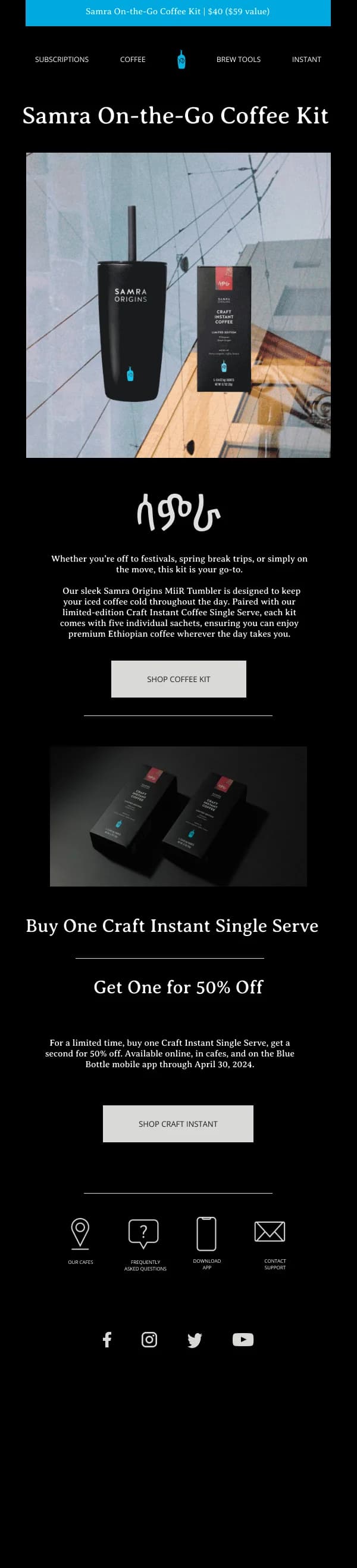
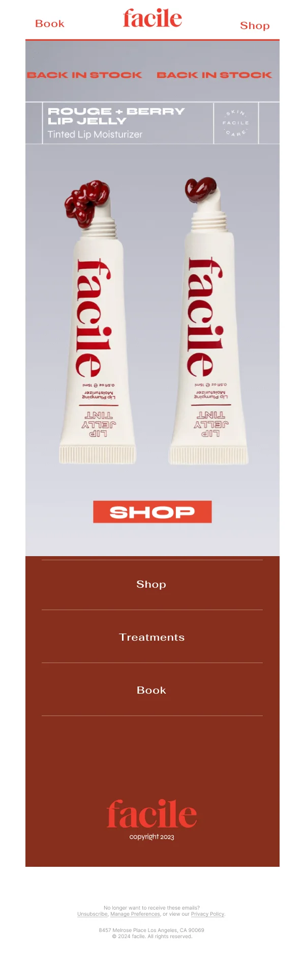
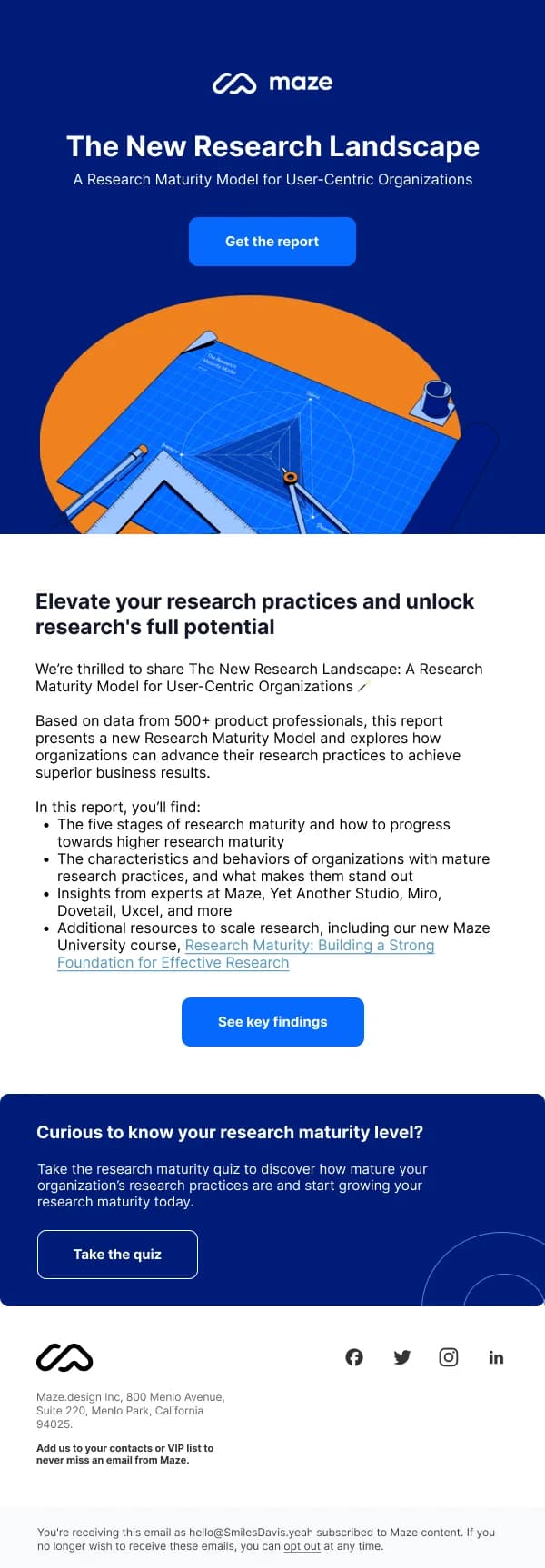
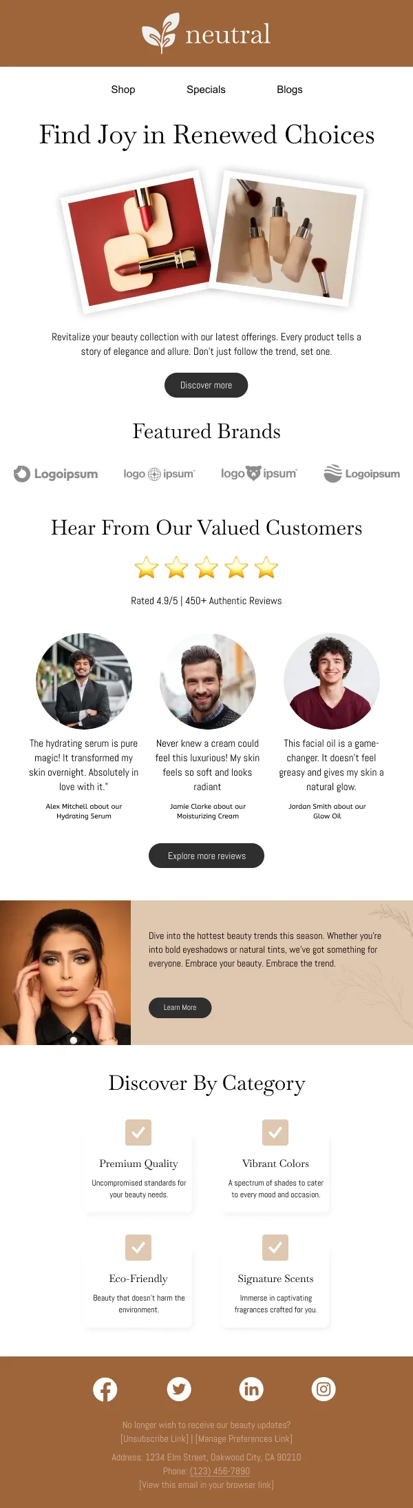
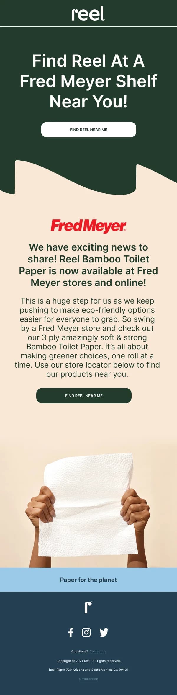
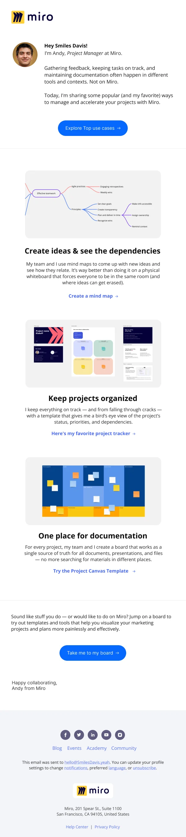
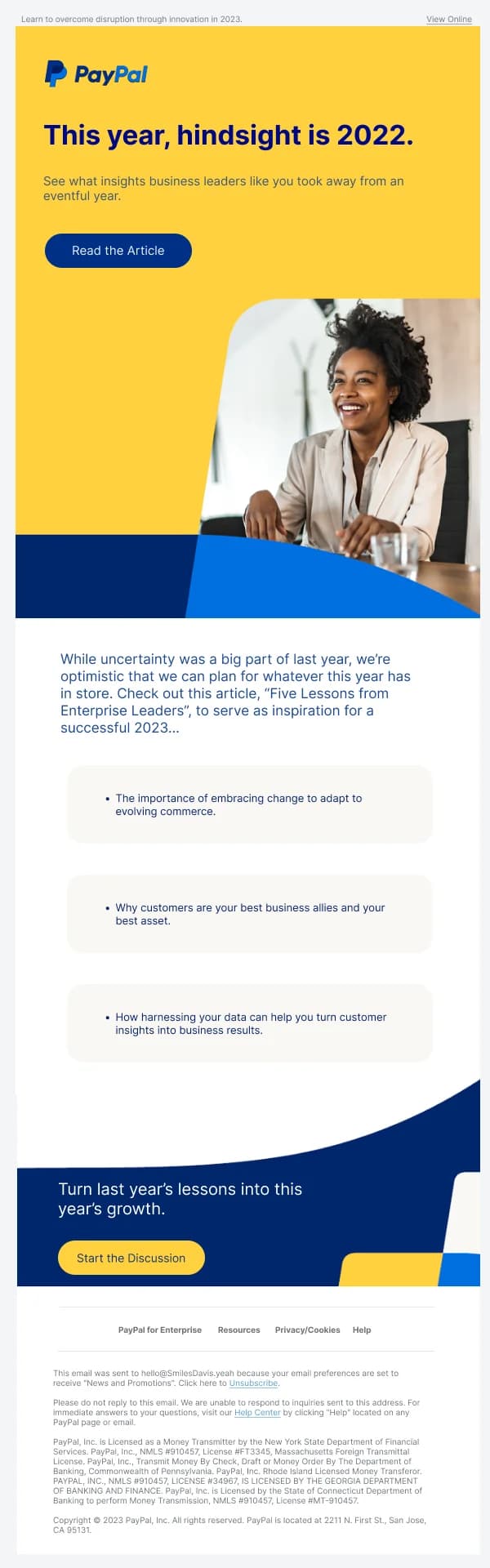
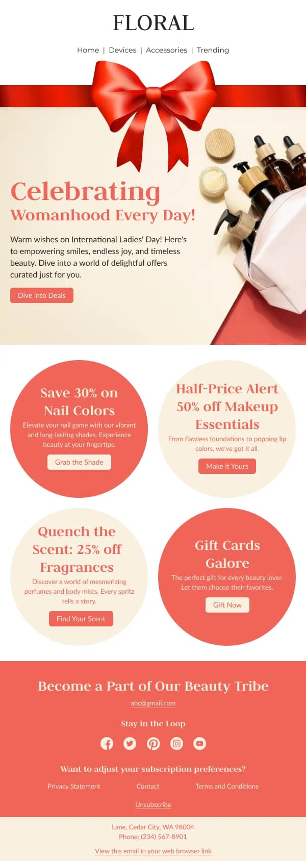
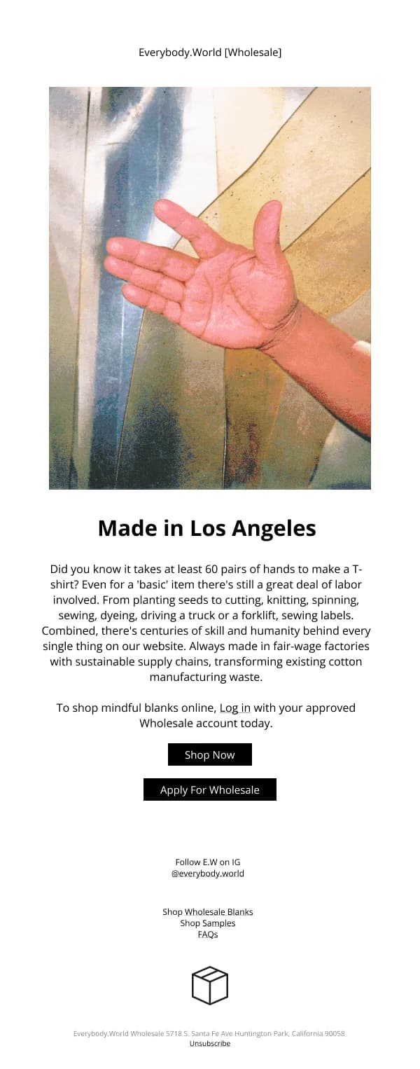
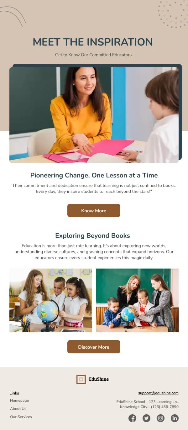
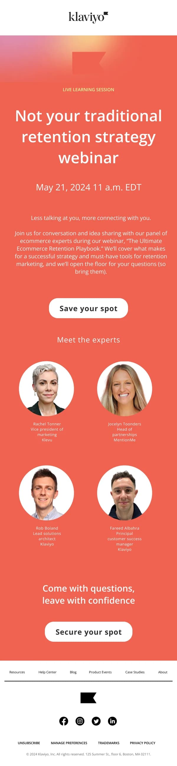
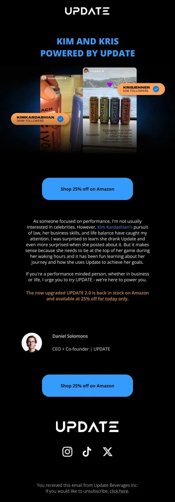
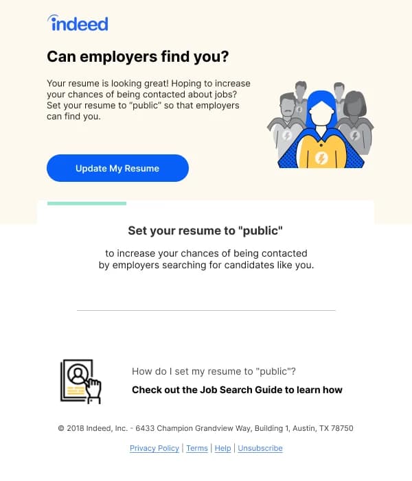
This is the workhorse category. Most email programmes send more of these than
anything else, and because there is no launch novelty and no discount urgency to
lean on, the design has to carry more.
The 84 designs in this collection are built for that repeated, unglamorous job.
Every promotion needs a reason
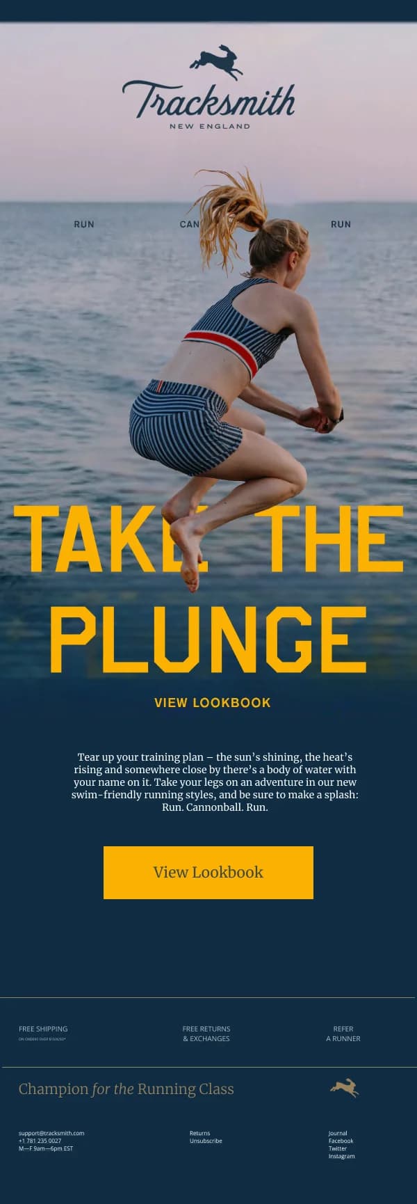
The weakest promotional email is one that shows a product with no answer to "why
now". The reader's question is not "is this nice" but "why am I being told about
this today".
Reasons that work, and that these templates are shaped around:
- It came back. Restocks are the most reliable promotional send there is,
because the reason is self-evident and the audience often self-selected.
- The season changed. The same product framed for a different context.
- There is a new use. A pairing, a recipe, an application the reader had not
considered.
- Something about it changed. A new colourway, a reformulation, an
improvement.
- Others are choosing it. Genuine popularity, specifically stated rather than
gestured at.
The design consequence: there should be a slot near the top for that reason, and
it should be filled with a specific sentence rather than a generic one.
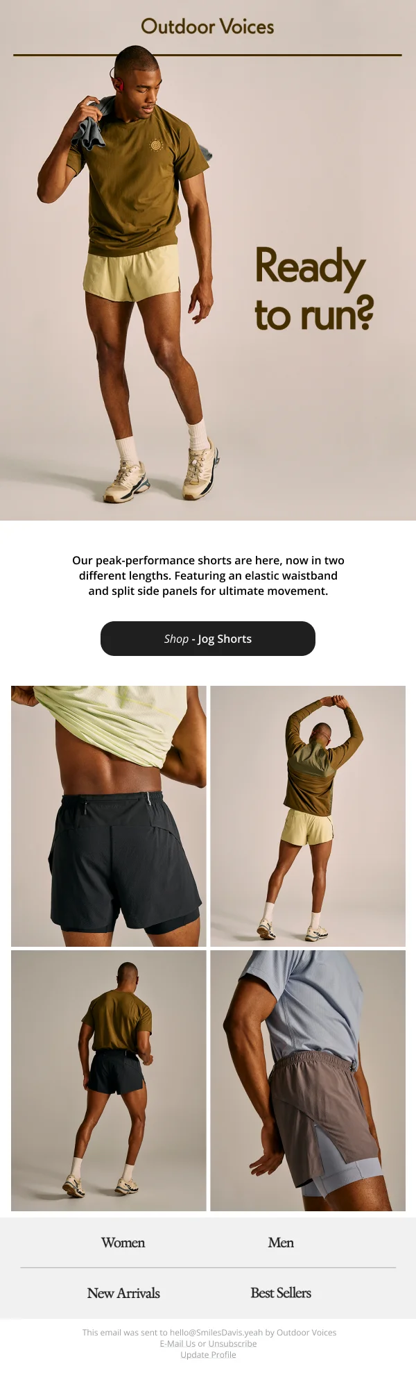
The single-product layout
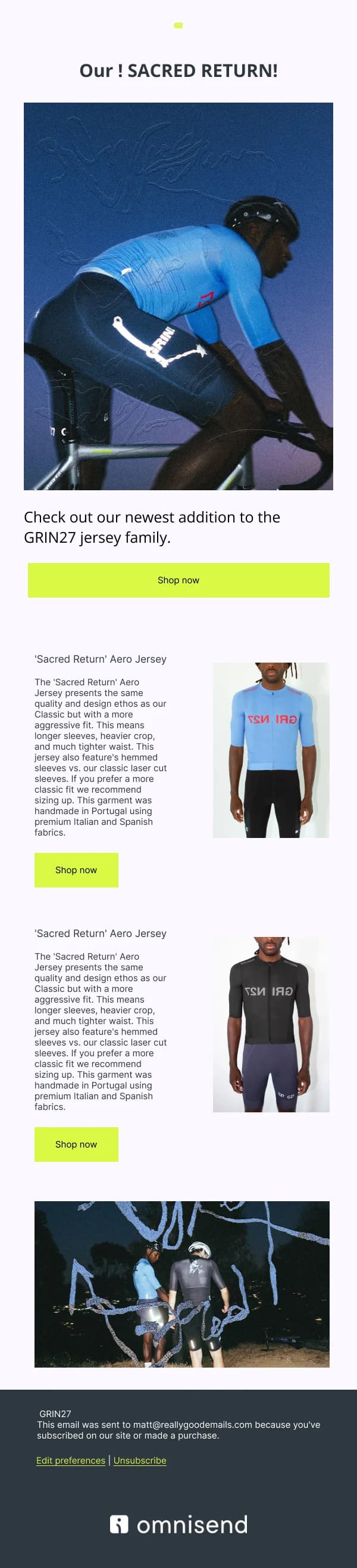
For one product, the shape that works most consistently is unfussy:
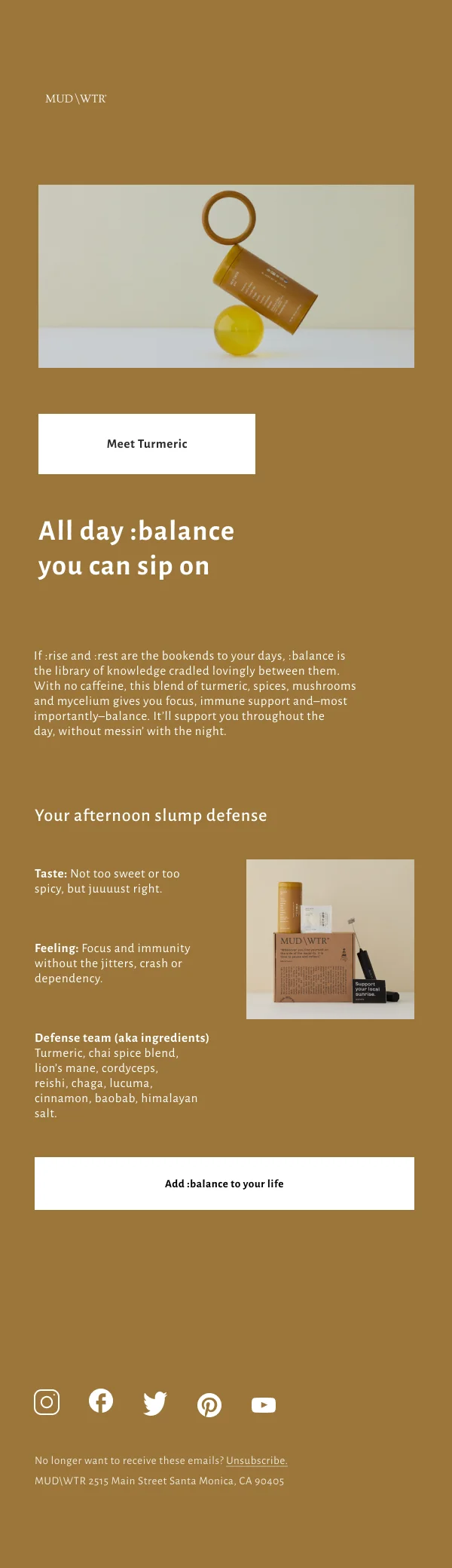
- A large, well-lit image with room around it.
- The name, at headline size.
- One line naming the distinguishing quality — not three.
- Price.
- Button.
- Below the fold: the detail for the interested, and two or three alternatives.
Single-product emails fail by adding a second product of equal weight halfway
down, which converts a decision into a comparison and slows both.
The spotlight and the roundup
A spotlight is a single product with genuine editorial attention — how it is made,
who it is for, why it exists. It is more work than a product card and it earns
more attention, particularly for higher-price items where the reader needs a
reason to trust the purchase.
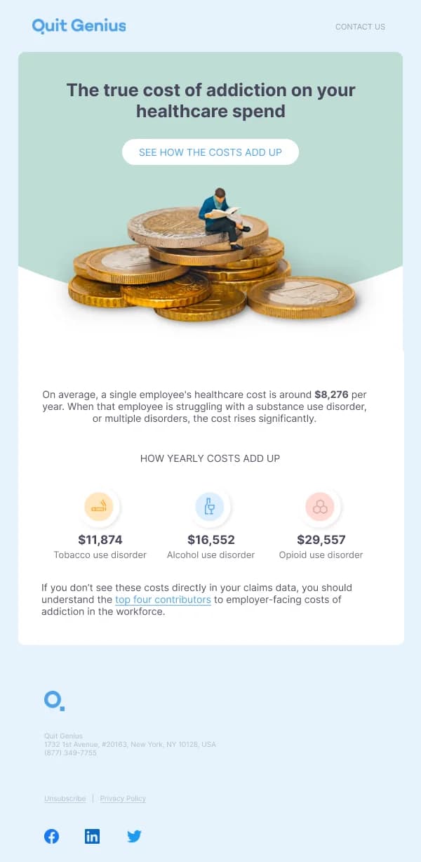
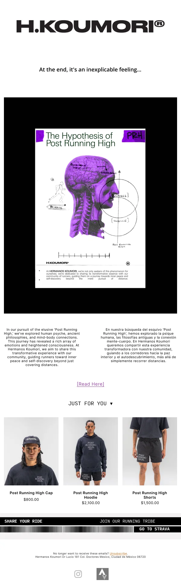
A roundup is three to six products with a stated organising idea. The organising
idea is what separates a roundup from a catalogue dump: "five things for a small
kitchen" works, "our products" does not. Design-wise, a roundup wants equal
visual weight across items and a consistent card shape, because uneven weighting
implies a ranking you probably did not intend.
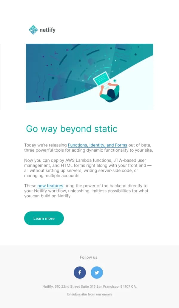
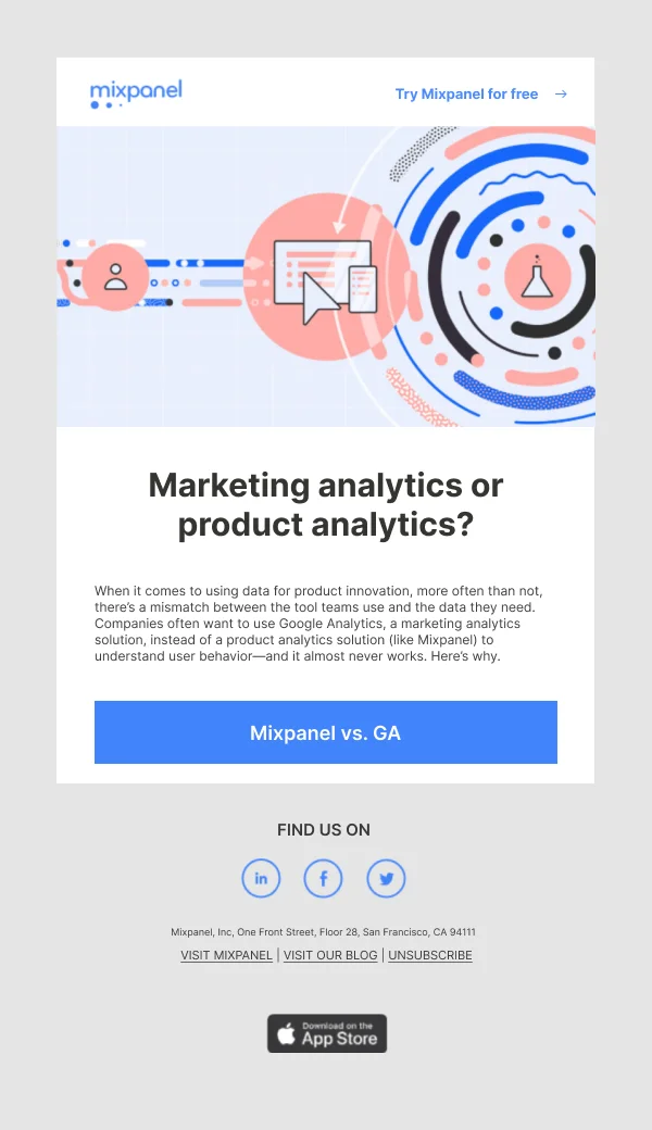
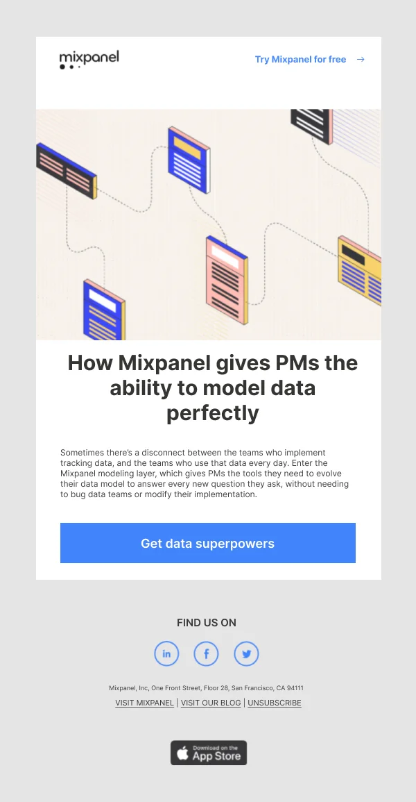
Product update emails
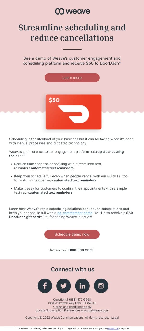
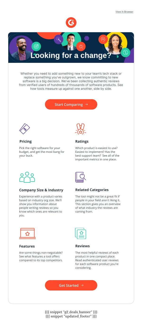
For software and subscription products, "update" means something changed and the
user should know. The discipline here is severe compression:
- One sentence on what changed, in plain language, not release-note phrasing.
- One sentence on who it affects and why they should care.
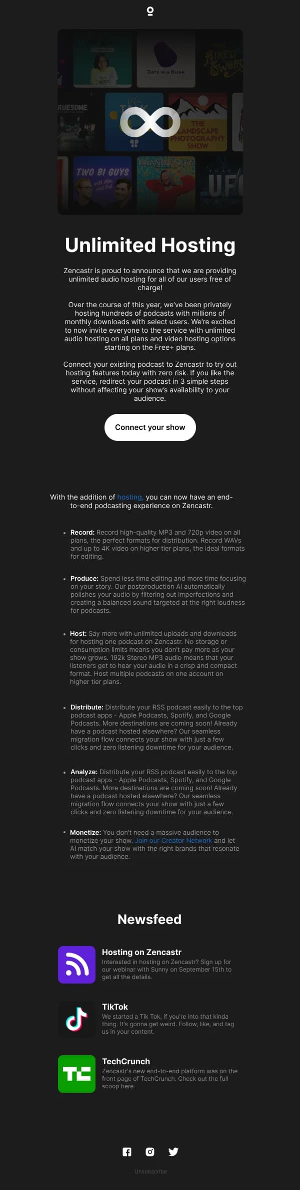
- A screenshot only if the change is visual. An interface change benefits from
one; a performance improvement does not, and a decorative screenshot makes the
email slower without making it clearer.
- A link to the detail for the minority who want it.
Bundling six unrelated updates into one email is efficient for the sender and bad
for the reader — the important one gets the same weight as the trivial ones. If
one change matters, give it its own send.
Building for repetition
Because these sends go out constantly, the economics favour a system over
individual designs. The templates here are built as variants on a shared
structure: consistent header, footer, card treatment, button and type scale, with
the hero and the content blocks interchangeable.
In practical Figma terms, that means product cards as components with text and
image properties, a section library you assemble per send, and the palette as
variables rather than hard-coded fills. Building the fifth email in the series
should take twenty minutes, not an afternoon.
The guide on
building an email design system in Figma
covers that structure in detail.
Using these templates
Built as variants on a shared structure, since this is the send you will make most often and rebuilding it each time does not scale. The
promotion-specific checks: is there a stated reason for the send near the top, is
there exactly one primary action, and do the product cards hold their alignment
when names wrap to different lengths.
Common questions
- What is the difference between a promotion and a launch?
- A launch has novelty to spend and gets the reader's curiosity for free. A promotion is asking attention for something that already exists, which means it needs a reason — a restock, a season, a use the reader had not considered, a price change. Designing a promotion like a launch, with big reveal framing, tends to disappoint.
- How do I make a repeat send feel fresh?
- Change the angle, not the layout. The same product photographed for a different season, framed for a different use, or paired with something new is a different email. A new layout with the same angle is not.
- Should product updates and promotions be in the same email?
- Rarely. An update tells an existing customer something changed; a promotion asks someone to buy. They have different audiences and different actions, and combining them usually means one of the two gets ignored.
- How much product detail belongs in the email?
- Enough to create the click, not enough to replace the page. Name, image, one distinguishing fact, price. The specification belongs on the product page; the email's job is to make that page worth opening.