Building an Email Design System in Figma: Components, Variables and Reusable Blocks
How to build a reusable email design system in Figma: component sets, text and image properties, palette variables, and a section library.
Designing one email is a design problem. Designing forty is a systems problem, and most email design debt comes from treating the fortieth like the first.
A programme sending weekly campaigns, a lifecycle sequence, seasonal variants and transactional notices is producing dozens of emails a year that share a header, a footer, a button and a card. If those are drawn each time, every change is a migration.
Here is the structure that avoids it.
What belongs in the system
Not everything. A useful email system covers the parts that genuinely repeat:
- Header — logo, optional nav, in one or two variants.
- Footer — links, address, unsubscribe, social.
- Button — primary, secondary, and a small variant.
- Product card — image, name, price, optional badge.
- Content band — a section wrapper with consistent padding.
- Text styles — headline, subhead, body, caption, legal.
- Palette and spacing — as variables, not as fills.
What does not belong: hero layouts, campaign-specific compositions, seasonal treatments. Those are the variable part, and forcing them into components produces components with fourteen boolean properties that nobody understands.
Variables first
Before components, define variables. In Figma that means collections for colour, spacing and typography.
Colour. Semantic names rather than literal ones. bg/page,
bg/surface, text/primary, text/muted, action/default, border/subtle. The
point of semantic naming is that a seasonal recolour changes what action/default
resolves to without touching a single layer.
If you run seasonal variants, this is where they live — a mode per season on the same collection, so switching a frame from default to festive is one selection.
Spacing. Your scale as variables: space/8, space/16, space/24,
space/32, space/48. Used as auto layout padding and gaps, this is what makes
vertical rhythm consistent across forty emails built by different people on
different days.
Type. Size and line-height variables paired with text styles. Email's type constraints are narrow, so this collection is small — which is exactly why it should be enforced.
Components with properties, not variants for everything
The common mistake is building a component set with a variant for every permutation. A product card with variants for badge/no-badge, sale/regular, two-line/one-line name becomes eight variants that all need updating.
Use properties instead:
- Text properties for name, price, label.
- Instance swap for the image.
- Boolean properties for genuinely optional elements — the badge, the strikethrough price.
- Variants only for real state differences: primary versus secondary button, light versus dark section.
The test: if two variants differ only in their text, they should be one component with a text property.
Auto layout everywhere, hug and fill deliberately
Every component and every band should be an auto layout frame. The rules that matter:
- Bands fill horizontally, hug vertically. Content determines height; the 600px width is fixed by the parent.
- Cards fill their column, hug their content, with a minimum height set if you need price alignment across a row.
- Buttons hug horizontally with fixed padding, so a longer label widens the button rather than overflowing it.
- Text fills its container. A fixed-width text layer is a layout bug waiting for a longer string.
Get this right and an email reflows correctly when content changes, which is what makes the system usable by someone who is not you.
The section library
Beyond components, keep a page of assembled sections — not full emails, but composed bands ready to drop in:
- Hero with headline and button
- Hero with overlay text
- Two-column image and text
- Three-across product row
- Two-across product row
- Full-width quote or testimonial
- Data or figures block
- Divider with heading
- Single call to action band
Building a new email becomes: duplicate the frame template, drop in five sections, fill the content. That is the twenty-minute email, and it is where the system pays for itself.
Frame templates
One page holding empty frames at the right sizes with the header and footer already
placed: 600 · desktop and 375 · mobile, both with the background colour and the
content column set up.
Include a guide at 400px from the top of the mobile frame, marking the fold. It is a small thing that keeps the most important constraint visible while designing.
Naming for handoff
The system is also documentation, and layer names are the part a developer reads:
- Bands named for their function:
band/hero,band/products,band/cta,band/footer. - Images named for their content, since the name often becomes the export filename.
- Text layers named by role where it is not obvious.
Avoid Group 47. It costs nothing to name and it is the difference between a
handoff that needs a call and one that does not.
Multiple brands and locales
Two situations strain a system in the same way, and variables handle both.
Multiple brands or sub-brands sharing a structure. Rather than duplicating the component library per brand, add a mode per brand to the colour and type collections. The header component swaps its logo via an instance property; everything else resolves from variables. A three-brand programme then maintains one set of components instead of three that drift.
Multiple locales. The design problem here is length: German text runs roughly 30% longer than English, and some languages need more line height. A system built with hugging containers and text that fills its parent absorbs that automatically. One built with fixed-width text layers breaks in every locale except the one it was drawn in.
If you localise, it is worth keeping a frame with the longest-language content as a standing test case. Checking a design against it takes seconds and catches the overflow before it ships.
Documenting the constraints, not just the components
The most useful page in a mature email system is not a component sheet — it is a short page of rules. Content width, the fold guide, minimum type sizes, the reliable font stack, tap target minimum, contrast floor, image export ratio.
These are the decisions a new designer on the team will otherwise get wrong, because nothing in Figma enforces them. A single page stating them turns tacit knowledge into something a reviewer can point at.
Keeping it honest over time
Two habits prevent drift:
Detach nothing. If a component does not do what an email needs, the component needs a property — not a detached copy. One detached header becomes six over a year, and then the footer change misses six emails.
Review quarterly. Look at what has been drawn outside the system. Anything that appeared three times is a candidate to become a section or a component. Anything in the system that has not been used in six months is a candidate for deletion.
What this makes possible
The concrete payoff, in the order it arrives:
- A new campaign email in twenty minutes instead of an afternoon.
- A seasonal recolour of the whole programme as a variable mode switch.
- A footer or legal change applied everywhere in one edit.
- A four-email lifecycle sequence that visibly reads as one voice.
- Handoff that a developer can build without a meeting.
Starting from the templates
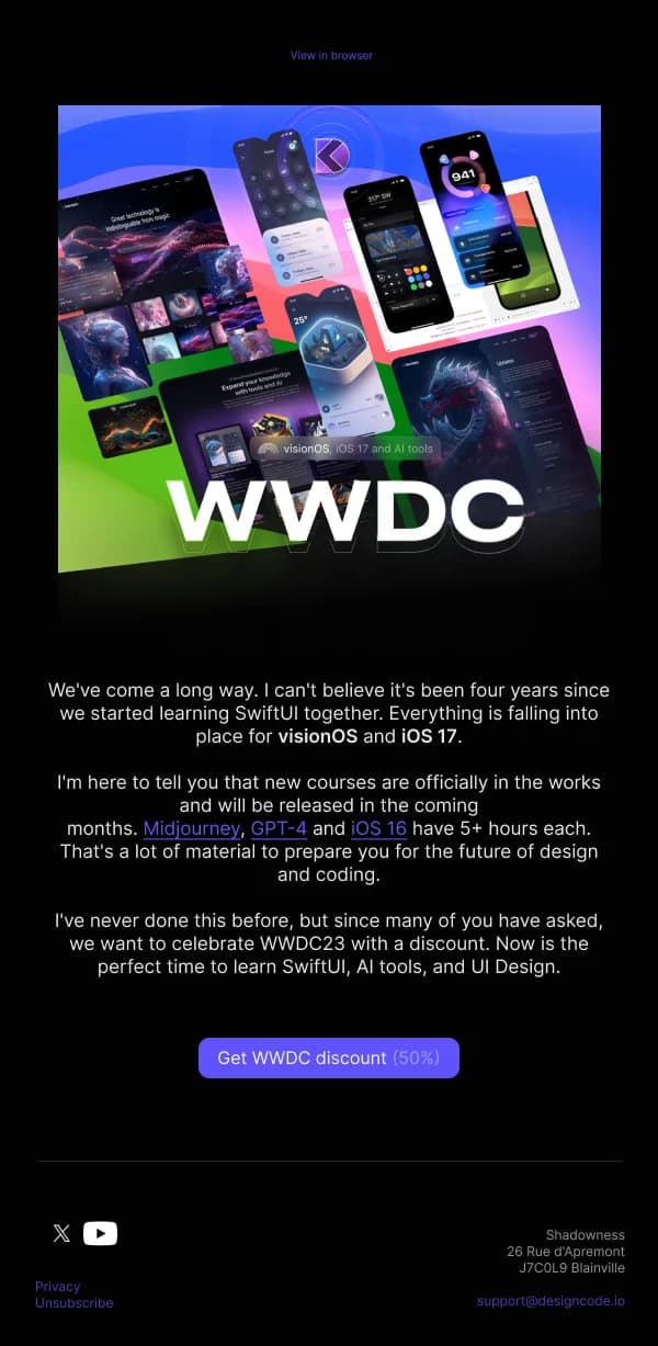
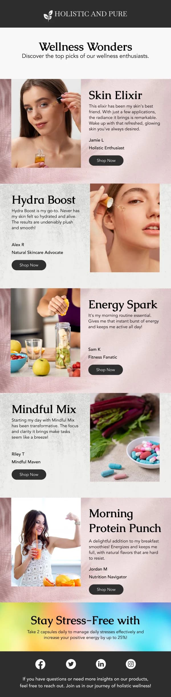
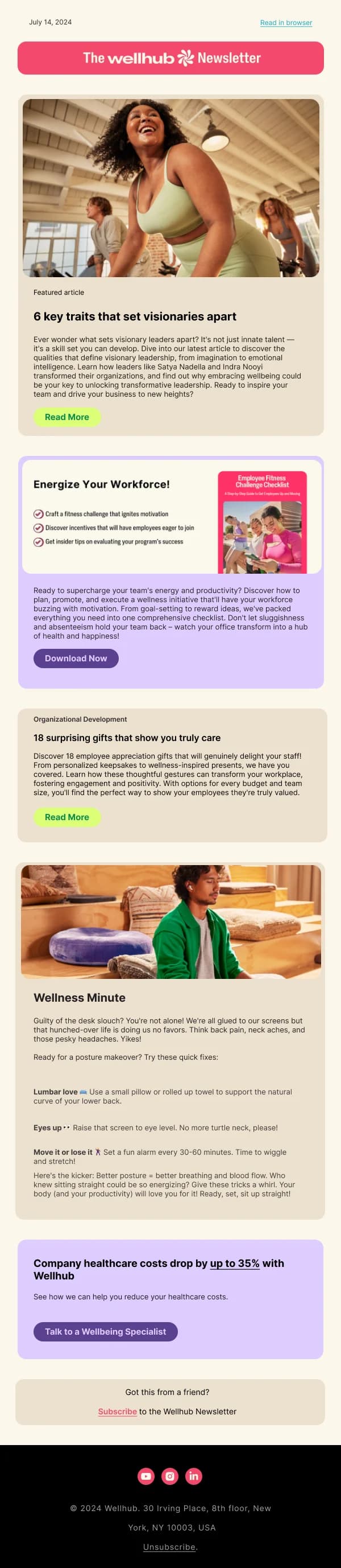
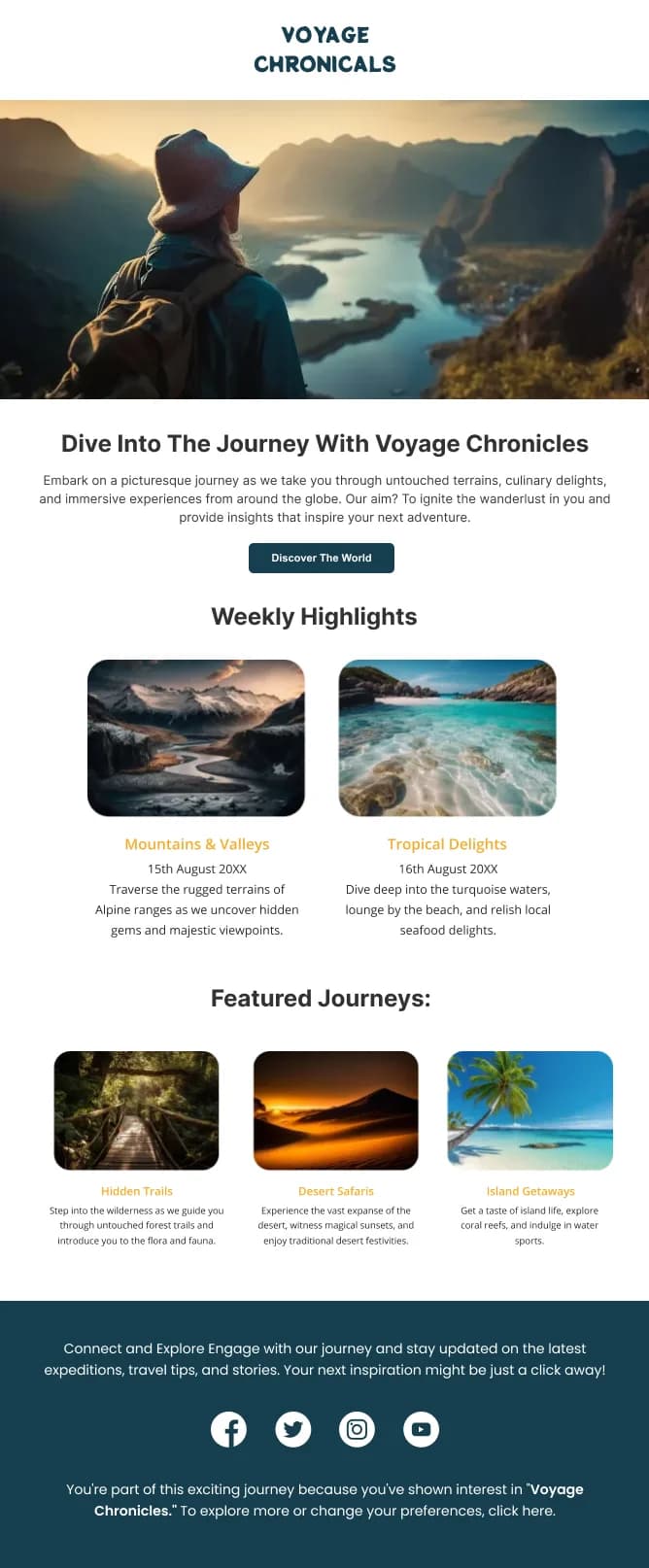
Every design in this library is built on this structure — auto layout bands, named layers, components for repeated elements. Duplicating one gives you a working skeleton rather than a blank canvas.
The software and digital services collection has the most sequence-oriented designs, and the newsletter collection has the most structurally reusable ones. For the underlying frame setup, see how to design an email in Figma.