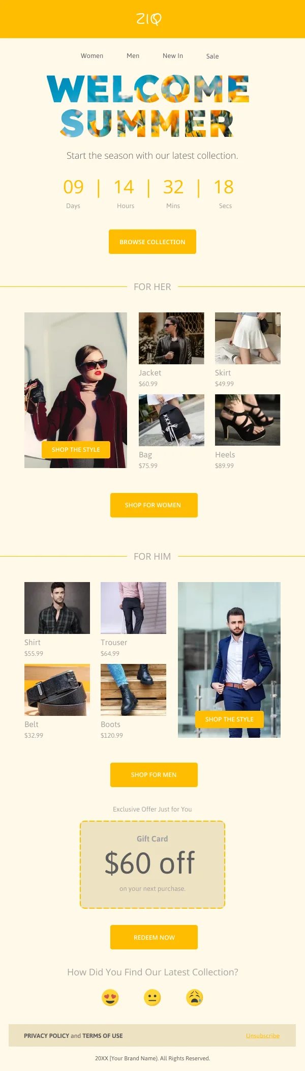
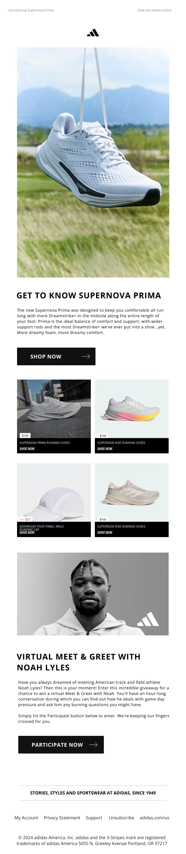
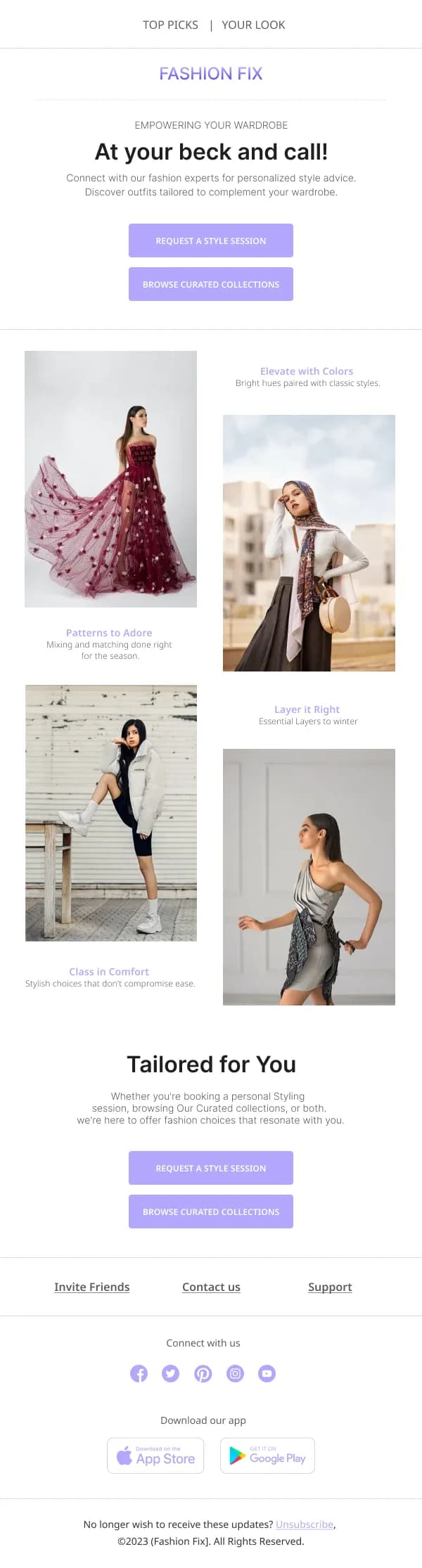
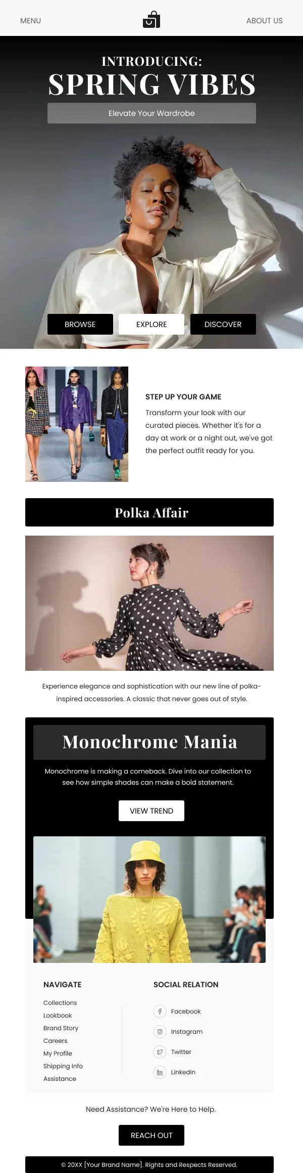
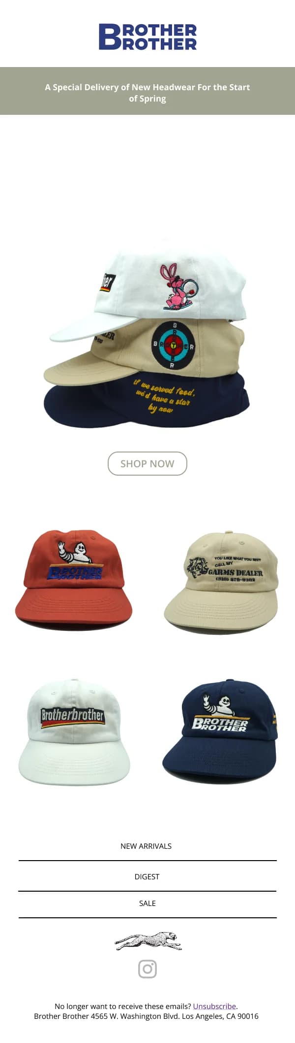
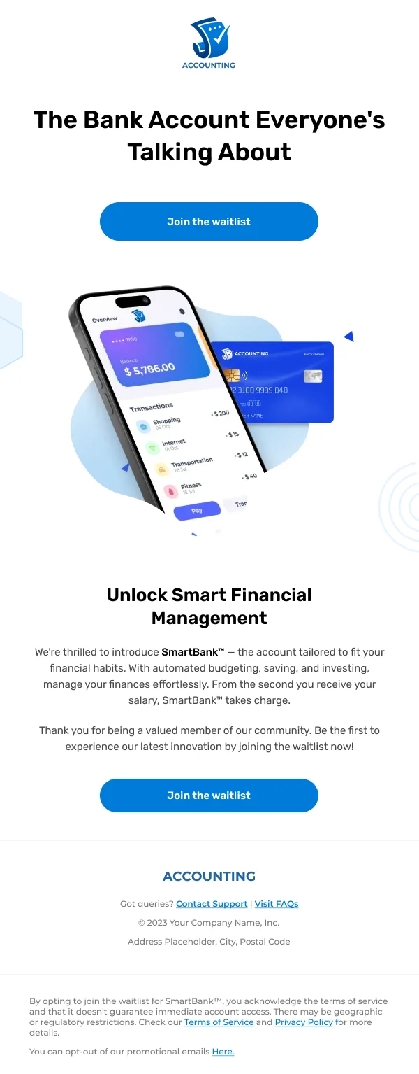
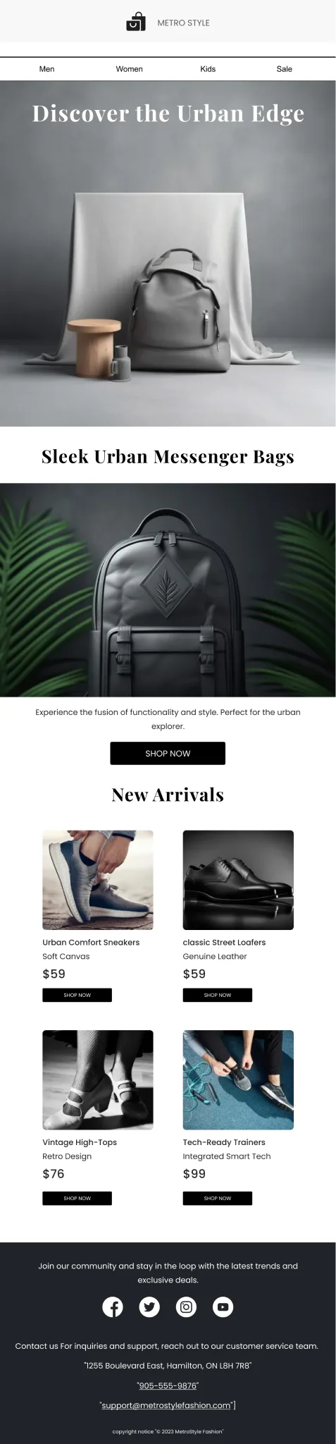
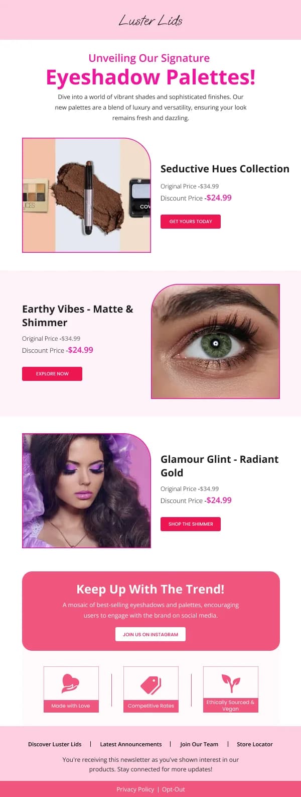
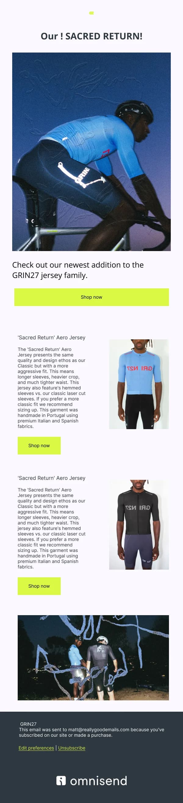
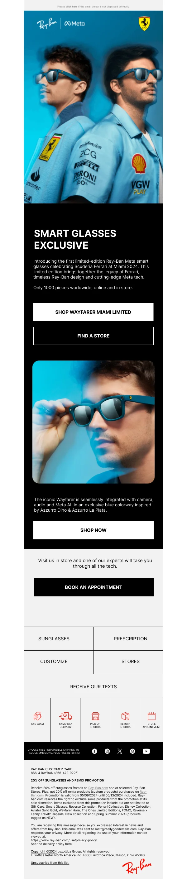
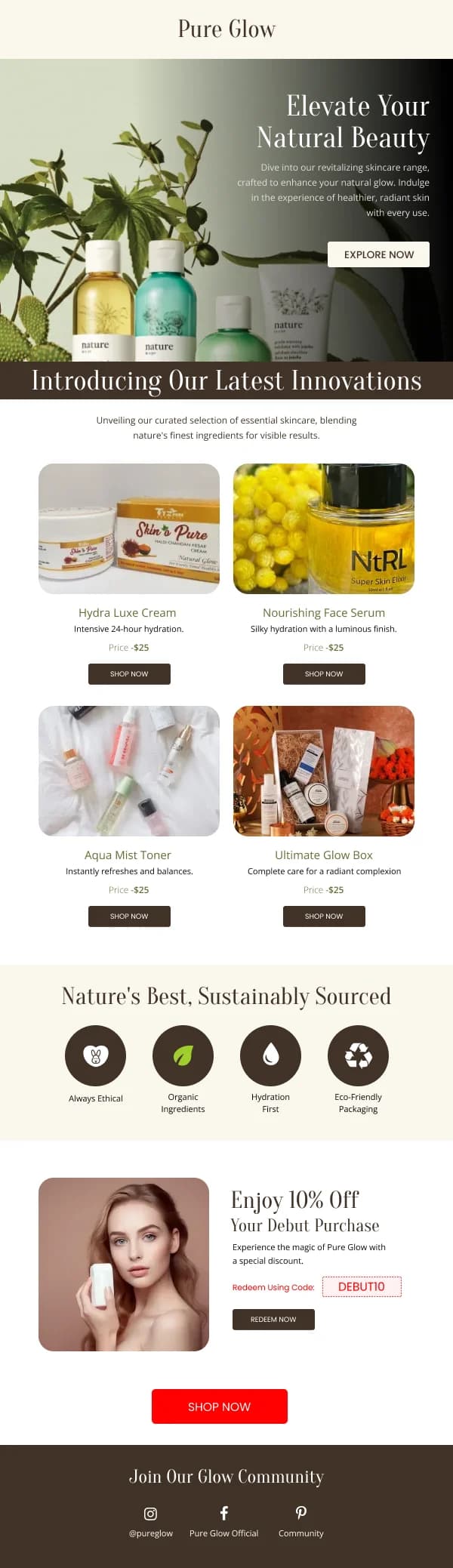
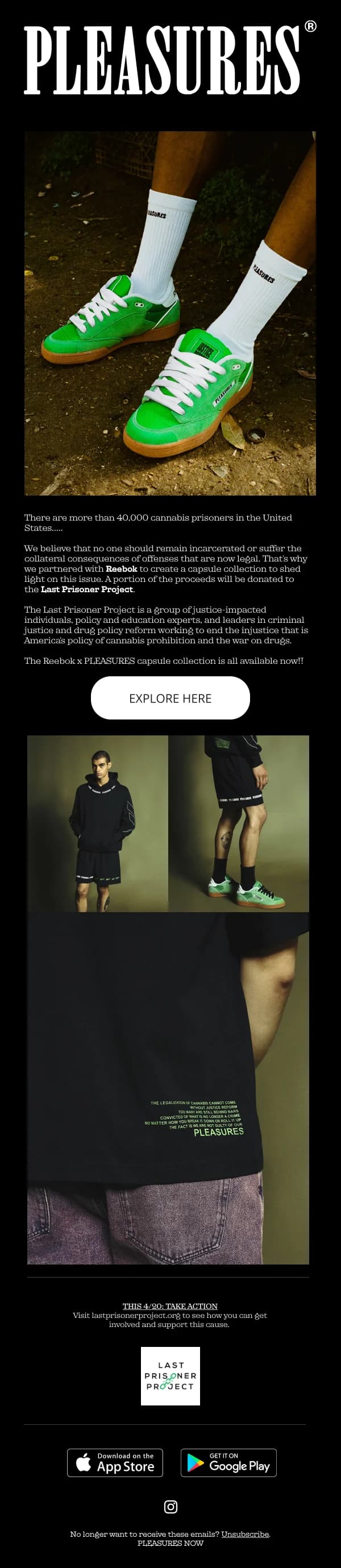
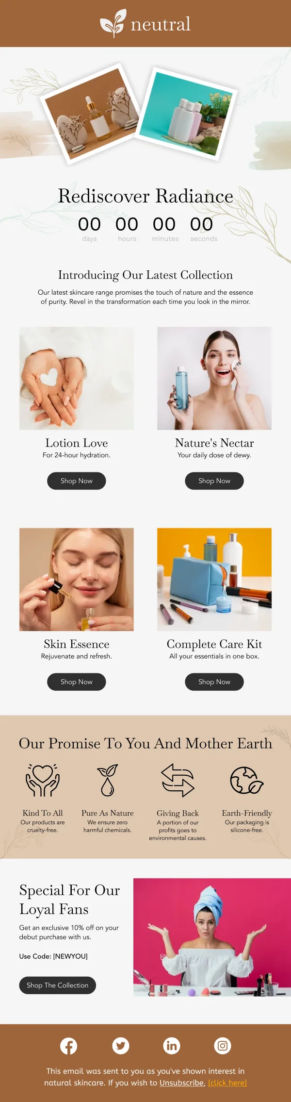
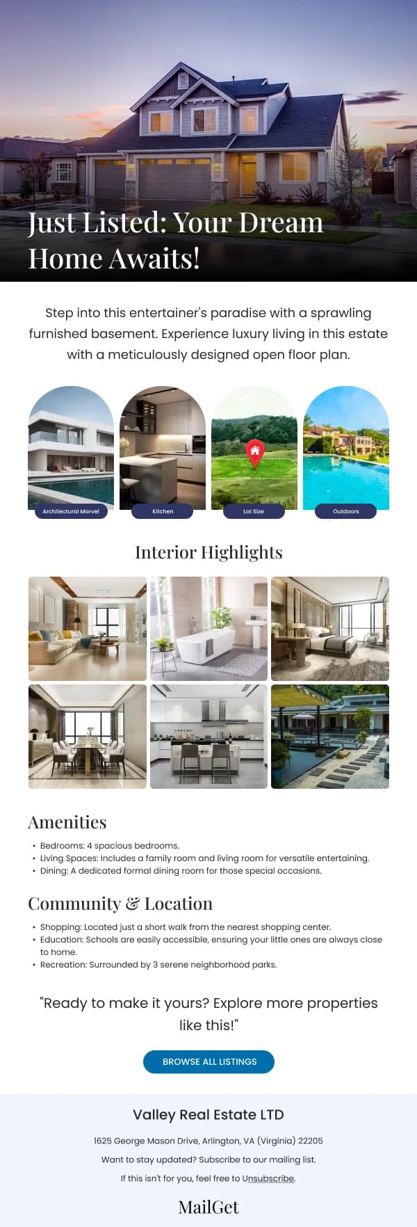
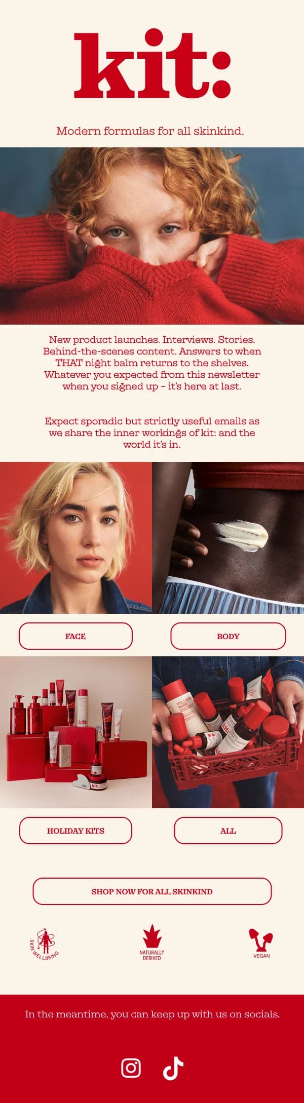
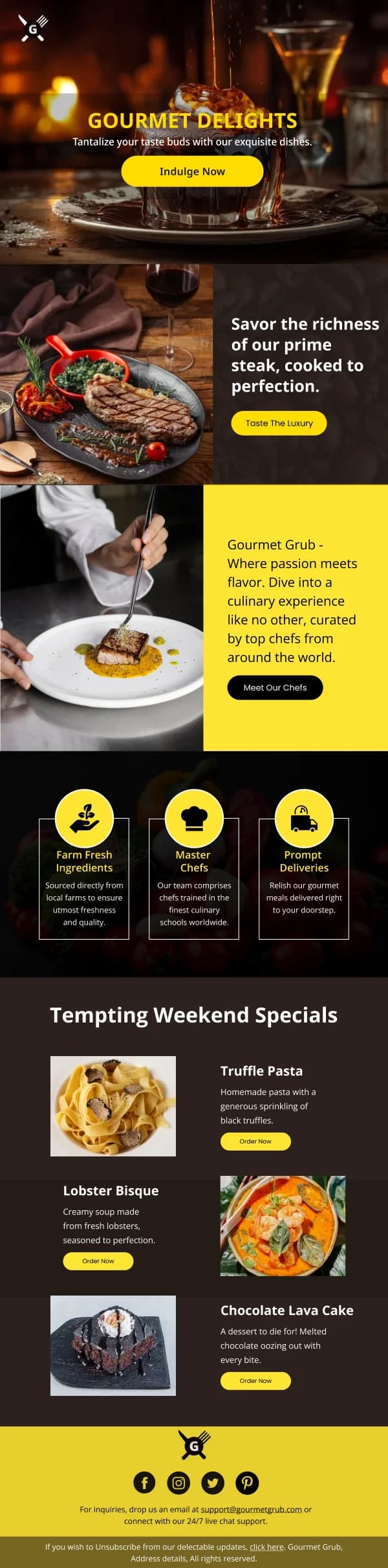
A launch is the one moment when an email programme gets curiosity for free.
Readers open a launch email because something is new, which means the design does
not have to work to earn attention — it has to avoid wasting it.
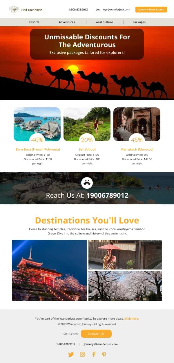
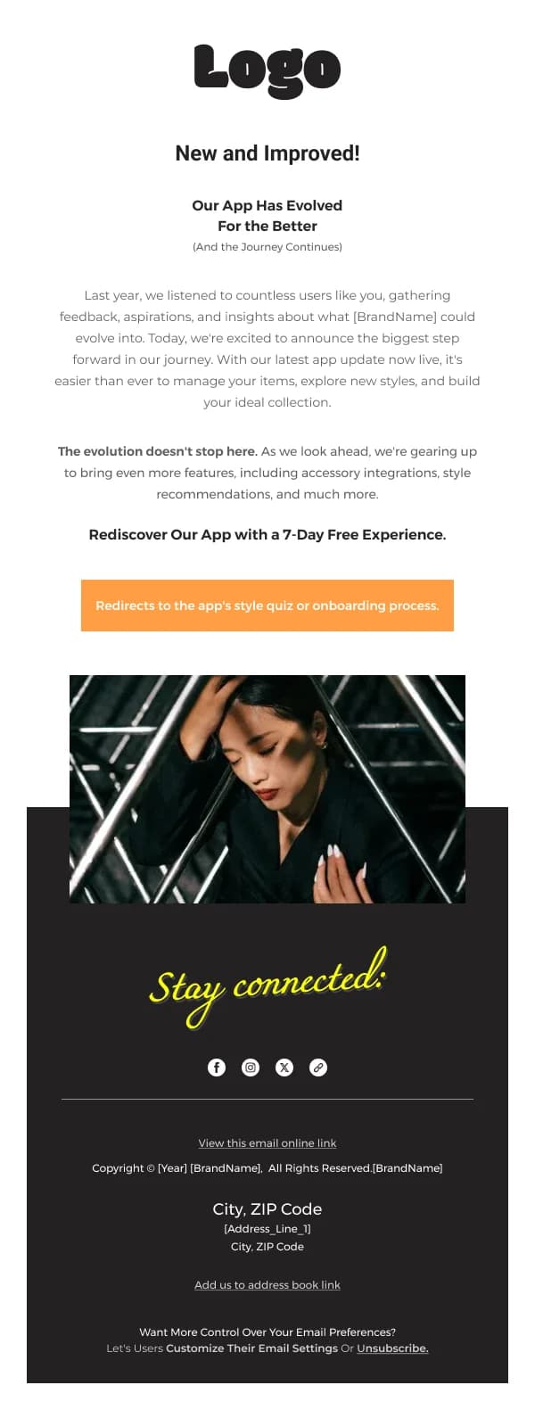
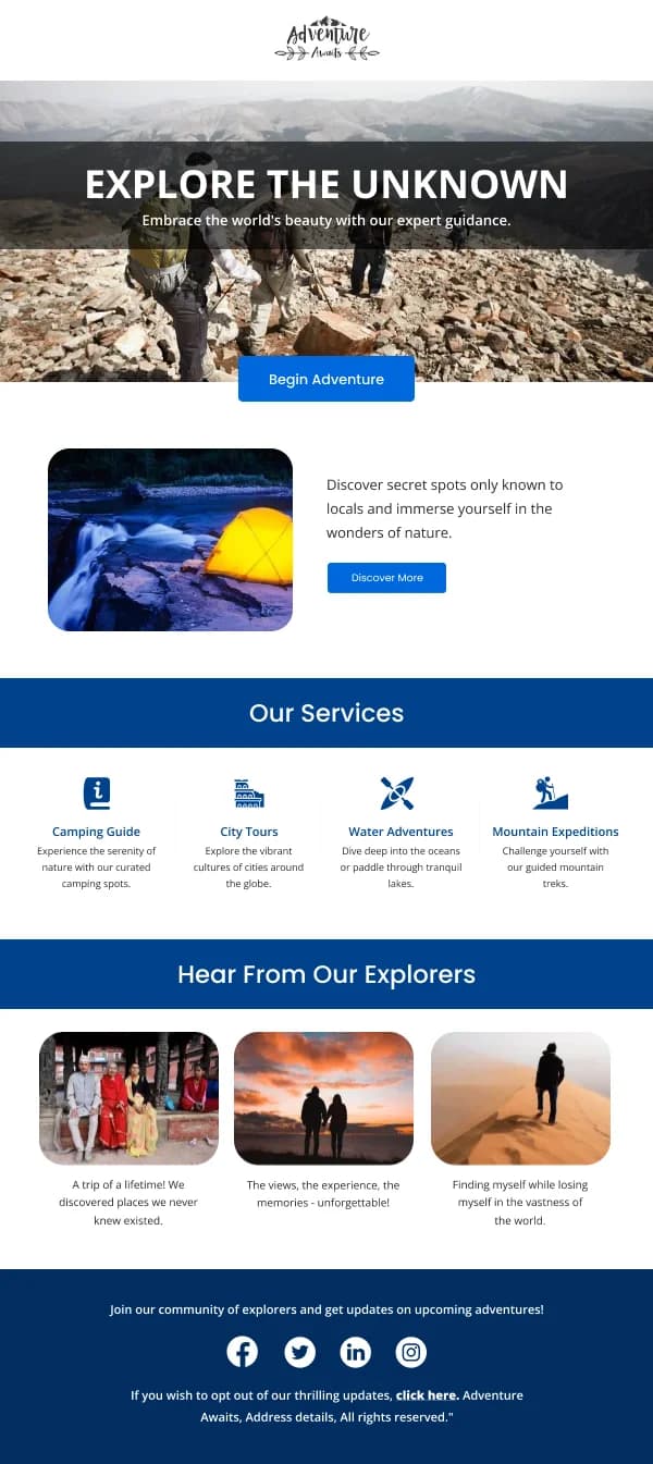
The 45 designs in this collection are built around that short window.
The three-email shape
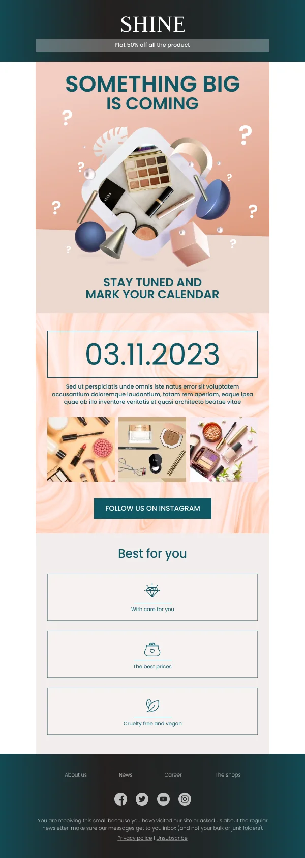
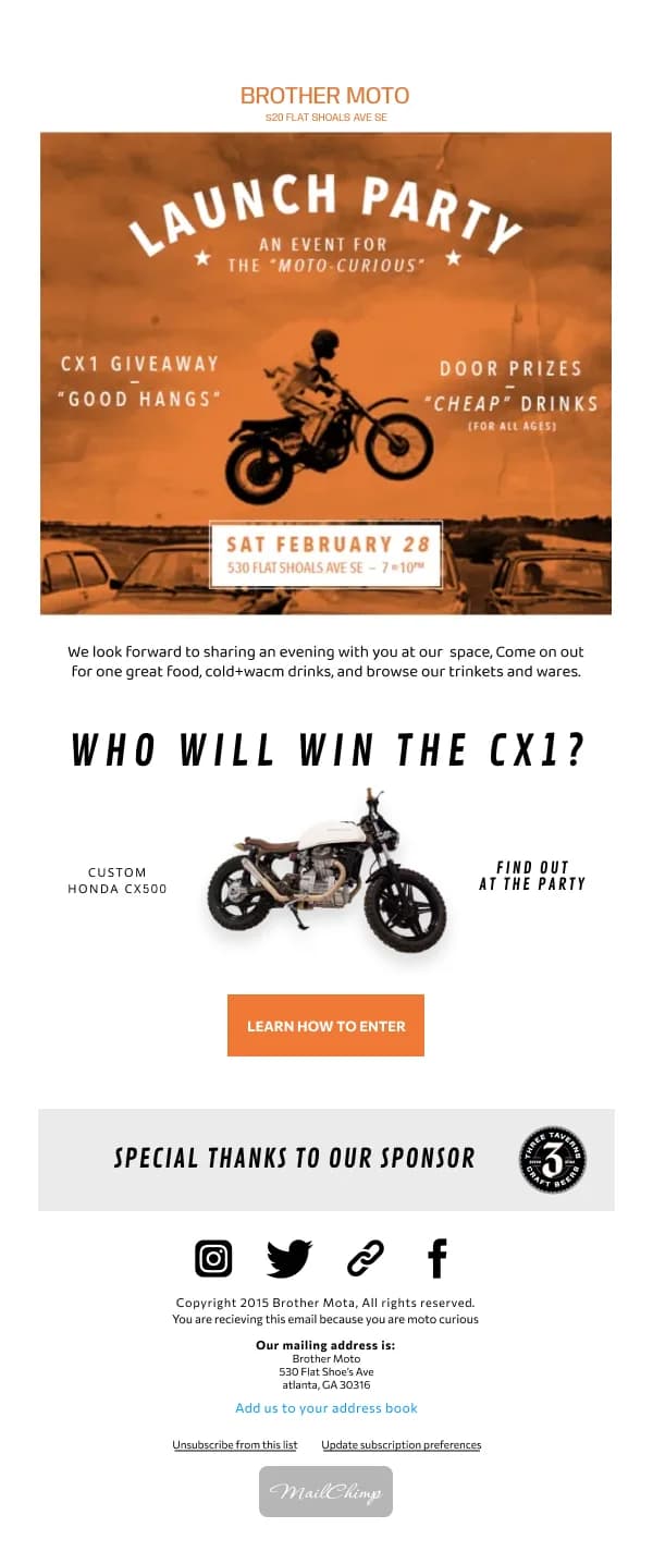
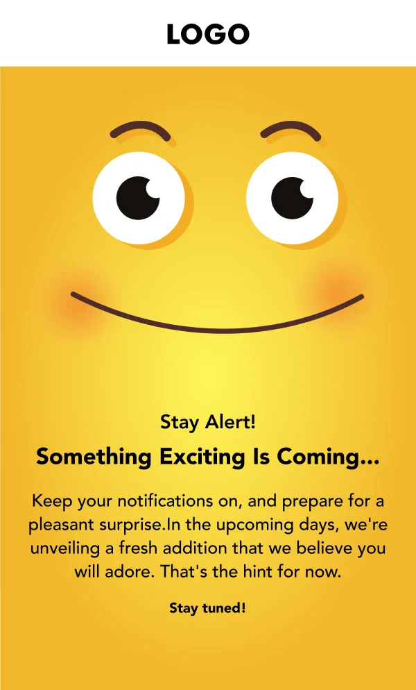
Teaser. Establishes that something is coming and when. Short, visually
distinctive, deliberately incomplete. The whole email can be one image, one line
and a date.
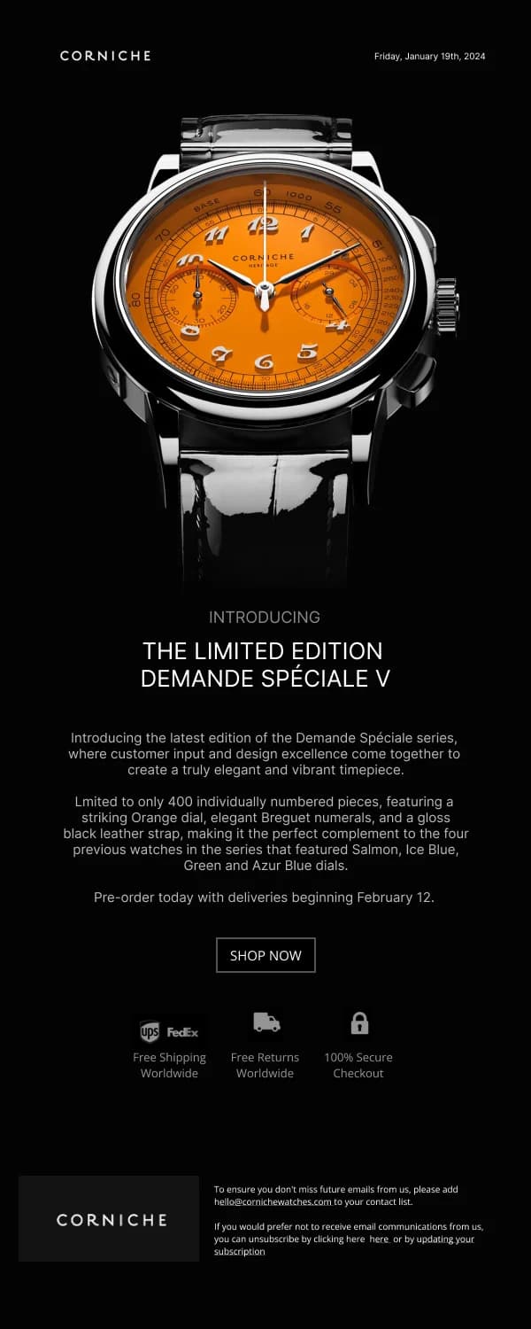
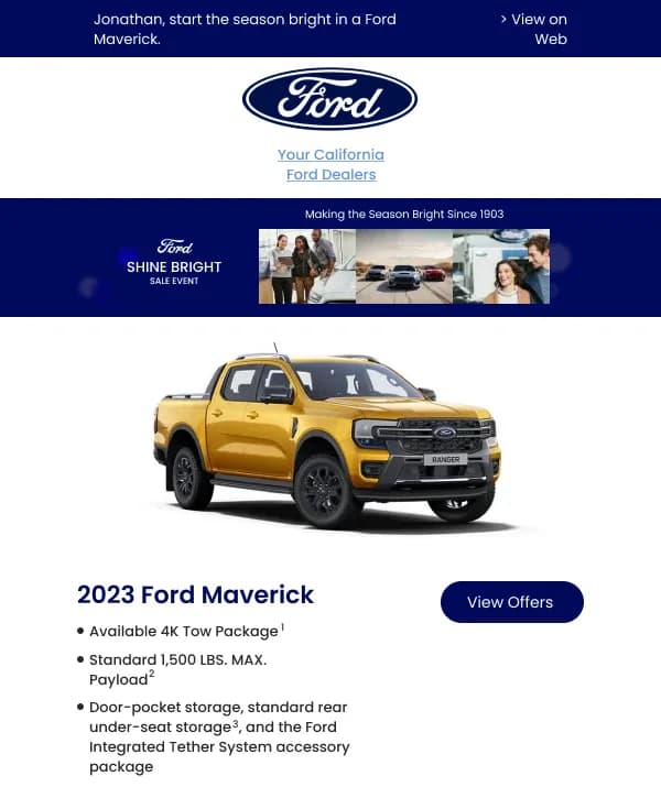
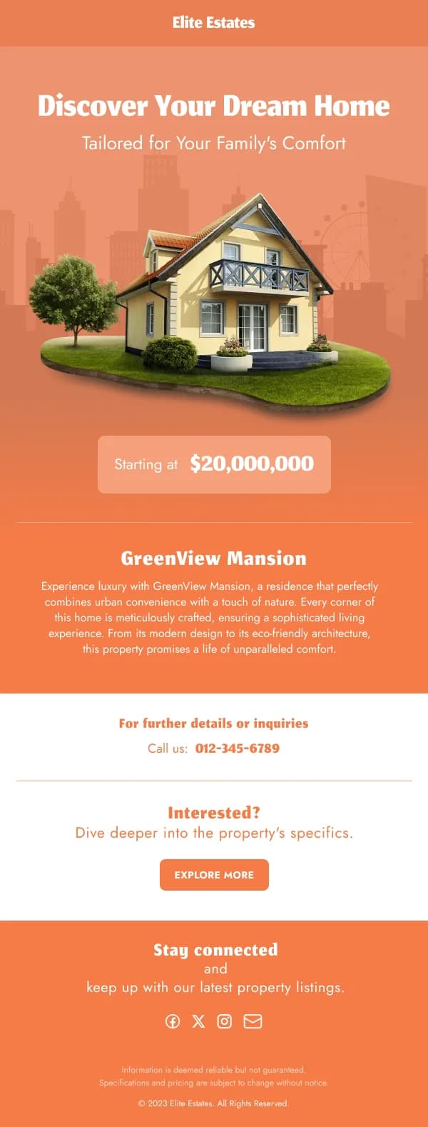
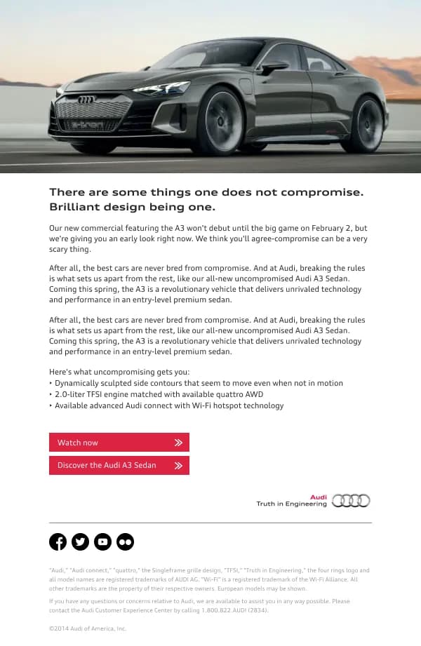
Reveal. The full product, the differentiator, the price, the availability, the
button. This is the email the sequence exists for and it should be the most
considered design of the three.
Reminder. For the readers who opened the reveal and did not act. Shorter than
the reveal, leading with the deadline or the availability rather than the
introduction.
Optional additions that genuinely add: a waitlist confirmation, an early-access
window for a segment, a launch-day "it's live" send, and a sold-out or restock
notice.
Show before you explain
The most common launch failure is a reveal email that opens with three paragraphs
of context before the product appears. The reader opened because something is new;
they want to see it.
The order that works:
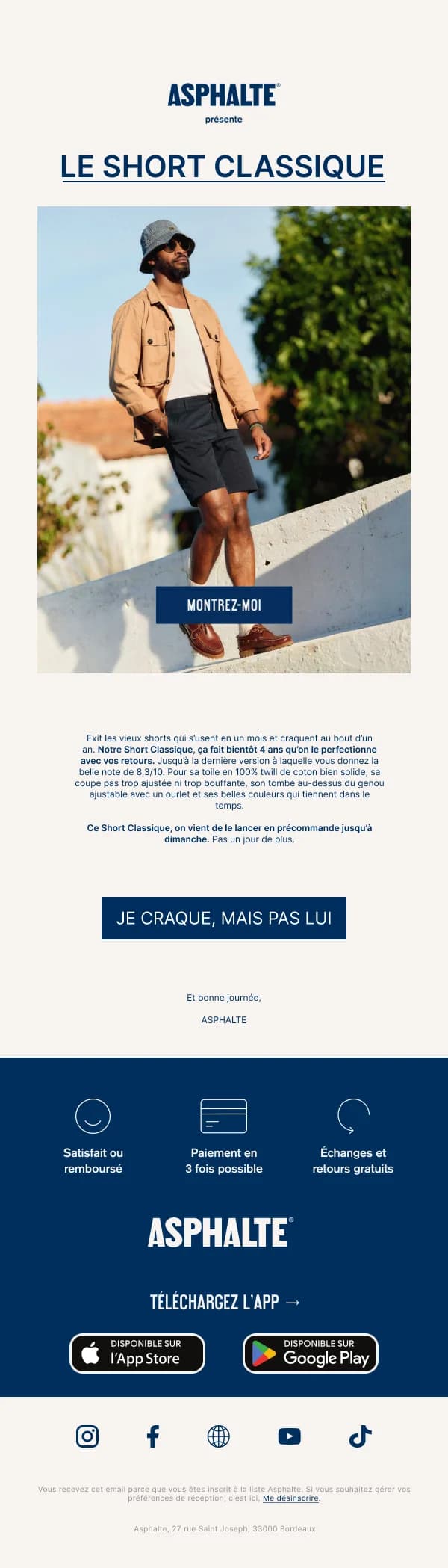
- Product image, large, in the first screen.
- Name.
- One sentence on what makes it different — the actual differentiator, not
category language.
- Price and availability.
- Button.
- Then the story, the detail, the specification, the making-of.
Everything from step six down is for readers who are already interested. Putting
it above the product loses the ones who were not yet.
Teasers have to be interesting to withhold
A teaser only works if the withholding creates real curiosity. A tight crop on a
distinctive silhouette, an unusual material, a colour that is clearly new — those
work. A question mark on a gradient does not.
The honest test: if you showed a colleague the teaser with no context, would they
want to see the rest? If not, the teaser is costing you a send.
Pre-orders and waitlists need certainty
These ask for commitment before delivery, so the design has to carry more
reassurance than a normal purchase:
- The ship date, stated plainly, in its own block. Not "soon".
- What happens to the payment and when it is taken.
- The cancellation position, in a single legible line rather than in terms.
- Quantity or window limits, if real. Manufactured scarcity is transparent and
costs more trust than it generates urgency.
Waitlist confirmations are the underrated send here. A reader who joined a
waitlist has raised their hand; the confirmation should tell them what happens
next and roughly when, which most brands omit.
Launch day
The "it's live" send is the highest-intent email in the sequence and should be the
simplest. Product, availability, button. The persuasion happened in the reveal;
this email is a door.
A common mistake is making launch day the biggest and busiest design of the
sequence. It wants to be the shortest.
Designing the sold-out state
A launch that sells out is a good problem that produces a bad email experience:
readers arriving from your reveal hit an out-of-stock page. The designs in this
collection include the recovery send for exactly that — a short email
acknowledging it sold out, with a restock notification signup as the single
action.
Sent within a day, it converts a disappointment into a list of people who want
the next batch. Sent a week later, it converts nothing.
Building the set
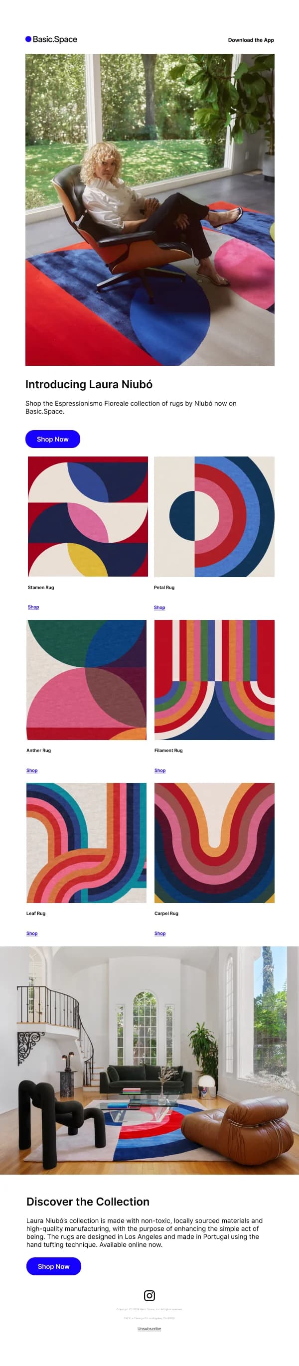
Because a launch is a sequence, the components should be shared: one header, one
footer, one button treatment, one type scale, with the hero and copy varying. In
Figma that means the three emails are variants of one component set, which also
makes the inevitable last-minute copy change a single edit rather than three.
For the frame and component setup, see
how to design an email in Figma.