A reminder is read in a glance, often on a lock screen preview or in a crowded
inbox on a phone. That makes it the most compressed design brief in email: the
essential information has to survive being seen for two seconds.
The 19 designs in this collection are built for that.
Front-load ruthlessly
The order that works:
- What — the appointment, the deadline, the renewal.
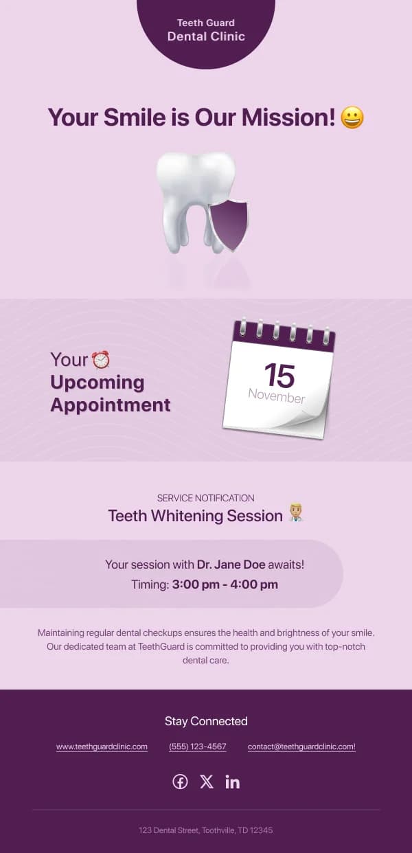
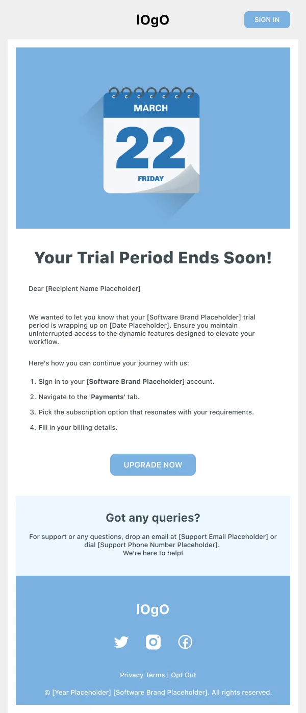
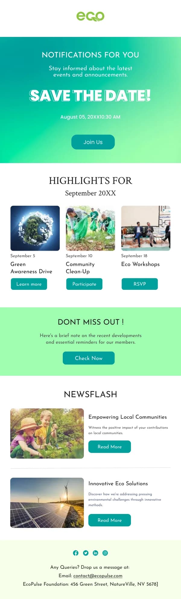
- When — date and time, in its own visual block, month in words.
- Where or how, if relevant.
- One action — confirm, reschedule, renew, complete.
- Everything else.
The date deserves the same treatment a price gets in a commerce email: distinct
type, its own space, unambiguous format. It is the reason the email exists.
Make the escape route easy
The counterintuitive part of reminder design: a prominent reschedule or cancel
option improves outcomes. A reader who cannot easily move an appointment is more
likely to simply not attend, which costs more than the reschedule would have.
For renewals, the equivalent is a clear route to change or cancel the plan.
Hiding it produces chargebacks and complaints rather than retention.
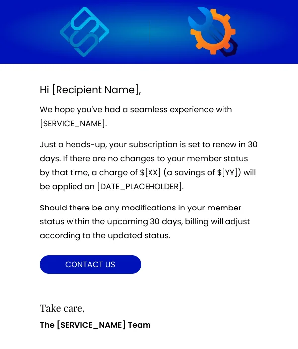
Say what happens if they do nothing
Every reminder with a consequence should state it plainly and with a date. "Your
subscription renews on 12 March at £14/month." "The offer ends at midnight on
Sunday." "Missing the appointment forfeits the deposit."
This is the line that makes a reminder useful rather than nagging, and it is
frequently absent.
Tone
Reminders go to people who have not done something, and it is easy to sound
accusing. What reads well is neutral and factual — state the thing and the
deadline, offer the action, stop. Cheerfulness in a third reminder is worse than
plainness.
Timing
Two sends handle most cases: one far enough ahead to allow action, one close
enough to prompt it. For appointments that is typically a day and an hour ahead;
for deadlines, a week and a day.
Using these templates
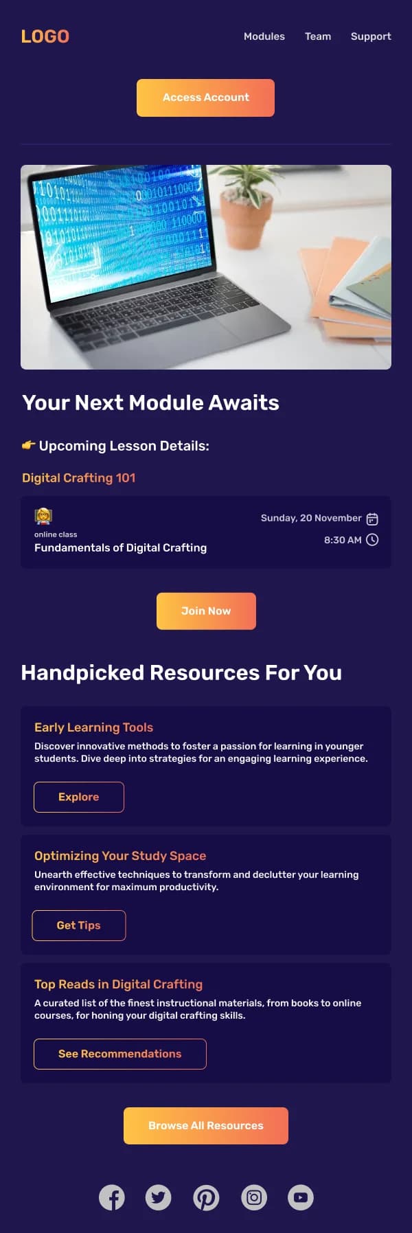
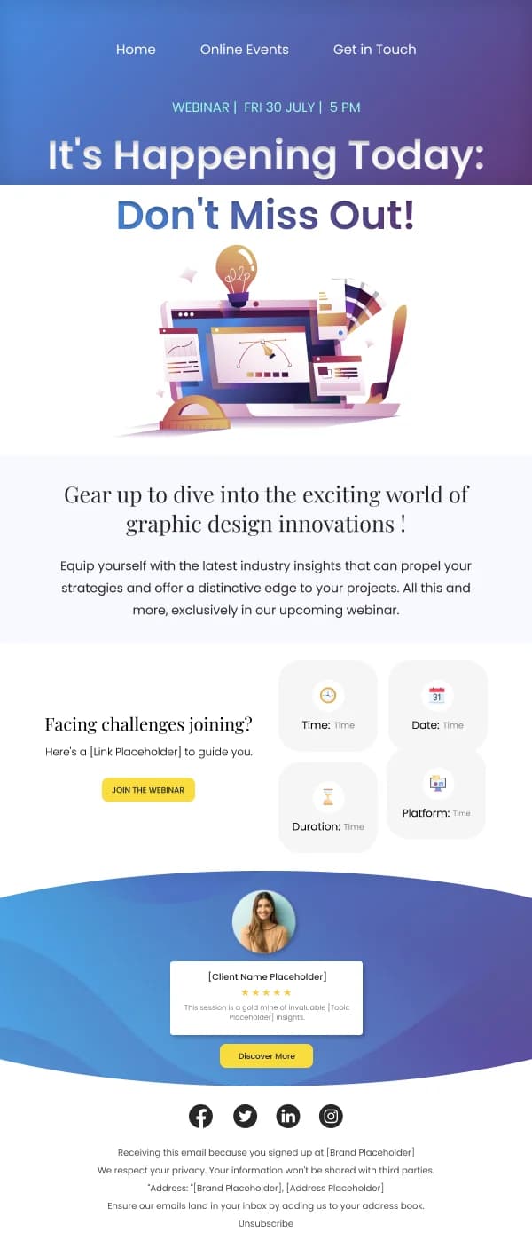
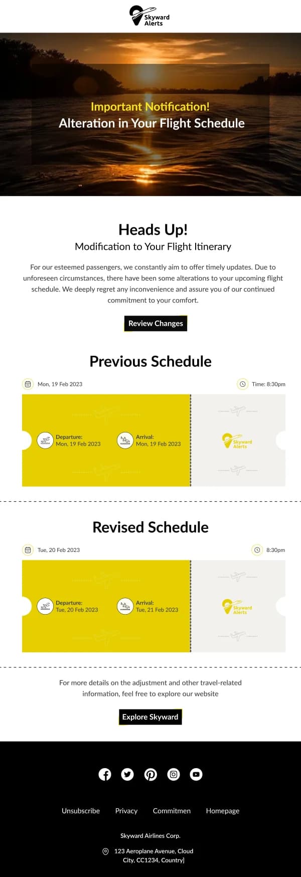
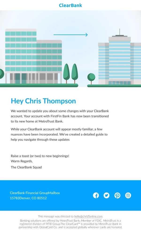
Compressed on purpose: these are read in a glance, so the date block is the most prominent element in the frame. Checks: are the what and the
when visible in the first screen on mobile, is the date format unambiguous, is
there a visible reschedule or cancel route, and does the email say what happens if
the reader does nothing.
Common questions
- How many reminders is too many?
- More than two for most things, more than three for anything with a hard deadline and a real consequence. Each additional reminder converts fewer people and annoys more, and the third one is usually where the balance tips.
- What should a reminder lead with?
- The thing being remembered and when. Not a greeting, not context. A reader glancing at a reminder on a phone should get the what and the when in the first two lines without scrolling.
- Should a reminder repeat the whole original email?
- No. A reminder is shorter than the thing it reminds you of. Restate the essential detail, lead with the deadline, and link to the rest.