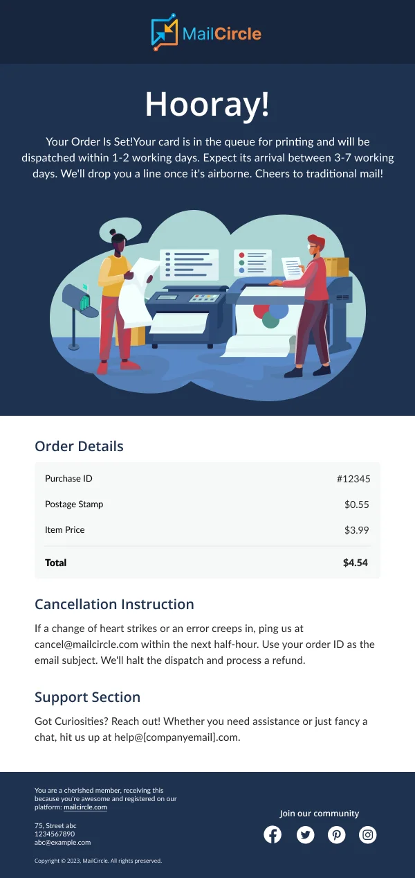
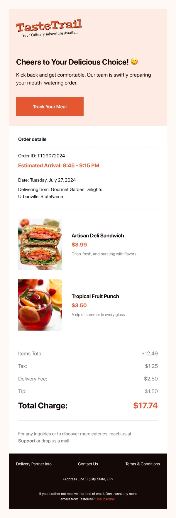
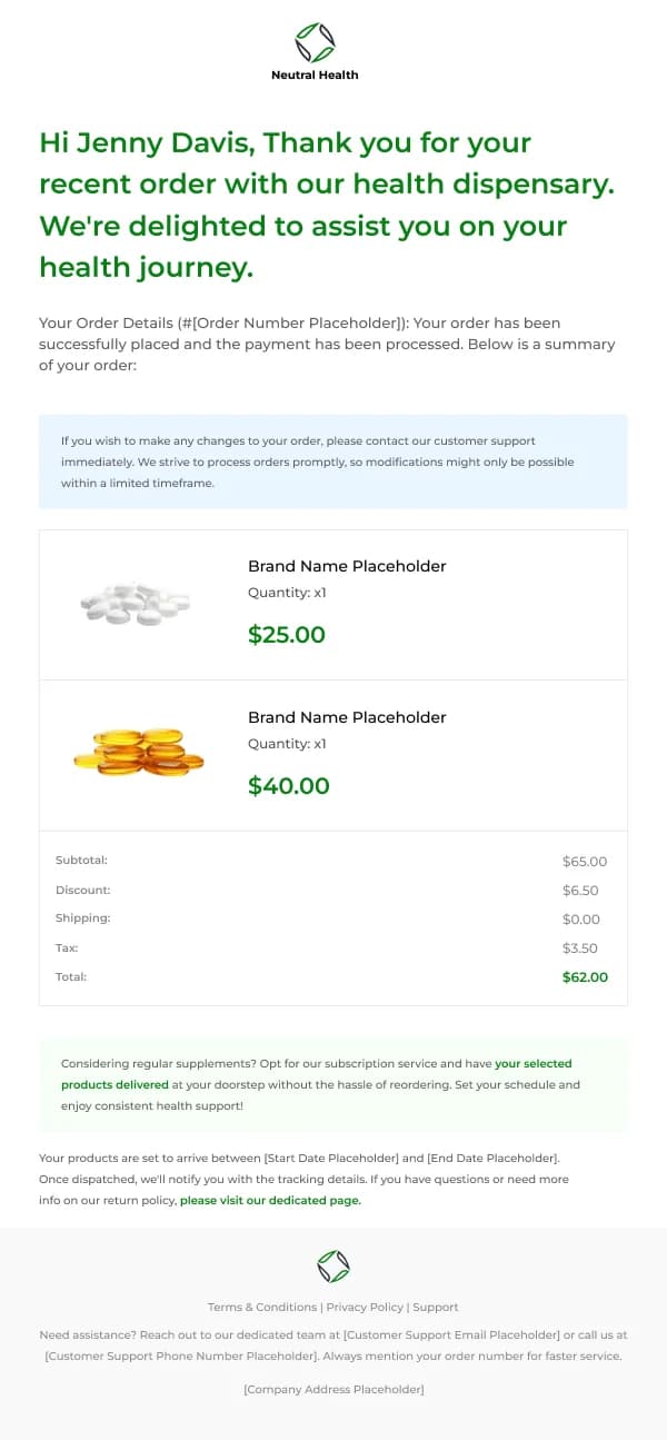
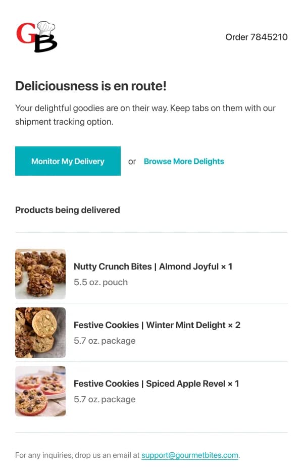
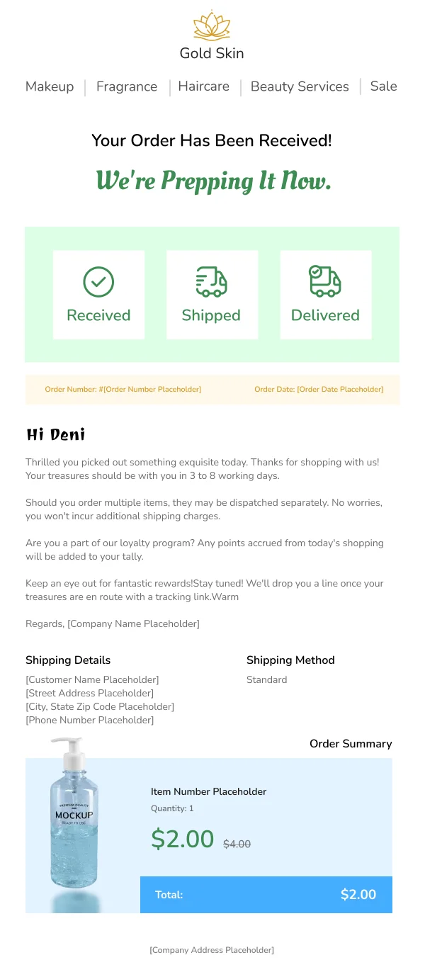
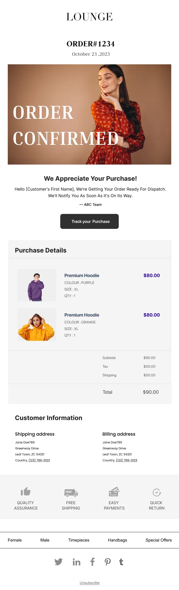
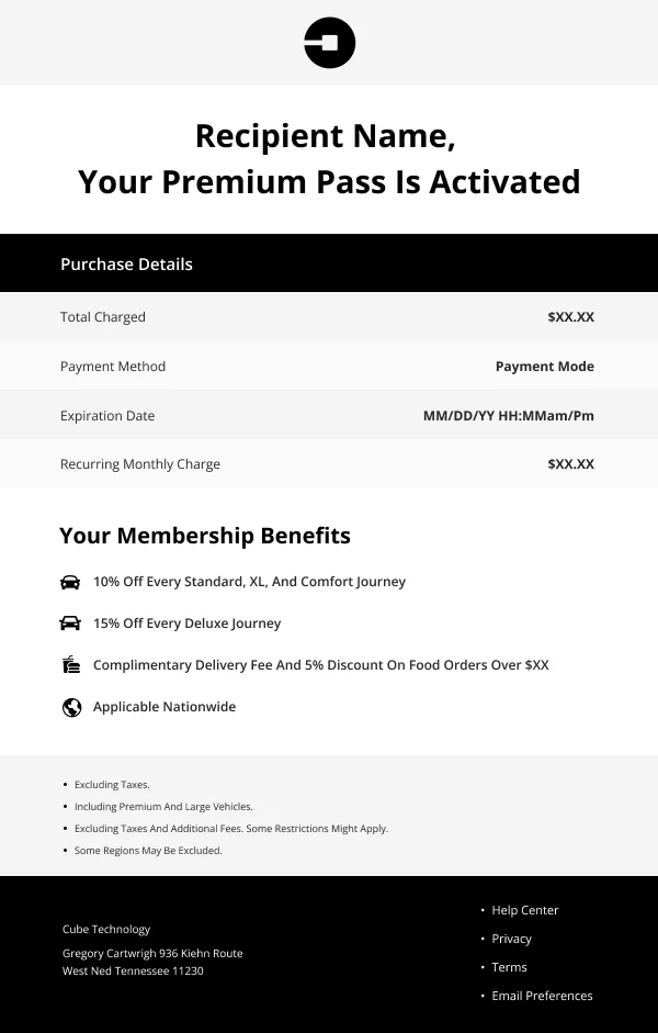
A customer opens an order confirmation to verify something. They are checking that
the right thing is on its way, to the right place, for the right amount. That
makes it a scanning task, not a reading one, and the design should serve scanning.
The 16 designs in this collection are built on that reading, plus one commercial
observation: this is the moment a customer is most pleased to hear from you, and
most stores waste it.
The verification block comes first
Above anything promotional:
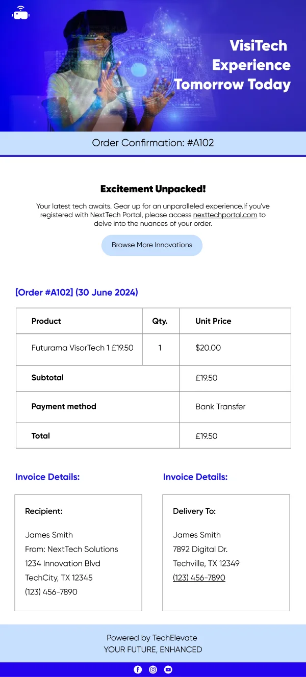
- A clear confirming statement and the order number, in the first screen.
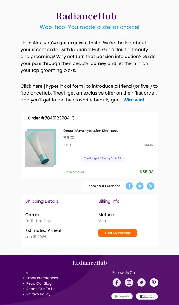
- The items — image, name, quantity, price — in a consistent row shape.
- The totals, with shipping and tax broken out and the final figure visually
distinct.
- The delivery address, as the customer entered it, so an error is catchable.
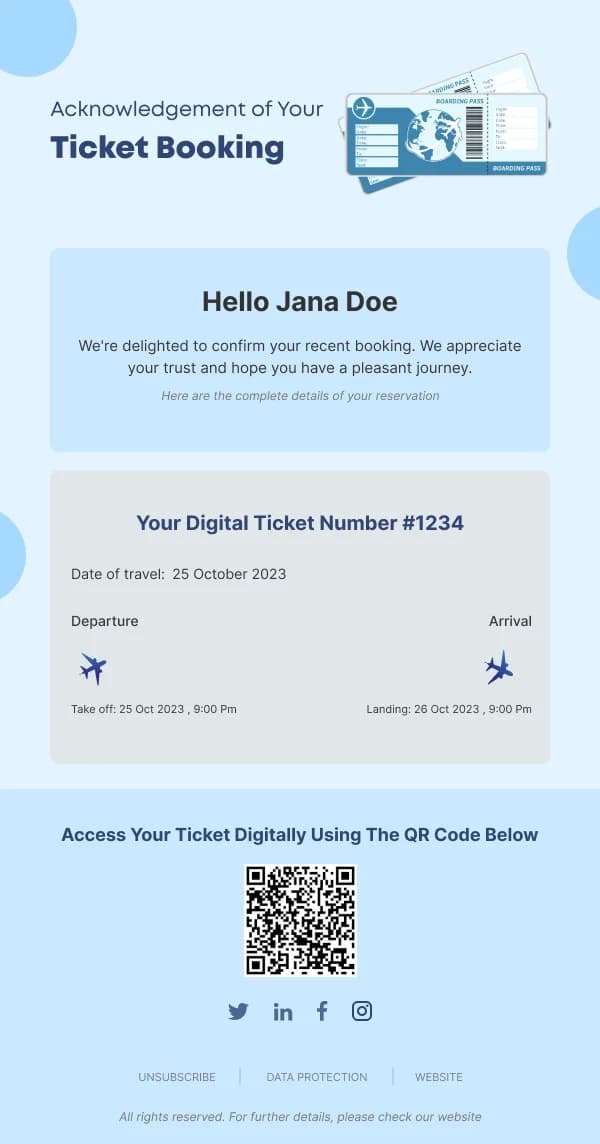
- An expected date or window, even if approximate. This is the question
customers email support about.
Figures should be right-aligned so the column can be read vertically, and the
whole block should be set at a readable size rather than treated as fine print.
Then use the attention
Once the verification is complete, the reader is receptive. What works below it:
- A small number of genuinely related products — complements to what they
bought, not a random bestseller grid.
- Care or setup information for the item, which reduces returns and support
contact.
- A referral offer, which lands better here than in almost any other send.
- A route to change or cancel, if the window is still open. Prominent, not
hidden.
What to avoid
The single most damaging layout choice is a promotional banner above the order
details. It makes the reader hunt for what they came for and it reads as
extraction. The commercial gain from the placement is smaller than the goodwill it
costs.
Similarly, a confirmation that opens with a large brand header consuming the whole
first screen on mobile has failed its primary purpose before it starts.
Using these templates
The verification block sits above everything promotional, which is the whole design argument of this collection. Checks: is the order number
visible without scrolling on mobile, do the figures align, is the address shown,
is there an expected delivery date, and is every promotional element below the
order summary.
Common questions
- What has to be in an order confirmation?
- The order number, what was bought, what it cost including any shipping and tax, where it is going, and when it should arrive. Anything else is optional and belongs below all of it.
- Can I put product recommendations in a confirmation?
- Yes, below the order details. It is one of the highest-attention placements available, which is exactly why it must not sit above the information the customer opened the email to check.
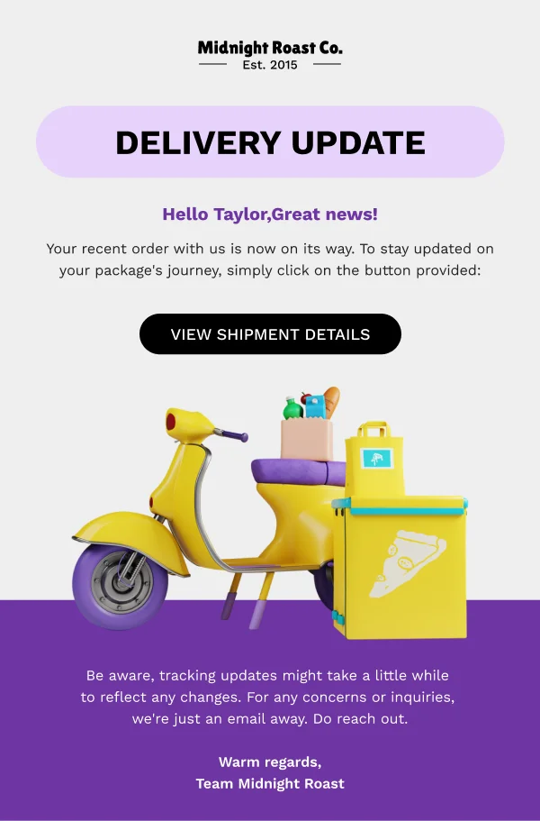
- Should confirmation and shipping notice be separate emails?
- Yes. They answer different questions at different moments, and combining them means the shipping information arrives before it is true. Separate sends also give you two legitimately opened emails instead of one.