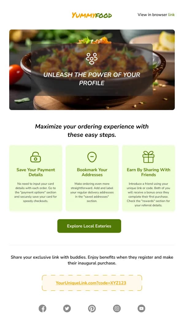
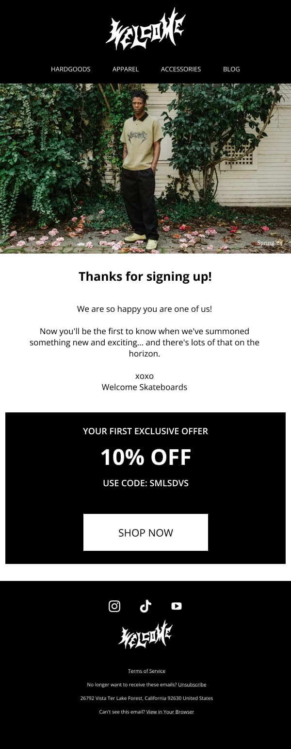
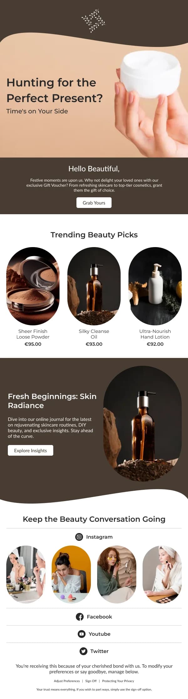
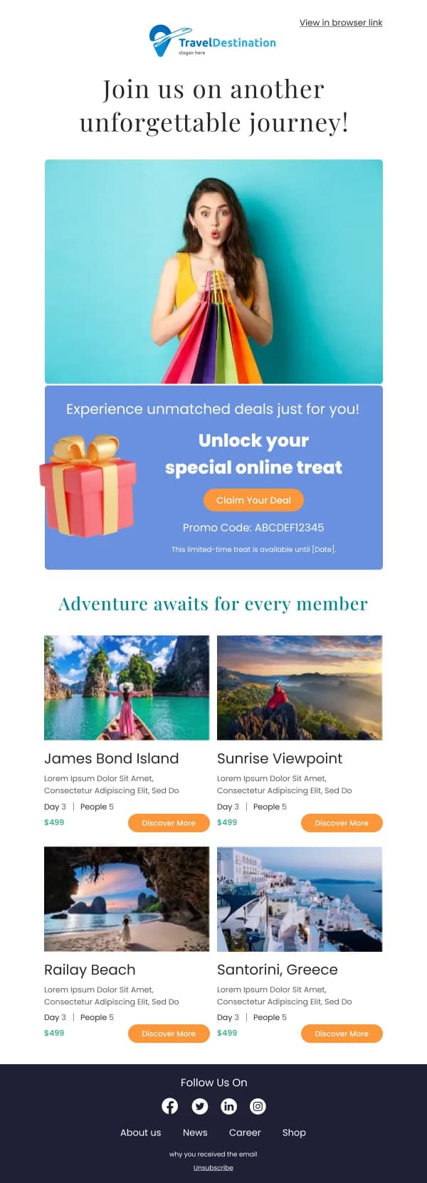
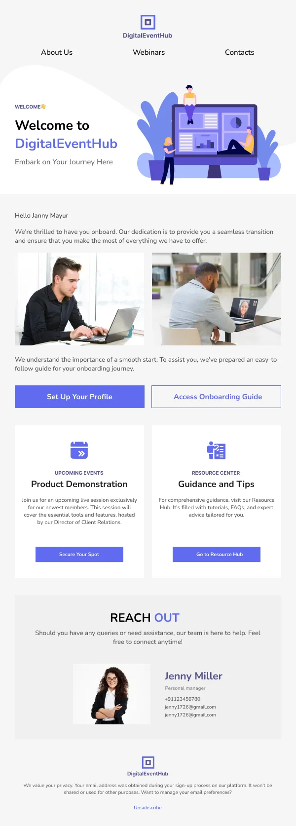
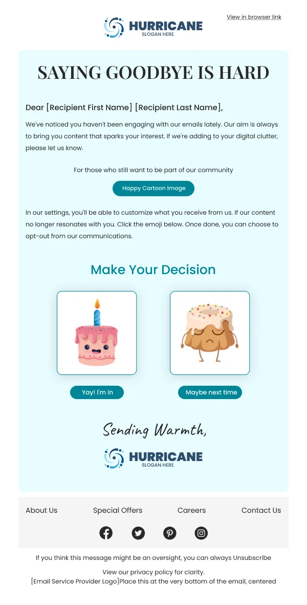
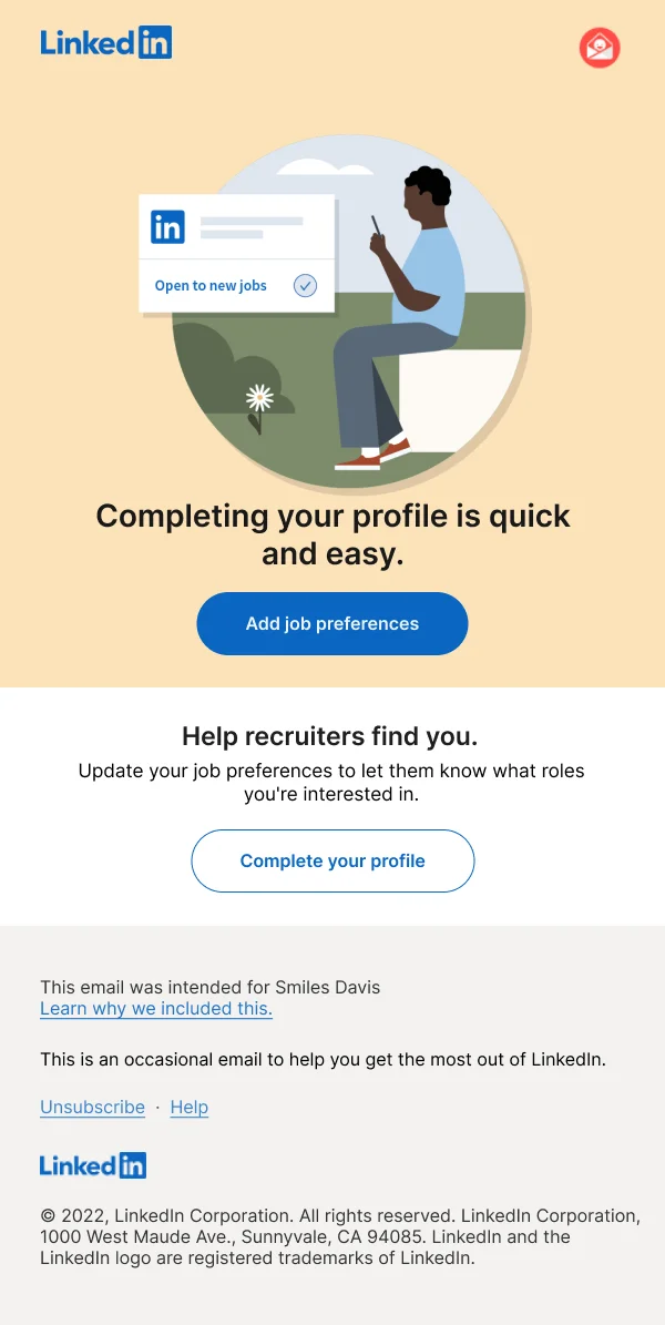
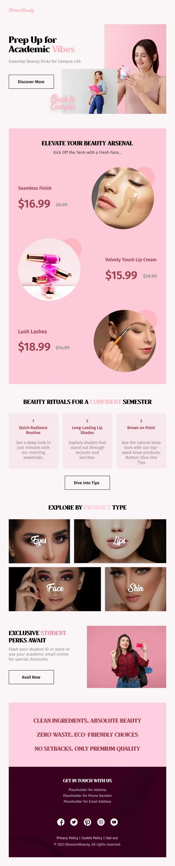
Activation is where most signups are lost, and it is lost quietly — an account
exists, nothing happens, and after a few weeks nothing ever will. These 25 designs
address that gap and the adjacent one: keeping the people who did activate.
Activation is a targeting problem first
The design cannot fix an activation email that does not know why the reader
stalled. Before choosing a layout, it is worth identifying the actual step where
people stop — the import, the invite, the first configuration, the first real use —
because a specific email about that step outperforms a general encouragement by a
wide margin.
What the design contributes is room. One message, one obstacle removed, one
action, no feature grid competing with it.
Reduce the work, not just the persuasion
The strongest activation emails do part of the job for the reader:
- A prefilled or one-click path where the product allows it.
- A short answer inline, so the reader does not have to open documentation to
understand the step.
- A named person offering help, with a reply that reaches them.
- An honest statement of effort — "this takes about two minutes" — which
addresses the real objection, which is usually time rather than doubt.
Retention has a different register
For active users, the email is not corrective. The formats that earn their place:
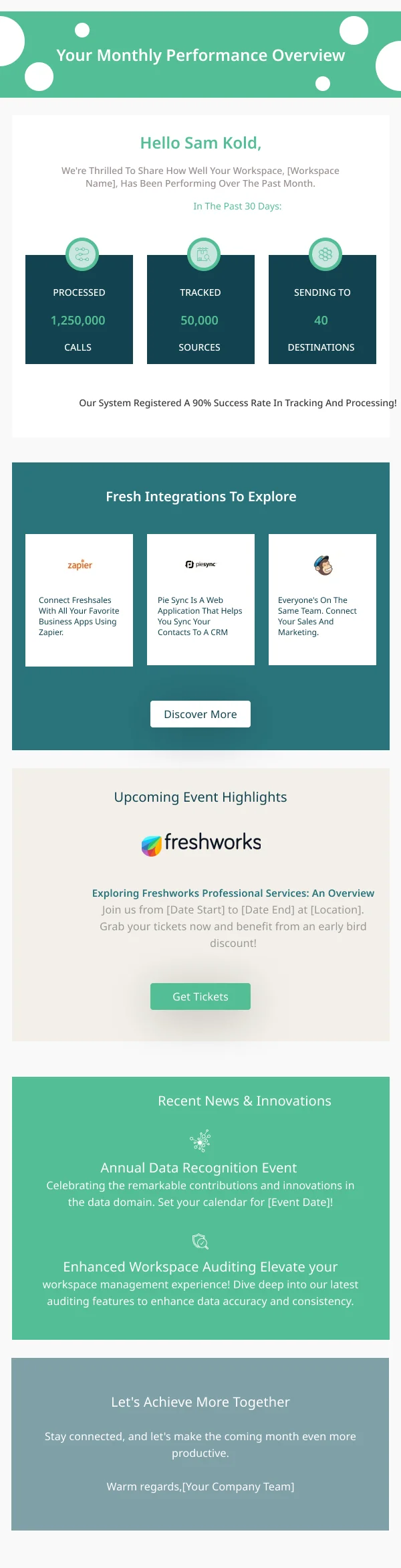
- A usage summary that tells the reader something they did not know about their
own behaviour. Numbers they can already see in the product are filler.
- One capability they have not used, chosen because it fits what they do use.
- An outcome recognised — a milestone, a total, a streak — stated plainly
rather than dressed as a celebration.
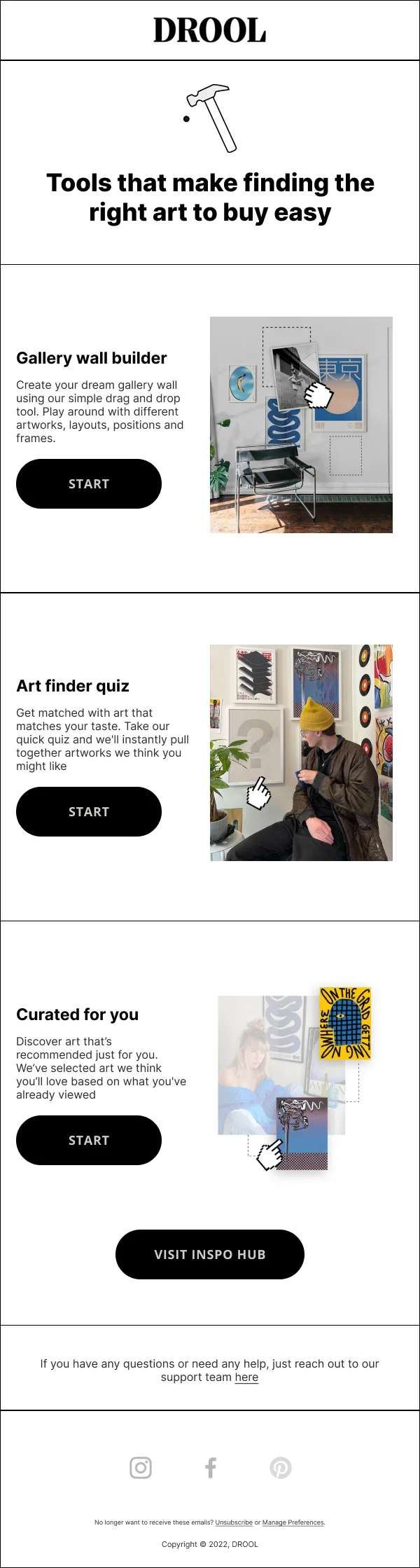
Design-wise these want structure: a small figure block, a short explanation, one
link. Usage data in a paragraph is unreadable.
Frequency is the whole risk
Activation and retention email is sent to people who have not asked for it
specifically, which makes cadence the main way it goes wrong. Two well-timed sends
beat six, and a preference option — fewer emails rather than none — retains readers
that a binary unsubscribe loses.
Using these templates
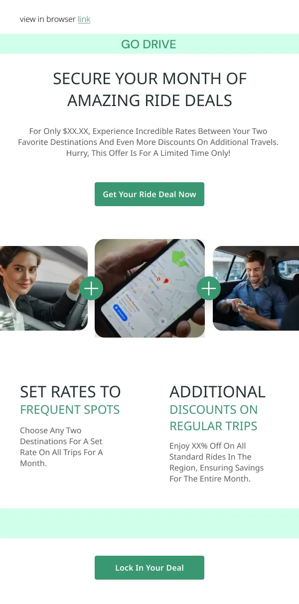
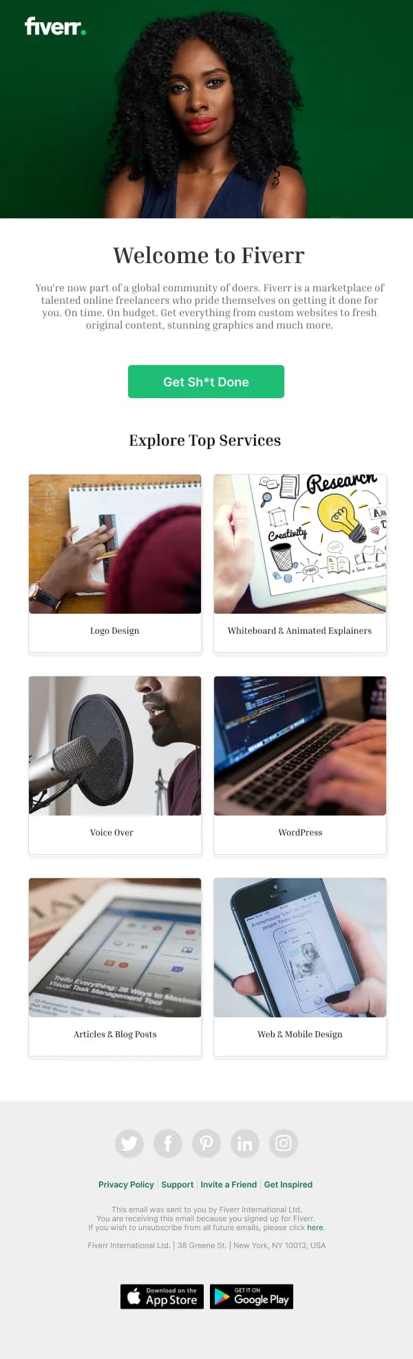
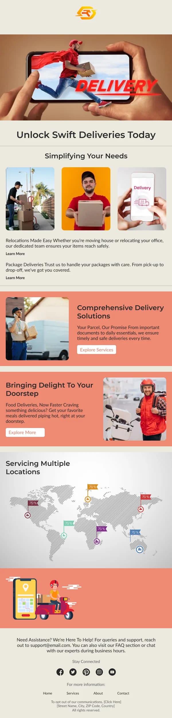
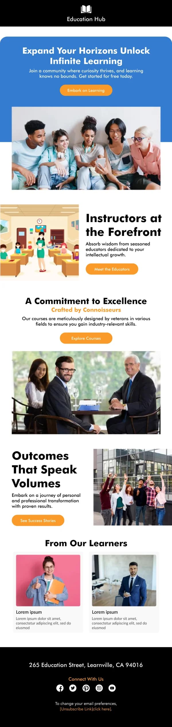
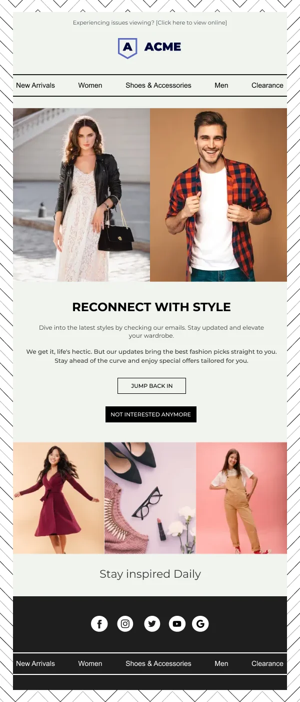
These are drawn plainly on purpose — the persuasion here is the product knowledge, not the styling. Checks: is there exactly one
action, does the email name a specific step rather than a general benefit, is any
data block structured rather than prose, and is the opt-down visible.
Common questions
- What is the difference between activation and onboarding?
- Onboarding is the sequence you send everyone; activation is the intervention you send the people it did not work for. Activation email is targeted at a known stall point, which is why it can be far more specific — and why it converts better than another general welcome.
- What should an activation email actually say?
- Name the step the reader has not completed and remove one obstacle in the way of it. That requires knowing where people stall, which is product analysis rather than design work — but the design has to give that one specific message room instead of burying it in features.
- How do retention emails differ?
- The reader is already succeeding, so the email is not fixing a problem. It is deepening a habit: a usage summary worth reading, a capability they have not found, an outcome they achieved. The tone shifts from helpful to confirming.