The Anatomy of a Welcome Email That Actually Gets Read
What belongs in a welcome email, what to leave out, and why the feature tour most brands send wastes their most-opened message.
The welcome email is opened more than anything else a programme sends. The reader just signed up, they are expecting it, and their interest is at its highest point in the entire relationship.
Most brands spend that on a tour of their features.
What the reader actually wants to know
Three things, in this order:
- Did it work? They submitted a form. They want confirmation.
- What happens now? What will you send, and how often.
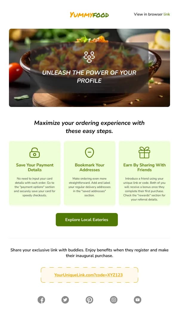
- What should I do? One action, ideally the one that produces their first bit of real value.
That is the whole brief. Everything else — the brand story, the founder's note, the full product range, the social links — is optional and belongs below those three.
Confirm, in the first line
The first line should remove all doubt. "You're subscribed." "Your account is ready." "You're on the list."
Not a greeting, not a headline about your brand's philosophy. The reader performed an action and wants to know it landed.
This matters more than it sounds because it is also a deliverability signal in disguise: an email that immediately does what the reader expected is one they do not mark as spam.
Set expectations — the most underused line in email
One sentence: what you will send and how often.
"We send one email a week, usually on Thursday, with new arrivals and occasional offers."
"You'll get three short setup tips over the next week, then nothing until you need us."
This single line reduces unsubscribes across the entire programme more than any later optimisation, because it converts a vague apprehension — how much will these people email me — into a known quantity. Readers who know what is coming tolerate more of it.
It also lets you be honest about frequency, which is a better filter than discovering three weeks later that a reader wanted monthly.
Ask for one thing
Not three ranked by priority. One.
And choose it carefully: the action worth asking for is the one that benefits the reader soonest, not the one that benefits you most. Those are sometimes the same and usually not.
- A profile completion helps your segmentation. A first successful use helps the reader.
- A social follow helps your reach. A saved preference helps their experience.
- Browsing a category helps your metrics. Finding the one thing they came for helps them.
If you can only have one, take the one that produces a satisfied user. The segmentation data is easier to get from someone who stayed.
The discount question
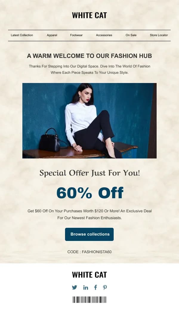
If you promised a discount at signup, it is the most important element in the email and it should be immediately visible, with the code as selectable live text at a generous size.
If you did not promise one, adding it as a surprise works — and sets the expectation that the next email carries one too. That is a programme decision rather than a design one, and it is worth making deliberately rather than by default.
Design register
Welcome emails perform better when they read like the start of a conversation than like a brochure:
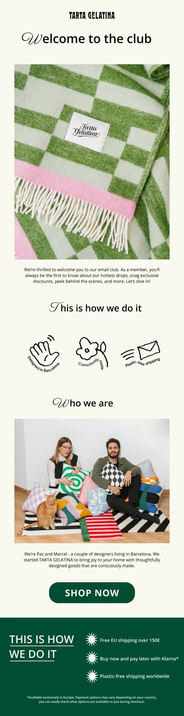
- One column, restrained. One hero, a short block of copy, one button.
- A human voice, and where credible, a named sender rather than a brand name.
- Live text for the headline. This matters more here than usual: clients often block images from senders they have not yet established trust with, and a welcome email is by definition from a new sender. If the headline is baked into the hero image, a meaningful share of readers see an empty rectangle on their first impression of you.
- A working reply address. A welcome from
no-reply@undercuts its own friendliness. Some readers reply to welcome emails, and those replies are useful.
Timing: immediately
A welcome that arrives an hour later reads as automated processing rather than a greeting, and the attention it would have caught is gone.
If your system cannot send immediately, that is worth fixing before anything about the design, because it is the single largest lever available.
The series version
Where one email cannot do the job, split it across three or four — but split it by hurdle, not by content you wanted to include.
A workable shape for a product:
- Welcome. Confirm, set expectations, one action.
- The first stall point. Whatever step people actually get stuck on. This requires knowing your data, and it is usually the highest-value email in the sequence.
- The thing that makes people stay. The second capability, introduced once the first has landed.
- A check-in. An offer of help, ideally from a person, with a low-friction reply path.
Built as component variants on one frame, the sequence reads as one voice. Built as four separate files, it reads as four unrelated emails — and it takes four times as long to change.
The subject line and preheader
The welcome email is the one send where the subject line barely has to work — the reader just signed up and is expecting it. That makes it a good place to be plain rather than clever.
What performs: a direct confirmation. "You're in", "Welcome to [name]", "Your account is ready". What underperforms: a promotional subject line, because it sets up the relationship as a sales channel from the first message, and a mysterious one, because there is no curiosity to build when the reader knows exactly what this is.
The preheader is more valuable here than the subject. Use it for the expectation setting or the single action — "One email a week, and here's your 10% code" — rather than letting the client scrape "View in browser" from the top of your template. It is 40–90 characters and it is the third thing a reader sees before deciding to open.
The double opt-in variant
If you use confirmed opt-in, the confirmation email is not a welcome email and should not be designed as one. It has exactly one job: get the button clicked. One line, one button, no navigation, no products, no discount above the button.
The welcome email then arrives after confirmation and does the three jobs described above. Merging them — asking for confirmation while also touring the product — reliably depresses confirmation rates, because the button competes with everything else on the page.
What to leave out
- A feature tour. Nobody has the context to care yet.
- Your company history. Later, if at all.
- Multiple competing calls to action.
- A navigation bar with eight links.
- Social icons above the primary action.
- "We're so excited to have you" as the opening line. It is about you, and it is in every welcome email ever sent.
Measuring it
- Click rate on the single action — the actual measure of whether the email worked.
- Completion of that action, not just the click.
- Unsubscribe rate on the welcome specifically. A high rate here usually means the signup promised something different from what arrived.
- Engagement on the second email. A welcome that sets expectations well produces a better open rate on the next send, which is where the effect really shows.
Starting points
The welcome collection has designs built for the single-email version and for sequences. The user lifecycle collection covers what comes after, and the design system guide covers building a sequence as variants rather than as separate files.