Announcements are the least glamorous email a organisation sends and the ones
where a design failure has the most direct cost. If a marketing email is unclear,
someone does not buy something. If a schedule change is unclear, someone turns up
on the wrong day.
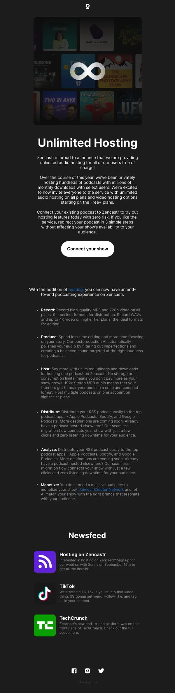
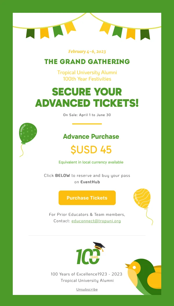
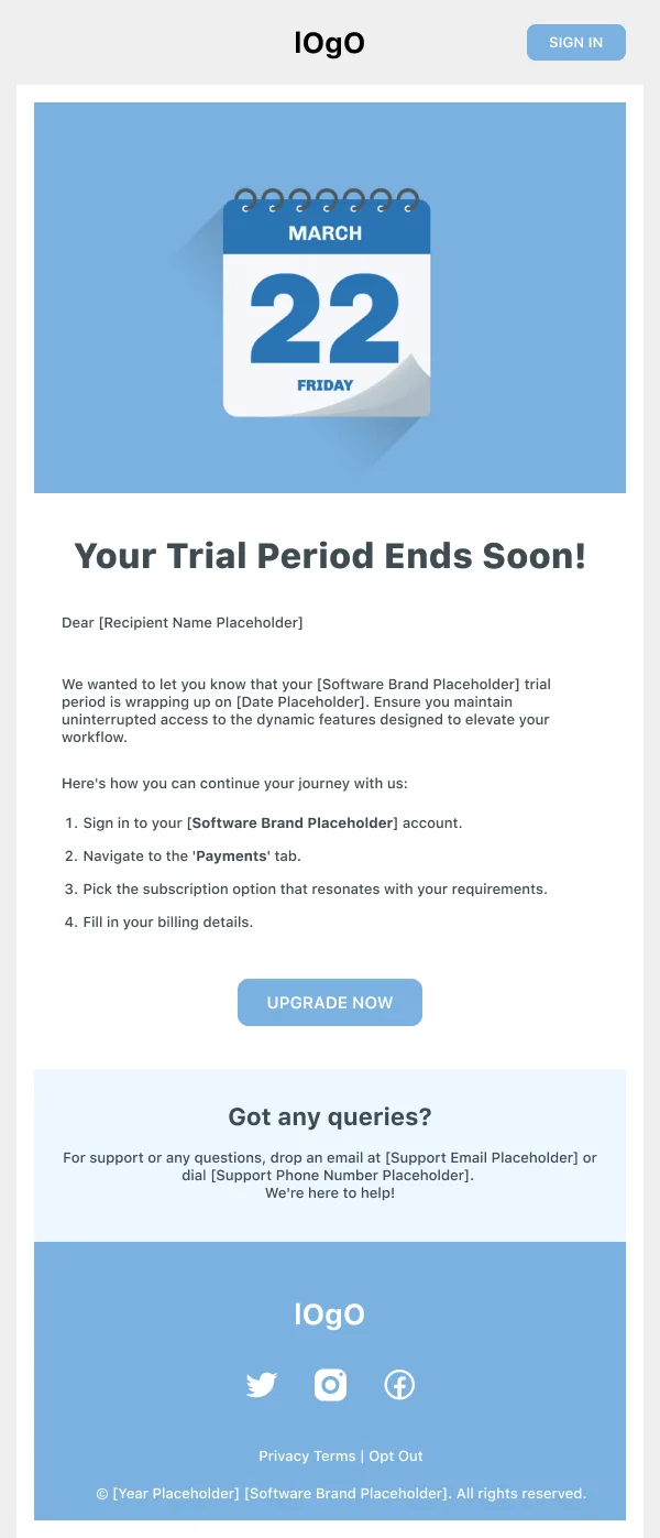
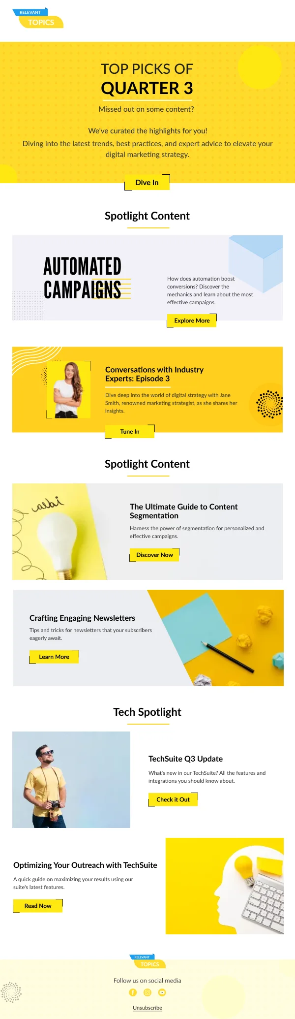
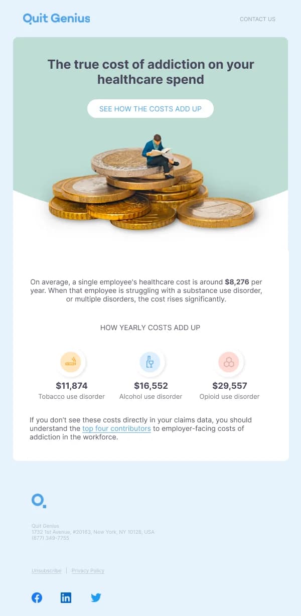
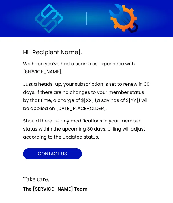
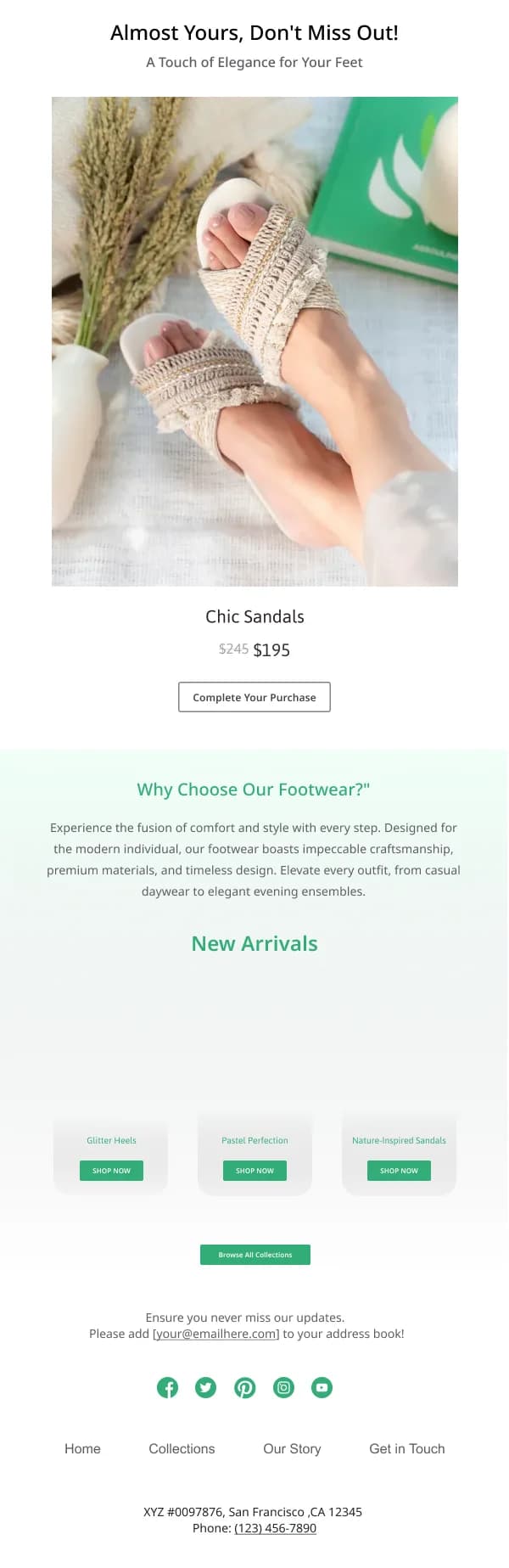
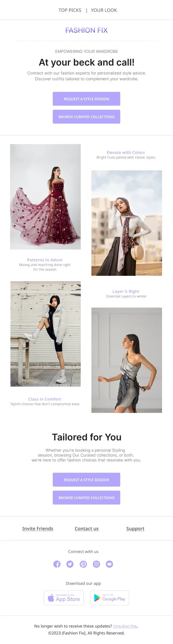
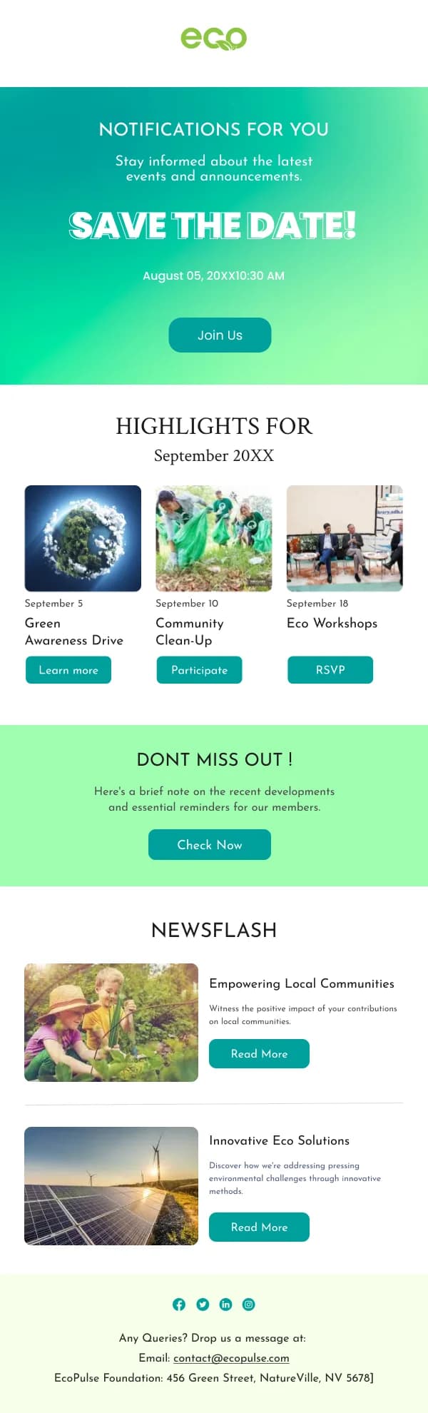
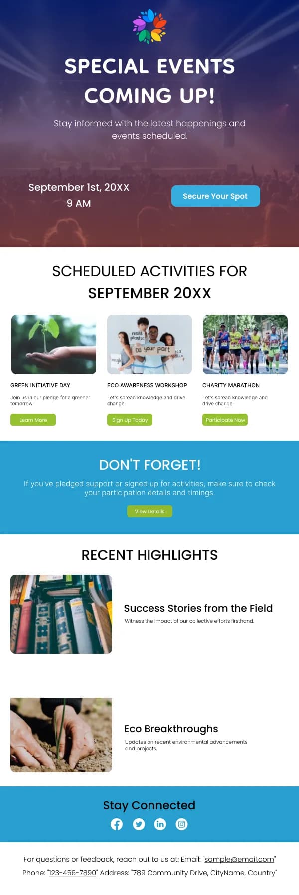
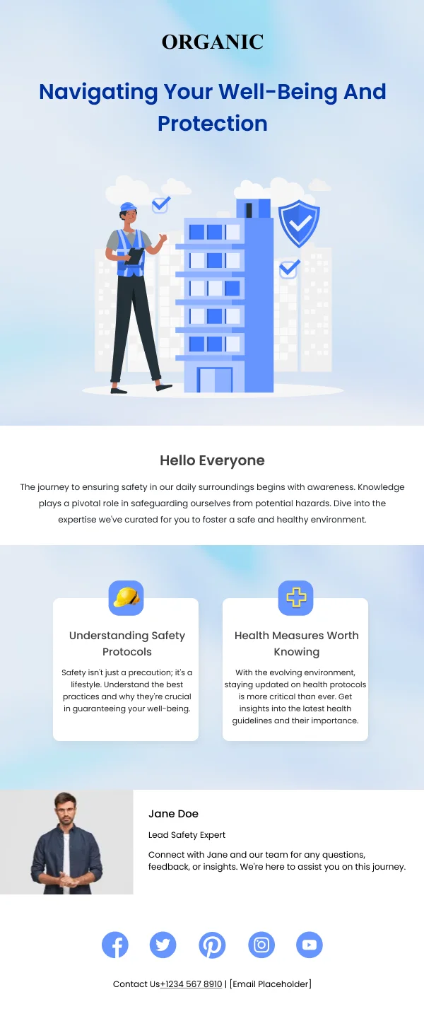
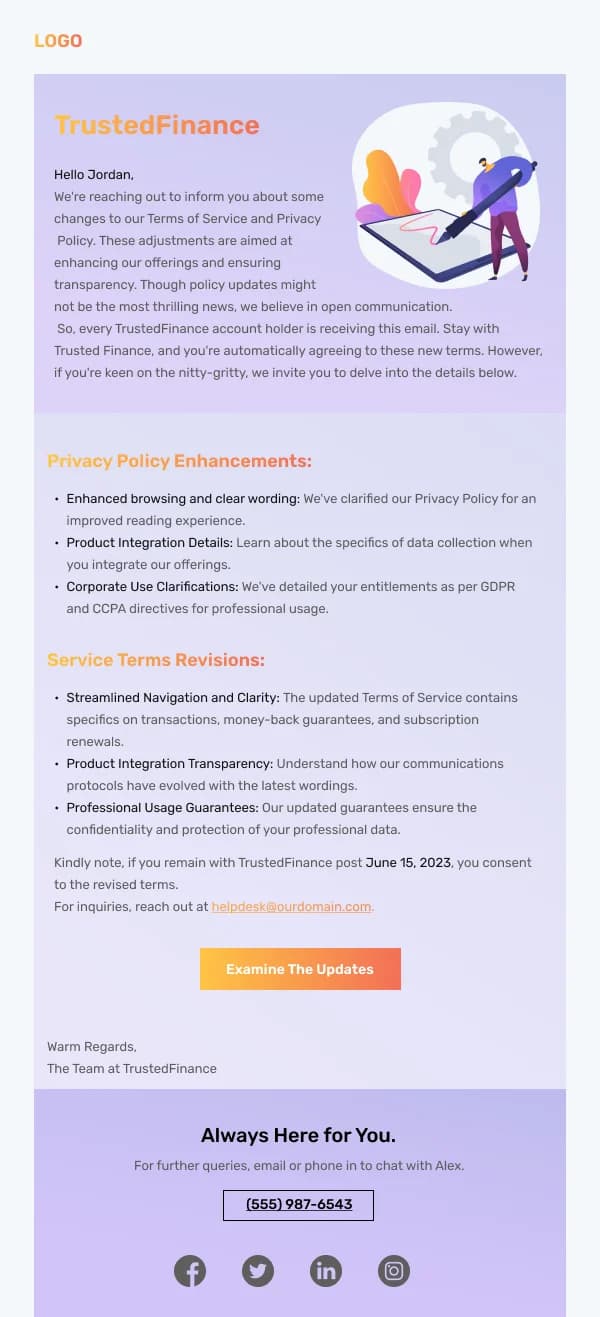
The 125 designs in this collection are built for comprehension first.
Front-load the fact
The most useful structural rule in announcement email is an inversion of the
narrative instinct. Do not build to the news; open with it.
A working order:
- The fact, as a headline, in plain words. "Our support hours are changing
from 3 March."
- The date or deadline, visually distinct — its own line, or a small
highlighted block.
- What it means for the reader. Not what it means for you.
- What they need to do, if anything. A button if there is an action, an
explicit "no action needed" if there is not.
- The detail and the reasoning, for readers who want it.
That "no action needed" line is worth designing a slot for. It saves a
meaningful number of support enquiries.
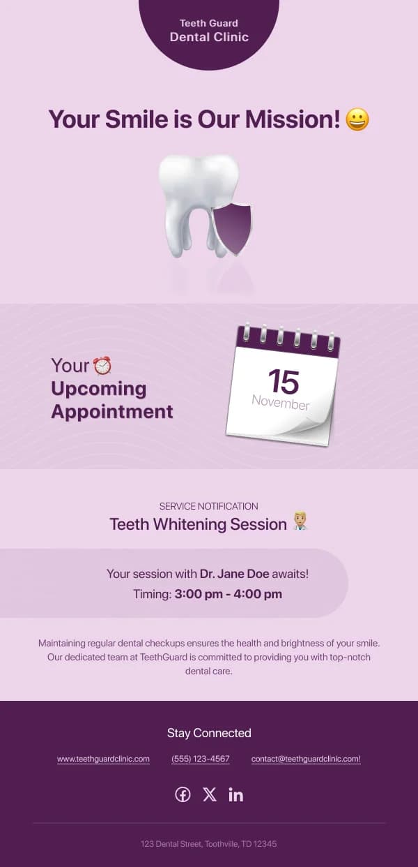
Make the date impossible to miss
Almost every announcement has a date in it, and it is almost always the single
most important thing on the page. The templates here treat it as a design element
rather than a phrase in a sentence: a bordered block, a distinct type size, or a
short labelled row.
Two details that matter more than they look like they should:
- Write the month in words. "03/04" is ambiguous across regions in a way that
"3 April" is not.
- Include the year for anything more than a few weeks out, because
announcement emails get forwarded and re-read.
Tone under pressure
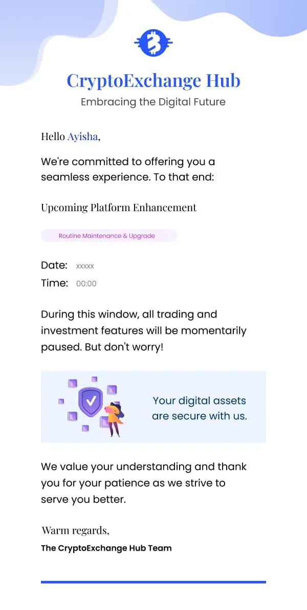
A large share of announcement email is unwelcome news: a price rise, a
discontinuation, an outage, a policy tightening. The design cannot make the news
better, but it can make the sender look either straight or shifty.
What reads as straight:
- The fact in the first line, at the largest size on the page.
- Plain language, including the uncomfortable word — "increase", "closing",
"no longer".
- A named human or team as the sender, not a faceless brand voice.
- A visible route to a reply or a question.
What reads as shifty: an opening paragraph about how much you value the reader, a
headline that describes the change as an improvement when it is a reduction, and
the actual number in the fifth paragraph.
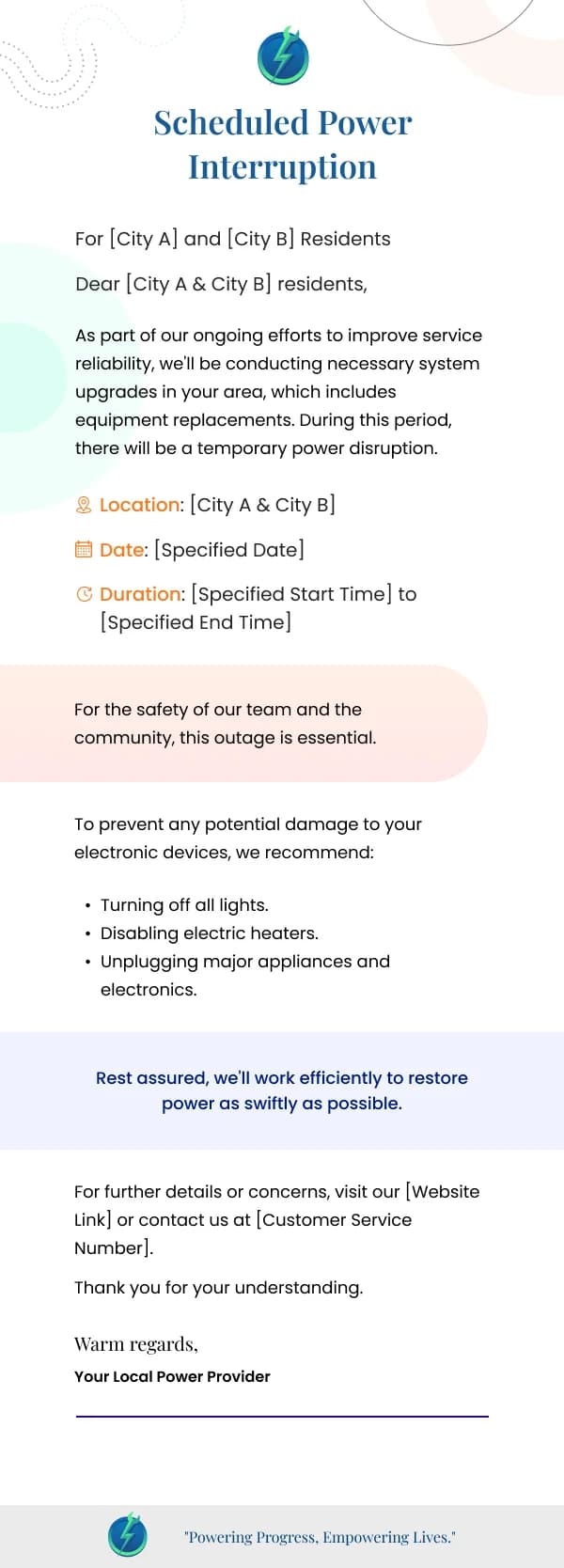
Service and outage notices
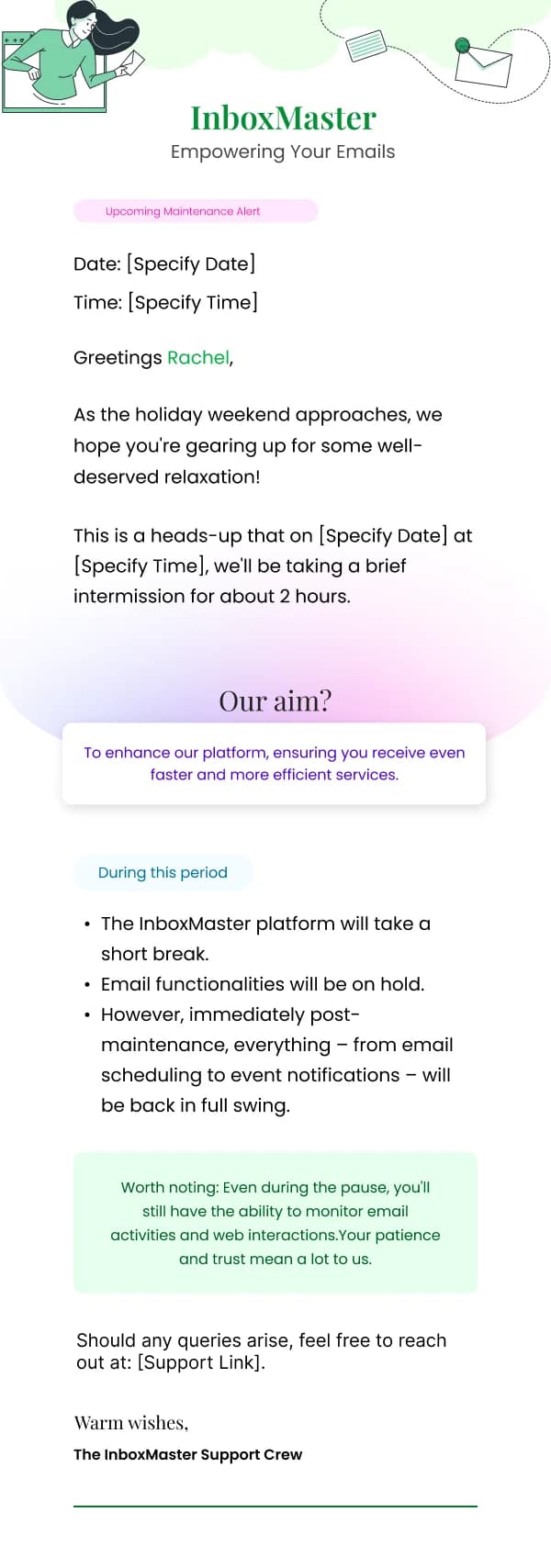
These have their own shape, because the reader is often already affected and
already frustrated:
- Status first. What is broken, since when, who it affects.
- A concrete next update time, even if you do not yet have a fix. "Next
update by 14:00" is the line that stops people refreshing and emailing.
- A workaround if one exists, prominently.
- Restraint on apology. One sincere sentence beats three paragraphs of it;
readers reading an outage notice want information, not contrition.
The follow-up — resolved, cause, prevention — deserves its own template, and
several designs here provide it.
Internal and organisational news
Some of these designs are built for audiences who are not customers: staff,
members, a community, a school's parents. The design constraints shift slightly.
Formality expectations are higher, the layout tends to be single-column and text
led, and a photograph of the people involved does real work in a way that stock
imagery never does for a customer announcement.
What holds constant is the front-loading. A member newsletter that buries the
committee decision under a chairman's welcome will be read by fewer people than
one that leads with the decision.
Restraint in the visual language
Announcement designs in this collection are typographically driven — clear
hierarchy, generous spacing, minimal colour, one accent used only for actions.
That is not a lack of ambition. It is the correct register for a message whose
success is measured in whether the reader understood it.
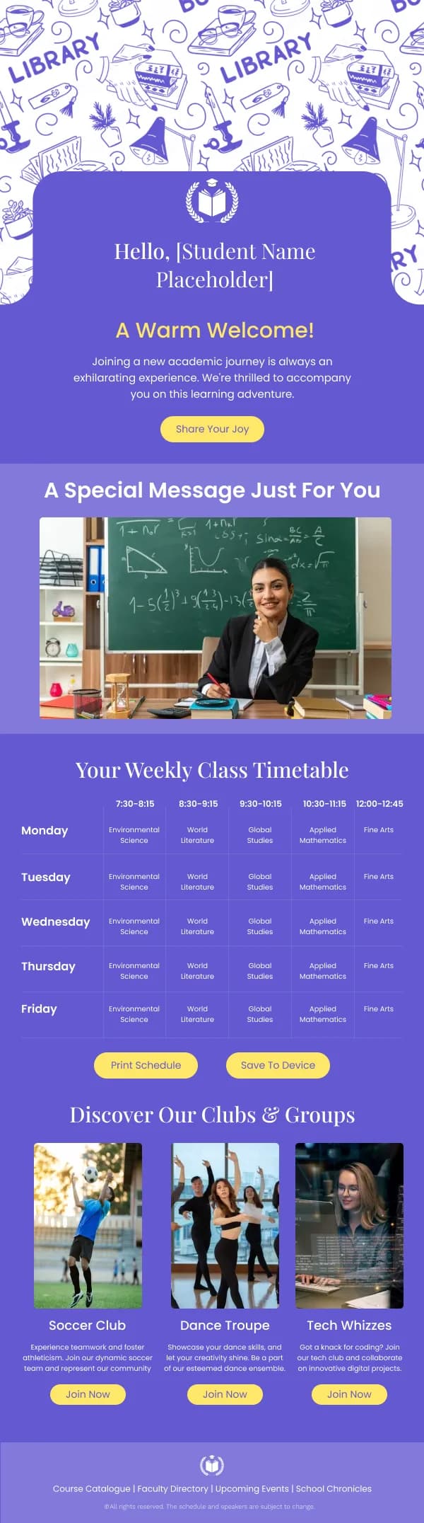
Where imagery appears, it carries information: a schedule table, a map, a
before-and-after of an interface change, a photograph of a new location.
For the typographic decisions behind these designs — and which fonts actually
survive across email clients — see the guide on
email typography.
Common questions
- How is an announcement different from a marketing email?
- The reader does not have to be persuaded, only informed — and often they need to act on the information rather than buy something. That changes the design: the headline states the fact rather than teasing it, the important detail sits high, and there is usually a date the reader needs to note.
- Should an announcement be short?
- It should be complete, and structured so a reader can stop early. Put the fact and the date first, the consequences next, and the detail last. Readers who only need the headline get it in three seconds; readers who need the specifics can keep going.
- What if the news is bad?
- Lead with it anyway. Burying a price increase or an outage under two paragraphs of appreciation reads as evasive, and readers who find the buried fact trust you less than readers who were told directly. State it, explain it, say what you are doing about it.
- Do announcement emails need imagery?
- Often no. An image that carries no information makes the email slower to read without making it clearer. Use imagery when it explains something — a map, a screenshot of a change, a schedule — and skip it when it is decoration.