Email Typography: Web-Safe Fonts, Webfonts and What Actually Renders
Which fonts render in email clients, how fallbacks change your layout, and the size, leading and contrast decisions that make email readable.
Email typography is constrained in a way web typography stopped being about fifteen years ago. You cannot rely on a webfont, you cannot rely on modern CSS, and you cannot see what the reader sees. Designing well inside that is mostly a matter of knowing which decisions are actually yours.
The fonts you can rely on
Live text in email renders in a font the reader's device already has, unless a webfont loads — and in several major clients it will not.
The reliable set:
Sans-serif
- Arial — universally available, the safest default
- Helvetica — resolves to Arial where absent
- Verdana — wide, very legible at small sizes
- Tahoma — narrower than Verdana, good in tight spaces
- Trebuchet MS — more character than Arial, widely present
Serif
- Georgia — designed for screens, the best serif choice for body text
- Times New Roman — universal, dated
- Palatino — less common, elegant where present
Monospace
- Courier New — universal
That is the practical list. Everything else is a webfont with a fallback.
Where webfonts work and where they do not
Webfonts load in Apple Mail, iOS Mail, and most of the modern webmail clients.
They do not load in desktop Outlook on Windows, which uses Word's rendering
engine and ignores the @font-face mechanism entirely. Depending on your audience,
that can be a substantial share of readers.
So a webfont in email is not a design choice, it is two design choices — the intended appearance and the fallback appearance — and both ship.
The fallback changes more than the letterforms
This is the part most often underestimated. Swapping a geometric sans for Arial changes character width, which changes where lines break, which changes the number of lines, which changes the height of every block below.
A headline set in a condensed display face that fits on two lines may take three in Arial. If it sits in a fixed-height hero, it overflows or clips.
What to do about it:
- Design the fallback frame and check it, particularly for headlines and buttons.
- Leave vertical slack in any container holding text that could reflow.
- Choose a fallback with similar metrics. Verdana for a wide font, Arial for a neutral one, Georgia for a serif. Matching x-height and width matters more than matching style.
- Write the stack in fallback order, and be honest with yourself about which version most of your audience sees.
A defensible position
For most senders: use the brand font in the logo, which is an image, and set all live text in a reliable family. What you design is then what ships, for everyone.
That sounds like a compromise and it usually is not. Email is a short-form, functional medium read in seconds; the typographic personality that matters in a brand's website or packaging has very little room to operate in 300 words of body copy. Georgia set well at 16/1.5 with good hierarchy looks considered. A webfont that renders for 60% of readers and reflows for the rest does not.
Sizes that work
| Role | Minimum | Recommended |
|---|---|---|
| Body | 14px | 16px |
| Secondary | 12px | 14px |
| Headline | 22px | 24–32px |
| Subhead | 18px | 18–20px |
| Legal / footer | 12px | 12–13px |
Two forces push these up. iOS Mail applies a minimum text size and will scale up anything it considers too small, which can break a fixed layout. And email is read in poor conditions — on a phone, in transit, in bright light.
For healthcare, financial and education audiences, 16px should be the floor for body text rather than the target.
Leading and measure
Line height 1.4–1.6 for body copy. Email defaults are tight, and tight leading on a phone is genuinely harder to read.
Line length 50–70 characters. At 600px with 16px type, full-width text runs longer than that, which is why most well-set email has horizontal padding of 24–40px inside the content column rather than text running edge to edge.
Left aligned for anything longer than two lines. Centred body copy forces the eye to find a new starting point on every line, which is fine for a headline and tiring for a paragraph.
Hierarchy with a small toolkit
Email typography works with two or three sizes, two weights and one colour for emphasis. That is a smaller toolkit than web, and the discipline is to use fewer distinctions rather than inventing more.
- Size separates headline from body.
- Weight separates a subhead or a label from body at the same size.
- Colour — one muted tone — separates secondary information.
- Space separates sections, and does more work than any of the above.
What to avoid: letter-spaced uppercase for anything longer than a short label, italics for emphasis in body copy at small sizes, and more than two type families.
Contrast, measured
Body text should hit at least 4.5:1 against its background. Large text can go to 3:1.
The combinations that fail most often are the ones that look sophisticated on a calibrated monitor:
- Mid-grey (#767676 and lighter) on white — borderline at best
- Gold or tan on cream
- White on pale pink, pale blue or pastel anything
- Any two mid-tones from the same palette
- Light grey on a dark grey that is not quite black
Check it with a contrast tool rather than by eye. The difference between 4.5:1 and 3.8:1 is invisible to a designer looking at a large sample and very apparent to a reader with reduced vision reading 14px copy.
Emoji and special characters
Emoji render inconsistently across platforms and appear in a different style on each, so an emoji chosen for how it looks on iOS may read quite differently on Windows or Android. They are safe in subject lines and preheaders, where they are common and add scannability; inside body copy they are more of a risk, particularly if they carry meaning rather than decoration.
Two practical rules: never use an emoji as the only carrier of information, since screen readers announce them by name and the announcement is sometimes unhelpful, and avoid the newer additions to the standard, which fall back to an empty box on older systems.
Typographic characters — proper apostrophes, en and em dashes, non-breaking spaces — are well supported and worth using. The one thing to check is that your build encodes them correctly; a curly apostrophe rendering as a question-mark diamond is a character-encoding failure rather than a font failure, and it is common enough to be worth a look at every new template.
Reviewing type in the wild
A design decision that looks right in Figma at 100% zoom on a large monitor is not verified. Two cheap checks:
- Send yourself the template and read it on a phone in daylight. More small-type and low-contrast problems surface in thirty seconds outdoors than in an hour of review on a desk.
- Zoom the browser to 200% in a webmail client. Some readers browse this way permanently, and layouts with fixed-height text containers break.
Accessibility beyond contrast
- Real headings. Use heading elements in the build, not styled paragraphs. Screen reader users navigate by heading.
- Meaningful link text. "See the spring collection" rather than "click here" five times.
- Do not rely on colour alone to convey anything — a required field, a status, a shade name.
- Alt text on every image, written to carry the meaning.
Applying this
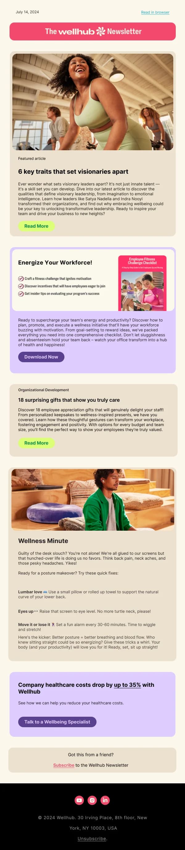
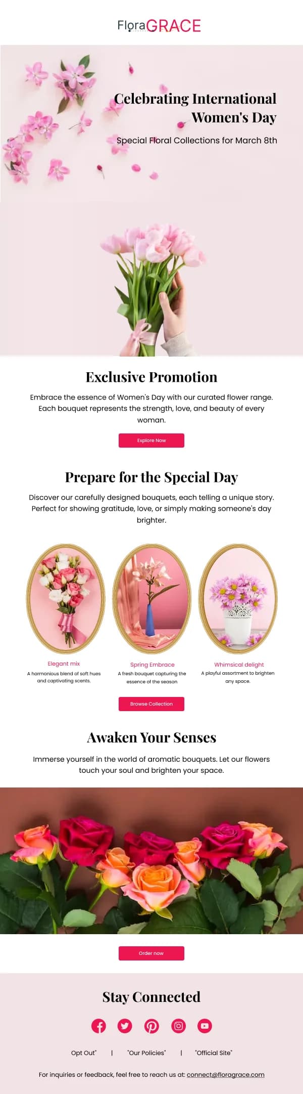
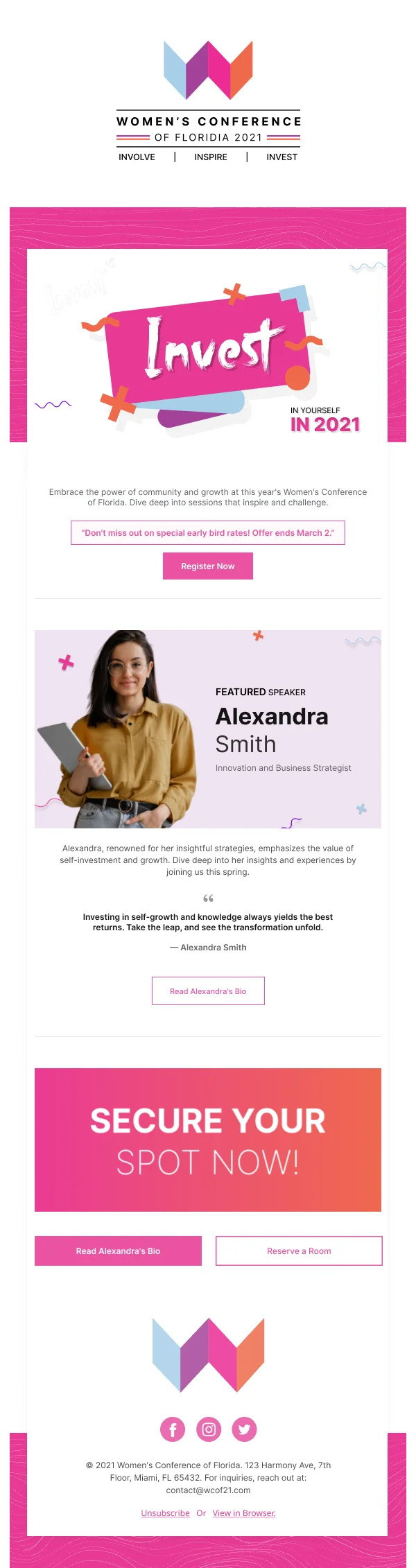
The templates in this library set live text in reliable families at 16px body with 1.5 line height, and reserve brand fonts for logos. The newsletter collection is the most typographically driven — long-form, text-led designs where these decisions matter most.
For the surrounding layout numbers, see the dimensions guide.