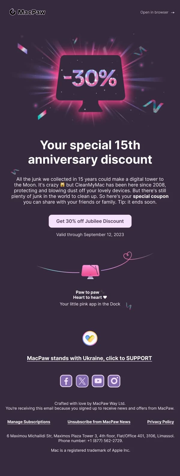
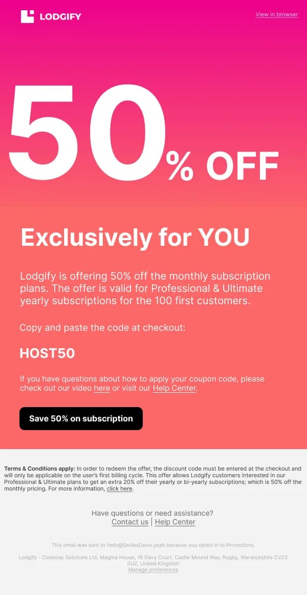
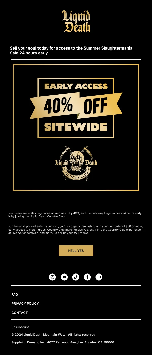
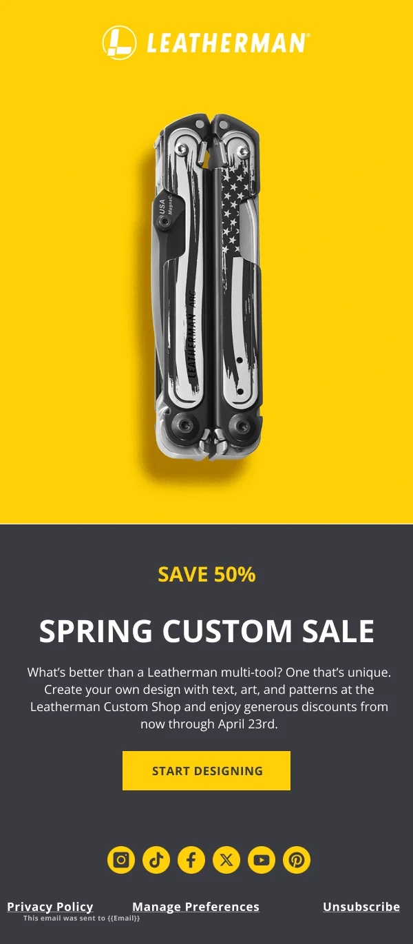
A discount email is the simplest brief in email design and one of the easiest to
over-complicate. The reader needs four facts — what the offer is, what it applies
to, when it ends, and how to use it — and every element that does not deliver one
of those is in the way.
The 82 designs in this collection are organised around delivering those four
facts cleanly.
The four facts, in order
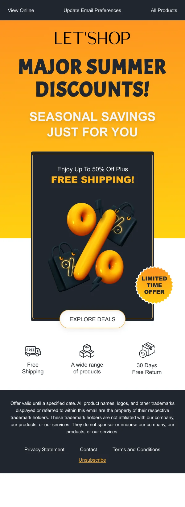
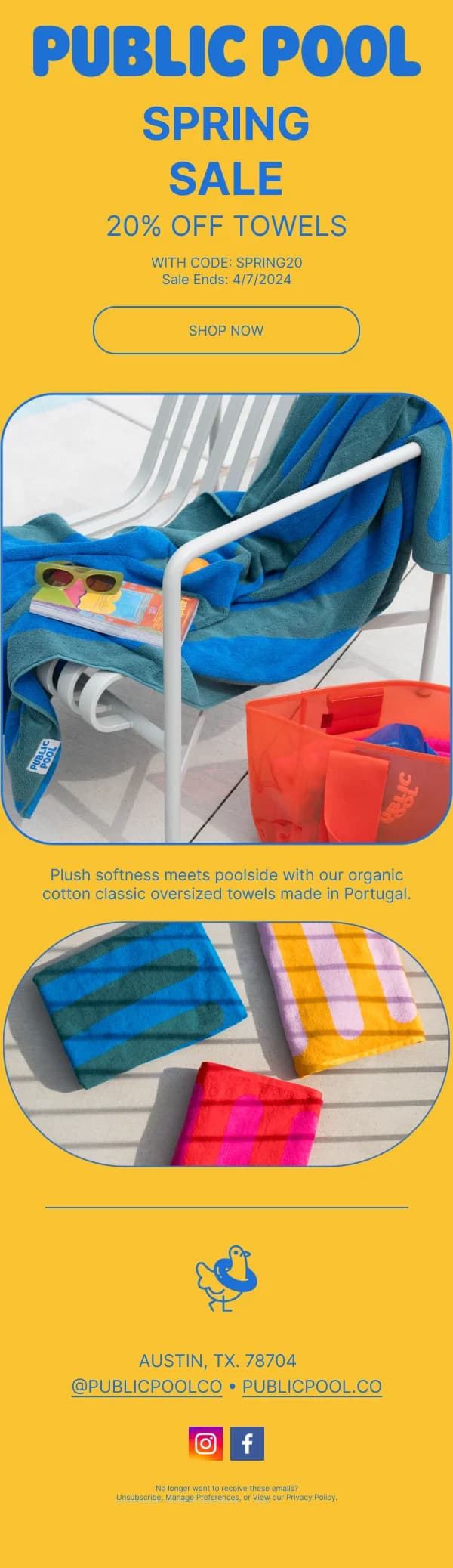
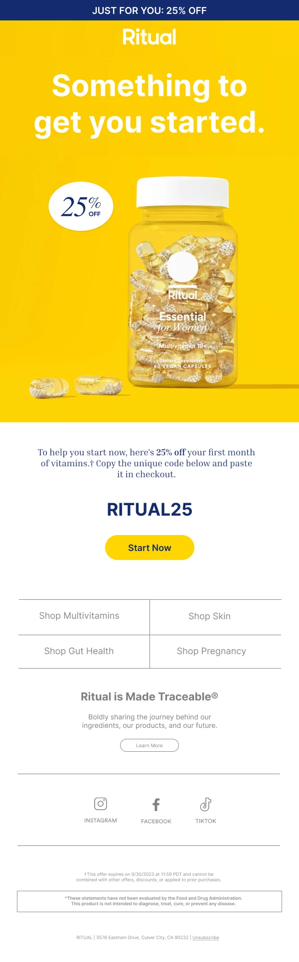
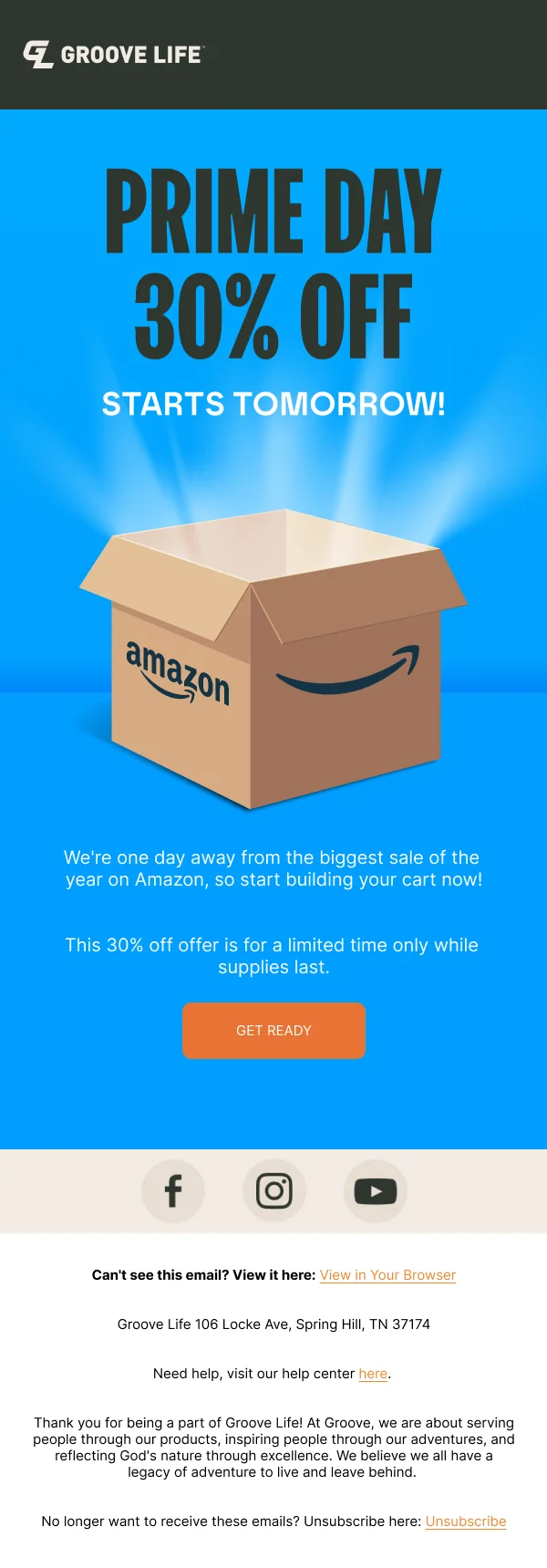
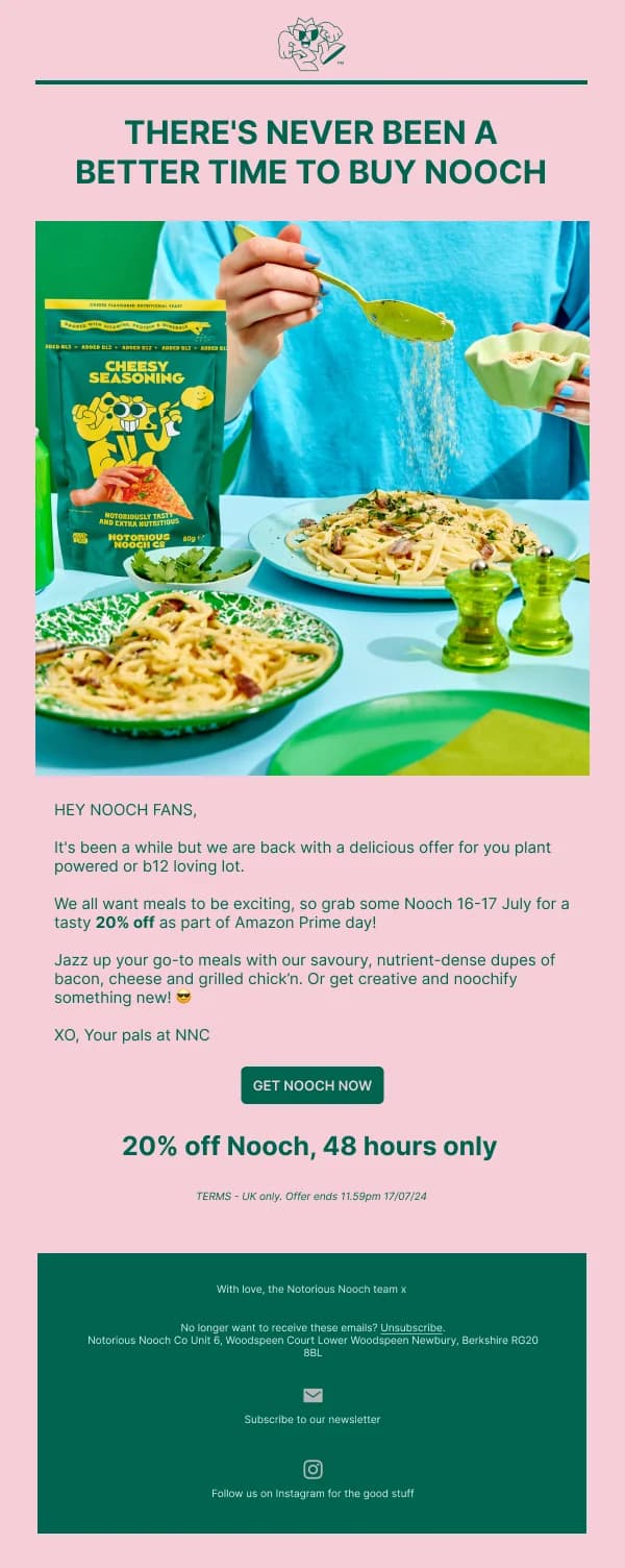
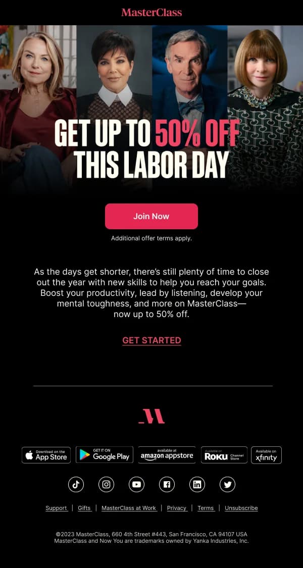
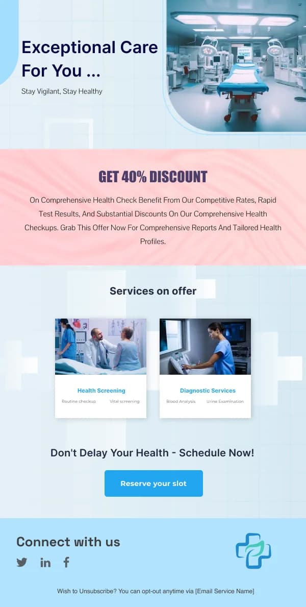
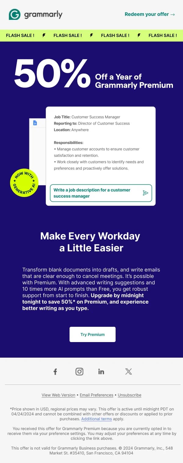
What the offer is. The headline. "30% off everything", "Free shipping over
£40", "Buy two, get the third free". Specific, in the first line, in the largest
type on the page.
What it applies to. The most common omission and the biggest driver of
support enquiries. Everything? One category? Full-price only? Say it directly
under the headline, not in small print at the bottom.
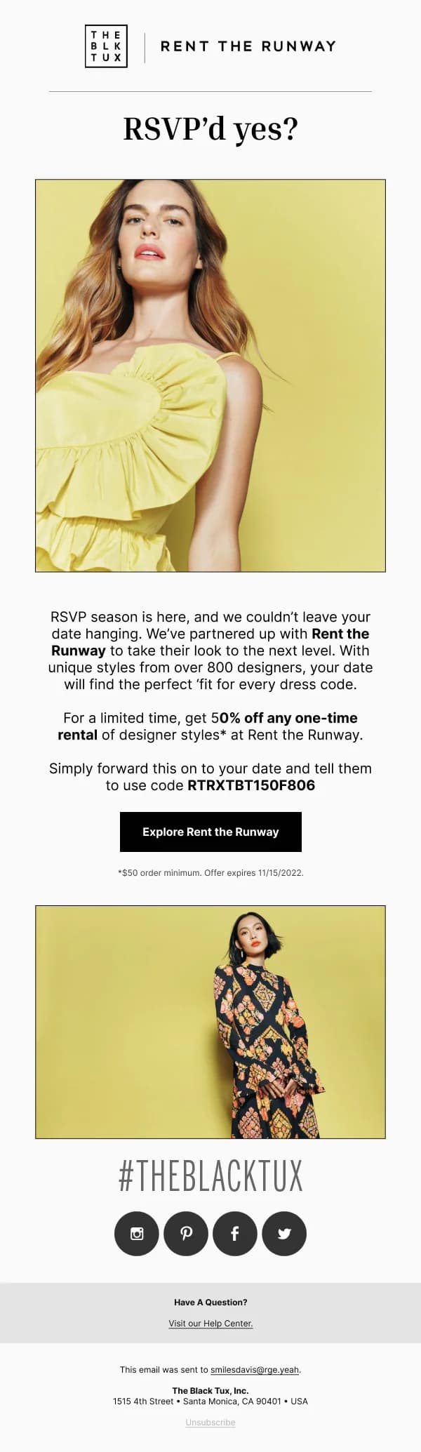
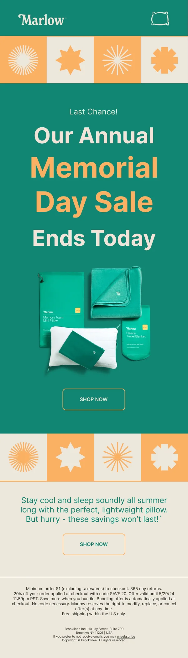
When it ends. A date, with the month in words, and a time if the window is
short. Vague urgency — "for a limited time" — is weaker than a real deadline and
readers know it.
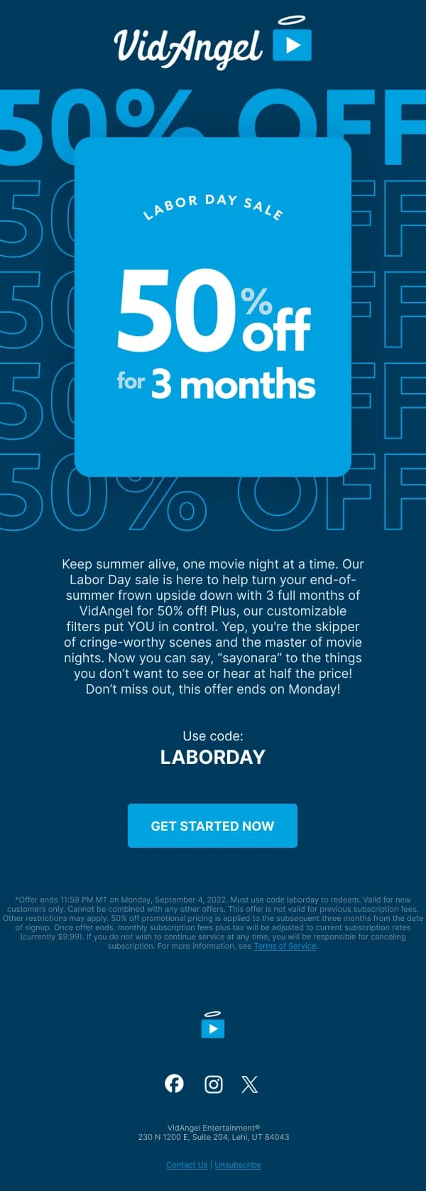
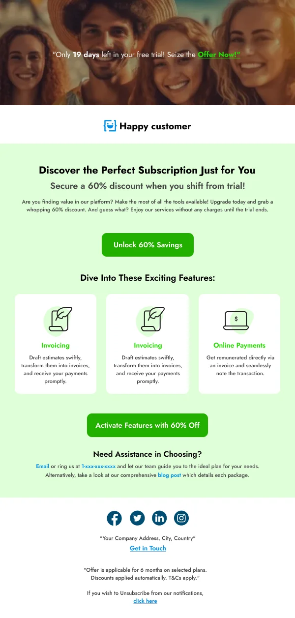
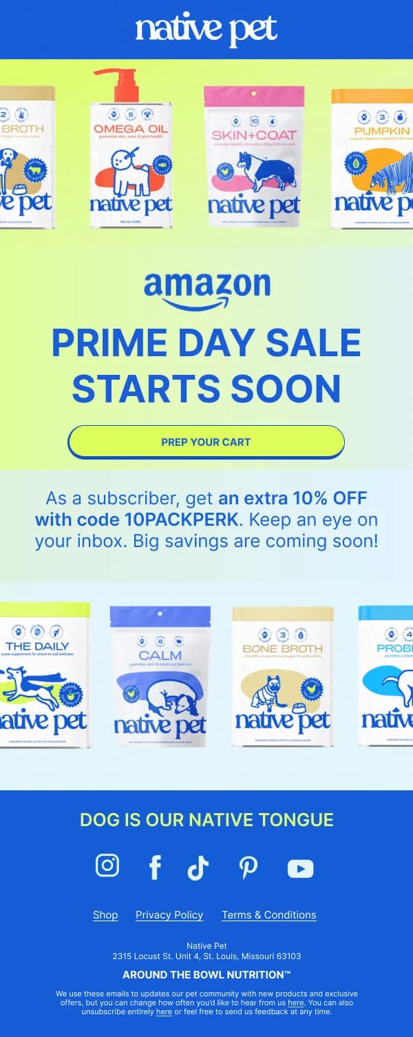
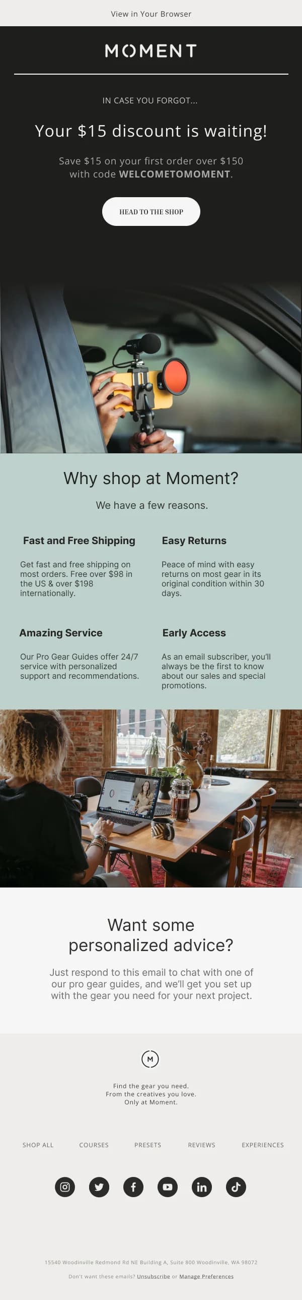
How to use it. Either a button that applies the discount, or a legible code
with a button beside it.
Everything else is optional.
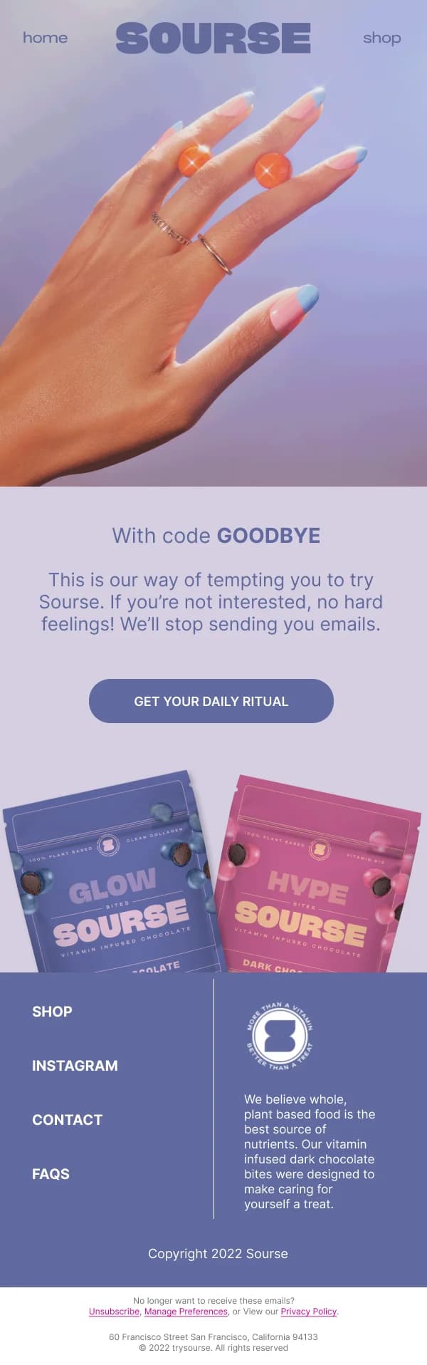
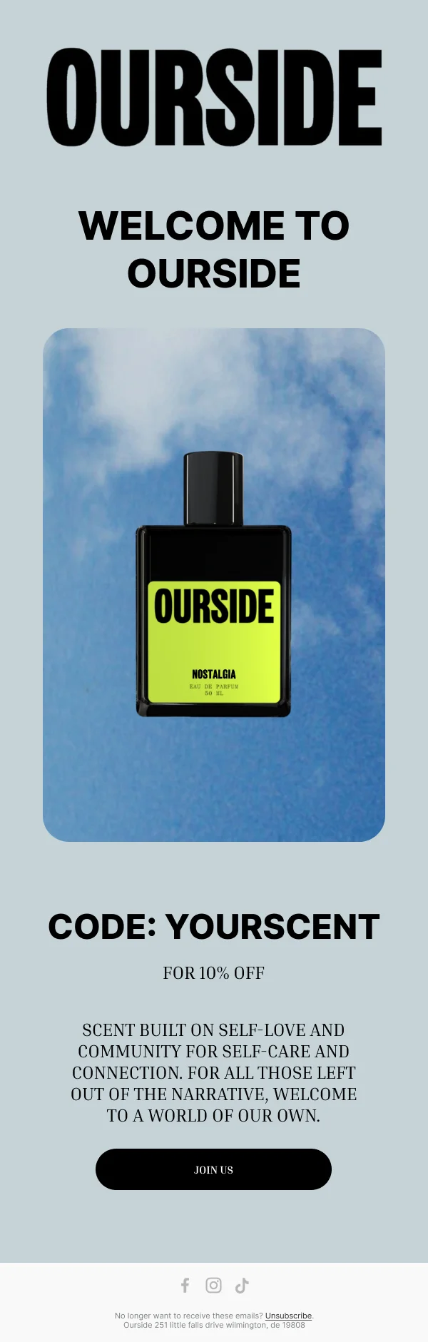
Design the code as an interface element
When there is a code, it is the point of failure. Design accordingly:
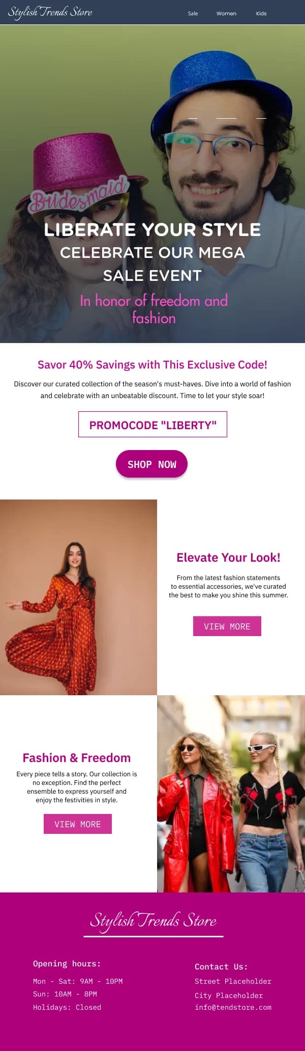
- Selectable live text, never inside an image. A reader on a phone needs to
long-press and copy.
- Generous size and letter spacing, in a bordered or filled block so it reads
as a distinct object rather than a word in a sentence.
- Case-insensitive, unambiguous characters. Avoid pairs that confuse — O and
0, I and l — and say the code is case-insensitive if it is.
- The button immediately adjacent, so the reader can copy and go in one
motion.
Several designs here place the code inside the button's own block for exactly
that reason.
Restraint outperforms volume
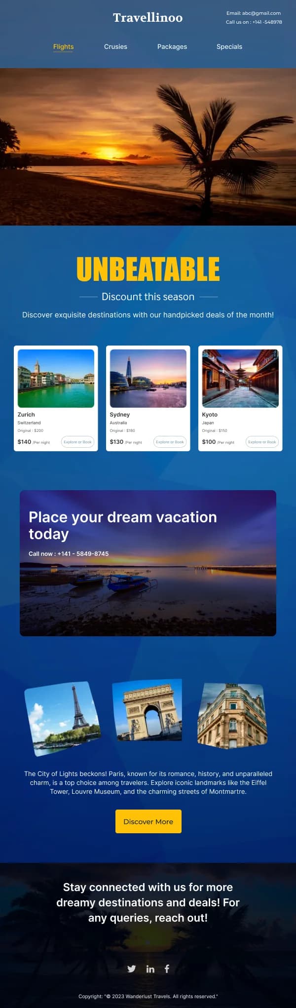
The instinct with a discount is to make everything bigger. In a crowded inbox
that backfires: an email that looks like a discount aggregator gets read as one.
What the stronger designs in this collection do instead:
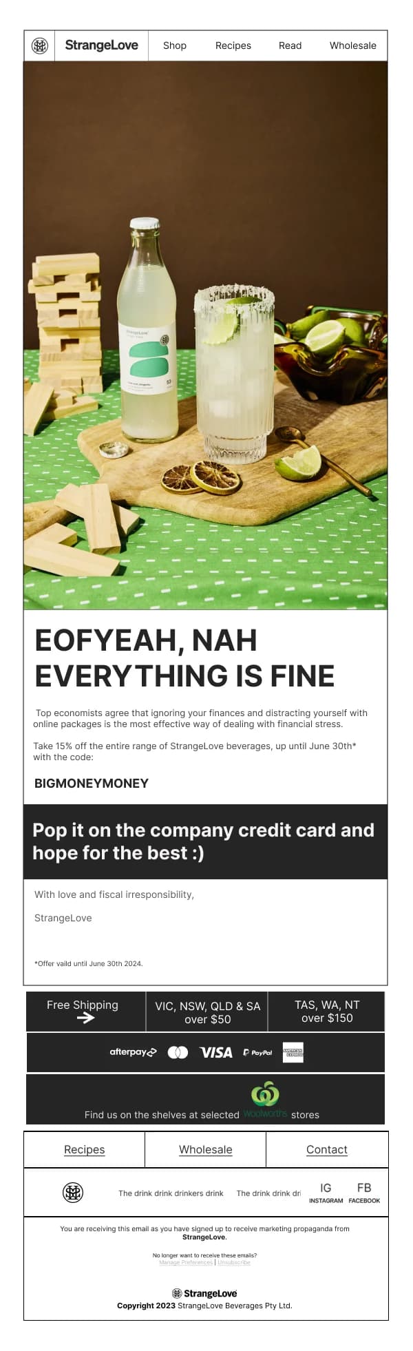
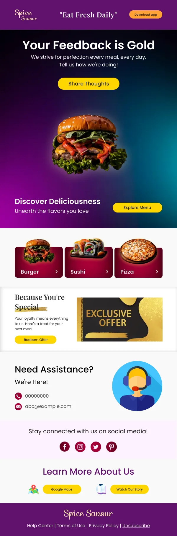
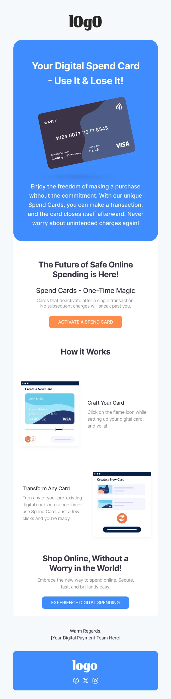
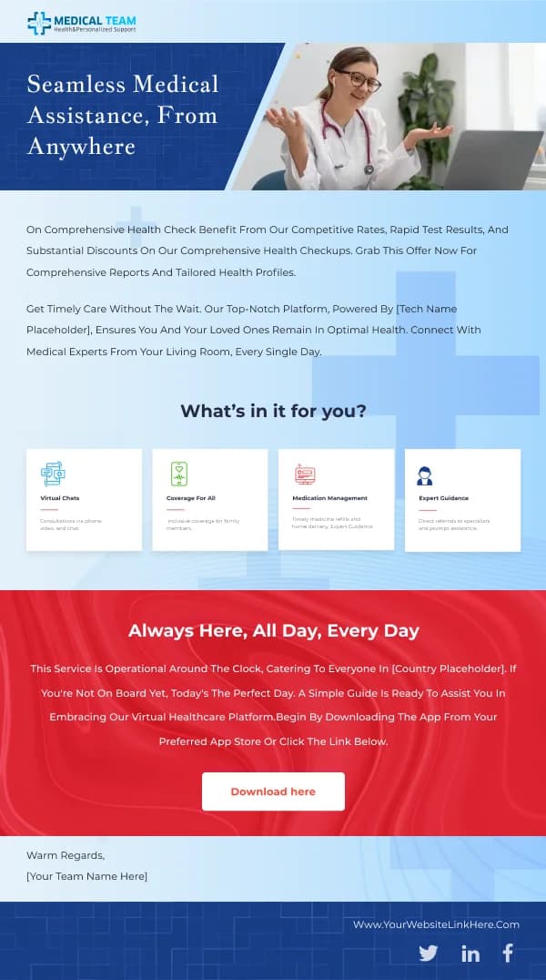
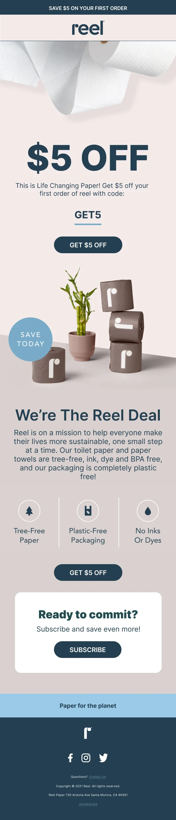
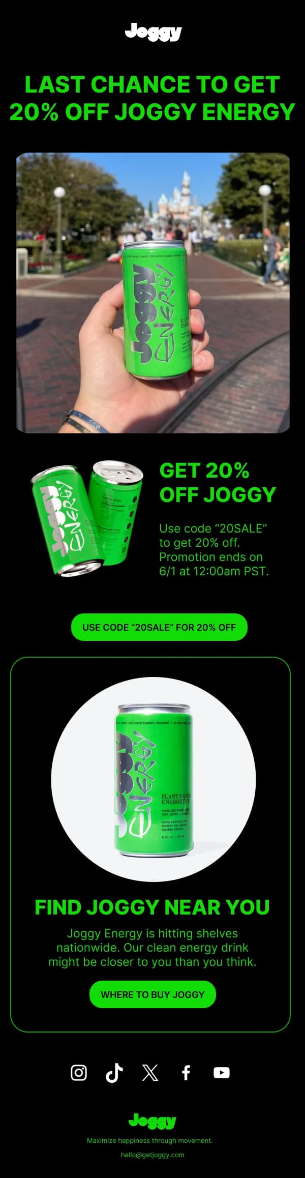
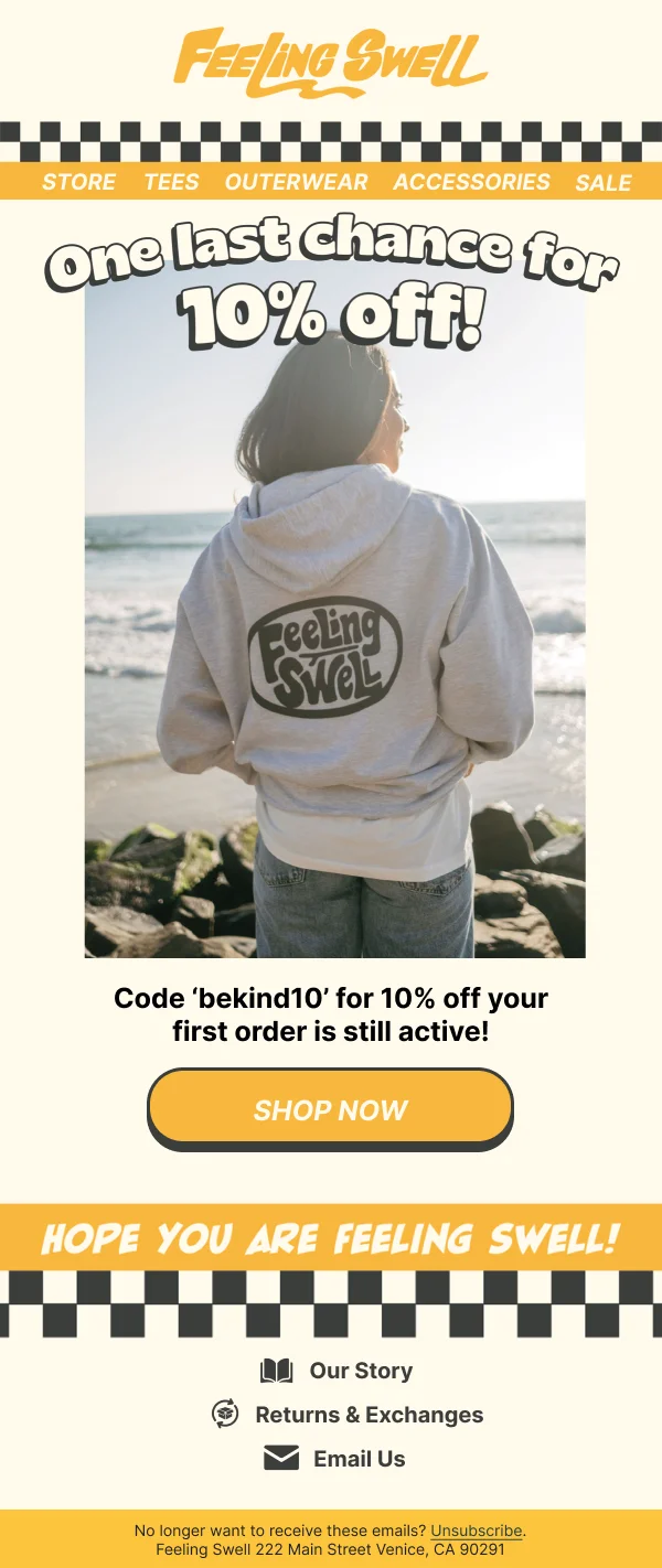
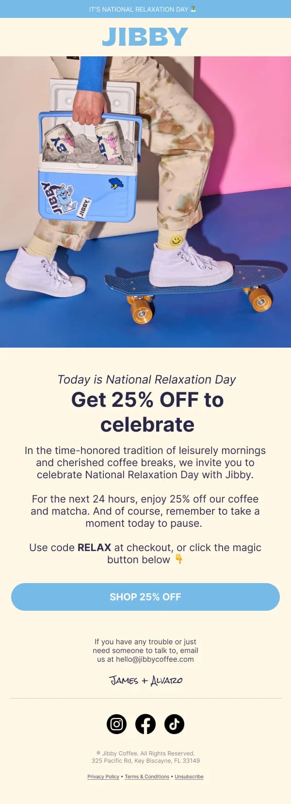
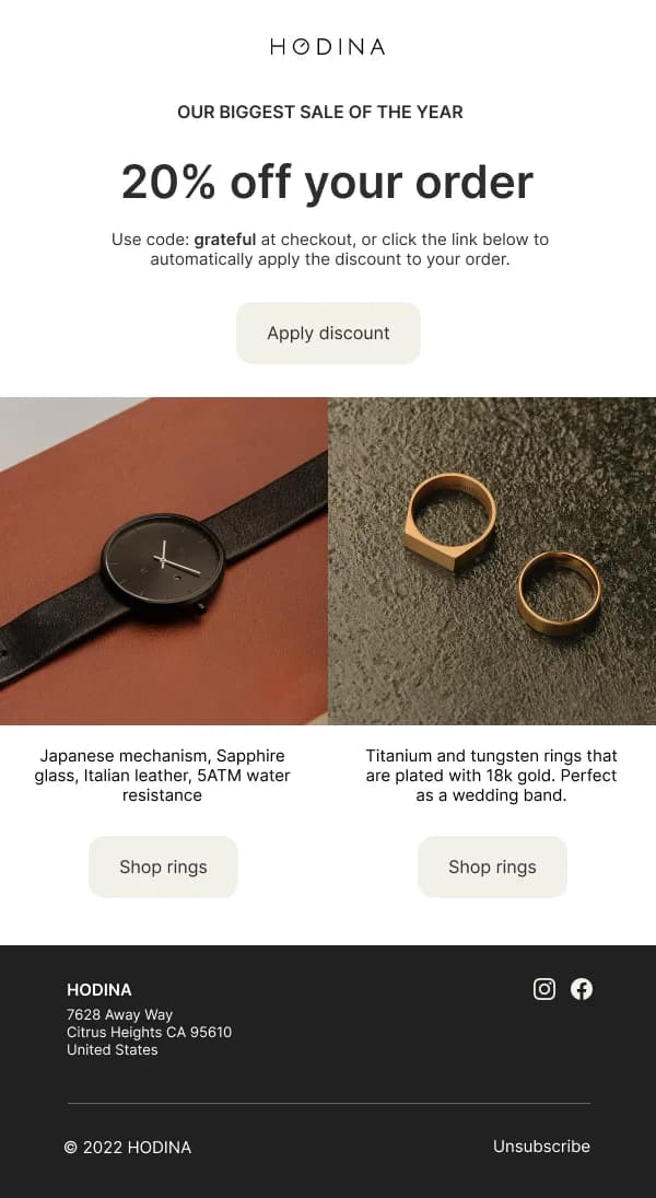
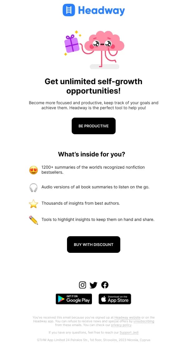
- Keep the brand's normal type, spacing and footer.
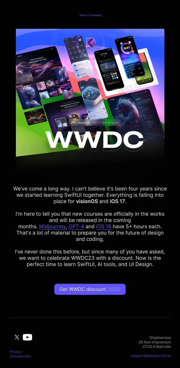
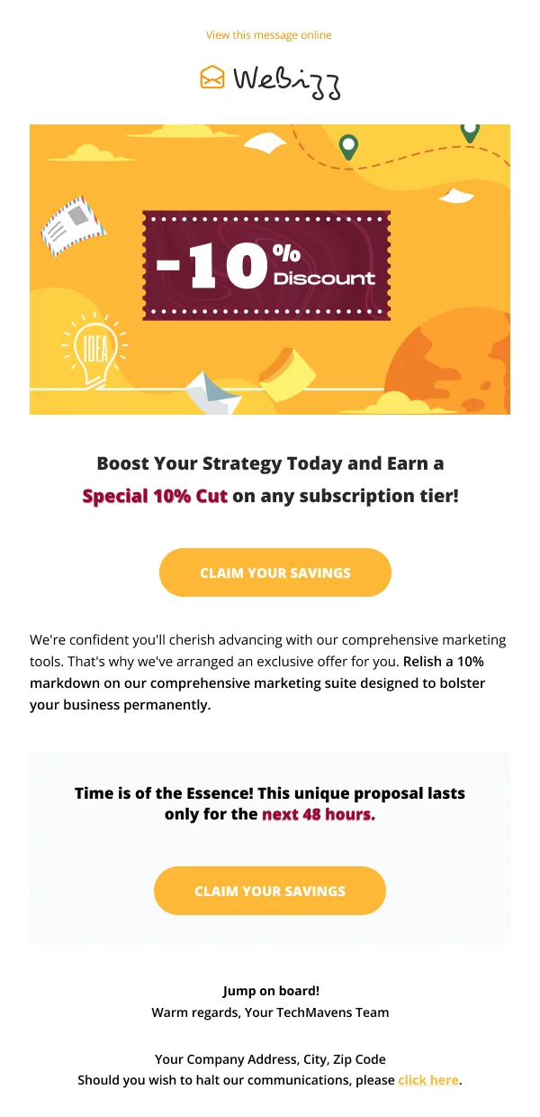
- Put the offer at the top in clear, large type — but in the brand's voice, not in
a starburst.
- Use one accent colour for the action and let white space create the emphasis.
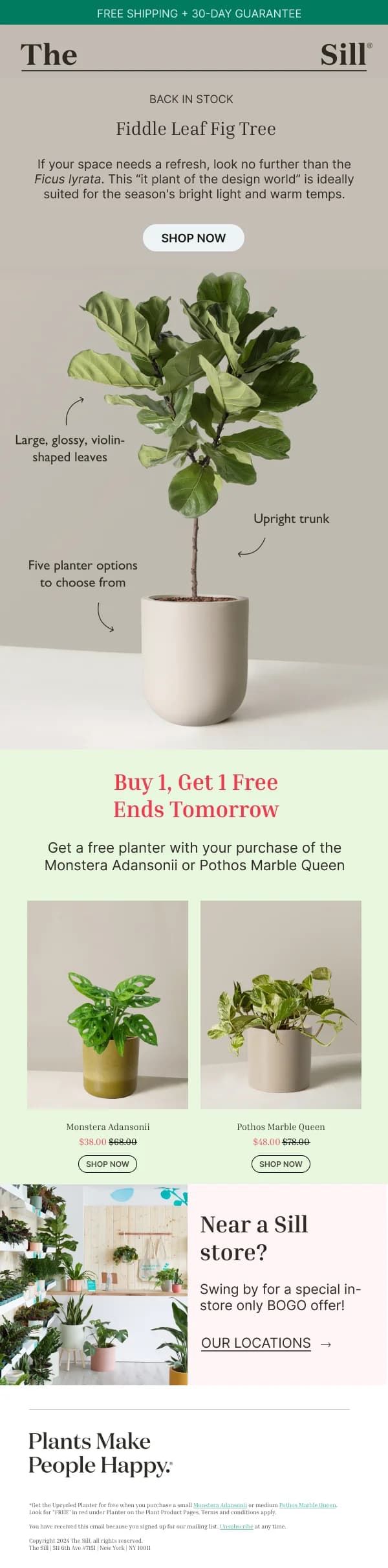
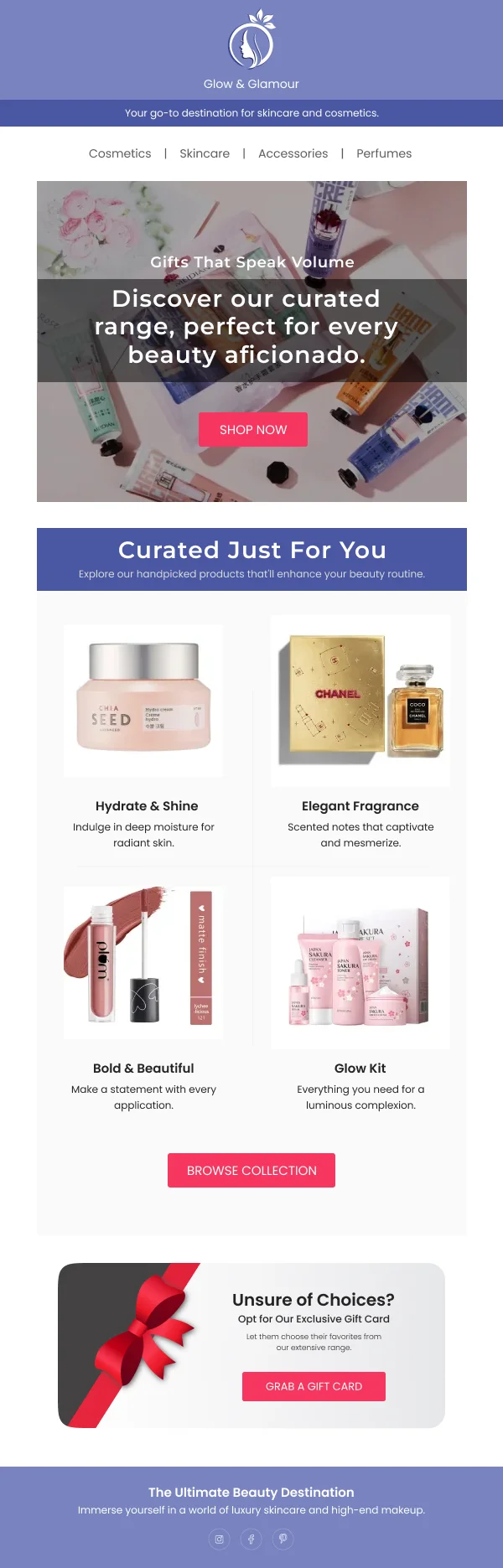
- Show the products the discount applies to, well photographed.
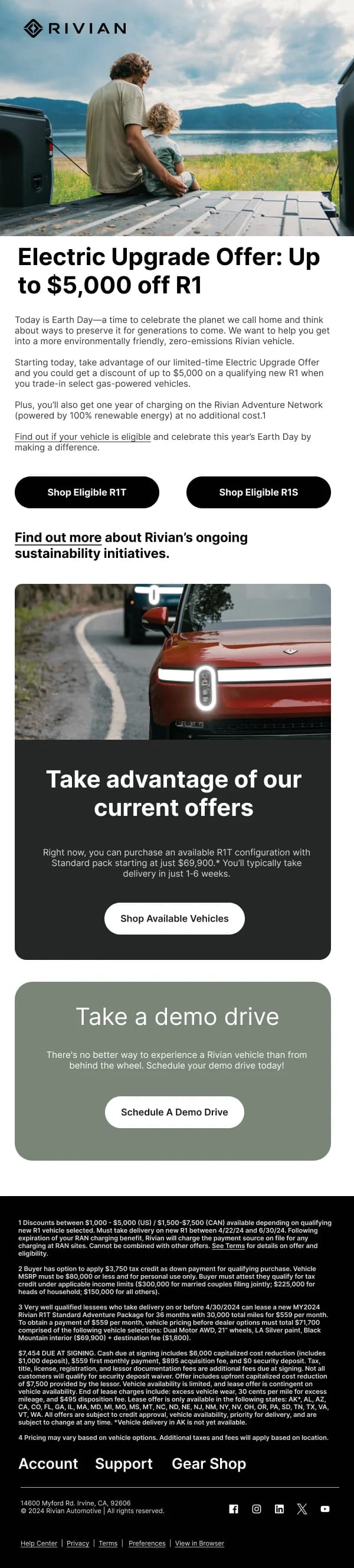
The email that looks like your normal email with a clear offer at the top is the
one that reads as a real brand having a sale.
Thresholds and tiers
Spend-threshold offers — free shipping over a value, tiered discounts — are a
layout problem because they carry conditional logic. The designs here that handle
it well use a small visual ladder: three rows, each with the threshold and the
reward, in ascending order, with the middle one emphasised.
What to avoid is a paragraph explaining the tiers. Conditional logic in prose is
much harder to read than the same logic in three rows.
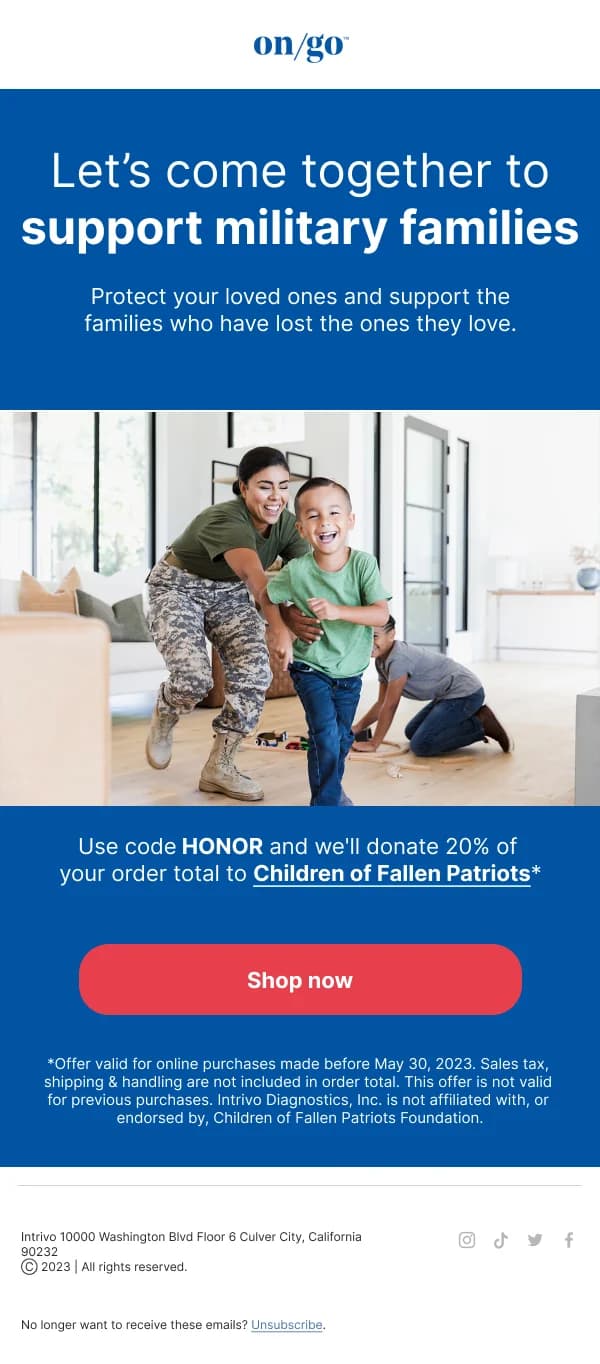
Terms without undermining the offer
Exclusions have to be present, and burying them produces complaints and returns.
The workable compromise, used across this collection, is a two-level structure:
the important qualifier next to the headline ("on full-price items"), and the
complete terms in a small but legible block above the footer.
Six-point grey type is not a solution; it fails accessibility and it reads as an
attempt to hide something.
When not to discount
Worth saying plainly, because it is a design decision as much as a commercial one:
if the only email a customer segment receives is a discount, the design of that
email is not the problem. The strongest programmes in this collection's source
libraries use discounts conditionally — a lapsed customer, an abandoned cart, a
threshold nearly met — and keep full-price sends visually distinct so the two do
not blur into one habit.
Using these templates
The code block is a real component with selectable text, because a code baked into an image cannot be copied on a phone. The
checks specific to discount email: is the offer legible at mobile width without
zooming, is the code live selectable text, is the deadline stated as a real date,
and does the scope of the offer appear near the headline rather than only in the
terms.
For discount sends used in recovery flows, the
abandoned cart guide covers when a code
helps and when it trains the wrong behaviour.